TL;DR
Yellow kitchen ideas thrive on the balance between high-energy saturation and grounding neutral tones. By selecting the right undertones like mustard or primrose and pairing them with natural textures, you create a space that feels both timeless and invigorating.
Introduction
Walking into a kitchen bathed in the right shade of yellow feels like a physical exhale. It is a color that holds the unique power to stimulate the appetite while simultaneously calming the mind. Most people feel a bit nervous about committing to such a bold palette, fearing it might overwhelm a small space or feel dated within a year. This guide breaks down how to use yellow with the precision of a professional designer to ensure your kitchen remains a sophisticated sanctuary. You will see how specific shades interact with light and materials to produce a result that feels intentional rather than accidental.
One: The Sophistication of Muted Mustard Cabinets
Mustard yellow serves as the anchor for a kitchen that wants to feel established and grounded. Unlike the neon yellows of the past, mustard contains a heavy dose of brown and ochre, which allows it to function almost like a neutral. When you apply this shade to cabinetry, you create a visual weight that feels expensive and deliberate. This specific tone works exceptionally well in homes that feature historical architecture or traditional molding.
Designers often pair mustard cabinets with dark, matte hardware to provide a necessary point of contrast. Think of charcoal or oil-rubbed bronze pulls against a deep, golden door. This combination prevents the yellow from feeling too whimsical. It grounds the room in a way that feels masculine and sturdy. I once saw a renovation in a Pacific Northwest home where the owners used a deep mustard on the lower cabinets and a soft off-white on the uppers. The result was a space that felt warm even on the gloomiest rainy days.
The key to making mustard work is the finish of the paint itself. A satin or eggshell finish allows the color to shift slightly as the sun moves across the room. In the morning light, the cabinets might look like a bright straw color, while the evening shadows bring out the deeper, spicy notes of the pigment. This kinetic quality keeps the kitchen from feeling static or flat over time.
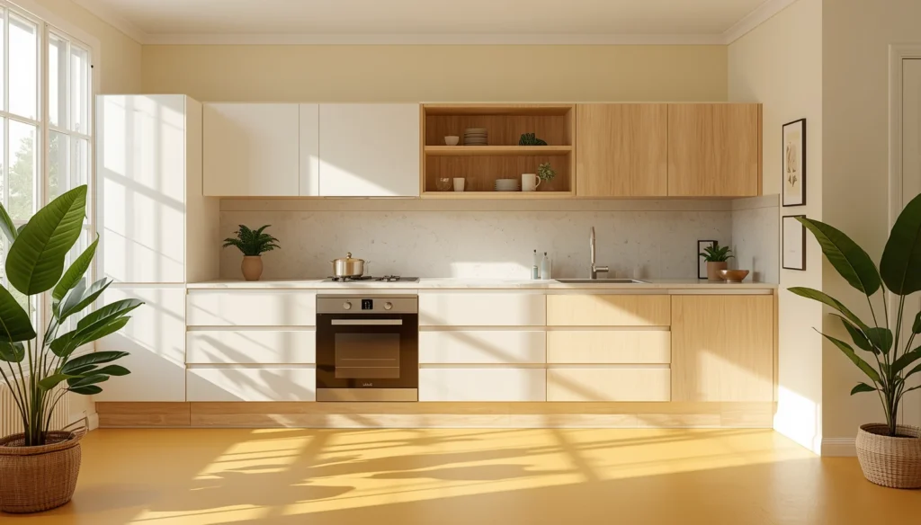
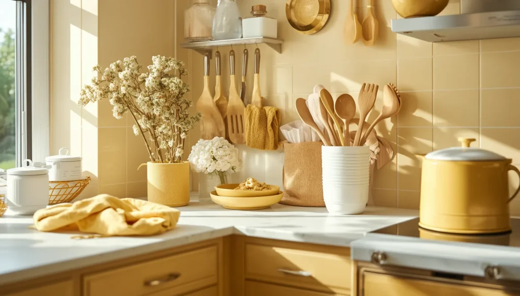
Two: Soft Buttery Walls for Visual Warmth
If you are not ready to commit to colored cabinetry, focusing on the walls with a butter-yellow hue is a masterclass in subtle design. This approach works by mimicking the appearance of natural sunlight hitting a white surface. It is the perfect solution for kitchens that lack large windows or northern-facing rooms that often feel cold. A buttery wall creates a glow that softens the harsh lines of appliances and countertops.
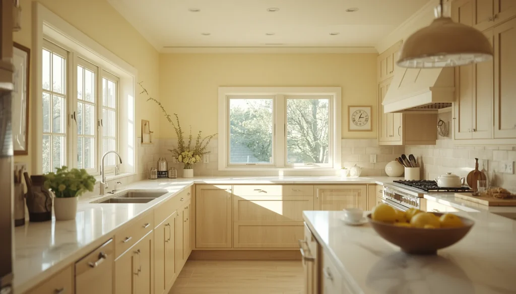
Pairing these soft walls with natural wood elements creates a cohesive, organic atmosphere. Oak, ash, or maple textures resonate beautifully with the creamy undertones of a pale yellow. Many Traditional Kitchens utilize this combination to create a timeless look. The wood grain provides a textural counterpoint to the smooth painted surfaces. This creates a kitchen that feels less like a clinical laboratory and more like a lived-in part of the home. It invites people to linger over coffee rather than just rushing through a meal prep routine.
Lighting plays a critical role when you choose a pale yellow for your walls. You must consider the color temperature of your bulbs. Standard warm white bulbs can sometimes make a pale yellow look muddy or overly orange. Opting for a “cool white” or “neutral” bulb around 3500 Kelvin ensures the yellow stays crisp and clean. This attention to detail separates a DIY project from a professional-grade interior.
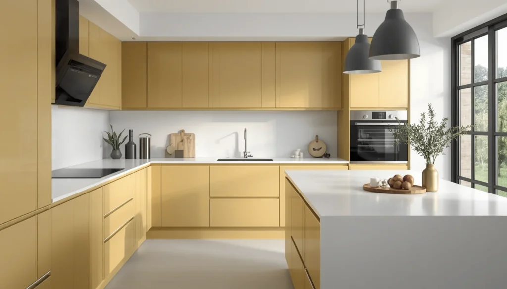
Three: High Gloss Canary for Modern Energy
Modernist homes often benefit from the high-impact energy of a glossy canary yellow. This is a bold choice that requires a minimalist environment to truly shine. When you use a high-gloss finish on flat-panel cabinets, the surface acts as a mirror, bouncing light around the room. This makes the color feel architectural rather than decorative. It is a choice for the confident homeowner who views their kitchen as a piece of functional art.
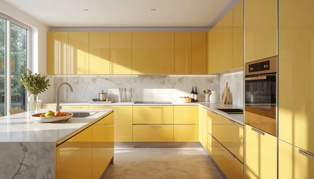
To keep a canary yellow kitchen from feeling chaotic, you must limit the rest of the palette. White quartz countertops, stainless steel appliances, or even Dark Grey accents provide the perfect backdrop. The sterility of the steel balances the heat of the yellow. This creates a professional, industrial vibe that still feels welcoming. It is the kind of kitchen that looks just as good at midnight under pendant lights as it does at noon.
Think about a small apartment in a dense city. A tiny galley kitchen can often feel like a closet. By introducing a high-gloss yellow, you trick the eye into seeing more depth and movement. I remember a project in a high-rise where the designer used yellow acrylic cabinets. The space went from a dark corner to the brightest spot in the unit. It proved that color, when used with the right finish, is the most effective tool for expanding a floor plan.
Four: The Grounding Effect of Ochre Flooring
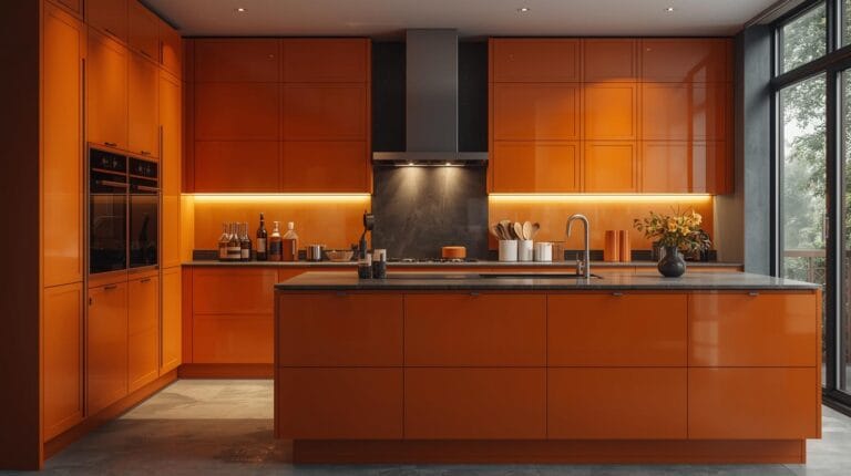
Most people think of walls and cabinets first, but the floor offers a massive canvas for yellow tones. Ochre floor tiles, particularly those with a matte or tumbled finish, bring a Mediterranean or southwestern soul to a kitchen. These tones are naturally occurring in clay and stone, which gives them an inherent sense of permanence. An ochre floor provides a warm base that allows the rest of the kitchen to remain neutral. This approach is a staple in Traditional Kitchens, where earthy tones bring a sense of permanence and history to the heart of the home. This grounding effect is similar to what you find in a Orange Kitchen, where earthy tones create a welcoming atmosphere.
When you have a warm yellow floor, you can experiment with cool-toned cabinetry like sage green or dusty blue. These colors sit across from yellow on the color wheel, creating a natural harmony. ou can also explore Dark Grey elements to add a sophisticated, modern edge to the warmth of the ochre. The warmth from the floor rises, making the entire room feel cozy even if the walls are a stark white. It is a brilliant way to introduce color without it being at eye level, which some find less distracting during long cooking sessions.
Maintenance is an unexpected benefit of these earthy yellow tones. Unlike white or dark gray tiles, ochre hides small amounts of dust or flour quite well. This makes it a practical choice for a high-traffic family kitchen. You get the beauty of a curated color palette without the stress of seeing every single crumb. It is a functional design choice that supports a busy lifestyle.
Selecting the Right Tile Texture
When choosing your floor, look for variations in the glaze. A tile that has slight shifts in tone from one piece to the next will look much more authentic than a perfectly uniform surface. This mimicry of natural stone or terracotta adds a layer of history to your kitchen. It tells a story of craftsmanship and time, even if the house was built last year.
Grout Color Matters
Do not overlook the grout when installing yellow flooring. A dark gray or chocolate brown grout can highlight the geometric patterns of the tile. Conversely, a matching tan or sand-colored grout makes the floor look like a continuous, flowing surface. Most experts suggest a slightly darker grout for yellow tiles to prevent the floor from looking washed out under bright overhead lights.
Five: Two Tone Dynamics with Sunshine Lowers
The two-tone kitchen trend remains popular because it offers a safe way to play with saturation. By painting only the lower cabinets yellow and keeping the upper cabinets white or glass-fronted, you anchor the room without closing it in. This “weighted” look is visually satisfying. It draws the eye down to the workspace while keeping the upper half of the room feeling airy and open.
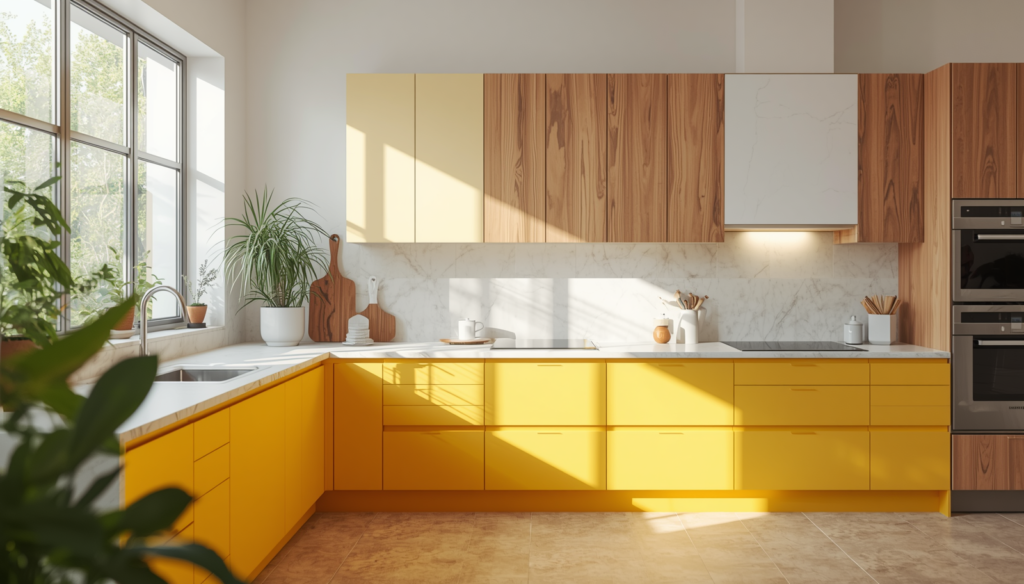
This layout is particularly effective when you use a vibrant, primary yellow. Because the color is restricted to the bottom half of the room, it never feels like it is “chasing” you. You can enjoy the mood-boosting effects of the color while your peripheral vision remains focused on the lighter upper sections. It is a balanced approach that works in almost any kitchen size or layout.
I recall a client who was terrified of the color yellow but wanted their kitchen to feel “happier.” We decided on a deep saffron for the island and the lower perimeter cabinets. We kept the walls and uppers in a soft alabaster. The transformation was immediate. The kitchen felt energetic but stayed remarkably sophisticated. It showed that you do not need to wrap a room in a color to feel its influence.
Six: Geometric Backsplashes and Focal Points
A backsplash is the jewelry of the kitchen. Using yellow tiles in this area allows you to introduce pattern and texture alongside color. Whether you choose a classic subway tile in a lemon glaze or a complex Moroccan fish scale pattern in mustard, the backsplash becomes an instant conversation piece. It is a concentrated dose of sunshine located exactly where you spend the most time: at the stove or the sink.
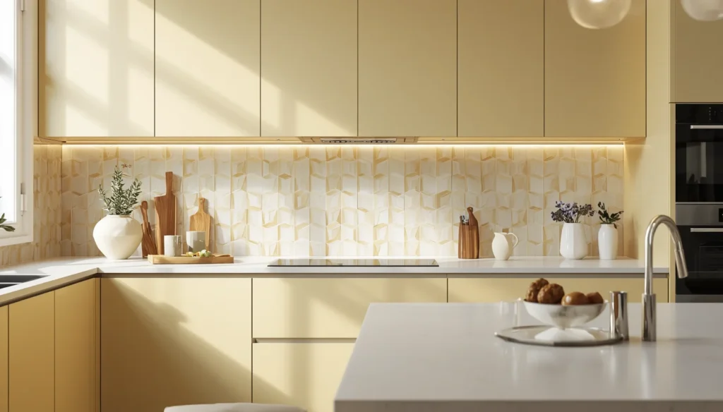
Texture is your best friend when it comes to a yellow backsplash. A handmade tile with slight imperfections will catch the light in different ways. This creates a shimmering effect that moves as you walk through the kitchen. If you pair a yellow backsplash with white cabinetry, the yellow pops with incredible clarity. If you pair it with dark wood, it glows like an ember.
Consider the layout of the tile as well. A herringbone pattern in a soft yellow can add a sense of height to a room. A vertical stack can make a kitchen feel more modern and structured. These small decisions in orientation change how the color is perceived. It is not just about the pigment; it is about the geometry of how that pigment is delivered to the eye.
Seven: Primrose Textiles and Flexible Accents
For those who live in rentals or who prefer to change their decor with the seasons, yellow textiles are the way to go. High-quality linen curtains in a primrose shade or a heavy-woven rug in a sunflower tone can shift the entire mood of a kitchen instantly. If you want to explore more vibrant palettes, you can also look into Orange Kitchen concepts to see how warm tones transform a culinary space. Textiles absorb sound and add a layer of softness that is often missing in a room full of hard surfaces like stone and metal.
The beauty of this approach is its low risk. You can experiment with different shades of yellow to see how they react to your specific lighting conditions before making a permanent change. I often suggest starting with a set of high-end yellow bar stools or a large-scale piece of yellow ceramic art. These items provide a focal point that anchors the room’s aesthetic without requiring a gallon of paint or a tile saw.
In a kitchen with a lot of gray or navy, yellow accents act as a spark. They break up the monotony of dark colors and bring a sense of humor to the design. A kitchen should be a place of creativity, and nothing sparks creativity like a splash of vibrant, sun-drenched color. It reminds us that home design should be joyful.
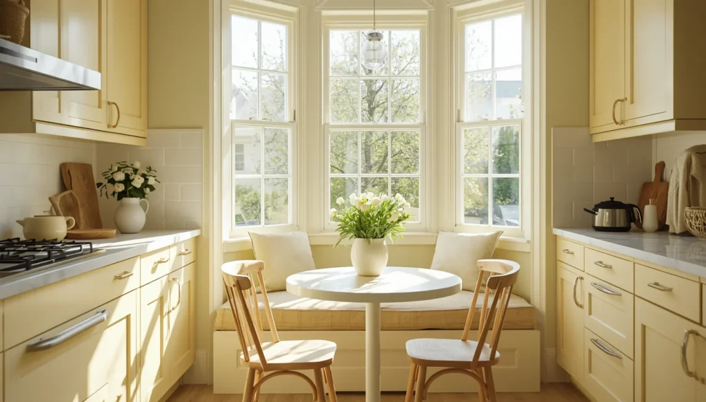
Eight: The Sunny Breakfast Nook
Creating a dedicated zone for yellow, such as a breakfast nook, allows you to define a space within a space. If you have an open-concept home, painting the interior of a built-in bench or the wall behind a small bistro table in a warm yellow can signal a transition. This is the place for morning light, for reading the news, and for starting the day. Yellow is the natural choice for this ritual.
Upholstery in the breakfast nook provides another opportunity for color integration. A durable, yellow performance fabric on a banquette seat can withstand the spills of daily life while looking incredibly chic. When you sit in a yellow nook, you are surrounded by a color that is scientifically proven to increase feelings of optimism. It is a functional way to improve your morning routine through environmental design.
Think about the view from the rest of the house. A glimpse of a sunny yellow nook from a neutral living room acts as a visual magnet. It draws people toward the heart of the home. By isolating the color to a specific functional area, you create a destination within your own floor plan. It is a strategic move that makes a home feel larger and more thoughtfully planned.
Wrap Up:
Creating a yellow kitchen ideas is about more than just picking a paint chip; it is about managing light, texture, and contrast to build a space that feels alive. Whether you choose the deep stability of mustard cabinets or the light touch of a primrose breakfast nook, the goal is to foster a sense of warmth. Remember to balance these bright tones with natural materials like wood and stone to keep the look grounded and professional. For more inspiration on classic layouts, explore these Traditional Kitchens to see how color and heritage blend together. Your kitchen should be a reflection of the energy you want to bring into your daily life, and few colors achieve that as effectively as yellow.
FAQs Section:
Does a yellow kitchen make a small space look bigger or smaller?
Yellow reflects a high percentage of light, which typically makes a small kitchen feel more expansive and open. Using a lighter shade like butter or primrose on the walls can push the boundaries of the room outward visually.
Which hardware finishes look best with yellow cabinetry?
Matte black and oil-rubbed bronze provide a sophisticated contrast that grounds the energy of yellow. For a warmer, more integrated look, unlacquered brass or champagne gold hardware resonates beautifully with mustard and ochre tones.
How do I prevent my yellow kitchen from looking too bright or overwhelming?
The best way to balance yellow is through the “sixty-thirty-ten” rule, where yellow takes up a portion of the space while neutrals like white, gray, or natural wood provide the foundation. For more inspiration on using bold, warm hues, check out our guide on Orange Kitchen layouts. Incorporating matte finishes rather than high-gloss can also soften the visual impact of the color.
Disclaimer
The content shared by Fall Rugs is solely for research and informational purposes. Fall Rugs is not a professional interior design or home renovation consultancy, and the information provided should not be considered professional advice for home improvement or decor. All ideas and suggestions are based on current trends and general knowledge in the home decor industry.