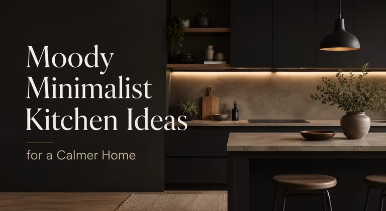
TL;DR
Purple kitchens thrive when the color anchors the architecture rather than decorating around it. Saturated cabinetry, stone veining, and tonal layering create depth without chaos. The real trick lies in letting one strong violet element lead while metallics, wood tones, and black accents carry the weight.
Introduction
A friend once stood in her just-finished eggplant kitchen and laughed because her mother asked if she had lost a bet. That room has now appeared in three shelter magazines. Purple carries a strange power in domestic spaces. It refuses to compromise, yet a well-executed violet kitchen settles into the architecture as if the house had always craved it. The following fifteen approaches move past novelty and into rooms that feel inevitable.
1. Matte Plum Cabinetry That Swallows Light
Deep plum on a matte finish does something peculiar to daylight. The cabinets stop reflecting and start absorbing, which flattens the surfaces into velvet planes. Shadows lose their edges. The effect reads more like soft leather than painted wood, and the room feels quieter than its square footage suggests.
Why the Finish Matters More Than the Shade
High-gloss purple can tip into candy shop territory before lunch. Matte lacquer or low-sheen conversion varnish keeps the color grounded. Fingerprints matter here too. A satin finish hides the daily smudges a kitchen generates, while gloss broadcasts every touch. The practical choice aligns with the aesthetic one. Specifying a 10-sheen level rather than 30 or 40 makes the difference between a room that feels editorial and one that feels like a film set.
Cabinetry this dark needs a counterbalance. Raw brass pulls, unlacquered and allowed to patina, warm the cool undertones in plum paint. Open shelving in white oak breaks the mass. The goal is not to dilute the purple but to give the eye a place to rest so the saturation hits harder where it counts.
2. A Single Amethyst Island as the Room’s Anchor
Painting every cabinet purple commits to a full sensory experience. Painting only the island plays a sharper strategic game. A nine-foot amethyst island in a room of soft greige perimeter cabinets draws every glance toward the center. The island becomes furniture rather than millwork, a piece of jewelry the kitchen wears.
Stone Selections That Earn Their Veins
Quartzite slabs with violet and charcoal veining make the island feel geological, as if the stone always held that hue. Avoid man-made quartz that tries too hard. The pattern repeats, the depth goes flat, and the island reads as a plastic impersonation. A natural stone with movement, even a quieter dolomite with plum undertones, carries more authority. The veining connects the purple to the mineral world rather than the paint deck.
Lighting the island properly seals the effect. A pair of pendants hung at thirty-two inches above the surface, with warm-dim technology, shift the amethyst from cool lavender at noon to deep aubergine after dinner. One surface, multiple personalities. Guests notice the shift without knowing why.
3. Lavender Plaster Walls and Raw Timber
Skip the paint entirely. A hand-troweled lime plaster wall in pale lavender reads as a texture first, a color second. The irregular surface traps shadows differently hour by hour, so the wall never looks the same way twice. Against raw Douglas fir open shelves and a honed black granite counter, the lavender recedes just enough to feel neutral while never quite behaving like beige.
The Breathability Factor Nobody Discusses
Lime plaster regulates humidity. A kitchen generates steam, grease aerosol, and temperature swings that test every surface. Plaster absorbs moisture when the air is heavy and releases it when the air dries. That functional property keeps the lavender wall from feeling precious or high-maintenance. It also ages well. Small cracks and subtle efflorescence deepen the character rather than ruining it.
Pairing the lavender with black steel brackets and unlacquered brass plumbing fixtures creates a material tension. Hard against soft, shiny against matte, warm against cool. The lavender becomes the quiet mediator between louder elements, and the kitchen feels centuries old even if it was finished last Tuesday.
4. High-Gloss Aubergine Ceilings That Lower the Sky
Ceilings rarely get the drama they deserve. A high-gloss aubergine on the ceiling, with walls kept to a warm plaster white, pulls the room downward into intimacy. The sheen reflects candlelight and under-cabinet warmth back into the space, so the ceiling glows rather than looming. In a kitchen with twelve-foot ceilings, the purple overhead shrinks the perceived height to something human.
When to Commit to the Fifth Wall
Older homes with uneven ceiling lines benefit most. The gloss distracts from imperfections. In a newer build with a flat eight-foot lid, a dark ceiling can compress the space unpleasantly. The trick is testing the paint on a large foam board first and holding it overhead at different times of day. If you want to lean fully into a moody, gothic kitchen style, aubergine shifts toward brown or black depending on orientation.
Keeping the crown molding in the same gloss aubergine erases the boundary between wall and ceiling. The room expands horizontally because the eye no longer stops at a white trim line. It is an architectural illusion that costs only an extra quart of paint.
5. Violet Glass Tile Backsplash in Herringbone
Glass tile earns skepticism for good reason. Much of it looks like a swimming pool mosaic. But violet glass in a slim three-by-six herringbone pattern, set with bright white grout, catches light like cut gemstones. The grout acts as a grid that organizes the shimmer, so the eye reads geometry before color. Without that white line, the violet dissolves into a blur.
Grout Color as a Design Decision
Grout is never just grout. Charcoal grout with violet tile mutes the whole composition into a moody slab, which is perfect for gothic kitchen designs. Bright white grout makes every tile a distinct note. The herringbone pattern already introduces movement. Pairing it with contrasting grout doubles the visual noise, which can work in a kitchen with otherwise quiet surfaces. In a room already busy with patterned stone and open shelving, matching grout calms things down.
Sealing the grout properly prevents the grease staining that turns a violet backsplash into a dull grey smear over time. Epoxy grout resists the discoloration better than cementitious mixes, though it demands a faster hand during installation.
6. Two-Tone Cabinets: Lavender Uppers, Charcoal Lowers
Splitting the cabinet color at the counter line creates a grounded composition that feels deliberate rather than timid. Lavender uppers keep the sightline light and airy, while charcoal lowers anchor the room and hide scuffs where shoes and brooms land. The purple floats above the work zone instead of competing with it.
Proportions That Make the Split Work
The lower cabinets in this scheme must be darker, always. Flipping the arrangement puts heavy color overhead and light color below, which feels top-heavy and unsettling. The countertop material bridges the two tones. A white marble-look quartz with faint grey veining connects lavender and charcoal without introducing a third color agenda.
Hardware can match across both cabinet colors for continuity, or the lowers can wear black iron while the uppers keep polished nickel. The second approach emphasizes the two-tone effect. The first approach makes the color split feel like a single deliberate sweep.
7. Blackberry-Painted Window Trim and Wainscot
Painting the window trim in blackberry instead of white turns every window into a framed view rather than a hole in the wall. The deep purple outline pulls the eye through to the outdoors. Add a tongue-and-groove wainscot in the same blackberry, rising forty-two inches from the floor, and the kitchen gains a wainscoted dining nook feeling without any actual nook.
Controlling the Wainscot Line
Standard wainscot stops at chair rail height, roughly thirty-six inches. Going taller, to forty-two or even forty-eight inches, pushes the proportion toward something more contemporary. Above the wainscot, a warm white paint keeps the room from closing in. The blackberry wraps the lower half of the room like tailored trousers, crisp and structured.
Flat stock wainscot panels read cleaner than beaded board in a modern house. In a 1920s bungalow, the beaded profile honors the original trim language. Either way, the painted wainscot withstands chair backs and wet-mop splashes better than wallpaper ever could.
8. Amethyst Concrete Countertops with Integrated Sink
Concrete counters carry a reputation for cracking and staining, and most of that reputation is earned. But amethyst-tinted concrete, poured in place with integral violet pigment, offers something stone cannot: seamless curves. The color runs through the full thickness, so a chip does not reveal a different substrate. An integrated sink, cast from the same batch, erases the rim where grime collects.
Sealing Regimens That Keep the Color True
A penetrating siloxane sealer applied every eighteen months keeps water beading on the surface. Topical film sealers peel and yellow under kitchen abuse. The pigment choice matters too. Iron oxide pigments hold color longer than organic dyes, which fade under UV exposure from nearby windows. Testing a sample block in the actual kitchen light for a month reveals whether the amethyst drifts toward grey or stays purple.
The thermal mass of concrete also absorbs warmth from morning sun and releases it slowly. In a kitchen with south-facing windows, the counters feel pleasant to the touch on winter mornings. That sensory detail has nothing to do with color and everything to do with living with the material day after day.
9. Plum Open Shelving with Copper Cookware Display
Open shelving painted in matte plum creates a deep backdrop that makes copper pots appear to hover. The reddish metal pops against the cool purple. Stacked white plates look crisp and intentional. The shelving itself reads as a color block rather than millwork, so the objects it holds become the foreground composition.
Editing the Display Down to What Earns Its Spot
Open shelving fails when it becomes a storage dumping ground. The plum background amplifies every object placed in front of it, for better or worse. A curated set of five copper pans, a stack of eight white dinner plates, and three glass canisters holding dry goods tells a clean story. Sixteen mismatched mugs and a dead succulent tell a different one.
The shelf brackets deserve attention. Raw steel L-brackets fastened with exposed screws complement the plum’s depth. Brass corbels push the composition toward traditional. The bracket choice determines whether the purple shelf reads as industrial loft or Edwardian pantry.
10. Lavender Ceiling Beams on a White Coffered Lid
Exposed ceiling beams painted lavender instead of stained wood or white reverse the expected hierarchy. The ceiling plane stays white, the structural grid goes purple. In a coffered ceiling, painting only the recessed beam grid in soft lavender turns the geometric framework into a subtle canopy. Visitors register the color without immediately understanding where it lives.
Beam Depth and Shadow Contrast
Shallow beams, less than four inches deep, barely read as lavender because the shadow cast is minimal. Deeper beams, six to eight inches, create enough shadow to make the purple recede and advance depending on light angle. The effect shifts through the day. Morning sun rakes across the beams and the lavender brightens. Evening downlight deepens the color toward grey-purple.
This approach works in kitchens already rich with crown molding and paneling. The lavender beams add a layer without competing with the vertical surfaces. In a minimalist kitchen, the same trick might feel gimmicky. Architectural context decides whether the purple beams feel whimsical or elegant.
11. Eggplant Range Hood as Sculptural Focal Point
A custom plaster range hood in eggplant transforms a necessary ventilation box into the room’s central artwork. The curved form, troweled smooth with rounded corners, reads as organic against the rectilinear cabinetry. The purple shifts the hood from appliance category into sculpture category. A pot filler mounted on the hood face in unlacquered brass completes the composition.
Plaster Versus Stainless Steel
A stainless steel hood canopy performs fine functionally but contributes nothing visually unless the kitchen leans heavily industrial. Plaster, even Venetian plaster with subtle mica flakes, absorbs light and holds color depth stainless steel cannot match. The downside is maintenance. Plaster near a cooktop collects aerosolized oil. A high-quality exhaust fan running at 600 CFM or above mitigates much of the grease, and a washable plaster sealer allows for gentle cleaning.
The eggplant tone itself can shift toward brown-purple or blue-purple depending on the plaster pigment mix. An umber-heavy eggplant reads warmer and earthier. An ultramarine-heavy eggplant reads cooler and more contemporary. The sample board stage is non-negotiable.
12. Checkerboard Lavender and Cream Floor Tile
Checkerboard floors usually default to black and white. Swapping black for lavender softens the contrast while keeping the geometric punch. Twelve-inch square tiles, matte finish to avoid slip hazards, create a grid that organizes the room from the ground up. Cream instead of white prevents the lavender from feeling icy.
Grout Joint Width and Room Scale
Narrow grout joints, one-sixteenth of an inch, make the checkerboard read as a unified surface. Wider joints, one-eighth inch, emphasize the individual tiles and add texture. In a small galley kitchen, wide joints can fragment the floor visually and shrink the room. In a large open-plan space, the wider joints add grain and keep the checkerboard from looking like a printed vinyl sheet.
Porcelain tiles hold up to dropped cast iron and dog claws better than ceramic. A through-body porcelain, where the lavender color runs the full tile thickness, hides any future chips. Laying the tiles on a diagonal stretches the room’s width perceptually, a trick that costs nothing extra in materials.
13. Purple Marble Backsplash Slab with Bookmatched Veining
A single slab of purple marble behind the range, bookmatched so the veins mirror across the centerline, creates a focal wall that no tile layout can replicate. The natural stone brings violets, greys, and occasional flashes of white calcite. The movement is chaotic and geological, and it makes the kitchen feel tethered to something older than the house.
Sealing Marble in a Splash Zone
Marble etches on contact with lemon juice, tomato sauce, and vinegar. Behind a range, splatter is constant. An etched marble slab, dulled and spotted, loses the depth that justified its cost. A high-quality penetrating sealer and a willingness to wipe splatters within seconds are the cost of admission. Some fabricators offer a honed finish that already lacks the high polish of acid-sensitive gloss, hiding early etching better than polished surfaces.
The bookmatched seam must land precisely on center. A misaligned seam turns the dramatic mirroring into a visible mistake. The slab fabricator’s skill matters more than the stone selection at this step.
14. Violet Window Film That Tints Daylight
A UV-blocking window film in pale violet transforms southern exposure into an asset. The light passing through takes on a lavender cast that shifts across the floor and countertops through the day. The room fills with color without a single painted surface. On overcast days, the tint is subtle enough to go unnoticed. On bright afternoons, the kitchen glows.
Functional Layers Beneath the Aesthetic
The film blocks a measurable percentage of solar heat gain, reducing cooling load in summer. It also protects wood floors and painted cabinets from UV fading, which matters in a kitchen where the purple investment sits in direct sun.
The film installs on the interior glass surface with a soapy water solution and a squeegee. Bubbles that dry into place are permanent, so professional installation often earns its fee.
South-facing kitchens benefit most. North-facing rooms lack the direct sun to activate the violet tint, and the film reads as a grey overlay rather than a color source. East-facing morning light carries more warmth and pulls the purple toward pink.
15. Wisteria-Painted Pantry Door as a Surprise Reveal
A walk-in pantry door painted in high-gloss wisteria stands apart from the surrounding kitchen palette. When the door is closed, the color reads as a contained accent. When the door swings open, the wisteria panel slices through the space. Guests always reach for the handle, curious what lives behind the purple door.
The Psychology of the Colored Door
A brightly colored interior door signals that something different waits on the other side. It creates anticipation. The wisteria tone, a blue-leaning lavender, reads as playful without tipping into childish. On a Shaker-style five-panel door, the color feels traditional. On a flush slab door with a concealed hinge, the same color feels minimalist and European.
The door swing matters for how much of the color is visible from the main kitchen. An in-swing reveals the wisteria only when opened. An out-swing places the purple panel in full view whenever the pantry is closed. Both work. The choice depends on whether the household wants the color on display or saved for the reveal.
Wrap Up
Purple in a kitchen succeeds through commitment. Half measures look like indecision. A single saturated element, a plum island or a violet plaster hood, anchored by neutral materials and warm metallics, reads as confident design rather than a color trend chased too late. The kitchens that wear purple best treat it as structure, not decoration.
FAQs Section
Does a purple kitchen hurt resale value?
A purple kitchen can narrow the buyer pool, but a well-executed design with neutral counterbalance, like charcoal flowers or white oak accents, often reads as a luxury upgrade rather than a liability. Buyers who love it tend to bid higher, offsetting the ones who walk away.
What countertop color works with purple cabinets?
White marble-look quartz with cool grey veining, honed black granite, and warm butcher block all pair well depending on the purple’s undertone. Cool purples want cool counters, while plum and eggplant with brown undertones handle wood and brass with more ease.
Can I do a purple kitchen in a small space?
Small kitchens handle deep purple best when confined to one element, Keeping the uppers and ceiling light prevents the room from shrinking. For more dark aesthetic inspiration, check out these gothic kitchen ideas to see how deep tones add depth without feeling cramped.
Disclaimer:
The content shared by Fall Rugs is solely for research and informational purposes. Fall Rugs is not a professional interior design or home renovation consultancy, and the information provided should not be considered professional advice for home improvement or decor. All ideas and suggestions are based on current trends and general knowledge in the home decor industry.