TL;DR
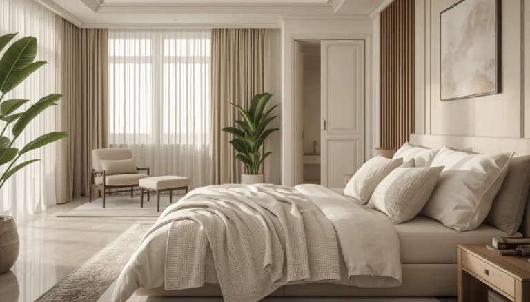
Applying color to a bedroom ceiling transforms an overlooked surface into a powerful design element that influences the perceived height and mood of the room. By selecting specific finishes and hues, you can create a cozy sanctuary or an expansive, airy retreat that standard white paint simply cannot achieve.
Introduction
Why do most people stop their design efforts at the top of the wall? The ceiling represents one of the largest unobstructed surfaces in your bedroom, yet it remains perpetually trapped in basic builder-grade white. Taking the time to treat this fifth wall with intentional color or texture changes the entire energy of your personal space. You will find that a well-chosen ceiling treatment makes a room feel finished and deliberate rather than merely functional.
1. The Monochromatic Saturate Technique
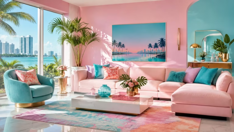
Choosing to paint your ceiling the exact same shade as your walls creates a cohesive environment that removes visual boundaries. When the line where the wall meets the ceiling disappears, the eye no longer gets caught on sharp transitions. This method works exceptionally well in bedrooms with irregular shapes or slanted attic ceilings because it hides awkward angles. You might worry that a single color feels overwhelming, but in practice, it creates a comforting cocoon that encourages rest and relaxation.
In a recent project involving a small guest suite in an old farmhouse, the walls and ceiling were painted in a muted terracotta. The room originally felt choppy and cramped due to the low, sloping roofline. By saturating the entire space in one flat finish, the architectural oddities became part of a deliberate aesthetic choice. The result was a sophisticated, high-end look that felt significantly more expensive than the actual cost of the paint used.
This approach requires careful attention to lighting, as the lack of a white reflective surface changes how light bounces around the room. You should ensure your light fixtures have warm bulbs to complement the saturated color. If you use a dark hue, consider adding multiple light sources like sconces and floor lamps to maintain functionality. The monochromatic look thrives when you vary the textures of your bedding and furniture to provide the visual interest that the walls no longer supply.
2. High Gloss Reflections for Light Play
Applying a high gloss finish to a bedroom ceiling is a bold move that pays off by making the room feel taller and more dynamic. While standard flat paint absorbs light, a lacquered or high-sheen finish acts like a mirror, reflecting every glow from your windows and lamps. This technique is particularly effective in rooms that lack natural light. The reflection creates an illusion of a deeper space, giving the impression that the ceiling is much higher than its physical measurement.
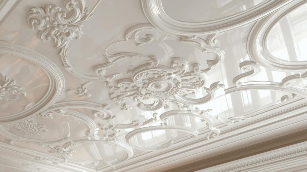
Achieving a perfect gloss finish demands extensive preparation because the sheen highlights every bump and imperfection in the drywall. You cannot simply roll this on and expect professional results without sanding the surface to a glass-like smoothness first. Most experienced painters prefer using a spray application for gloss finishes to avoid the texture of a roller nap. It is a labor-intensive process, but the liquid-like appearance of a finished gloss ceiling is truly incomparable in its luxury.
Consider a pale blue or soft cream for a gloss ceiling to keep the room feeling light and airy. In a coastal-inspired bedroom, a pale azure gloss ceiling can mimic the appearance of water or a clear sky, adding a serene quality to the space. The way the morning light hits a reflective ceiling creates a shifting landscape of highlights and shadows that changes throughout the day. It turns the ceiling into a living part of the room decor rather than a static background.
3. Deep Tones for a Midnight Canopy
Selecting a dark color like navy, charcoal, or forest green for the ceiling can transform a bedroom into a sophisticated sanctuary. Many people fear that dark colors make a room feel small, but on a ceiling, a dark shade can actually create a sense of infinite depth. It mimics the vastness of the night sky, which is naturally calming for a sleep environment. This strategy works best when the walls remain a lighter, contrasting shade to prevent the room from feeling like a cave.
A notable example occurred in a modern city apartment where the owner struggled with insomnia. We opted for a deep, matte midnight blue on the ceiling while keeping the walls a crisp, light gray. The dark ceiling lowered the visual center of gravity in the room, making the bed feel more grounded and secure. The owner reported a significant improvement in their ability to wind down, proving that the psychological impact of color overhead is a real factor in interior design.
When you go dark, the finish matters just as much as the color choice. A matte or flat finish is usually preferable for dark ceilings because it hides imperfections and prevents distracting glares. Dark pigments can sometimes look patchy if the paint quality is low, so investing in a high-pigment, professional-grade product is essential. The depth of color achieved with quality paint provides a richness that makes the dark ceiling feel intentional and high-end.
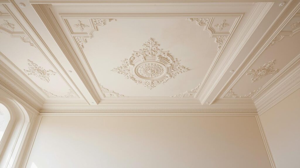
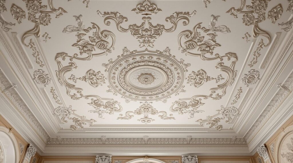
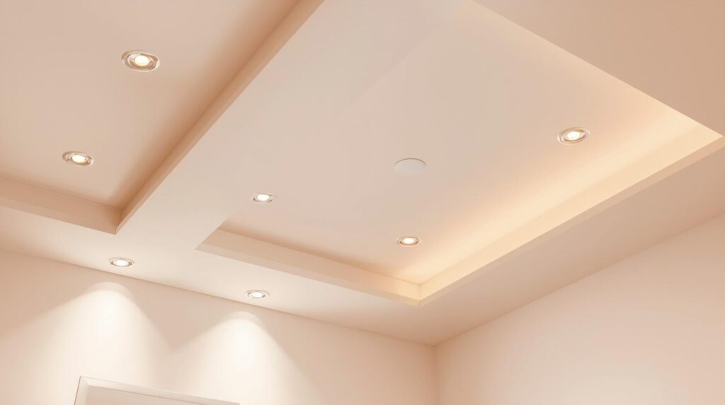
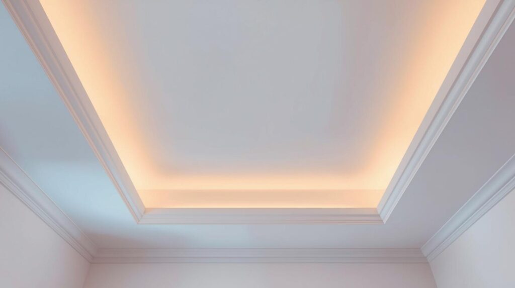
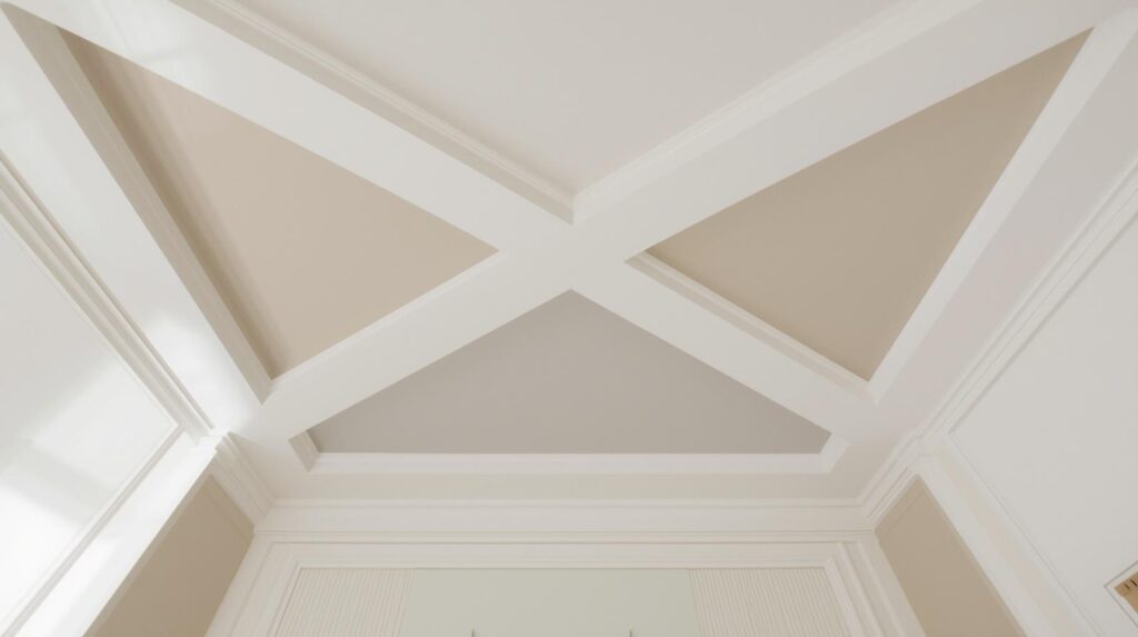
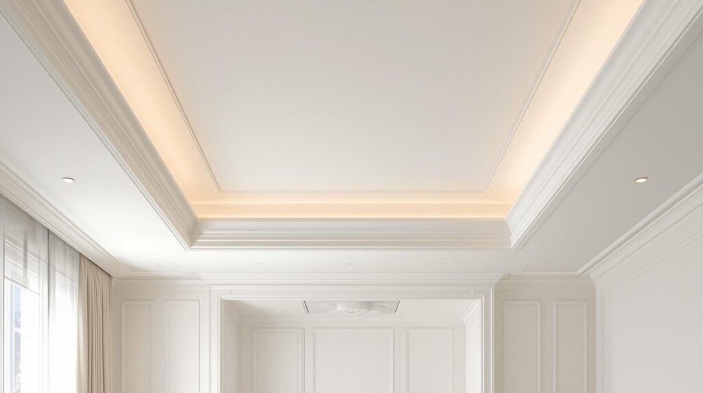
4. Architectural Framing with Contrast Trim
If your bedroom features crown molding or a tray ceiling, you have a built-in opportunity for sophisticated color play. Painting the recessed portion of a tray ceiling a different color than the surrounding borders creates an immediate focal point. This draws the eye upward and emphasizes the architectural character of the home. You can choose a subtle variation of your wall color for a gentle look or a sharp contrast for more drama.
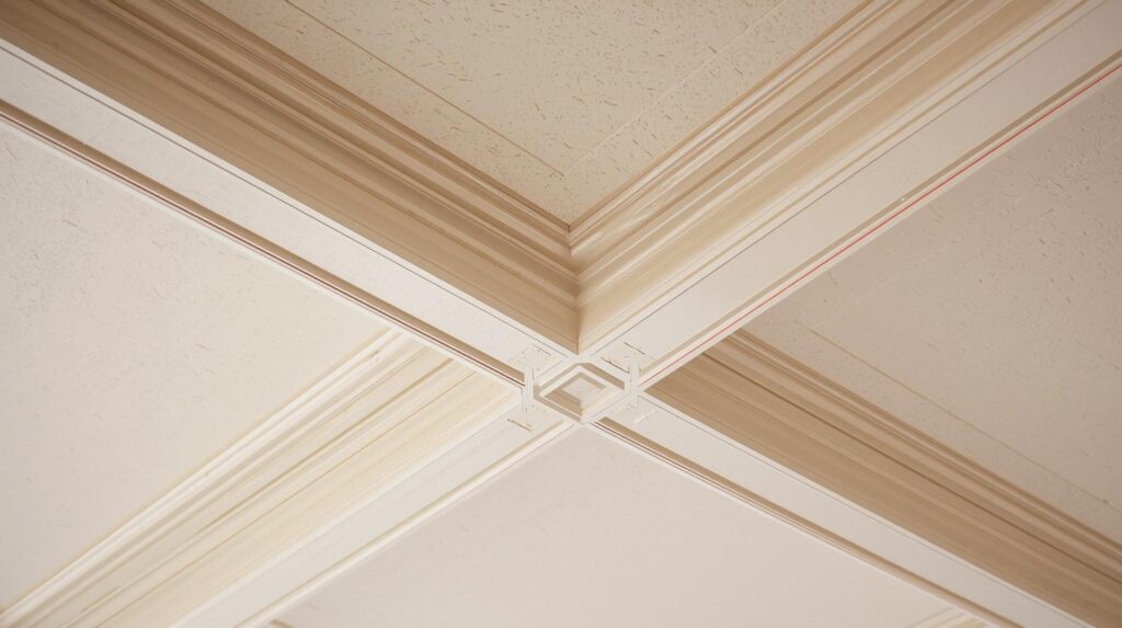
Contrast trim works well because it creates a clear transition point between different planes of the room. For instance, in a traditional master bedroom, painting the ceiling a soft sage green while keeping the heavy crown molding a bright, clean white defines the space beautifully. The molding acts as a frame for the color, much like a piece of art. This prevents the color from feeling like it is floating aimlessly and gives it a structured, professional appearance.
The logic behind this method relies on the hierarchy of shapes. By highlighting the different levels of the ceiling, you add layers of visual information that the brain perceives as high-quality design. You should be mindful of the width of your molding; thinner trim might require a more subtle color contrast to avoid looking busy. In contrast, large, ornate moldings can handle bold ceiling colors like deep plum or burnished gold without losing their impact.
Precision in the Transitions
When working with architectural details, the “cut-in” line where the paint meets the wood or plaster must be razor-sharp. Using a high-quality painter’s tape specifically designed for delicate surfaces ensures that your lines stay clean. Even a slight wobble in the paint line can ruin the illusion of professional architectural framing. Taking the extra time to prep these edges pays dividends in the final aesthetic of the bedroom.
Choosing the Right Paint Sheen for Trim
While the ceiling itself might be flat, the trim or molding should typically have a satin or semi-gloss finish. This difference in sheen adds another layer of depth to the architectural framing. The slight shine on the molding catches the light differently than the flat ceiling, further defining the boundaries between the two. This interplay of light and texture is what separates a DIY project from a professional-grade interior design.
5. Soft Atmosphere with Pale Pastels
For those who find bold colors intimidating, pale pastels offer a way to introduce style without overwhelming the senses. A soft lavender, pale mint, or blush pink ceiling provides a hint of color that feels sophisticated and thoughtful. These tones work particularly well in rooms with high ceilings, as they add warmth without making the space feel closed in. A pastel ceiling can act as a bridge between your wall color and your bedding, pulling the entire room’s palette together.
The psychological effect of light colors overhead is generally one of openness and tranquility. In a child’s bedroom or a nursery, a soft yellow ceiling can feel like a gentle sunbeam, creating a cheerful but calm environment. In an adult bedroom, a pale gray-blue ceiling can evoke a sense of clarity and peace. It is a subtle touch that many visitors might not immediately name, but they will certainly feel the difference in the room’s atmosphere.
Pastels also have a unique way of interacting with natural light. During the “golden hour” before sunset, a pastel ceiling can take on a glowing quality that changes the mood of the entire room. Because the color is so light, it does not significantly reduce the overall brightness of the space. It remains a safe choice for those who want to experiment with the fifth wall but are not yet ready for the commitment of dark or high-gloss finishes.
6. The Gradient and Ombre Effect
An ombre ceiling involves a gradual transition from one color to another, usually moving from a darker shade at the walls to a lighter shade in the center. This technique is incredibly effective at making a ceiling appear vaulted or domed, even if it is perfectly flat. The transition tricks the eye into seeing more depth than actually exists. It requires a steady hand and a good understanding of blending, but the result is a custom look that feels like a piece of fine art.
One successful application used a gradient that started with a medium forest green at the edges and faded into a very pale seafoam in the center of the room. This created an organic, leafy feeling that made the bedroom feel connected to the garden outside. The transition was so smooth that it was difficult to tell where one color ended and the next began. This level of detail adds a bespoke quality to the home that generic paint jobs cannot match.
Executing an ombre ceiling usually involves a wet-on-wet painting technique. You apply the different shades while the paint is still damp, using a clean brush or sponge to blend the boundaries together. It is a time-sensitive process that often requires two people working in tandem to ensure the paint does not dry before the blending is complete. While challenging, it is one of the most effective ways to add unique depth to a standard bedroom.
7. Strategic Zoning with Painted Sections
You do not always have to paint the entire ceiling to make a statement. Zoning involves painting a specific section of the ceiling, often directly above the bed, to create the illusion of a canopy or a defined sleeping area. This is a brilliant way to handle large, open-concept bedrooms where you want to create a “room within a room” feel. By extending the color from the headboard wall up onto the ceiling for three or four feet, you create a visual anchor for the bed.
A client once used this technique in a modern loft with extremely high ceilings. They felt the bed was lost in the vastness of the room. By painting a wide stripe of charcoal gray that started behind the headboard and extended across the ceiling, we created a cozy niche. It provided the intimacy of a four-poster bed without the physical bulk of additional furniture. This type of strategic zoning is as much about architecture as it is about color.
Zoning also allows you to play with geometry and bold shapes. You could paint a large circle in the center of the room to frame a chandelier, or use diagonal lines to lead the eye toward a window view. This approach is highly modern and works best in rooms with clean lines and minimal clutter. It treats the ceiling as a canvas for graphic design, offering a way to express personal style that is easily changed if your tastes evolve.
Using Tape for Crisp Zoning Lines
For geometric zoning, the quality of your tape is your most important tool. You must seal the edges of the tape with a tiny amount of the base color first to prevent the accent color from bleeding underneath. This professional trick ensures that when you peel the tape away, the line is perfectly straight and sharp. This precision is what makes the zoning look like a deliberate architectural feature rather than a painting mistake.
Balancing Zoned Colors with Furniture
When you zone a ceiling, you must consider how that color interacts with the furniture below. The color on the ceiling should ideally be mirrored in small accents throughout the room, such as in a throw pillow or a piece of rug detail. This creates a vertical connection that makes the design feel cohesive. If the ceiling color is completely isolated, it can look like an afterthought rather than a strategic design choice.
The Technical Reality of Ceiling Projects
Painting a ceiling is physically demanding and requires a different set of tools than wall painting. You will need an extension pole for your roller to avoid constant trips up and down a ladder, which can lead to fatigue and uneven application. Lighting is also a major challenge during the process. Because you are working on the surface that usually holds the light source, you will need portable work lights to see your progress clearly and avoid leaving “holidays” or unpainted spots.
You should also consider the weight of the paint. On a ceiling, gravity is working against you, which means you are more likely to experience drips and splatters. Covering every inch of your floor and furniture with heavy-duty drop cloths is a non-negotiable step. Experienced painters often wear protective eyewear to keep stray droplets of paint out of their eyes while looking upward. It is a messy job, but the transformative power of the result makes the effort worthwhile.
The second-order effect of a painted ceiling is how it changes your perception of the room’s temperature. Warm tones like terracottas or deep yellows can make a drafty, large bedroom feel significantly warmer and more inviting. Conversely, cool blues and grays can make a south-facing room that gets too much sun feel refreshing and calm. Understanding these nuances allows you to use ceiling paint as a functional tool for comfort as well as a decorative one.
Wrap Up
Treating your bedroom ceiling as a deliberate design element opens up a world of possibilities for depth and character. Whether you choose the intimacy of a dark midnight canopy or the expansive reflection of a high-gloss finish, the fifth wall is your greatest untapped asset. By moving beyond basic white, you create a space that feels curated, intentional, and perfectly tailored to your personal rest.
FAQs Section
Does a dark ceiling make a bedroom look smaller?
While dark colors can make a space feel more enclosed, on a ceiling, they often create a sense of infinite depth that makes the room feel taller. The dark tone mimics the night sky, drawing the eye upward and receding visually rather than closing in.
What is the best paint finish for a bedroom ceiling?
A flat or matte finish is the standard choice because it hides surface imperfections and minimizes distracting reflections. However, a high-gloss finish can be used strategically in small or dark rooms to bounce light and create a luxurious, liquid-like appearance.
Should the ceiling color match the walls?
Matching the ceiling to the walls creates a seamless, monochromatic look that can make a room feel cozy and modern. It is an excellent strategy for hiding awkward architectural angles and creating a restful, cocoon-like atmosphere in a sleeping area.
Disclaimer
The content shared by Fall Rugs is solely for research and informational purposes. Fall Rugs is not a professional interior design or home renovation consultancy, and the information provided should not be considered professional advice for home improvement or decor. All ideas and suggestions are based on current trends and general knowledge in the home decor industry.