

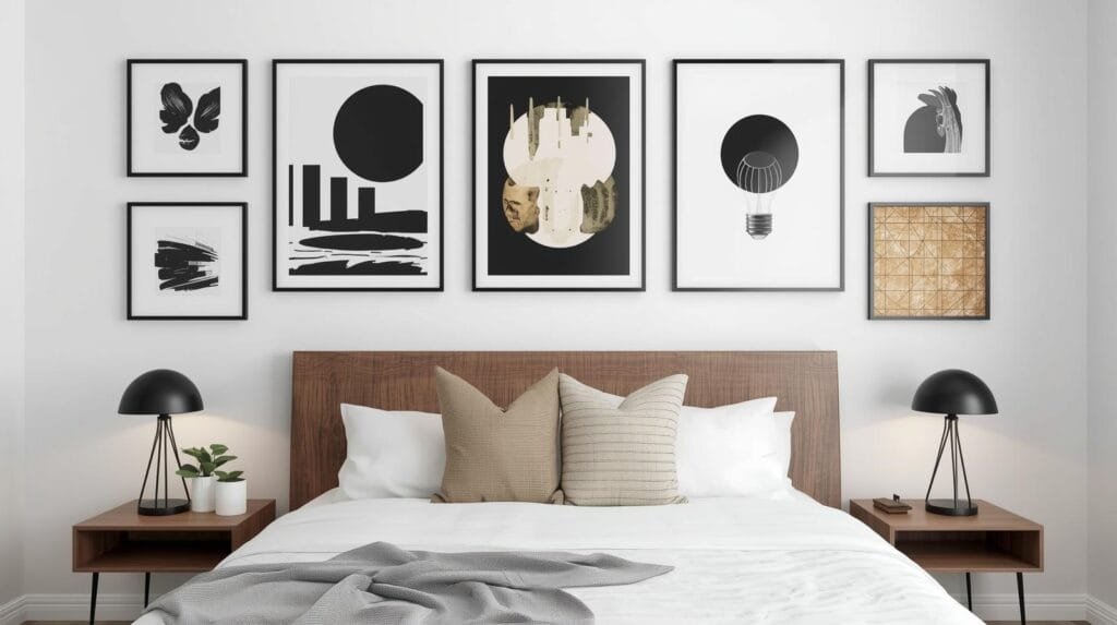
TL;DR
The space above your bed requires a careful balance of scale and visual weight to avoid feeling cluttered or sparse. Most successful designs use the two-thirds rule, ensuring art spans a majority of the headboard width while maintaining safe, intentional mounting heights.
Introduction
Have you ever stared at the empty expanse of drywall above your headboard and felt like the entire room was missing its soul? This specific architectural void is one of the most challenging areas to style because it demands a balance between personal expression and a restful atmosphere. Finding the right piece involves more than just picking a color you like; it requires an understanding of scale, safety, and how light interacts with different textures. We will examine how professional designers approach this focal point to create a bedroom that feels both curated and comfortable.
The First Idea: Large Scale Statement Canvases
When we look at high-end residential projects, the most frequent choice for a master suite is the single, oversized canvas. This approach works because it provides a singular focal point that does not compete with other design elements in the room. A large piece of art creates a sense of luxury and intentionality that smaller, scattered items often lack. The key here is the scale. A canvas that is too small will look like an afterthought, while one that is too wide might overwhelm the proportions of your bed frame.
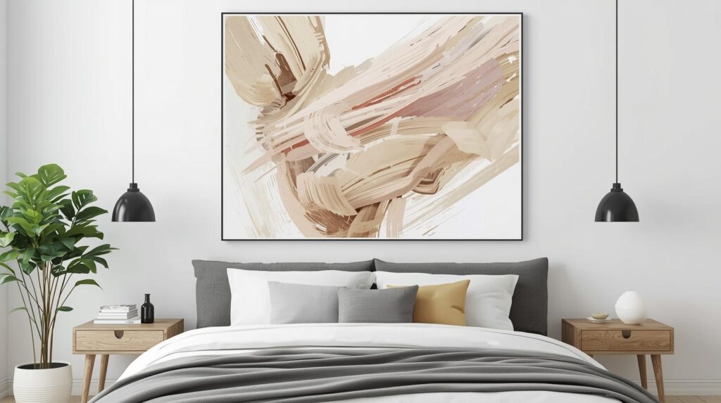
To get this right, aim for a piece that covers roughly two-thirds to three-quarters of the width of your headboard. This creates a visual anchor that feels grounded. If you have a king-sized bed, you are looking at something in the range of sixty inches wide. I have found that frameless gallery-wrapped canvases offer a softer look that suits the relaxation goals of a bedroom. If you prefer a more formal aesthetic, a thin floater frame in a wood tone that matches your nightstands can pull the entire room together.
The height at which you hang a large canvas is equally vital. You want the bottom of the frame to sit approximately six to ten inches above the top of the headboard. This gap is wide enough to prevent the art from feeling cramped but close enough to ensure the bed and the art read as one cohesive unit. In a recent project for a mid-century modern home, we used a soft blue abstract canvas that mirrored the tones of the bedding. The result was a space that felt instantly more expensive without changing a single piece of furniture.
The Second Idea: Symmetrical Triptychs and Grids
Symmetry acts as a natural sedative for the human brain, making it an excellent choice for a sleep environment. By using a series of three panels, also known as a triptych, or a larger grid of smaller frames, you create a rhythmic pattern that feels organized and calm. This method is particularly effective if you find a single large piece of art too imposing or if you are working with a limited budget.
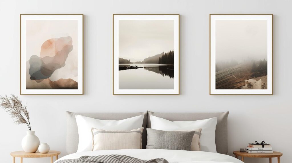
When you use multiple frames, the spacing between them becomes a design element in itself. Generally, you should keep the gap between frames between two and three inches. If the gap is too wide, the eye views them as separate, disconnected objects. If they are too close, they lose their individual identity. Using identical frames for every piece in the set helps maintain that sense of professional cohesion. Black frames offer a sharp, modern contrast, while light oak or maple frames lean into a more organic, Scandinavian feel.
The content of these frames should share a common thread, such as a botanical series, architectural sketches, or even abstract ink blots. This consistency ensures that the wall does not become a distraction. I once worked with a homeowner who used three framed pieces of vintage Japanese textile. Because each piece shared the same indigo dye and linen background, the trio felt like a curated museum installation. It added a layer of history and sophistication that a mass-produced print simply could not achieve.
The Third Idea: Softening the Space with Textile Wall Hangings
Not every piece of art needs to be behind glass or printed on canvas. In fact, many modern bedrooms benefit from the introduction of softer materials to dampen sound and add physical warmth. Textile hangings, including high-quality tapestries, woven macramé, or even framed rugs, are becoming a staple in contemporary interior design. These pieces break up the hard lines of a traditional bed frame and provide a tactile quality that feels appropriate for a room dedicated to rest.
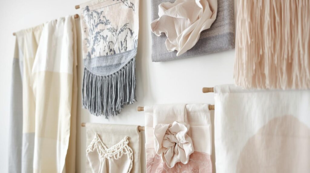
The acoustic benefits of textiles are often overlooked but are significant. In rooms with hardwood floors and high ceilings, a large woven piece can help reduce echoes, making the space feel more intimate. When selecting a textile, look for heavy-weight fabrics or intricate weaves that have enough substance to hang flat against the wall. A flimsy piece of cloth often looks messy rather than intentional. Using a sturdy wooden dowel or a hidden mounting strip ensures the piece remains level and secure.
One specific example that stands out involved a master bedroom with twenty-foot ceilings. A traditional painting felt dwarfed by the verticality of the room. We opted for a custom-sized wool weaving that featured varying pile heights and earthy tones. The texture of the wool contrasted beautifully with the smooth silk pillows on the bed. It filled the vertical space without making the room feel heavy or dark. This approach is perfect for anyone who wants to move away from the traditional “art gallery” look toward something more artisanal and lived-in.
The Fourth Idea: Deep Ledges for Layered Architectural Art
For those who enjoy a more dynamic and evolving space, an art ledge is a superior alternative to permanent wall mounts. A long, shallow shelf installed above the headboard allows you to lean and layer different frames of varying sizes. This creates a casual, “collected over time” aesthetic that is very popular in modern urban dwellings. It also gives you the freedom to swap out art based on the season or your changing tastes without putting new holes in the wall.
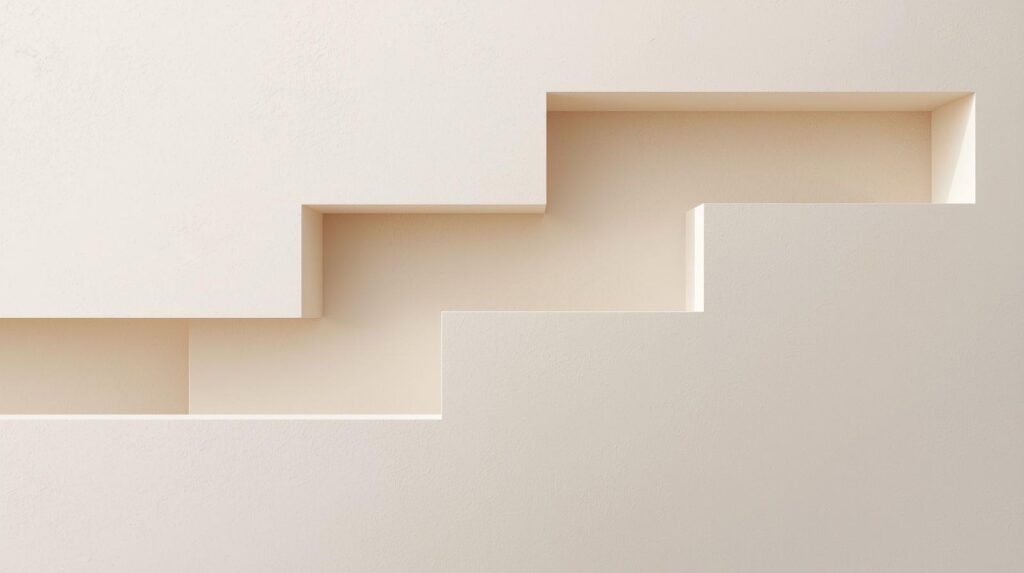
Layering is the secret to making an art ledge look professional rather than cluttered. You should start with your largest frame in the back and slightly off-center. Then, overlap it with a medium-sized frame and perhaps a smaller object, like a ceramic vase or a small clock. The goal is to create varying heights and depths. Keep the color palette of the frames consistent to prevent the ledge from looking like a chaotic bookshelf. A monochrome palette of black, white, and grey frames works exceptionally well here.
Safety is the primary concern with this setup. Ensure the ledge is deep enough to hold the frames securely and that it has a small lip on the front edge to prevent anything from sliding off. I always recommend using museum putty on the bottom corners of the frames to keep them anchored. In a small apartment project, we used a white ledge that blended into the wall color, making the art appear to float. This helped the room feel larger while still providing a clear focal point above the bed.
The Fifth Idea: Intentional Asymmetry in Gallery Wall Design
While symmetry is a safe bet, an asymmetrical gallery wall offers a more modern and artistic energy. This approach involves arranging a variety of frames and objects in a way that is balanced in visual weight but not identical on both sides. It is a fantastic way to incorporate personal mementos, photography, and small sketches into a single installation. The challenge lies in making the arrangement feel like a singular unit rather than a collection of random items.

To master asymmetry, start by defining the outer boundaries of your gallery. The entire collection should still roughly follow that two-thirds width rule relative to the headboard. Use a mix of vertical and horizontal orientations to keep the eye moving. One effective trick is to pick one “anchor” piece that is significantly larger than the rest and place it slightly to the right or left of the center. Then, fill in the surrounding space with smaller items that balance the visual weight on the opposite side.
In a recent residential consult, the client had a collection of travel photos and line drawings. We used a mix of thin metal frames and thicker wooden frames but kept all the mats white. This shared element tied the diverse pieces together. Asymmetry allows for a narrative to emerge from the wall. It tells a story about the person sleeping in the room. This style works best in bedrooms with minimalist furniture, as the wall art becomes the primary decorative statement.
The Six Idea: Dimensionality via Sculptural Metal Installations
If you want to move away from two-dimensional art entirely, sculptural metal pieces are a sophisticated option. These installations add a layer of depth and shadow that changes throughout the day as the sun moves across the room. Metal art can range from abstract geometric shapes to organic, branch-like structures. Because these pieces often have negative space within them, the wall color behind them becomes part of the art itself.
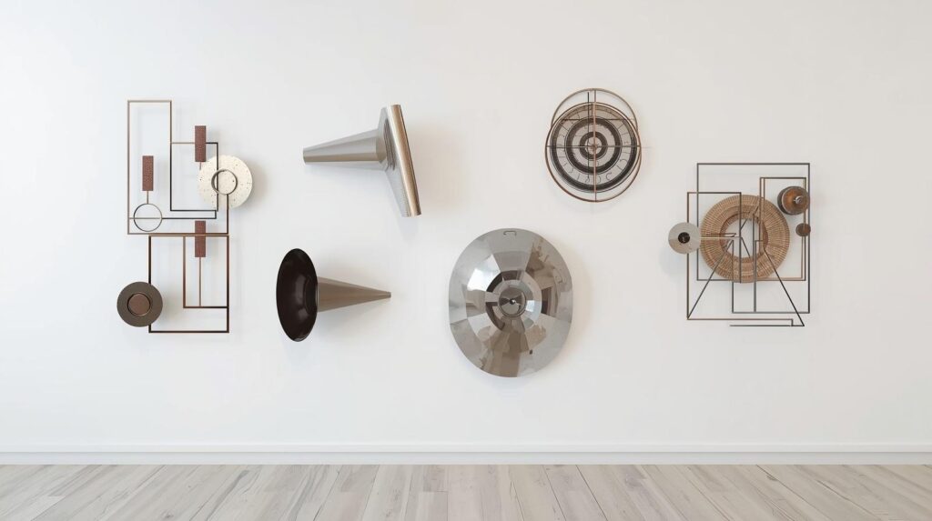
Metal art is particularly effective in rooms that have a lot of soft textures, such as velvet headboards or heavy drapes. The hard, cool surface of the metal provides a necessary visual counterpoint. When choosing a finish, consider the other metals in your room, such as lamp bases or drawer pulls. You do not need to match them perfectly, but they should be in the same family. For example, a warm brass sculpture looks beautiful in a room with gold accents, while a matte black iron piece suits a more industrial or monochromatic space.
A concrete example of this was a master suite where the walls were painted a deep charcoal. We installed a large, three-dimensional gold leaf sculpture that looked like a cluster of ginkgo leaves. During the day, the gold popped against the dark background. At night, the bedside lamps cast intricate shadows on the wall, adding a layer of drama and moodiness. This type of art is durable and easy to clean, making it a practical long-term investment for a high-traffic room.
The Seventh Idea: High Contrast Black and White Photography
There is a timeless quality to black and white photography that lends itself perfectly to the bedroom. It removes the distraction of color and focuses on composition, light, and emotion. Whether you choose a large landscape, a series of portraits, or abstract architectural shots, black and white imagery feels inherently calm and sophisticated. It is a versatile choice that works with almost any color scheme, from vibrant teals to muted beiges.
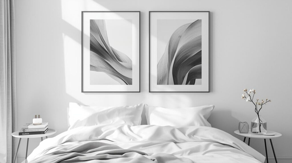
For a modern look, consider using oversized mats in your frames. A small photograph centered in a very large white mat creates a sense of importance and luxury. This technique is often seen in high-end art galleries and helps a smaller image take up the appropriate amount of space above a bed. I often suggest choosing personal photography for this area. A high-resolution photo of a meaningful place, edited to be black and white, adds a layer of intimacy that a store-bought print cannot provide.
I remember a project where we used a series of six square frames, each containing a black and white macro shot of different plant textures. We hung them in two rows of three. The high contrast of the images against a light grey wall created a crisp, clean look that helped the client feel organized and peaceful. The lack of color meant that the client could change their bedding to any hue they wanted without ever clashing with the wall art. This flexibility is one of the biggest advantages of monochrome photography.
The Eighth Idea: The Subtle Elegance of Minimalist Line Art
Sometimes, less is significantly more. Minimalist line art has seen a massive surge in popularity because it provides visual interest without the weight of a full painting. These pieces usually consist of simple, continuous lines that form a face, a figure, or a botanical shape. The simplicity of the lines creates a sense of airiness that is perfect for smaller bedrooms or for anyone who feels overwhelmed by busy patterns.

Line art is all about the quality of the line and the choice of frame. Because the art itself is so sparse, the frame becomes a very prominent feature. A thin, modern frame is usually the best choice. This style also pairs exceptionally well with other bedroom trends, like light linen bedding and natural wood furniture. It is the “quiet luxury” of the art world. It doesn’t scream for attention, but it rewards those who look closely.
In a minimalist apartment renovation, we used a single, large-scale line drawing of a reclining figure. The lines were done in a deep espresso brown on a cream-colored paper. We paired this with a matching wood frame. The piece felt like a natural extension of the headboard rather than an addition. It provided a sense of completion to the room without making it feel smaller or more enclosed. For those who want their bedroom to be a true sanctuary from a noisy world, line art is the perfect visual companion.
Wrap Up:
Choosing the right wall art for the space above your bed is about finding the intersection of scale and personal comfort. Whether you prefer the boldness of a single canvas or the soft texture of a textile hanging, ensure the piece respects the proportions of your furniture. By following the two-thirds rule and paying attention to mounting height, you can turn a plain wall into a professional-grade focal point. The ultimate goal is to create a space that reflects your personality while fostering the relaxation you need.
FAQs Section:
How high should I hang art above my headboard?
The most balanced look is achieved by hanging the bottom of the art frame between six and ten inches above the top of the headboard. This keeps the art connected to the bed while leaving enough breathing room to avoid a cluttered appearance.
What is the best size for art over a king-sized bed?
For a king-sized bed, look for art or a grouping of frames that spans between fifty and sixty inches in width. Following the two-thirds rule ensures the art doesn’t look swallowed by the size of the mattress.
Is it safe to hang heavy frames directly above the bed?
Yes, but you must use appropriate hardware such as heavy-duty wall anchors or screw directly into wall studs. For added safety, many designers prefer using lightweight canvases or plexiglass instead of heavy glass in this specific area.
Disclaimer:
The content shared by Fall Rugs is solely for research and informational purposes. Fall Rugs is not a professional interior design or home renovation consultancy, and the information provided should not be considered professional advice for home improvement or decor. All ideas and suggestions are based on current trends and general knowledge in the home decor industry.