TL;DR
A fireplace wall works best when it earns its role as the room’s focal point through material, scale, and styling decisions made in concert. Whether you work with stone veneer, shiplap, tile, or built-ins, the wall behind and around the firebox sets the visual tone for the entire space. Getting this right is about proportion, contrast, and restraint, not maximalism.
Introduction
Most living rooms have a fireplace. Far fewer have a fireplace wall. There is a difference, and that gap is where a room either becomes memorable or forgettable. The surround, the mantel, the stretch of wall above it, and the flanking space on either side all function as a single design unit, even if most people treat them as separate decorating problems. This piece covers the full picture: materials, scale, layout strategies, styling logic, and the specific mistakes that turn a promising focal point into visual noise.
Why the Fireplace Wall Shapes the Entire Room
A fireplace sits on an exterior or interior wall, and in most floor plans it automatically occupies the longest uninterrupted surface in the room. That makes the design decision there unusually high-stakes. Interior designers often call it the “anchor wall,” and the phrase is accurate in both a physical and psychological sense. The furniture arrangement almost always radiates out from it, which means whatever happens on that wall becomes the lens through which people read everything else.
Rooms that feel cohesive typically have a fireplace wall that does one thing well, not several things tolerably. A floor-to-ceiling stack of Venetian plaster with a simple black steel surround reads with clarity. A mix of tile, a floating mantel, two different accent paint colors, and seasonal decor crammed on every ledge reads as indecision. The material choice is almost secondary to the commitment made to it.
Scale is the variable most homeowners miscalculate. A standard 42-inch firebox on a 14-foot wall looks stranded without vertical elements pulling the eye upward. That is why built-in cabinetry, tall plaster columns, floor-to-ceiling paneling, or a statement mirror matter so much structurally. They are not decoration, they are proportion-correction.
Stone and Brick: The Case for Texture-Led Walls
Natural stone has anchored fireplace walls for centuries, from the rubble-and-mortar hearths of Scottish farmhouses to the smooth limestone surrounds you will find in Parisian apartments. The reason it endures is not nostalgia but physics: texture diffuses light, and diffused light makes a room feel warmer regardless of whether the fire is actually lit. Stacked ledger stone, a product widely used in American residential construction, is a direct descendant of that instinct.
Thin-cut quartzite and slate ledger panels from brands like MSI Surfaces or Emser Tile are applied over cement board directly to the stud wall. The depth they add, usually a quarter to three-quarter inches per panel, creates shadow lines that shift through the day. In a sun-facing room, that movement gives the wall a quality no paint or wallpaper can replicate.
Brick is the older, more polarizing choice. Exposed original brick has credibility that brick veneer struggles to match, but veneer has improved significantly. Roman brick, which runs longer and thinner than standard modular brick, has become a preferred option in new construction and renovation alike because it reads as deliberate and contemporary rather than rustic. A home in Nashville’s 12 South neighborhood finished in 2023 used a white-washed Roman brick floor-to-ceiling fireplace wall to bridge a period renovation with new open-plan living, and the result moved around social media precisely because it felt neither vintage nor trend-chasing.
Mortar color changes everything on a brick or stone wall. A matching mortar recedes and lets the units read as a field of texture. A contrasting mortar, especially a warm sand or charcoal, makes the grid pattern active and geometric. The decision belongs at the planning stage, not at the trowel stage.
Shiplap and Wood Paneling as Backdrop
Shiplap became culturally dominant partly because of Magnolia’s Joanna Gaines, who used it on nearly every renovation during the show’s peak years. It is easy to dismiss as overexposed, but the reason it works on fireplace walls specifically is structural: horizontal lines in a wide room read as calm, while vertical shiplap or board-and-batten draws the eye up in a room with average-to-low ceilings.
The execution matters more than the choice. Shiplap painted the same color as the surrounding walls, a technique sometimes called “tone-on-tone,” eliminates the farmhouse connotation entirely and reads as architectural texture. Benjamin Moore’s Chantilly Lace on white oak shiplap produces a wall that feels expensive and quiet rather than thematic.
Wider plank paneling, including the “German smear” finish where mortar is pressed and partially wiped across wood grain, occupies the middle ground between raw material and painted surface. West Elm’s furniture line and its editorial photography have pushed this aesthetic toward mainstream acceptance in urban markets. The key constraint is moisture and heat management: any wood within 36 inches of a working firebox needs to be rated for the proximity, and a licensed contractor should confirm clearances before installation begins.
When to Go Dark With Wood Tones
Walnut and smoked oak paneling create a specific kind of drama that lighter wood cannot. A fireplace wall finished in dark-stained shiplap or wide-plank walnut becomes absorptive rather than reflective, pulling the eye inward and giving the room a sense of compression that some people find enveloping and others find oppressive. The difference is usually ceiling height. In rooms above nine feet, dark wood paneling on the fireplace wall feels intentional and moody. Below eight feet, the same choice tends to make the room feel smaller than it is.
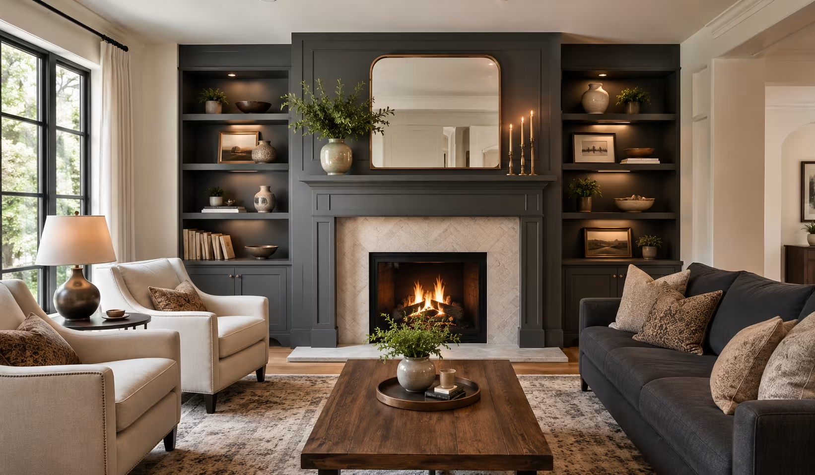
Built-In Shelving and the Architecture of the Fireplace Wall
Built-in cabinetry flanking a firebox is one of the most functionally and visually efficient things you can do to a fireplace wall. It addresses the proportion problem, provides storage, creates display space, and signals custom work in a way that loose furniture cannot. IKEA’s Billy bookcase hacked with face frames and crown molding is one of the most widely documented budget versions of this technique, and it works because the proportions of the Billy system are close enough to custom cabinet boxes to pass visual scrutiny when properly finished.
Custom millwork from a local cabinet shop, or semi-custom lines like those from Waypoint Living Spaces or CliqStudios, gives more control over depth, door style, and finish. The decision between open shelving and closed cabinets below the mantel line is partly practical and partly about the room’s visual temperature. Open shelving amplifies personality, showing books, art objects, and curated items. Closed lower cabinets lower the room’s visual temperature by hiding everyday clutter.
Styling built-ins well is an entire discipline. Interior stylist Emily Henderson, who has documented her approach extensively, works from a principle of layering: start with books in grouped color ranges, add objects at varied heights, include one living element (a plant or fresh greenery), and leave intentional negative space. The common mistake is filling every inch, which eliminates the breathing room that makes each object readable.
The Mantel as Scale Anchor
A mantel without proper scale is a ledge. A mantel with the right scale is architecture. The standard mantel height sits at 54 to 60 inches from the floor to the shelf face, and the shelf depth runs between five and seven inches. Those are functional numbers, not aesthetic ones. The aesthetic decision is how much material extends above and below, and what relationship that material has to the firebox opening.
A chunky limestone surround with a thick shelf and minimal overhang reads as classical. A thin steel shelf cantilevered at 72 inches with no physical connection to the firebox reads as contemporary. Neither is inherently better, but each makes a commitment the rest of the room needs to honor.
Plaster, Tile, and the Detail-Driven Approach
Venetian plaster applied to a fireplace wall is a choice that requires both a skilled plasterer and a tolerance for a material that cannot be corrected with touch-up paint. The result, when done well, is a surface with depth and luminosity that photographs poorly and impresses in person, which is arguably the right priority hierarchy for a home. Companies like San Marcos Plaster in California have seen consistent demand for fireplace wall commissions specifically because the material is heat-tolerant and develops character over time.
Tile is the most variable category because the range runs from four-dollar-per-square-foot subway tile to hand-painted Moroccan zellige at over forty dollars a square foot. The fireplace surround, meaning the immediate framing around the firebox opening, is the tile zone that matters most. Ann Sacks, the tile brand, has documented case studies where a small-scale intricate tile on the surround against a plain plaster wall outperformed an all-tile treatment in terms of visual impact. The restraint in the supporting material is what lets the tile perform.
A real scenario worth studying: a couple renovating a 1940s craftsman bungalow in Portland, Oregon, faced a fireplace wall stripped to bare drywall after removing a dated stone surround. Instead of replacing with new stone, they used a continuous coat of Portola Paints’ Roman Clay in a warm terracotta tone across the entire wall, then framed the firebox opening with three-inch Calacatta marble tile on the immediate surround only. The cost was lower than stone, the visual hierarchy was clearer, and the mix of matte plaster-effect paint and glossy stone gave the wall a sophistication that neither material would have achieved alone.
Color Strategy for Fireplace Accent Walls
Paint remains the fastest and most reversible way to define a fireplace wall, and the accent wall approach, where the fireplace wall reads in a different color from adjacent walls, is effective when the contrast is chosen deliberately rather than arbitrarily. Farrow and Ball’s Hague Blue has been used on fireplace walls across thousands of British and American homes because its depth and slight green undertone hold interest across changing light conditions without reading as cold.
The opposite strategy, painting the entire room including the fireplace wall in a single color, is gaining traction for good reason. When the walls, ceiling, and trim are all the same tone (a technique called “drenching”), the fireplace wall is defined not by color contrast but by the texture and material of its treatment. This works particularly well in small rooms where a contrasting accent wall would feel like it was cutting the space in half.
A practical note on dark paint near an active wood-burning fireplace: soot accumulates on walls above the firebox opening, and matte finishes show it faster than eggshell or satin finishes. Ruggable and similar washable product categories address the floor side of the soot problem. The wall finish choice addresses the upper surface.
Wrap Up
A fireplace wall earns its authority through material commitment, proportional thinking, and the discipline to stop adding elements before the wall becomes cluttered. Stone, shiplap, plaster, tile, and built-in cabinetry each solve the problem differently, and the right answer depends on ceiling height, room scale, existing architecture, and personal tolerance for visual complexity. The one consistent principle across every approach that works: the wall should feel like it was designed, not assembled. Start with scale, commit to a material, and style from there.
FAQs
What is the best material for a fireplace accent wall?
There is no single best material. Stone veneer and plaster work well for texture and heat tolerance, shiplap suits transitional and farmhouse styles, and tile on the surround with plaster on the wall is a strong mix for contemporary spaces. The right choice depends on the room’s existing architecture and the scale of the wall.
How high should built-in shelves be on a fireplace wall?
Built-in shelving flanking a fireplace typically runs floor to ceiling for maximum impact, with the cabinetry matching the height of the mantel shelf or the firebox opening on the inner face. Stopping shelves at a height lower than the mantel creates a visual imbalance that is difficult to correct with styling alone.
Can you add shiplap to a fireplace wall yourself?
Shiplap installation on a fireplace wall is a manageable DIY project for walls away from the firebox. Any wood installation within the manufacturer-specified and code-required clearance from a working firebox should be reviewed by a licensed contractor to confirm it meets local fire safety requirements.
Disclaimer
This content shared by Fall Rugs is solely for research and informational purposes. Fall Rugs is not a professional interior design or home renovation consultancy, and the information provided should not be considered professional advice for home improvement or decor. All ideas and suggestions are based on current trends and general knowledge in the home decor industry.