TL;DR
Butter yellow wall paint acts as a soft, light-reflecting neutral that replaces cold grays and stark whites. This specific undertone mimics natural sunlight to make small or north-facing rooms feel expansive and welcoming. Pairing this hue with crisp white trim or contrasting muted blues creates a balanced, sophisticated palette.
Introduction
Why do standard neutral walls often feel flat and lifeless when the afternoon shadows hit? Many homeowners face this issue after painting their spaces a trendy cool gray, only to find the room feels gloomy by October. Soft, creamy yellow tones offer an immediate remedy by injecting warmth without overwhelming the senses. This discussion breaks down how to select the right pigment depth, match it with existing furniture brands, and apply it to maximize natural light.
Deciphering the Undertones of Creamy Yellow Paints
Selecting a warm paint color requires an understanding of how base pigments react to different lighting conditions. True butter yellow sits between a sharp lemon tint and a heavy beige hue, containing a specific balance of white and warm ochre. In north-facing rooms, cool blue exterior light can turn a poorly formulated yellow into a sickly greenish tint. Testing samples on multiple walls prevents this shift and ensures the color remains crisp throughout the day.
During a 2025 residential project in Chicago, interior designer Sarah Sherman Samuel noted that clients often mistake bright pastel yellows for soft butter tones. The mistake becomes apparent under 3000K LED lighting, where high-saturation paints look aggressively bright. Choosing a formula with a gray or brown grounding base keeps the final result sophisticated rather than juvenile.
- Look for options with a high Light Reflectance Value (LRV) above seventy to ensure maximum brightness in dark hallways.
- Test the paint next to your flooring material because dark oak tends to pull out the amber notes in warm wall colors.
- Evaluate the formula under both morning sunlight and evening incandescent bulbs to verify the color stability.
Strategic Color Pairings for Balanced Modern Interiors
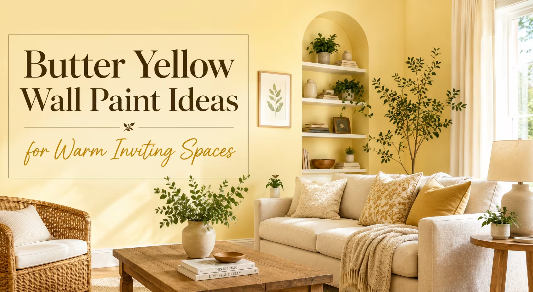
A common challenge with butter yellow walls is preventing the space from looking dated or overly country kitsch. Modern interior styling balances the warmth of the walls with cool-toned furniture pieces and crisp architectural details. Pairing creamy walls with a clean white trim, such as Benjamin Moore White Dove, establishes a clear visual boundary that sharpens the room.
Proportional contrast keeps the yellow pigment looking deliberate and fresh. West Elm frequently styles their catalog rooms by placing dark charcoal or rich navy blue sofas against warm, pale backdrops. This juxtaposition grounds the floating quality of a light wall color, creating a balanced visual weight that anchors the entire seating area.
- Combine creamy walls with matte black hardware on doors and cabinets to introduce a sharp contemporary edge.
- Use sage green accents through textiles or indoor plants like a fiddle-leaf fig to create a nature-inspired palette.
- Ground the space using a washed jute or sisal area rug from Ruggable to add tactile texture underneath the warm walls.
Real World Living Room Transformations and Lighting Tricks
Dark living spaces with small windows benefit the most from a coat of buttery paint, but application methods dictate the success of the project. A historic townhouse renovation in Boston faced severe light deprivation due to neighboring brick walls blocking the south view. The design team bypassed standard white primers and applied two coats of Farrow & Ball Tallow, a pale yellow-cream hybrid.
The transformation relied heavily on the interaction between the wall finish and the room layout. Using a chalky matte or dead-flat finish absorbs light unevenly, whereas a subtle eggshell sheen bounces light deeper into the floor plan. The project pair complemented the walls with an upholstered linen sofa from Pottery Barn, which softened the overall look while maintaining a bright atmosphere.
- Apply an eggshell finish on the main walls to catch low-angle winter sunlight without creating harsh glints.
- Paint the ceiling a flat, pure white to create the illusion of higher ceilings and prevent a claustrophobic feel.
- Position a large, arched floor mirror opposite the main window to duplicate the yellow-tinted light bouncing across the space.
Choosing the Right Palette for Kitchens and Dining Spaces
Kitchens serve as the natural home for warm, appetizing colors, making butter tones an excellent alternative to stark all-white culinary spaces. When updating a kitchen, the wall color must coordinate with countertops, cabinetry finishes, and backsplash tiles. A warm yellow backdrop beautifully complements polished brass fixtures and natural stone surfaces like Carrara marble or soapstone.
During a kitchen refresh in a 1920s bungalow, a DIY blogger applied a soft cream-yellow paint behind open oak shelving from IKEA. The warm walls highlighted the grain of the white oak shelves while making the vintage ironstone dishware pop. The mistake here would be using a high-gloss yellow on the walls, which reflects appliance glare and causes eye strain during food preparation.
- Match the yellow paint with warm wood tones like walnut, cherry, or white oak for a cohesive Scandinavian feel.
- Avoid pairing butter yellow with yellow-veined granite because the two elements will compete and look muddy.
- Coordinate cabinet hardware by selecting unlacquered brass which ages naturally against the warm background.
Wrap Up
Embracing butter yellow wall paint allows you to create an inviting, sunlit sanctuary regardless of your home’s architectural limitations. By paying close attention to undertones, selecting an eggshell finish, and balancing the warmth with cool modern furniture, you avoid the pitfalls of muddy or overly bright rooms. This versatile hue bridges the gap between stark minimalism and cozy traditionalism for a timeless interior update.
FAQs Section
What trim color looks best with butter yellow walls?
A crisp, clean white with slightly warm undertones offers the best balance without looking too harsh or clinical. Avoid ultra-pure, blue-toned whites because they create an jarring contrast that makes the yellow look disconnected.
Will butter yellow paint make a small room feel bigger?
Yes, options with a Light Reflectance Value (LRV) above 70 reflect significant amounts of light, which visually expands the walls. The warm undertone also prevents the dingy shadow effect that often plagues small rooms painted in cool grays or stark whites.
How do I stop my yellow walls from looking too bright or loud?
Select a paint color that looks almost beige or cream on the swatch, as yellow pigments intensify significantly when applied to all four walls. Sampling the color on a large poster board and viewing it at different times of day ensures the tone remains soft and muted.
Disclaimer
This content shared by Fall Rugs is solely for research and informational purposes. Fall Rugs is not a professional interior design or home renovation consultancy, and the information provided should not be considered professional advice for home improvement or decor. All ideas and suggestions are based on current trends and general knowledge in the home decor industry.