

TL;DR
Selecting curtain colors requires balancing wall paint undertones, natural window lighting, and existing furniture shades. Matching drapes directly to walls creates depth through subtle texture, while contrasting panels draw eyes directly to window frames. Always test fabric swatches under both daytime sun and warm evening indoor lamps before finalizing purchases.
Introduction
Do your window panels clash with your flooring or blend invisibly into the drywall background? Choosing drape shades often paralyzes homeowners because lighting shifts throughout the morning and evening hours. Matching fabric swatches to wall paint requires looking at warm and cool undertones rather than relying purely on base color labels. You will learn practical methods to evaluate room exposure, coordinate accent colors, and select window coverings that feel cohesive.
Matching Drapery Tones to Wall Paint Undertones
Wall paint rarely sits as pure white or simple gray. Paint formulas from major brands like Sherwin-Williams or Benjamin Moore carry subtle green, blue, yellow, or pink bases that dictate how adjacent fabrics look.
Interior designers like Kelly Wearstler often suggest using drapes two shades lighter or darker than the primary wall paint to establish visual depth. If your living room features cool gray paint such as Sherwin-Williams Repose Gray, hanging slate blue or crisp white linen panels prevents the space from looking washed out. Warm beige walls pair exceptionally well with rich cream tones, soft olive greens, or deep terracotta velvet drapes.
- Soft ivory linen panels complement warm greige walls without creating harsh contrast lines.
- Dark charcoal velvet drapes anchor light gray spaces and frame exterior views sharply.
- Navy blue cotton curtains balance warm brass fixtures and honey-oak hardwood flooring.
Consider a residential renovation project in Chicago where a homeowner installed stark bright white drapes against warm alabaster walls. The contrast highlighted yellow tones in the paint, making the room look aged. Replacing those drapes with warm oatmeal wool blend panels from West Elm smoothed the visual transition and balanced the room tone instantly.
Balancing Warm vs Cool Color Bases
- Cool wall tones demand cool fabric accents or carefully balanced warm neutrals.
- Warm paint colors look best alongside warm beige, brown, or gold undertones.
- Mismatched undertones create visual tension that makes rooms feel disorganized.
Factoring in Natural Sun Exposure and Window Orientation
Room orientation drastically alters how fabric colors appear throughout the day. North-facing windows receive indirect blue-tinted daylight, while south-facing windows flood rooms with intense warm sunlight.
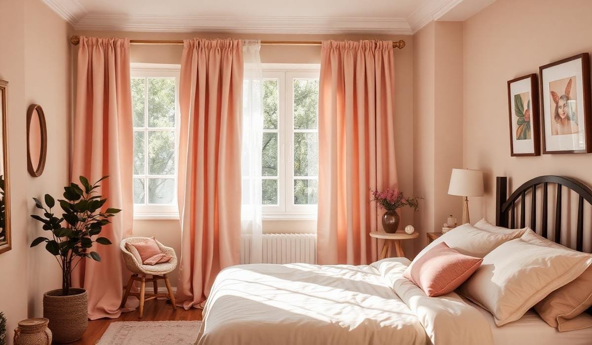
North-facing bedrooms often feel chilly if fitted with cool blue or pure white curtains. Choosing warm camel, gold, or soft rose drapes adds perceived warmth to counteract flat light. South-facing living rooms handle cool tones like dusty sage, navy, or soft teal, which tone down intense midday sun glare.
- East-facing rooms benefit from warm neutrals that look rich during bright morning hours.
- West-facing spaces handle deep jewel tones like emerald or navy that absorb harsh late afternoon glare.
- Sun-exposed windows require lined drapes to prevent bright sunlight from fading organic cotton or silk threads over time.
A condo owner in Seattle with north-facing windows installed charcoal blackout panels, turning the living area dark and gloomy. Switching to light-reflecting cream linen drapes from Pottery Barn brought airiness to the space while preserving privacy.
Light Reflection and Room Brightness
- Light fabric shades bounce light deeper into dim, north-facing living rooms.
- Dark drapery absorbs excess light, making large south-facing rooms feel cozy.
- Double-lined drapes protect rich fabric pigments from solar bleaching over five to ten years.
Coordinating Curtains with Flooring and Major Furniture Pieces
Curtains must speak to large anchor pieces in the room, including sofas, area rugs, and timber flooring. Rather than matching curtains directly to your couch color, look for secondary accent shades within your floor rug or decorative pillows.
If your sofa features plain gray upholstery, bring color through curtains that match a subtle accent line in a printed Persian rug from Ruggable. For rooms with heavy dark walnut wood floors, light-toned curtains break up the visual weight and prevent the room from feeling bottom-heavy.
- Forest green drapes highlight warm oak tables and cognac leather armchairs naturally.
- Creamy off-white panels soften heavy dark brown leather sectional sofas.
- Terracotta drapes tie together woven rattan armchairs and warm jute rug fibers.
In a Austin Texas home, a designer paired a charcoal velvet sectional with identical charcoal drapes. The monochrome setup erased all depth, turning the corner into a dark void. Swapping the dark drapes for textured off-white drapes from IKEA restored balance, making the dark sofa look intentional rather than overwhelming.
Establishing Visual Hierarchy
- Anchor drapes around rug patterns instead of matching the main couch fabric exactly.
- Use light curtain panels when floor boards or large carpets are exceptionally dark.
- Match curtain grommets or brass rings to nearby lamp finishes for subtle polish.
Choosing Between Monochromatic, Contrasting, and Patterned Panels
Deciding between solid neutral panels, bold color blocks, or intricate patterns depends on your room size and visual goals. Small spaces generally benefit from solid colors that match wall tones, extending the room visually.
Large open-concept floor plans allow for bold contrasting panels or large-scale botanical prints. If your walls display busy gallery frames or loud wallpaper, stick with solid curtain fabrics to avoid visual chaos. Conversely, plain painted walls act as a clean canvas for striped, geometric, or floral patterns.
- Solid ivory drapes make low eight-foot ceilings feel higher when hung floor to ceiling.
- Bold navy or burgundy stripes add architectural interest to plain white drywall spaces.
- Small floral prints suit cozy reading nooks or traditional guest bedroom settings.
When styling a small condo in Boston, an owner selected heavy plaid drapes for a compact bedroom with low ceilings. The pattern shrank the perceived space significantly. Replacing the plaid panels with plain cream curtains hung from a ceiling-mounted rod nine feet high made the room feel instantly taller and wider.
Pattern Selection Principles
- Small rooms favor solid colors or subtle tone-on-tone woven patterns.
- Large rooms handle grand floral or geometric motifs without feeling crowded.
- High-contrast patterns draw immediate focus to windows, framing outdoor garden views.
Fabric Material Selection and Its Impact on Color Perception
Fabric texture alters how color hits the eye. Velvet absorbs light, making colors appear darker and richer, while sheer linen lets light pass through, softening color intensity.
Heavy velvet panels in dark jewel tones create dramatic luxury suitable for dining rooms or main bedrooms. Sheer polyester or cotton drapes filter glare while keeping rooms feeling bright and breezy during spring and summer seasons.
- Silk and faux-silk drapes reflect light, adding shimmer to gold, champagne, and silver tones.
- Linen slub textures introduce natural casual variation to beige, gray, and white panels.
- Heavy cotton canvas holds crisp structured folds ideal for navy, green, or black shades.
A project in Miami involved installing deep navy velvet drapes in a sun-drenched sunroom. The dense fabric absorbed so much light that the room felt warm and heavy. Changing the velvet to sheer navy-tinted linen preserved the color scheme while letting sea breezes and bright sunlight filter through cleanly.
Texture Characteristics
- Matte cotton and linen soften bright primary colors into relaxing natural tones.
- Sheer fabrics reduce color intensity by roughly fifty percent under direct sunlight.
- Velvet enriches dark shades like plum, navy, and forest green with deep shadows.
Wrap Up
Picking curtain colors involves balancing paint undertones, room light exposure, and existing furniture shades. Testing fabric swatches in real room conditions prevents costly color mistakes and ensures long-term visual satisfaction. Focus on how drapes interact with your flooring and lighting rather than treating window panels as isolated accessories.
FAQs Section
Should curtain colors be lighter or darker than wall paint?
Selecting curtains two shades lighter or darker than your walls creates soft contrast and keeps panels from blending invisibly into the drywall.
Is it better to match curtains to the wall or sofa?
Matching curtains to secondary accent tones in rugs or throw pillows usually looks better than matching the primary sofa fabric directly.
What curtain color makes a small room look larger?
Light neutral curtains like ivory, off-white, or light gray hanging from ceiling to floor make small spaces feel open and bright.