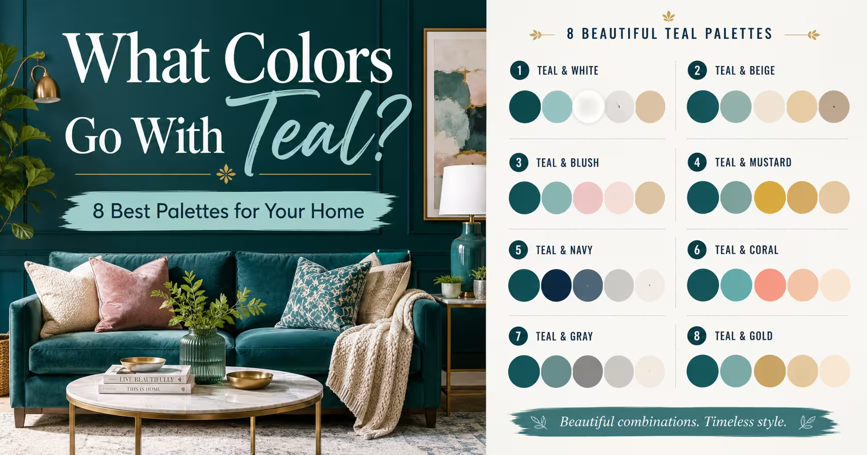
TL;DR
Teal balances beautifully with warm metallics, earth tones, and crisp neutrals to create sophisticated spaces. Successful palettes rely on managing the proportion of cool and warm tones across your furniture and textiles. Choosing the right accent colors prevents this deep blue-green shade from overwhelming a room.
Introduction
Finding the perfect accent shades for a specific deep blue-green tone often challenges homeowners who want a bold yet balanced look. Teal sits right between blue and green, carrying both the calming properties of the ocean and the stabilizing energy of nature. This unique position makes it incredibly versatile, but it also means the wrong pairing can quickly make a room feel dark or chaotic. You will discover how to build balanced spaces using real-world color pairings that work across various interior styles.
The Foundations of Teal Color Theory
Decorating with this complex hue requires an understanding of its undertones and how they react to light. Some variations lean heavily into a dark slate blue, while others flash a bright tropical green when hit by natural sunlight. Identifying where your specific paint or fabric sits on this spectrum dictates which accent pieces will look natural next to it.
Misjudging the undertone often leads to spaces that feel visually disjointed or muddy. During a recent redesign of a coastal property, the initial choice of a green-heavy peacock shade clashing with the existing olive flooring forced a complete repainting. Switching to a blue-toned marine variant corrected the visual weight and settled the room instantly.
Balancing Warmth and Coolness
Because the base color is inherently cool, introducing warm elements prevents the space from feeling clinical or chilly. Incorporating natural woods, leather, or warm-toned metals creates a pleasing visual tension that catches the eye. The goal is to establish a clear hierarchy where one temperature dominates and the other acts as a deliberate accent.
Cream and Soft Neutrals for Timeless Contrast
Pairing deep jewel tones with crisp white can sometimes create a harsh contrast that feels jarring to the eye. Opting for rich cream, warm alabaster, or soft beige softens the transition and creates a more inviting environment. This combination works exceptionally well in bedrooms and quiet reading nooks where relaxation is the priority.
A residential project in Chicago utilized this approach by layering cream linen sofas against matte deep water walls. The softness of the fabric muted the intensity of the paint, creating a classic look that felt bright despite the dark backdrop. Using varied textures like wool rugs and woven baskets added depth without adding competing colors.
Selecting the Right Neutral Undertone
Avoid neutrals with grey or blue bases when working with dark walls, as they can drain the life from the room. Look for ivory or oatmeal shades that carry a hint of yellow or pink to give the space a subtle glow. This warmth coaxes out the green notes in your primary color, making the entire room feel more cohesive.
Terracotta and Burnt Orange Warmth
Earth tones offer a natural companionship to blue-green shades because they sit opposite each other on the color wheel. Terracotta, rust, and burnt orange introduce an energetic warmth that makes the cool base color pop. This palette feels grounded, modern, and deeply tied to natural desert landscapes.
An editorial studio in Austin successfully implemented this look by matching a plush velvet sofa with matte clay pottery and rust-colored throw blankets. The contrast was vivid but felt sophisticated rather than loud because both hues shared a similar saturation level. It proves that bold choices can live together harmoniously if their intensity matches.
Managing High Contrast Pairs
When combining opposites, limit the brighter accent to smaller details like accent pillows, ceramic vases, or artwork frames. Allowing the fiery tones to cover large surfaces can create a restless energy that disrupts the flow of your home. Use the earth tones as punctuation marks within a larger, cooler landscape.
Mustard Yellow for Mid Century Energy
Mustard and ochre yellow inject a cheerful vintage energy into spaces that feature deep ocean tones. This pairing calls back to classic mid-century modern design, offering a playful yet mature aesthetic. The golden undertones of mustard cut through the moodiness of the dark green-blue base, brightening dark corners effectively.
A mid-sized urban apartment lounge utilized an ochre leather accent chair against a moody teal built-in bookcase. The golden leather pulled the warmth out of the surrounding walnut flooring, bridging the gap between the furniture and the architecture. This combination brings life to spaces that receive minimal natural daylight.
Dusty Pink and Blush Softness
Blush pink offers a gentle, sophisticated partner for deep peacock tones, creating a balanced masculine and feminine dynamic. The softness of the pink tones down the seriousness of the dark blue-green, adding a touch of modern romance. It is a favorite choice for contemporary boutique hotels and stylish dressing rooms.
A commercial design client utilized this palette for a salon reception area, using plush blush chairs against a striking geometric feature wall. The contrast felt upscale and welcoming, avoiding the chilly atmosphere that sometimes plagues commercial spaces. The addition of matte black hardware kept the overall look grounded and modern.
Sage and Forest Green Monochromatic Depth
Building a palette using different shades of the same color family creates a rich, layered look with minimal visual noise. Sage green, olive, and deep forest green blend naturally with teal because they share common color DNA. This approach relies on subtle shifts in tone and texture rather than high-contrast pops to generate interest.
A home office in Seattle used this monochromatic style by layering sage green window treatments over dark teal cabinetry. The result was a quiet, focus-heavy environment that felt wrapped in nature. The lack of sharp color contrasts allowed the eye to rest, making the small room feel significantly larger than it actually was.
Charcoal Grey and Matte Black Structure
For a sleek, urban aesthetic, pairing blue-green hues with dark charcoal or matte black provides a strong architectural framework. This combination emphasizes the cool, moody side of the spectrum and works perfectly in modern industrial spaces. It creates an atmosphere of quiet luxury and dramatic depth.
A penthouse renovation featured matte black steel window frames cutting across rich teal accent walls in the dining area. The dark lines framed the color beautifully, treating the painted surfaces like pieces of art. Polished concrete floors kept the look minimalist and structural.
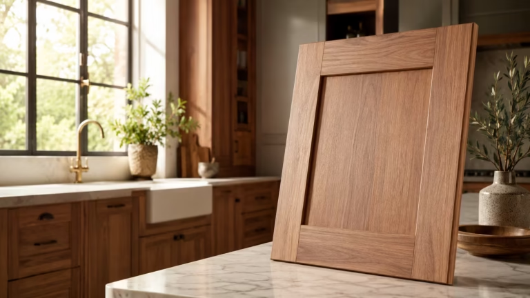
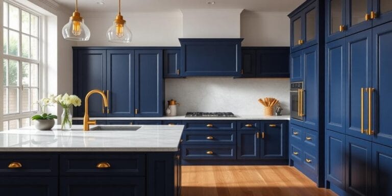
Copper and Warm Gold Metallic Accents
Metals act as the jewelry of a room, and the right finish can completely alter how a paint color behaves. Copper, bronze, and warm brushed gold contrast beautifully against the cool depth of teal surfaces. The reflective qualities of these metals catch the light, breaking up large blocks of dark color.
Replacing standard chrome kitchen hardware with brushed copper pulls against peacock-colored cabinets completely revitalized a dark kitchen space. The copper brought out the hidden warmth in the paint, making the cabinetry look custom and expensive. It is an easy update that requires no structural changes but yields massive visual returns.
Soft Lavender for An Unexpected Twist
Lavender and lilac offer a unique, artistic pairing that feels fresh and unexpected in contemporary homes. The purple undertones complement the blue side of teal while providing a soft contrast to its green characteristics. This palette works beautifully in creative spaces, studios, or eclectic living rooms.
An art gallery viewing room paired soft lavender accent walls with deep marine upholstered benches. The combination allowed the colorful artwork to pop while ensuring the seating area felt distinct and curated. It is a bold choice that rewards those willing to step away from traditional neutral pairings.
Wrap Up
Mastering the use of teal requires balancing its cool nature with strategic injections of warmth, whether through textiles, woods, or metals. The eight palettes discussed show that this versatile hue can adapt to classic, modern, or eclectic tastes with ease. Focus on matching the intensity of your accent colors to create a cohesive, professional look. Trust your eye, respect the undertones of your room, and let the color combinations bring new energy to your living space.
FAQs Section
What is the single best accent color for a small teal room?
Warm cream or soft alabaster works best because it provides a bright contrast without the harshness of pure white, keeping small spaces feeling open and warm.
Can you use teal and navy blue together in the same space?
Yes, they work beautifully as a monochromatic pairing because they share blue undertones, creating a rich and layered look when mixed with different textures.
How do you keep a teal room from looking too dark?
Incorporate light-toned wood furniture, brushed brass fixtures, and woven textiles to bounce light around the room and break up the heavy blocks of color.
Disclaimer
This content shared by Fall Rugs is solely for research and informational purposes. Fall Rugs is not a professional interior design or home renovation consultancy, and the information provided should not be considered professional advice for home improvement or decor. All ideas and suggestions are based on current trends and general knowledge in the home decor industry.