
TL;DR
Small dining rooms succeed when every surface, sightline, and seat earns its place. The ten ideas here work because they manipulate perception rather than square footage, using light placement, furniture geometry, and material continuity to trick the eye into reading more space. Pick three that fit your actual room shape and commit to them fully, because half measures read as compromise rather than intention.
Introduction
Most small dining room advice treats the problem as a storage puzzle. That misses the point. A dining room that feels cramped does not suffer from too little cabinetry. It suffers because the eye hits too many stops before it reaches the far wall. The rooms that feel twice their size are rarely the ones stuffed with clever organisers. They are the rooms where someone understood sightlines, vertical proportion, and the quiet power of a single bold choice that draws attention away from the boundary walls. What follows comes from watching real rooms succeed and fail, often with the same square footage.
1. Pull the Table Away from the Wall
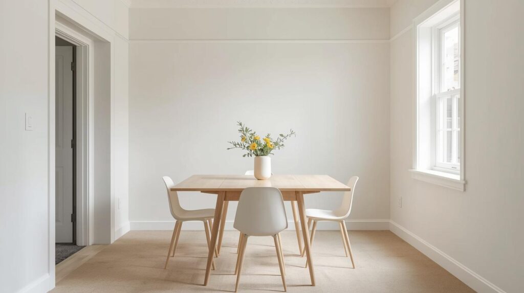
Every instinct says push the table against the wall to save floor space. The instinct is wrong. A table pressed tight to a wall reads as a corridor, not a dining zone. When you float the table, even by eighteen inches on all sides, the room suddenly has circulation. The perimeter walls recede because the eye understands the space between the table edge and the wall as usable volume, not dead zone.
Why Floating Works Even When It Looks Wrong on Paper
A client in a Glasgow tenement flat argued with me for weeks about this. Her dining alcove measured barely seven feet by six. She wanted a built-in bench against the long wall with a narrow table in front. We tried the floating approach instead with a forty-inch round pedestal table. The room immediately felt wider because you could see the baseboard running uninterrupted around all four walls. The continuous sightline told the brain the room was whole, not sliced into fragments.
Choosing the Right Pedestal Base
The base matters more than the top. A pedestal table eliminates the four-corner leg obstruction that catches chairs and stops feet. It also creates a single visual anchor point rather than four separate stops. In a tight room, a turned wood pedestal with a modest footprint gives you more chair manoeuvrability than any leg configuration. Avoid anything with a wide splayed base that eats the same floor space you are trying to preserve.
2. Bench Seating on the Long Side
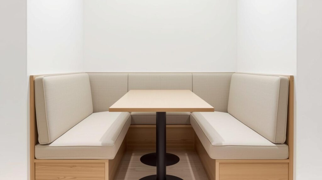
Benches solve a geometry problem that chairs cannot. A chair requires clearance behind it and beside it. A bench needs only the space along its length. When placed against a wall, a bench swallows zero visual floor area while seating two or even three people. The room reads wider because the seating plane merges with the wall plane rather than interrupting it.
The Custom Bench That Changed Everything
A couple in a 1920s Seattle bungalow had a dining room that was essentially a widened hallway. Eight feet wide, fourteen feet long, with windows only at the far end. We installed a floor-to-ceiling shiplap treatment on the long wall with a floating oak bench cantilevered from it. The bench appeared to grow from the wall, not sit in front of it. Paired with two slim chairs on the opposite side, the room seated six without a single chair back breaking the sightline across the table. The bench depth was only sixteen inches, shallower than standard, because wall support meant no backrest was needed.
Upholstery Choices That Keep Things Airy
Dark upholstery on a bench reads heavier than the same fabric on a chair because the bench presents a longer visual mass. A light neutral linen or a subtly textured cotton blend keeps the bench from dominating. If you need durability, a performance fabric in a warm ivory or greige hides the daily wear while reflecting whatever ambient light the room receives. Skip the tufting. Deep button details add visual weight exactly where you want none.
3. Clear Material Under the Tabletop
The volume beneath the table surface affects how open a room feels more than anything above it. Glass tops, acrylic legs, and slender metal frames let the eye travel through the table to the floor and walls beyond. The table effectively disappears from the lower half of the room, which is where cramped spaces announce themselves most loudly.
Glass Tops with Deliberate Edge Details
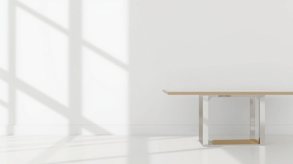
A tempered glass top with a bevelled edge reads as intentional, not office furniture. The bevel catches light and gives the slab a jewellery quality that solid wood cannot match at the same thinness. Pair a glass top with a brass or blackened steel base that has narrow legs, and the table becomes a floating surface. The floor pattern or rug underneath remains visible, which extends the perceived room depth by several feet. One word of caution: glass shows every fingerprint. If your household includes young children, a matte etched glass or a smoked glass hides smudges far better than clear.
Acrylic Chairs That Vanish
Acrylic ghost chairs are not a design cliche if you use them sparingly. Two transparent chairs on the visible side of the table, paired with upholstered seating on the wall side, create an asymmetrical arrangement that feels curated rather than themed. The transparent chairs disappear from peripheral vision, which makes the room feel empty in the best possible way when no one is seated. The key is investing in thick, properly moulded acrylic that does not flex or scratch within a year. The cheap versions cloud over and announce the budget loudly.
4. Vertical Stripe Wall Treatments
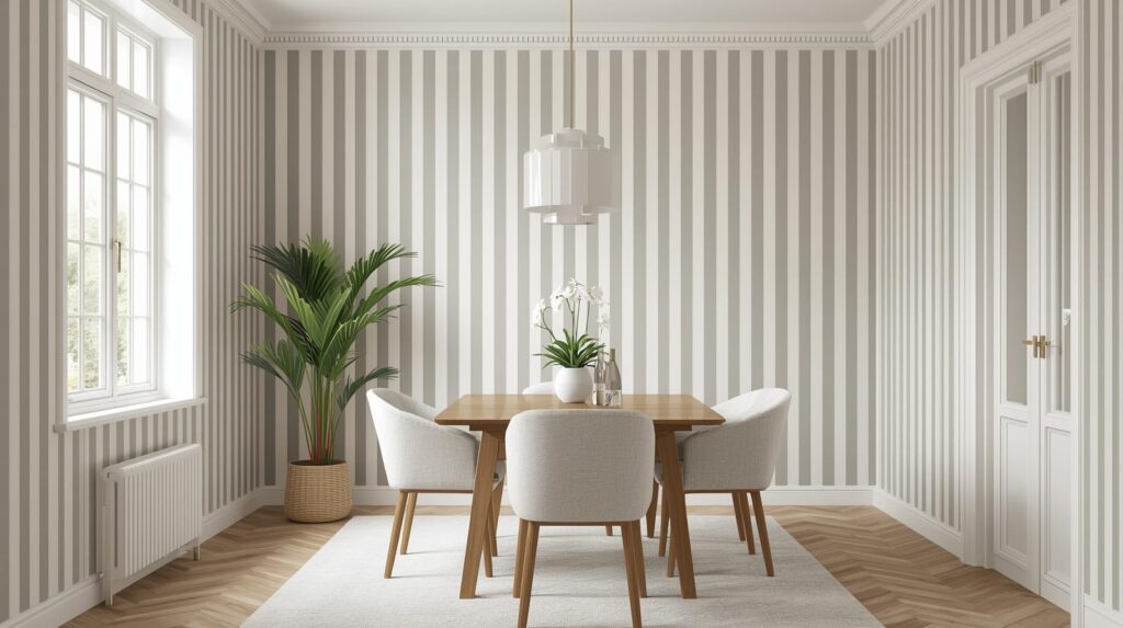
Horizontal lines widen a room. Vertical lines lift it. In a small dining room, the ceiling often feels oppressively low because the table occupies the horizontal plane so emphatically. Introducing vertical rhythm on the walls pulls the eye upward and distracts from the cramped footprint by making height the dominant dimension.
Paint Stripes Without Renovation
A hand-painted vertical stripe pattern in two tones of the same colour, say a matte finish paired with an eggshell version of the identical hue, creates movement without the visual noise of contrasting colours. The two sheens catch light differently throughout the day, so the stripes read as subtle shadow play rather than circus tent. The stripe width should sit between six and ten inches. Anything narrower reads as busy wallpaper, and anything wider loses the vertical elongating effect entirely.
Millwork Panels That Frame the Height
If you have the depth to spare, applied moulding in vertical panels from chair rail to ceiling draws the eye up in a structured, architectural way. The panels should be taller than they are wide, ideally a two-to-one ratio. Paint the panels and the wall the same colour to keep the treatment unified. The shadow lines do the work without adding colour contrast. This approach particularly suits older homes where the dining room already has some period trim language to build upon.
5. One Oversized Mirror on the Widest Wall
Mirrors expand space, but only when placed where they can reflect something worth seeing. A mirror facing a blank wall doubles the blankness. A mirror on the widest wall, positioned to catch light from a window or a pendant fixture, sends borrowed light deep into the room and creates a false depth that the eye accepts as genuine.
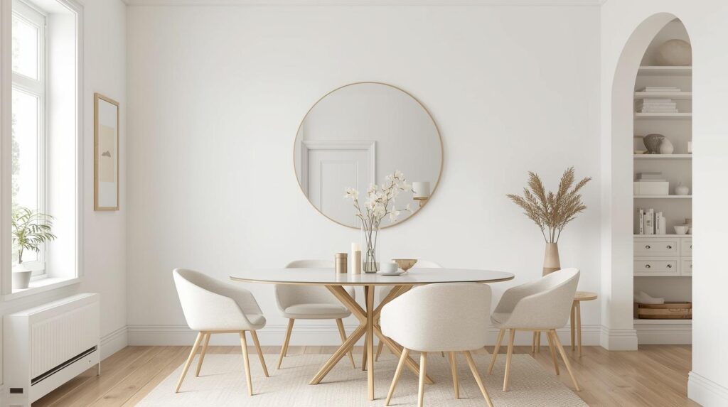
Sizing and Placement That Avoids the Gym Effect
The mirror must be large enough to read as an architectural element rather than a hung accessory. A six-foot-wide mirror that spans most of the dining wall, with its bottom edge aligned just above the chair rail or wainscot height, becomes a window into another room. Lean it rather than hang it flat if the proportions allow. A slight backward tilt reflects more ceiling and light fixture, which adds height perception on top of depth perception. Avoid bevelled mirror tiles or any grid arrangement. The seams announce the illusion and cheapen the effect.
What the Mirror Should Reflect
Position the mirror so it captures the chandelier or pendant when someone sits at the table. The reflected light source appears to double the illumination without adding a single fixture. If the room has a window on an adjacent wall, angle the mirror to catch that natural light during daytime hours. The reflected outdoors gives the room an ever-changing quality that fixed decor cannot replicate.
6. Wall-Mounted Lighting That Frees the Table
A pendant light defines the dining zone beautifully but also announces exactly where the table sits, which in a small room can feel like shouting the room’s limitations. Wall-mounted sconces or a swing-arm fixture eliminate the overhead visual obstruction while still delivering focused light onto the eating surface.
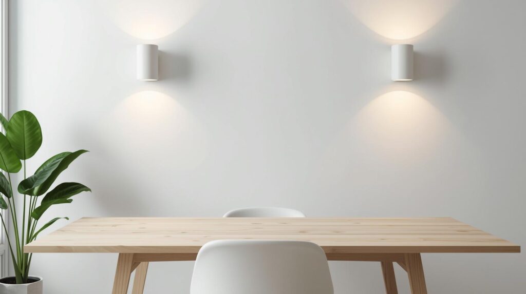
Hardwired Swing Arms for Flexible Illumination
A pair of hardwired swing-arm sconces mounted on the wall behind the table can be pulled outward during meals and folded flat against the wall afterward. The flexibility means the room serves multiple functions without a permanent pendant hanging in the middle of the space. Choose sconces with fabric shades rather than metal cones. The fabric diffuses light softly across the table and glows warmly against the wall, which adds depth perception in evening hours when small rooms tend to close in.
The Candle Sconce Alternative
If wiring new sconces is not an option, a pair of substantial candle sconces mounted at eye level on each side wall creates ambient light that flatters both the room and the people in it. The vertical placement pulls the eye up along the wall surface. Use dripless taper candles in a warm ivory rather than bright white. The softer wax colour reads as more intentional and less last-minute grocery store.
7. Built-In Banquette That Follows a Corner
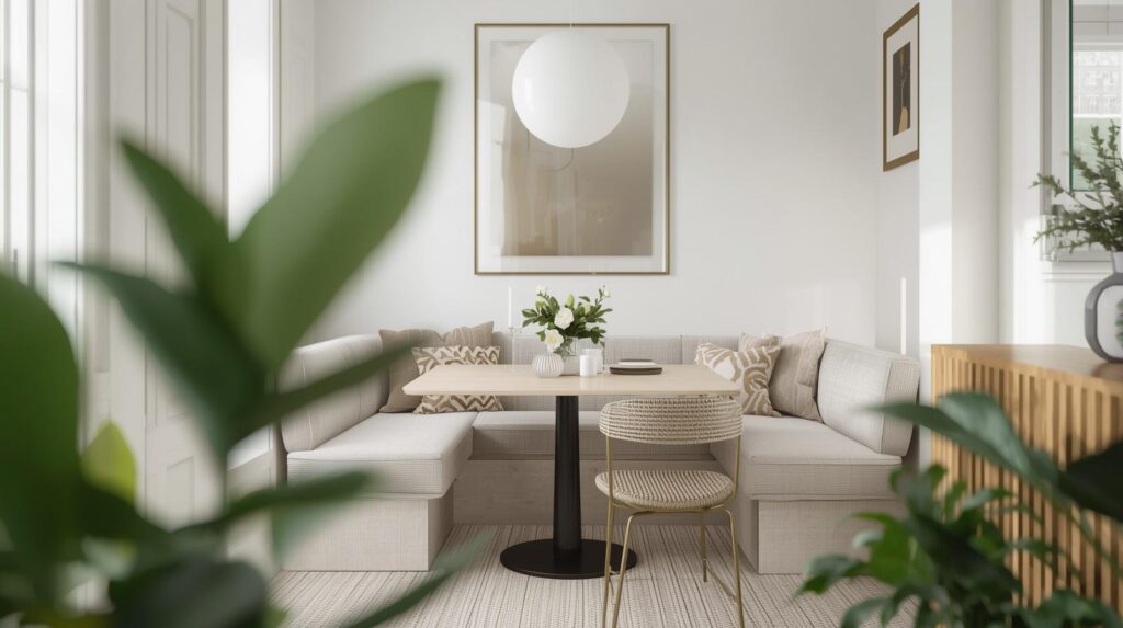
A corner banquette uses the least useful square footage in any small room, the corner itself, and turns it into the most efficient seating in the space. When properly scaled, a corner banquette can seat four people where freestanding chairs would struggle to fit three. The fixed seating also establishes a permanent sense of place, which small dining rooms often lack.
Storage Beneath Without Visual Bulk
Lift-top bench storage under a banquette conceals table linens, seasonal serveware, and the overflow of daily life that small homes accumulate. The trick is making the base look like a solid plinth rather than a row of cabinet doors. A recessed toe kick and a continuous panel front without visible hardware keeps the banquette reading as architecture, not millwork. Paint the base the same colour as the wall behind it. The banquette recedes visually and the dining area feels larger because the largest piece of furniture disappears into the perimeter.
Cushion Thickness and Backrest Angle
A banquette cushion should be at least three inches thick, ideally four, to make sitting comfortable for a full meal. The backrest should angle backward by about five degrees rather than standing perfectly vertical. The slight recline makes the seat feel deeper than it is and prevents that stiff, church pew posture. If a fixed backrest is not possible, a row of loose lumbar cushions in the same fabric achieves a similar effect with more adjustability.
8. Round Tables in Square Rooms
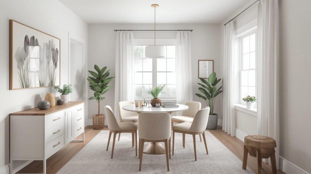
Square rooms and round tables have a natural affinity that rectangular tables lack. A round table centred in a square room creates radial symmetry. The circulation path becomes a continuous loop around the table rather than a series of narrow corridors along straight edges. Everyone at the table sits equidistant from the centre, which makes the seating arrangement feel equitable and the room feel organised around a single clear purpose.
Diameter Decisions That Make or Break Flow
A forty-eight-inch round table seats four to six comfortably and leaves enough perimeter space in a room as narrow as nine feet square. If the room is closer to eight feet, drop to a forty-two-inch diameter. The critical measurement is the clearance between the table edge and the nearest wall or piece of furniture. You need at least thirty-six inches for someone to walk behind a seated person. Forty-two inches is better if the room allows it. Anything less than thirty and the room will feel like an obstacle course, no matter how beautiful the table.
The Unexpected Advantage of Circular Circulation
Round tables encourage a different kind of gathering than rectangular ones. The sightlines around the table are open. No one sits at the head or the foot. In a small room, this egalitarian arrangement makes the space feel more generous because no one is squeezed into a corner or stuck with a view of a blank wall. The conversation flows differently, and the room seems to participate in the meal rather than merely contain it.
9. Monochromatic Colour Drenching
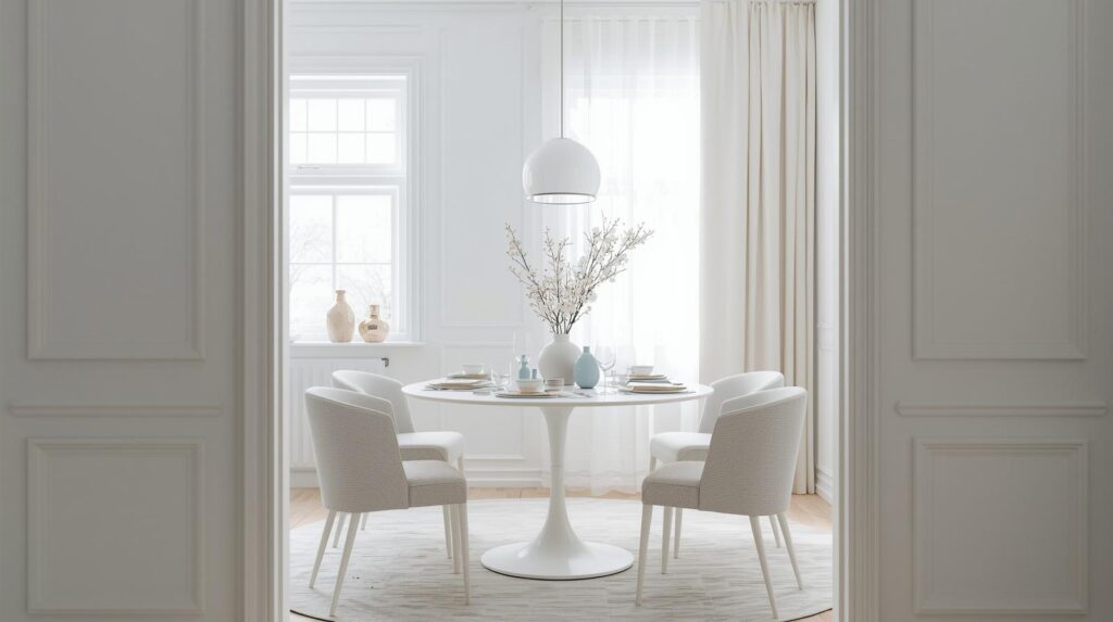
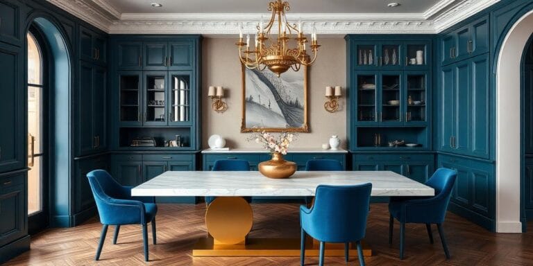
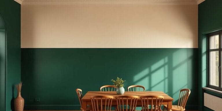
Colour drenching means painting the walls, ceiling, trim, and even the doors the same colour in different sheens. In a small dining room, this technique eliminates the visual boundaries that tell the brain where the walls stop and the ceiling starts. The room reads as a continuous volume, and the lack of contrast at the corners makes the actual dimensions feel ambiguous.
Sheen Strategy for Depth Without Contrast
Paint the walls in matte, the trim in satin, and the ceiling in a flat version of the identical colour. The subtle sheen differences create just enough light play to prevent the room from feeling like a velvet jewellery box, unless that is the goal. The trim catches light slightly and gives the room its edges without announcing them loudly. If the room has crown moulding, painting it the wall colour rather than white keeps the ceiling from visually lowering.
Colour Choices That Absorb Rather Than Reflect
Mid-tone colours work best for drenching. Too light and the technique reads as timid. Too dark and the room absorbs all the light and feels smaller rather than larger. A smoky blue, a dusty sage, or a warm plaster pink all have enough pigment to define the space while reflecting enough light to keep the room from closing in. The colour must be one you can tolerate on every surface, because the commitment is total. Test a large swatch on two walls before committing to the full room.
10. Clear the Floor of Everything but the Table and Seating
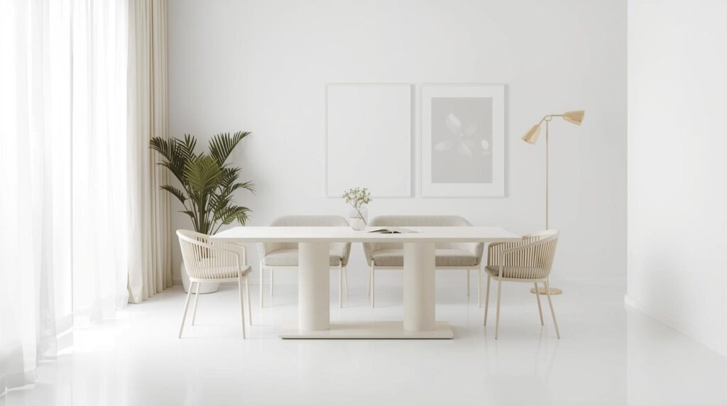
Small dining rooms attract furniture creep. A sideboard, a bar cart, a plant stand, a small console. Each piece arrives with good intentions, but together they fragment the floor plane into unusable slivers. The single most effective thing you can do for a small dining room is remove every piece of furniture that is not the table and the seating. The floor opens up, and the room breathes.
Wall Storage as Floor Liberation
If you need storage for serving pieces, mount a narrow floating shelf or a shallow wall cabinet at eye level or higher. Keeping the storage off the floor preserves the unbroken floor plane, which is the single biggest contributor to a sense of spaciousness. The shelf should be no deeper than ten inches to avoid head clearance issues when people stand near the wall. Paint it the wall colour so it recedes.
The Rug Question Resolved
A rug under the dining table can anchor the zone, but in a very small room it can also cut the floor into competing shapes. If you use a rug, it must be large enough that the chairs remain on it even when pulled out. A rug that is too small becomes an island that the chairs fall off of every time someone sits down, which creates visual chaos. In rooms under one hundred square feet, skipping the rug entirely and letting the floor run wall to wall often looks cleaner and feels more expansive.
Wrap Up
Small dining rooms reward decisiveness. The ten approaches above share a common thread. They remove visual obstacles rather than adding clever storage or decorative distractions. Pick the ones that address your room’s specific proportions. A narrow rectangle needs different interventions than a tight square. Once you commit to three or four changes, stop. Overworking a small room is the fastest way to make it feel smaller than when you started.
FAQs
How small is too small for a dining room?
A room measuring roughly seven feet by seven feet can still function as a dining space if you choose a round table under forty inches and use bench or banquette seating against at least one wall. Below those dimensions, a drop-leaf or wall-mounted folding table that tucks away between meals works better than a permanent setup.
Does dark paint really work in a small dining room?
Dark paint works when you apply it to all surfaces, including the ceiling, and provide layered artificial lighting from multiple sources at different heights. The darkness blurs the corners and makes the room’s boundaries recede in low light, which can feel more expansive than a pale room with harsh shadow lines at every junction.
What shape table is best for a long narrow dining room?
An oval or a rectangular table with rounded corners suits a long narrow room better than a sharp-edged rectangle. The rounded ends soften the circulation path at each end of the table and prevent the room from feeling like a bowling alley with chairs.
Disclaimer:
The content shared by Fall Rugs is solely for research and informational purposes. Fall Rugs is not a professional interior design or home renovation consultancy, and the information provided should not be considered professional advice for home improvement or decor. All ideas and suggestions are based on current trends and general knowledge in the home decor industry.