TL;DR
Blue palettes bring immediate calm and sophisticated structure to dining spaces when balanced with the right wood tones. Success relies on matching the paint undertone to your natural light source and anchoring the space with high-contrast furniture. Combining rich tones with brass accents ensures the room feels inviting rather than chilly during evening meals.
Introduction
Why do so many homeowners struggle to make their dining spaces feel both elegant and cozy? The answer often lies in color selection, where neutral shades can sometimes feel uninspired or flat. Introducing cool blue tones provides a brilliant solution by adding depth while keeping the room feeling airy and clean. This article examines practical design setups, specific paint swatches, and furniture layouts that will change how you look at your dining area.
Deep Ocean Tones and Classic Coastal Styles
Using deep blue shades can anchor a dining room, making large spaces feel intimate and small spaces feel intentional. Many people worry that dark colors will make a room feel like a cave, but the secret lies in balance. By pairing deep blues with natural materials, you create a space that feels grounded and welcoming for guests during evening dinner parties.
Consider how natural light enters the room throughout the day before committing to a dark palette. West-facing rooms handle deep blues beautifully because the warm afternoon sun counters the cool undertones of the paint. If your room faces north, choose a blue with a hint of red or purple to keep the atmosphere from looking gloomy in the morning.
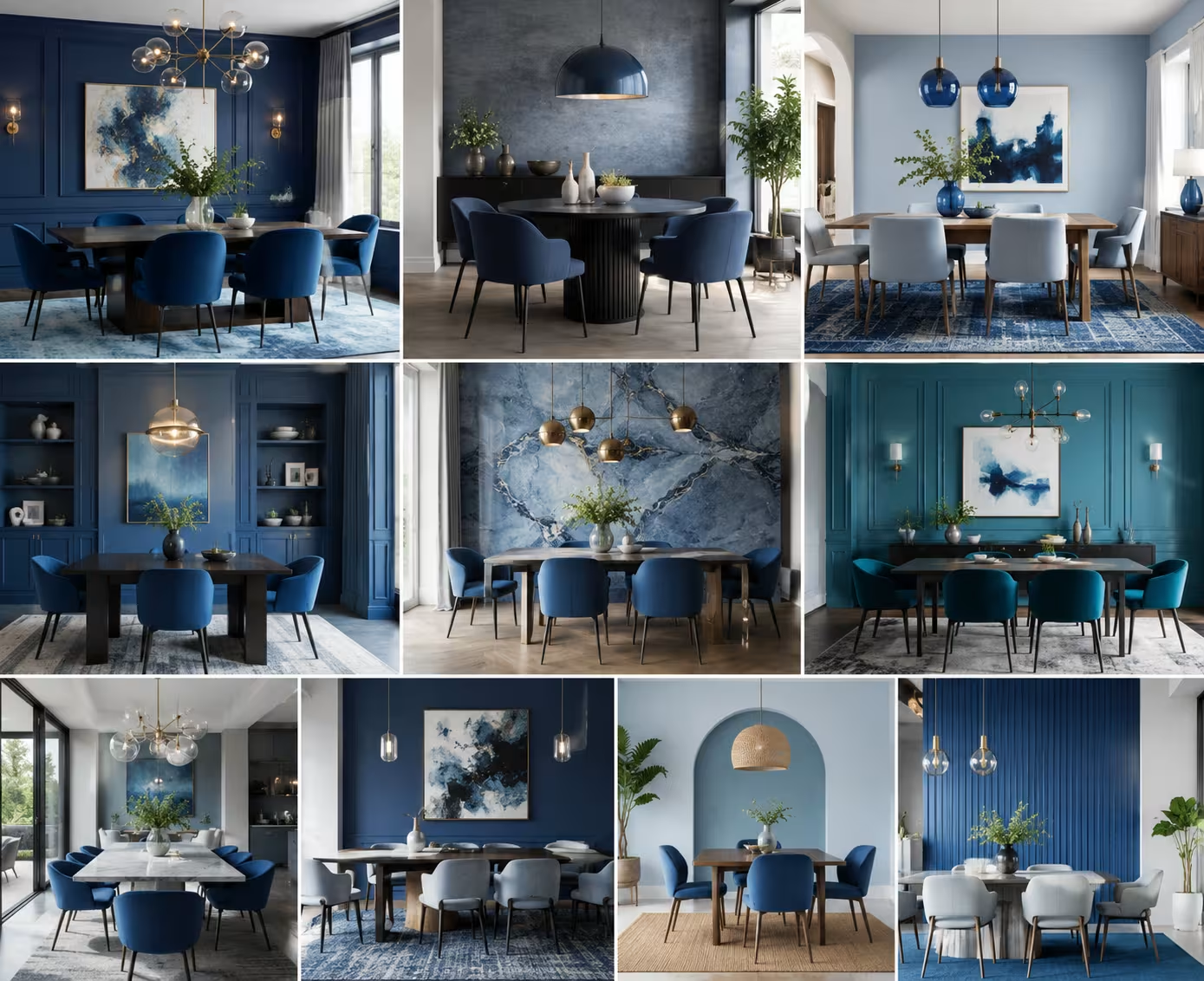
1. Navy Blue Walls with Natural Oak Furniture
A classic approach involves applying a rich navy paint to all four walls of the dining room. Homeowners often select Sherwin-Williams Naval or Benjamin Moore Hale Navy for this specific look because these tones retain their blue identity even under dim evening light. A client in Seattle used this setup in a 12 by 14 foot room, finding that the dark walls created a striking backdrop for family photos.
The deep walls require a stark contrast to keep the room from feeling heavy. Introducing a solid white oak dining table, such as the Pottery Barn Sausalito collection, breaks up the dark vertical surfaces. The light honey tones of the oak bring out the hidden warmth in the navy paint, creating a balanced visual environment.
- Apply two coats of flat navy paint to hide minor drywall imperfections.
- Position a light oak wood table in the center to reflect overhead light.
- Install a matte black chandelier with exposed frosted bulbs for modern contrast.
2. Pale Blue Coastal Textures with Linen Elements
If dark walls feel too intimidating, pale blue shades offer a breezy alternative that mimics the seaside. Farrow & Ball Borrowed Light is a popular choice for achieving this airy look without making the space look like a child’s nursery. This specific shade contains a significant amount of grey, which keeps the color sophisticated and adaptable to changing light.
A historic beach house project in Maine utilized this light palette to maximize the view of the ocean. The designer paired the soft walls with West Elm linen-wrapped dining chairs in an ivory shade. The woven texture of the linen absorbs harsh light reflections, creating a soft glow throughout the room during daytime gatherings.
- Select a soft blue with strong grey undertones to maintain an adult aesthetic.
- Hang floor-length ivory linen drapes two inches above the floor frame.
- Add a braided jute rug to introduce earthy texture under the table.
3. Cobalt Blue Accents on Velvet Dining Chairs
Sometimes the best way to introduce blue is through furniture rather than paint. Keeping the walls a neutral cream shade, such as Benjamin Moore Swiss Coffee, allows you to experiment with high-saturation accent pieces. Cobalt blue is a bold choice that injects immediate energy into an otherwise quiet or traditional architecture.
An apartment renovation in Chicago successfully used this strategy by placing four cobalt velvet chairs around a clear glass table. The velvet material catches light along its pile, giving the cobalt hue a multi-dimensional appearance that changes as you walk around the room. It provides a contemporary edge that looks sharp against dark stained hardwood floors.
- Keep the walls bright white or pale cream to let the chairs stand out.
- Choose a clear glass or white marble table surface to maximize visibility.
- Use a brass bar cart nearby to complement the vivid blue fabric.
Contemporary and Minimalist Blue Layouts
Modern homes often benefit from clean lines and unexpected color applications. Minimalist design does not mean you are limited to white and grey. Cool blues can act as a neutral base when you select shades with flat finishes and minimal green undertones, allowing you to create a space that feels highly curated and clutter-free.
When working with modern layouts, focus on the geometry of the room. Large windows, concrete floors, and exposed brick all interact differently with blue pigments. The goal is to use the color to highlight architectural strengths while softening the coldness often associated with industrial building materials.
4. Monochromatic Slate Blue from Floor to Ceiling
Color drenching is a modern technique where you paint the walls, baseboards, window trim, and even the ceiling the same color. Choosing a slate blue like Sherwin-Williams Blustery Sky for this technique eliminates visual boundaries. This lack of contrast tricks the eye into seeing a larger room, making it excellent for compact dining nooks.
A family in Boston applied this approach to their formal dining space with great success. They coated the traditional crown molding and the ceiling in the same matte slate finish, which gave the room a cozy, cocoon-like feeling. They completed the look with a mid-century walnut table that contrasted beautifully with the cool walls.
- Use eggshell finish on walls and semi-gloss on trim for subtle texture shifts.
- Install dimmable recessed LED lights to control the evening mood easily.
- Hang large-scale monochrome artwork with thick white matting to break up the color.
5. Electric Blue Lighting Fixtures and Modern Art
For those who prefer white walls, a single statement piece can deliver the cool blue aesthetic without a paint brush. Electric blue is an attention-grabbing shade that works best in small, deliberate doses. Think of it as a punctuation mark in a sentence; too many will ruin the flow, but one is perfect.
A design project in Austin featured a minimalist dining room with stark white walls and a simple IKEA Mockelby oak table. The designer suspended a custom hand-blown electric blue glass pendant light directly over the center of the table. This single pop of color defined the entire eating area within the open-concept home.
- Select cool-toned white paint for the main walls to prevent color clashing.
- Hang the primary lighting fixture exactly 32 inches above the tabletop surface.
- Incorporate abstract canvas paintings that feature high-saturation blue brushstrokes.
6. Duck Egg Blue Cabinets for Subtle Contrast
Incorporating blue into built-in cabinetry or free-standing hutches offers a farmhouse twist on modern dining. Duck egg blue is a soft hue with green and grey undertones that feels both historic and fresh. Magnolia Home Emmie’s Room is a reliable paint option for achieving this specific country-modern balance.
A suburban home renovation featured a full wall of built-in cabinets painted in this gentle blue tone. The homeowner displayed white ironstone dishes and vintage silver platters behind the glass doors. The soft blue backing made the white ceramic collection pop, turning everyday storage into the main design feature of the room.
- Sand all cabinet surfaces thoroughly before applying a durable satin finish paint.
- Install brushed nickel or pewter handles for a clean and timeless look.
- Keep surrounding wall surfaces a soft cream to avoid a cold atmosphere.
Historic and Sophisticated Blue Themes
Classic architecture handles blue paint exceptionally well because the color has a long history in traditional design. From Victorian dining rooms to colonial estates, blue has signaled elegance for centuries. The key to using blue in a traditional setting is focusing on depth and pairing the paint with historical materials like brass, mahogany, and plaster.
When decorating a historic home, look at the existing woodwork. Dark mahogany, cherry wood, and walnut all require specific blue companions to look their best. Avoid bright electric shades in these settings and lean toward colors that contain hints of black, grey, or deep forest green.
7. Traditional Indigo Wainscoting with Brass Hardware
Wainscoting provides an excellent opportunity to experiment with two-tone walls. Painting the lower third of the room a deep indigo, like Farrow & Ball Stiffkey Blue, anchors the lower half of the space. The upper portion of the wall can then feature a crisp white paint or a delicate botanical wallpaper to maintain brightness.
An interior designer in Philadelphia used this technique in an 1890s colonial home to update the space without losing its character. They added unlacquered brass wall sconces directly onto the indigo wood paneling. Over time, the brass developed a beautiful patina that complemented the deep historic tones of the lower walls.
- Measure wainscoting to sit exactly 36 inches from the floorboard line.
- Mount solid brass hardware to introduce warm metallic reflections against the blue.
- Place a dark mahogany dining set to anchor the traditional aesthetic.
8. Teal Blue Mid-Century Modern Settings
Teal blue bridges the gap between blue and green, offering a rich option for mid-century modern enthusiasts. This shade pairs naturally with the warm orange and reddish undertones found in vintage teak and walnut furniture. A homeowner in Denver selected a deep teal paint for their dining room wall to showcase a 1960s credenza.
The combination of the teal background and the tapered legs of the mid-century furniture created a sophisticated retro vibe. Because teal can feel quite energetic, the homeowner balanced the room by using neutral grey wool upholstery on the dining chairs. This kept the focus on the wood grain and the wall color.
- Look for teal paints with strong green undertones to match warm wood grains.
- Position a vintage starburst clock on the main accent wall for period accuracy.
- Introduce geometric patterned pillows on a dining bench seat for comfort.
Textural and Transitional Blue Strategies
Transitional design allows you to mix elements from different eras, creating a home that feels assembled over time rather than bought from a single showroom. Blue acts as a wonderful unifying agent in transitional spaces because it can tie together a modern metal light fixture with a rustic wooden table.
Focus on textiles and floor coverings when implementing a transitional style. A rug or a set of curtains can introduce multiple shades of blue at once, allowing you to bridge the gap between light and dark elements in the room. This approach is highly flexible and easy to modify as your taste evolves over the years.
9. Periwinkle Blue Patterned Rugs as Room Anchors
Starting from the floor up is a reliable design strategy for busy households. A large patterned rug featuring periwinkle blue can anchor a dining set while hiding the inevitable crumbs and spills. For families with young children or pets, choosing a washable option like a Ruggable Kamran rug ensures long-term practicality.
A home in Atlanta utilized an 8 by 10 foot periwinkle rug under a simple birch wood dining table. The subtle purplish undertone of the periwinkle added a playful yet sophisticated element to the room. The washed pattern allowed the family to use the space daily without worrying about permanent stains or wear patterns.
- Ensure the rug extends at least 24 inches past the table edges for chair movement.
- Coordinate table linens or cloth napkins with the exact blue shade in the rug.
- Use light-colored wood furniture to keep the overall room atmosphere breezy.
10. Steel Blue Visual Elements in Open Plan Spaces
Open floor plans require careful color placement to define specific zones without building physical walls. Steel blue is an excellent zoning color because it has a neutral quality that does not clash with adjacent living room or kitchen spaces. It creates a visual boundary that tells guests where the kitchen ends and the dining room begins.
A modern townhouse renovation used a steel blue accent wall behind the dining table to separate it from the nearby white kitchen island. The cool blue wall held a floating black shelf displaying ceramic vases. This setup gave the dining area its own distinct identity while maintaining the open feel of the main floor layout.
- Apply steel blue paint only to the architectural features you want to highlight.
- Use open industrial metal shelving to maintain a clear line of sight.
- Select charcoal grey upholstery to tie the blue tones into the living room area.
Wrap Up
Selecting the right blue shade can completely alter the mood of your dining room, transforming it from a neglected space into the centerpiece of your home. Whether you choose a dramatic navy paint, a soft coastal sky tone, or a vibrant cobalt chair fabric, balance remains the key to design success. Pair your chosen blue with complementary wood textures, intentional lighting heights, and warm metallic accents to create an inviting environment. Trust your instinct, check your lighting conditions, and enjoy the decorating process.
FAQs Section
What trim color works best with dark navy dining room walls?
A crisp, clean white paint like Benjamin Moore Simply White provides an excellent contrast that frames dark navy walls beautifully. Alternatively, painting the trim the exact same navy shade in a semi-gloss finish creates a sleek, modern look.
How do I stop a blue dining room from feeling too cold and uninviting?
Incorporate warm natural elements such as white oak furniture, brass light fixtures, and woven jute rugs to balance the cool undertones of blue paint. Dimmable warm-toned LED bulbs also help create a cozy atmosphere during evening meals.
Can I use blue paint in a small dining room without making it look smaller?
Yes, light blues with grey undertones can make a small room feel larger by reflecting light and making the walls seem to recede. If you prefer dark blue, using the color-drenching technique across walls and ceilings eliminates hard lines, which also expands the perception of space.
Disclaimer
This content shared by Fall Rugs is solely for research and informational purposes. Fall Rugs is not a professional interior design or home renovation consultancy, and the information provided should not be considered professional advice for home improvement or decor. All ideas and suggestions are based on current trends and general knowledge in the home decor industry.