TL;DR
A kitchen archway works when it respects the structural rhythm of the house, not when it shouts for attention. The ten ideas ahead come from real remodeling floors, not mood boards. Soft radius plaster returns, flush drywall pockets, and deep cased openings age better than thin decorative mouldings. Proportion and material honesty beat ornament every single time.
Introduction
Does the curve soften the hallway or just shrink the sightline? That question has killed more renovation sketches than any budget spreadsheet ever did. An archway between a kitchen and a living zone is the architectural equivalent of a handshake, done well it connects two rooms with grace, done poorly it feels like a theme park prop.
After walking through dozens of remodeled homes where the arch was either the smartest line item or the first thing the next owner sledgehammered out, a clear pattern emerged. The designs that last share a quiet logic about sightlines, ceiling height, and material honesty. What follows pulls ten of those durable concepts into focus, each one road-tested in an actual house, with the scrapes and second tries that prove they belong. Dive into these archway ideas to find the right structural vocabulary for your space.
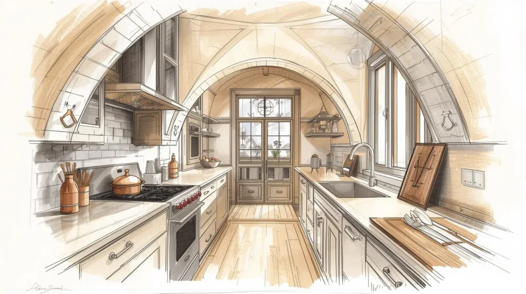
1. The Soft Radius Plaster Return
A family in a 1950s Austin ranch had a load-bearing wall separating their galley kitchen from a dark dining room. Their architect proposed removing the wall entirely, but the engineer balked at the steel beam cost. The compromise became a five-foot-wide opening with compound plaster curves at the corners, no casing, no tile edge, just a hand-troweled lime plaster return that wrapped the jamb like pulled taffy. The radius was generous enough that a shoulder never clipped it while carrying a Dutch oven.
Why the No-Casing Decision Matters
Framing carpenters often push for pre-hung arch kits with applied casings because the trim hides the gap between drywall and jamb. That convenience erases the sculptural quality that makes a plaster arch read as part of the wall, not a picture frame hung on it. A cased arch announces the doorway. A plastered arch dissolves the doorway. In the Austin project, the finisher spent three days floating compound into an eighteen-inch radius template, sanding between coats until the transition felt like one continuous surface. The absence of wood casing also removed a dust ledge, a small detail any cook values.
What the Plaster Arch Teaches About Light
A curved return catches side light differently at eight in the morning than at five in the afternoon, rolling a soft gradient across the wall. Flat jamb stock cannot produce that. Visitors in the Austin house instinctively stopped and touched the corner the first time they walked past. That tactile pull is what separates a considered arch from a standard drywall opening. Plaster cost ran about forty percent above painted drywall, but the owner saved on trim material and the ongoing maintenance of painted wood near a steamy cook zone.
2. The Deep Cased Arch With Integrated Shelving
An early-2000s Colonial in New Jersey had a wide but shallow pass-through between the kitchen and family room. The opening felt flimsy because the wall was only four and a half inches thick, standard interior partition depth. The designer stole twelve inches from a rarely used pantry behind the wall and built a deep cased arch with recessed birch ply shelves facing both rooms.
Structural Depth Over Decoration
Doubling the jamb depth to nine inches transformed the arch from a hole in drywall into a piece of cabinetry-scale architecture. The shelves hold cookbooks on the kitchen side and a small pottery collection on the family room side, objects that absorb sound and break the line of sight just enough to define two rooms without closing them off. Shallow openings read as leftover space. Deep openings read as intentional thresholds. The millworker used rift-sawn white oak for the arched header and vertical jambs, clear-coated to stay pale under warm LED tape tucked into the top reveal. That reveal, a quarter-inch shadow gap, keeps the light source invisible while washing the book spines.
Avoiding the Weight Trap
Deep arches can turn top-heavy fast. On this project, the header height stopped six inches below the ceiling plane, leaving enough drywall above to anchor the opening visually. An arch that kisses the ceiling reads like a tunnel, fine for a wine cellar, oppressive near a breakfast nook. The reveal at the top also gave the crown moulding somewhere to die into the wall without colliding with the curve, a junction that trips up otherwise competent trim carpenters.
3. The Flush Drywall Pocket Arch
A Seattle bungalow from 1942 had a cramped kitchen separated from the dining room by a swinging door. The owner wanted the door gone but did not want a cavernous open-plan feel that would let every clatter of pans reach the dinner table. The solution was a flush pocket arch, essentially a wide opening with the sides pushed deep enough to house a sliding pocket door that disappears entirely into the wall cavity.
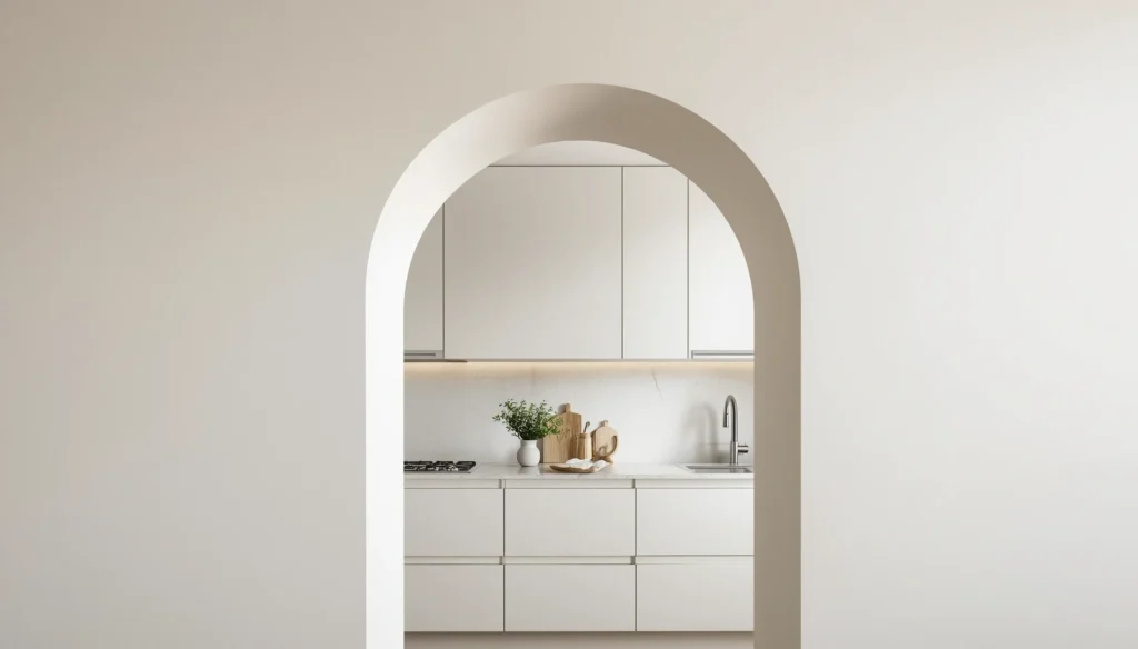
Concealment as a Design Tool
When the pocket door sits fully open, the arch reads as a clean contemporary opening with square-set drywall returns, painted the same matte white as the walls. Zero trim, zero hardware visible. When a dinner party needs acoustic separation, the door slides out from its hidden pocket on a soft-close track, a slab of painted MDF with a recessed finger pull. The arch becomes two spaces in one: a wide-open gallery most days, a discreet partition on demand. The carpenter who framed it cursed the precision required, the header needed steel reinforcement because the wall was structural, but the homeowner swears it was the best money spent in the entire remodel.
Track Hardware That Disappears
Ceiling-mount track systems have improved enormously. The Seattle house used a top-hung roller assembly with a machined aluminum track recessed into the header before the drywall went up. No floor track, no raised threshold to stub a toe. The door slab itself got three coats of high-build primer, sanded to 320-grit between coats, to match the orange-peel texture of the surrounding walls exactly. When shut, the only giveaway is the vertical hairline seam and the faint metallic click of the soft-close engaging.
4. The Steel and Glass Transom Arch
A loft conversion in a former Chicago printing plant had a common problem, the kitchen got zero natural light. A ten-foot-high brick wall separated it from the living area where enormous steel-sash windows faced south. Cutting a standard doorway would have felt timid given the industrial ceiling height. The architect instead designed a steel-frame arch with clear tempered glass panels set above head height, running the full width of the wall.
Borrowing Light Without Borrowing Noise
Glass transoms above doors are a Victorian trick, but scaling the arch to an eight-foot width and fabricating the frame from two-inch blackened steel channel updated the idea for a modern industrial shell. Light pours through the glass upper section all day while the solid lower wall blocks the visual clutter of the kitchen counter. The division between transparent and opaque happens at fifty-seven inches from the floor, above the eyeline of someone seated in the living room but below the standing sightline. Someone washing dishes sees the brick wall; someone standing in the living area sees the upper cabinets and the pendant lights glowing through glass.
The Steel Patina Question
Raw steel will flash-rust in a humid kitchen. The Chicago fabricator applied a hot beeswax finish while the metal was still warm, a low-VOC method that seals without plastic coatings. Three years in, the steel has developed a matte graphite bloom with faint rust speckling near the cooktop, exactly the living finish the owner wanted. Powder coating would have been cheaper and more predictable, but the waxed raw steel ties the arch to the original factory windows, which have aged the same way.
5. The Arch-Front Pantry Wall
A 1920s Tudor in Minneapolis had a butler’s pantry hallway running parallel to the kitchen, separated by a wall with a single swinging door. Demolishing the wall completely would have sacrificed the pantry storage. The designer kept the wall and cut three arch openings into it, each four feet wide, framing the shelves behind as a kind of open pantry display.

Three Arches as a Unified Composition
Repeating an arch motif across a wall gives it a rhythm that a single opening cannot. The central arch stays open as a passage, while the two flanking arches frame floor-to-ceiling oak shelves stocked with dry goods in glass jars and white ceramic serving bowls. A trio of arches reads as architecture. A single arch risks reading as a stage prop. The proportions followed a simple rule: each arch width equals exactly half its height to the spring point. That ratio, borrowed from Roman aqueduct proportions, keeps the shape from looking squashed or stretched.
Spillover Storage and Sightlines
The open shelving exposes the pantry’s contents, which forces a certain discipline. No cardboard packaging, no mismatched plastic. That constraint, which sounded fussy during the design phase, turned out to be the feature the family appreciated most. The pantry stayed organized because it was always on display. LED strip lighting tucked into the underside of each shelf made the jars glow at night, a gentle nightlight visible from the adjacent family room through the arches.
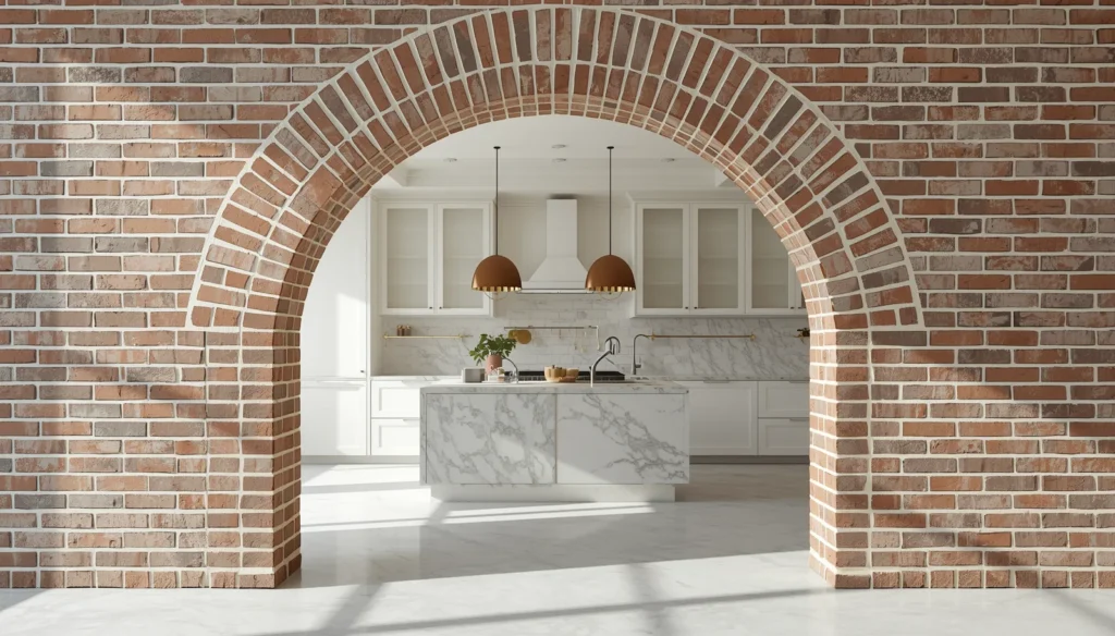
6. The Brick Arch Opening With a Soot Finish
A farmhouse kitchen in upstate New York had an existing brick arch between the cooking hearth and the keeping room, original to the 1860s structure. Generations of whitewash and latex paint had turned the brick into a lumpy, toothpaste-colored mess. The owner spent three weekends with a soda blaster, stripping every layer back to raw clay-fired face brick, then applied a traditional German schmear of thinned lime mortar.
Why the Schmear Works Better Than Paint
Lime mortar schmear, a slurry of lime putty, fine sand, and water, soaks into the brick pores and bonds at a crystalline level. Paint sits on top and traps moisture. In a kitchen where wood-burning heat and steam from stockpots cycle daily, breathability keeps the mortar joints from spalling. The schmear also leaves the brick’s natural color variation visible, a range from deep oxblood to pale salmon that no tinted paint can replicate. The arch feels found, not fabricated, and that authenticity carries a specific kind of curb appeal that faux finishes never achieve.
The Curve That Predates Modern Framing
Original field-built brick arches are never perfect radial curves. This one had a slight asymmetry, the right spring point sat an inch higher than the left, and the keystone had settled over 150 years. The contractor wanted to grind it flat. The owner refused. That slight irregularity is what tells you a human being laid those bricks before electric light existed. New brick arch kits from the home center look sterile by comparison because they lack exactly that wabi-sabi imperfection.
7. The Rounded Opening With Corbelled Brick Sides
A 1970s split-level in Salt Lake City had a dark galley kitchen separated from the dining area by a wall with a rectangle cutout, a classic mid-grade builder move. The owner wanted texture and warmth without drywall demo. A mason laid thin brick veneer in a running bond on both sides of the opening and corbelled the brick edges outward in four gradual steps to create an arched profile without any curved brick cutting.
The Corbelling Trick for DIY Budgets
Cutting curved brick segments requires a wet saw, skill, and time. Corbelling uses standard rectangular brick but projects each course slightly farther into the opening, creating a stepped arch that reads as curved from a few feet away. It is a Medieval stonemason’s shortcut that still works beautifully. The Salt Lake City mason charged half what a radius-cut arch would have cost because every piece was standard shape. The trick is keeping the corbel overhang consistent, three-eighths of an inch per course, and stopping the projection before it looks precarious.
Grout Color as a Design Decision
The mortar used was a warm buff tone, not bright white. White grout against red brick screams “1970s shopping mall.” Buff or natural gray grout recedes and lets the brick carry the visual weight. The homeowner sealed the finished arch with a matte penetrating sealer to keep cooking grease from staining the porous clay, a maintenance step that takes fifteen minutes once a year with a foam brush.
8. The Barrel-Vault Arch for a Galley Kitchen
A narrow galley kitchen in a San Francisco Victorian measured only seven feet across but had ten-foot ceilings. The vertical space felt wasted. A general contractor framed a segmented barrel-vault ceiling that ran the entire length of the galley, terminating at each end in a matching arch opening into the front parlor and rear mudroom. The vault lifted the eye upward and made the narrowness feel intentional, like a chapel.
Framing a Segmented Arch Without CNC Equipment
Old-world barrel vaults were built over elaborate wooden centering forms, but this contractor used a different method. He cut identical plywood arch segments on a bandsaw using a master template, then sistered them to ceiling joists at sixteen-inch centers. Flexible drywall, the half-inch high-density type designed for curved surfaces, was screwed into the ribs and finished with a skim coat of joint compound. The result is a continuous plaster tunnel that transforms a tight corridor kitchen into the most memorable room in the house. Material cost was modest, the labor cost was not, because curved drywall finishing demands a patient hand.
Lighting the Vault Correctly
Recessed cans in a barrel vault scatter light in ugly hot spots. The San Francisco project used a continuous LED channel hidden behind a shallow cove at the spring point, where the curve meets the vertical wall. The light grazes the vault surface from end to end, amplifying the curve’s depth and eliminating shadows on the countertops. Dimmers set to twenty percent at night make the kitchen visible from the parlor without glare.
9. The Arch Window Between Kitchen and Stairwell
A developer-renovated townhouse in Boston had a stairwell running behind the kitchen, separated by a solid wall. That wall blocked the only source of cross-ventilation and made the stair landing feel like a cave. The architect cut a large arch opening and filled it with fixed steel-mullioned glass, a window that is not a window, between the kitchen and the stairwell.
Interior Windows as Borrowed Views
Looking through the arch, a person in the kitchen sees the stairwell’s gallery wall of framed family photographs. A person on the stairs sees the soft glow of pendants above the island. The glass preserves acoustic privacy, the kitchen fan’s hum does not reach the bedrooms, while letting borrowed light and borrowed views flow in both directions. The steel mullions, slender T-sections painted matte black, match the stair railing and create a visual rhyme that ties the two spaces together across floors.
The Sill Height Question
The bottom of the glass sits at forty-two inches from the kitchen floor, high enough that a countertop backsplash continues uninterrupted but low enough that a child on the stairs can peer through. That sightline consideration gets overlooked often. A sill too low exposes kitchen clutter to the stairwell. A sill too high loses the point of the window. Forty-two inches, the standard counter height, solves both problems neatly.
10. The Curved Arched Cased Opening in Monochrome
A contemporary house in Portland wanted a clean, graphic arch between the kitchen and a sunken living room. No brick, no plaster, no glass. Just a sharply defined opening with a two-inch-wide flat-stock MDF casing, all painted in the same satin black as the window frames throughout the ground floor. The monochrome treatment turned the arch into a bold line drawing. It’s a perfect companion for dark grey kitchens where contrast defines the space.
When Paint Color Is the Architecture
Painting an arch, the wall, and the trim the same dark color erases the distinction between surface and frame. The shape becomes the statement, not the material. In the Portland house, the black arch framed the white kitchen beyond like a camera viewfinder, pulling the eye through the opening with an almost cinematic focus. A white arch in a white wall can disappear under flat light. A dark arch never apologizes for being there. The risk is that dark paint shows drywall imperfections ruthlessly. The finisher spent a full day sanding the curve to a level-five finish before the paint crew arrived.
Sheen Choice and Wear Patterns
Flat black paint would show every fingerprint near the jambs where hands naturally touch. The Portland designer chose a scuff-resistant matte enamel, essentially a low-sheen formula with a dense resin binder. After two years of heavy family use, the arch still looks fresh. The wipe-down is a damp microfiber cloth once a week, less work than the raw plaster arch in Austin but more intentional than standard eggshell wall paint. If you are planning a similar renovation, exploring various modern ideas can help you lock in the perfect aesthetic before the first drywall cut.
Wrap Up
A kitchen archway turns a threshold into a moment. The ten variations here share a common thread, none of them rely on applied decoration to carry the weight. Whether the choice is a hand-troweled plaster return, a deep cased shelf system, or a dark graphic outline, the thing that makes the arch work is proportion and material integrity. Pick the version that matches your house’s structural vocabulary, perhaps drawing inspiration from grey kitchen designs, and spend money on the finishing labor, because that is where the mistakes announce themselves first.
FAQs
Do kitchen archways feel dated in a modern home?
Square-set drywall arches and soft radius plaster returns read as contemporary when they avoid applied mouldings and ornamental keystones. The shape itself is timeless; the trim choices around it date the opening. For inspiration, checking out modern designs will show you how to execute this look seamlessly.
What is the smallest width a kitchen archway can be and still feel right?
A minimum of thirty-six inches works for a tight passage, but forty-two to forty-eight inches feels generous without requiring structural header changes. Proportionality to ceiling height matters more than absolute width.
Can I cut an arch into an existing wall without structural work?
If the wall is non-load-bearing, yes. A carpenter can frame a curved opening in a day. If the wall carries load from above, a structural engineer must size a header, and the cost jumps significantly, but the result follows the same design principles.
Disclaimer:
The content shared by Fall Rugs is solely for research and informational purposes. Fall Rugs is not a professional interior design or home renovation consultancy, and the information provided should not be considered professional advice for home improvement or decor. All ideas and suggestions are based on current trends and general knowledge in the home decor industry.