TL;DR
Geometric wall art works in modern interiors because it brings structure, rhythm, and visual order without needing heavy decoration. The strongest rooms use scale, color, spacing, and material contrast with intent. Good placement matters as much as the artwork itself.
Introduction
Can a single print change the way a room feels? In many modern interiors, yes. Geometric wall art gives blank walls a sense of architecture, especially in rooms built around clean furniture, neutral rugs, glass, metal, or pale wood. This article explains how geometric art works, where it fits, and why some pieces feel refined while others look random or forced.
Why Geometric Wall Art Belongs in Modern Interiors
Modern interiors often rely on restraint, which can leave a room looking unfinished if the wall decor feels too soft or too busy. Geometric wall art solves that gap by adding shape, contrast, and direction. A circle can soften sharp furniture. A grid can calm visual noise. A diagonal composition can bring energy to a plain wall.
The appeal isn’t new. The Bauhaus school, founded in Weimar in 1919 by Walter Gropius, treated simple forms as serious design language. De Stijl artists in the Netherlands, including Piet Mondrian, pushed rectangles, primary colors, and asymmetry into a visual system. Modern homes still borrow from those ideas, even through mass-market prints from IKEA, West Elm, CB2, and independent studios.
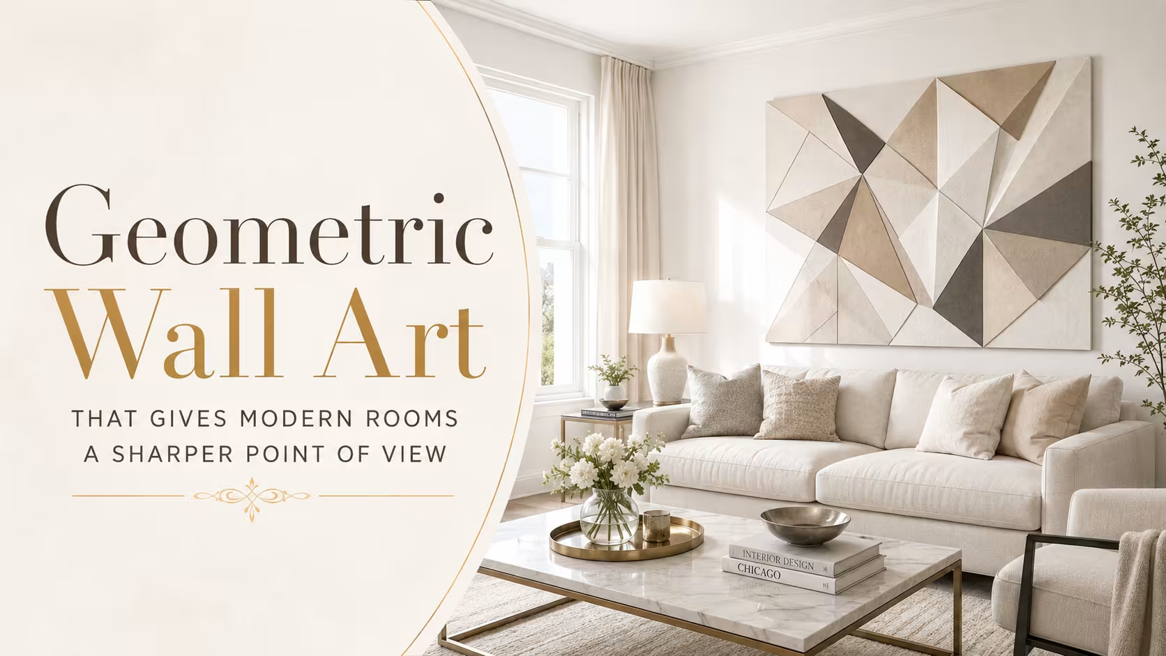
A well-chosen geometric piece can act like a room’s visual anchor. In a living room with a beige sectional, a low oak table, and a textured rug, art with black lines and muted terracotta shapes can pull separate elements together. Without that anchor, the same room may look pleasant but flat.
The Design Language Behind Lines, Shapes, and Pattern
Geometry works because the eye reads shape before it reads detail. Squares feel stable, circles feel calm, triangles feel active, and repeating lines create rhythm. Interior designers often use these cues without saying so directly. A round mirror, a checkerboard rug, a fluted cabinet, and a geometric print all speak the same visual language.
Pattern also affects mood. Large blocks of color tend to feel confident and architectural. Thin-line drawings feel lighter and more editorial. Repeated diamonds or arches can suggest Moroccan tile, Art Deco lobbies, or mid-century textiles, depending on color and spacing. A small change in proportion can shift the mood from playful to formal.
The mistake I’ve seen often in styling work is choosing a geometric print only because it matches a cushion. That approach can work for a quick refresh, but it rarely creates depth. Stronger rooms repeat an idea, not just a color. A curved artwork above an arched floor lamp feels more intentional than a print chosen only for its beige background.
Choosing Scale Before Choosing Color
Scale decides whether art feels designed or accidental. A tiny geometric print above a large sofa can look stranded, even if the colors are perfect. A canvas that spans roughly two-thirds the width of the furniture below it usually feels more balanced. The same principle applies over beds, consoles, dining benches, and office desks.
Large geometric art often suits modern interiors because contemporary furniture tends to have broad surfaces and clean silhouettes. A single oversized canvas can look calmer than six small frames fighting for attention. In open-plan apartments, large art can also define zones, especially near a dining table or reading corner.
Small Prints Need Stronger Grouping
Small geometric prints can still work beautifully, but they need structure. A pair of framed line prints above nightstands creates symmetry. A three-piece set in a hallway can create movement. A tight gallery wall above a console can feel curated if the spacing stays consistent and the frames share a finish.
Spacing matters more than many homeowners expect. I once reviewed a compact apartment where the client had placed four abstract prints too far apart over a sofa. Each piece looked lonely. Moving them closer, aligning the top edges, and leaving more wall space around the group made the same affordable prints look gallery-ready.
Color Strategy for Geometric Prints and Canvas Art
Color gives geometric art its emotional temperature. Black and white pieces work well in minimalist interiors because they add contrast without adding visual clutter. Earthy palettes, such as clay, sand, olive, rust, and charcoal, suit warm modern rooms with wood furniture and woven rugs. Brighter palettes can work, but they need discipline.
Color should connect with the room without copying it too literally. A navy shape in the artwork can relate to a ceramic vase across the room. A muted green block can echo plants near a window. A cream background can soften black metal shelving. These relationships feel natural because the eye catches them quietly.
Strong color becomes risky when every decor item tries to match the artwork. That creates a showroom effect rather than a lived-in interior. Better results come from choosing one dominant color, one supporting tone, and one neutral bridge. This keeps the wall art connected while letting the room breathe.
Material and Frame Choices Change the Whole Mood
A geometric poster in a thin black frame feels crisp and urban. The same design printed on canvas feels softer and more casual. A raised wood relief panel feels more sculptural, while metal wall art can add a sharper architectural tone. Material choice shapes the message before the viewer studies the pattern.
Frames deserve more attention than they usually get. Oak frames pair well with Scandinavian furniture, jute rugs, and white walls. Black frames suit industrial shelving, leather seating, and high-contrast spaces. Brass or champagne frames can warm up Art Deco-inspired rooms with velvet chairs, marble tables, and curved lighting.
Glare can weaken even a strong piece. In rooms with large windows, matte paper, canvas, or textured panels often perform better than glossy prints. I’ve seen beautiful geometric posters lose impact because the glass reflected a ceiling fixture all evening. The fix was not a new artwork, but a non-glare acrylic frame and a slightly lower hanging height.
Room-by-Room Placement That Feels Natural
The living room usually carries the largest visual load, so geometric wall art can be more assertive there. Above a sofa, choose a horizontal composition or a balanced square piece with enough width. Near a fireplace, vertical art can strengthen the height of the wall. In rental homes, framed prints offer flexibility without permanent changes.
Bedrooms need a softer approach. Hard angles and high-contrast color can feel too energetic above a bed, especially in small rooms. Curved forms, muted palettes, and generous negative space create a calmer effect. A pair of abstract geometric prints above a headboard often works better than a loud single canvas.
Dining areas can handle bolder choices because people don’t spend all day staring at the wall. Graphic prints, Bauhaus-inspired forms, or Art Deco patterns can give the space a restaurant-like polish. In a home office, structured line art can create focus, especially behind a desk during video calls where the background needs polish without distraction.
Matching Geometric Art With Rugs, Furniture, and Lighting
Wall art should not compete with the rug. If a rug already has a strong chevron, diamond, or checkerboard pattern, the artwork may need larger, quieter shapes. If the rug is plain, the wall can carry more pattern. This balance matters because floors and walls frame the whole room together.
Furniture lines also guide the art choice. A sofa with blocky arms pairs well with softer circles or arches. A round dining table can look stronger with angular art behind it. A low platform bed can benefit from vertical forms that lift the wall. The aim is contrast with connection, not repetition without thought.
Lighting finishes the composition. Picture lights create a gallery effect, while track lighting can highlight texture on canvas or relief panels. Warm bulbs flatter earthy colors and wood frames. Cooler bulbs suit monochrome prints but can make terracotta, beige, and cream look dull. The wrong light can make expensive art look cheap.
Real Interior Scenarios That Show What Works
A small Lahore apartment renovation used a gray sofa, walnut media unit, cream floor rug, and one large abstract print with black arcs and clay-colored blocks. The room had no architectural detail, so the artwork supplied structure. The owner first tried three tiny prints, but they disappeared against the wall. One larger piece fixed the scale problem.
A second case came from a compact studio used for remote consulting work. The back wall looked empty on video calls, but a busy gallery wall felt distracting. The final choice was two framed geometric prints with thin black lines and muted green shapes. They gave the camera view order, while plants and a floor lamp softened the edges.
These examples point to a practical lesson. Geometric art rarely fails because the idea is wrong. It fails because scale, placement, or surrounding decor sends mixed signals. Once those parts align, even modest prints can look considered.
Common Mistakes That Make Geometric Wall Art Look Cheap
The most common mistake is buying art too small. Small art can work in pairs, corridors, shelves, and compact corners, but it often looks weak above major furniture. A room with a queen bed, a wide sofa, or a long dining cabinet needs art with enough visual weight.
Another mistake is using too many competing patterns. A striped cushion, tiled rug, graphic wallpaper, and geometric canvas can all be attractive alone. Together, they can feel restless. Modern interiors need breathing room, especially if the furniture already has strong shapes or the architecture includes panels, arches, or visible beams.
The third mistake is hanging art too high. A framed piece should connect to the furniture below it. Many galleries use eye-level hanging, but homes need a more relational approach. Above a sofa or console, the lower edge often feels better closer to the furniture than people first expect.
How to Build a Timeless Geometric Wall Art Collection
A lasting collection starts with pieces that connect to your actual home, not just a trend image. Look at the room’s fixed elements first: flooring, wall color, window frames, built-ins, and major furniture. Art should answer those conditions. A black-and-white print may suit a concrete loft, while warm abstract forms may suit a room with oak and wool.
Mixing sources makes a room feel more personal. A framed museum-style print, a local artist’s canvas, a handmade textile panel, and a simple line drawing can sit together if scale and palette agree. Geometric art doesn’t need to be expensive, but it should feel chosen rather than collected in one rushed shopping trip.
Trends will keep changing. Checkerboards, arches, line grids, Memphis-style color, and soft Bauhaus forms have all moved through modern decor cycles. The safest pieces have strong proportion, controlled color, and enough negative space. They can survive furniture changes because they rely on design logic, not novelty.
Wrap Up
Geometric wall art gives modern interiors structure, energy, and a clear design point of view. The strongest choices come from scale, color discipline, room context, and material quality rather than trend chasing. A good piece can connect furniture, rugs, lighting, and architecture into one calm visual story. Choose art that supports the room’s rhythm, not art that fights for attention.
FAQs Section
What is geometric wall art in interior design?
Geometric wall art uses shapes such as circles, squares, triangles, arches, grids, and lines to create visual structure. It suits modern interiors because it adds order, contrast, and pattern without heavy decoration.
Where should geometric wall art be placed in a modern living room?
The strongest placement is usually above a sofa, console, fireplace, or reading chair where the artwork can anchor a zone. The piece should relate to the furniture width and sit low enough to feel connected to the room.
Is geometric wall art still in style?
Yes, geometric wall art remains relevant because it connects with long-standing design movements such as Bauhaus, De Stijl, Art Deco, and mid-century modern design. The look feels current when the scale, palette, and frame suit the room.
Disclaimer
This content shared by Fall Rugs is solely for research and informational purposes. Fall Rugs is not a professional interior design or home renovation consultancy, and the information provided should not be considered professional advice for home improvement or decor. All ideas and suggestions are based on current trends and general knowledge in the home decor industry.