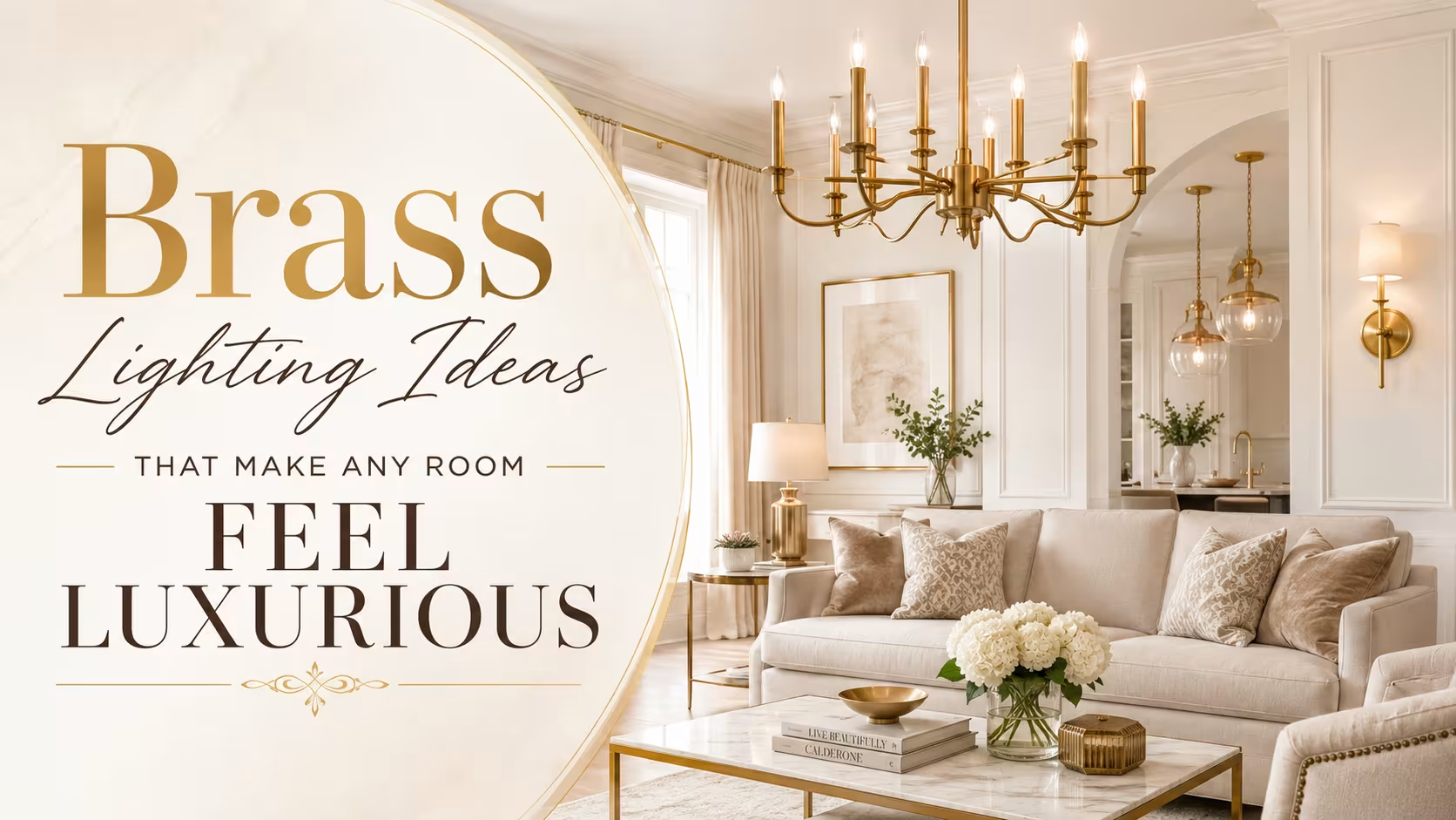
TL;DR
Brass lighting creates a warm, layered ambiance that few other finishes can replicate, partly because of how the metal interacts with light at different intensities. Mixing antique brass, brushed brass, and polished brass within one space adds depth rather than visual noise. The finish works across design styles, from Art Deco to Scandinavian minimalism, as long as the scale and placement are considered carefully.
Introduction
What makes a room feel genuinely luxurious rather than just expensive? Materials play a role, textiles matter, and scale counts for a lot, but nothing does the work quite as quietly or as reliably as brass lighting. There is a reason designers keep returning to it across decades and style movements: brass carries both warmth and authority in a way that chrome never quite manages and matte black can sometimes feel too stark to deliver.
This piece covers the full scope of using brass lighting in residential spaces, from understanding why the finish behaves the way it does, to specific fixture types, placement strategies, and the common pairing mistakes that make even expensive pieces feel off.
Why Brass Reads as Glamorous in the First Place
Glamour in interior design is largely a lighting phenomenon. A room bathed in cool, flat light reads as clinical regardless of the furniture inside it. Brass works because its warm golden undertones shift the color temperature of any light source passing through or reflecting off it, pulling ambient light into the 2700K–3000K range that the human eye associates with candlelight and firelight. That association is not accidental: brass fixtures were the dominant form of domestic lighting for centuries before electrification, and the visual memory runs deep.
When you place a polished brass chandelier above a dining table, the metal acts as a secondary light source through reflection. It bounces light across ceilings and walls in a way that creates the multi-directional, shadow-softening effect professional cinematographers replicate on set using bounce cards. This is the same principle that explains why a single brass pendant can make a kitchen island feel more considered than three recessed cans pointing straight down.
The finish type matters enormously here, and it is where a lot of first-time buyers make their first mistake. Polished brass has a mirror-like surface that throws reflections aggressively, which reads as formal and vintage-leaning. Brushed brass scatters light more softly, producing a contemporary matte warmth with almost no glare. Antique brass, with its intentional patina, absorbs more light than it reflects, and it reads as richly layered rather than bright, which is why it pairs so naturally with dark, moody color palettes.
Choosing the Right Brass Fixture for Each Room
Dining Rooms and the Case for a Statement Chandelier
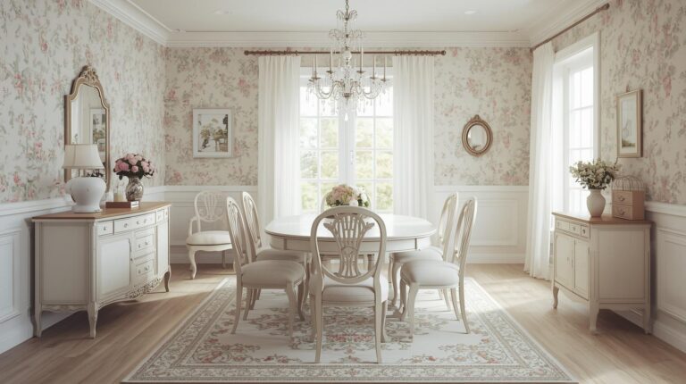
The dining room is where brass lighting earns its reputation most consistently, and the chandelier is the obvious anchor point. The rule that gets ignored most often: the fixture’s diameter in inches should roughly match the room’s diagonal measurement in feet. A 14-by-12-foot dining room has an 18-foot diagonal, so a chandelier between 18 and 22 inches across will sit in correct visual proportion. Going larger creates drama; going smaller creates awkwardness.
Marta, a homeowner in Philadelphia who renovated her 1920s Colonial townhouse, initially chose a 16-inch antique brass drum pendant for her 13-by-15-foot dining room. It looked timid above her dark walnut table. She replaced it with a 24-inch five-arm chandelier in aged brass, and the room’s proportion snapped into focus immediately. The fixture did not overpower the space; it anchored it. That shift in scale also allowed her to lower the pendant to 30 inches above the table surface, which created the intimate pool of light she had been trying to achieve with the smaller piece.
The hanging height matters as much as the diameter. In a room with 9-foot ceilings, a chandelier above a dining table should sit between 28 and 34 inches from the tabletop. Drop it lower and it interrupts sightlines across the table; hang it higher and the warmth dissipates before it reaches the surfaces and faces below.
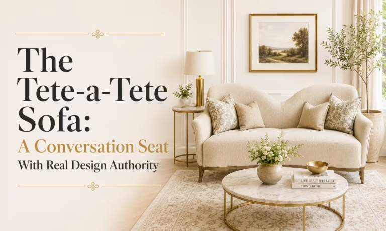
Living Rooms: Layering Without Looking Busy
A living room relies on layered brass lighting more than any other space because it serves the widest range of functions. Task lighting for reading, ambient light for conversation, and accent light for art or architectural details all need to coexist without competing. Brass works here because it reads as a neutral accent when the scale is right, functioning as a connective thread between other warm tones in the room rather than as a competing focal point.
The most reliable approach is to anchor the room with one larger piece, whether that is a brass floor lamp or a pair of antique brass table lamps flanking a sofa or fireplace, and then let smaller brass accents extend the palette. A brushed brass wall sconce beside a gallery wall or bookshelf pulls the eye without demanding it. The mistake is treating every brass piece as a statement piece, which produces a busy, almost theatrical effect rather than the quiet glamour most people are actually after.
One specific combination worth knowing: a polished brass arc floor lamp positioned over an upholstered reading chair, paired with a smaller antique brass table lamp on the opposite side of the room, creates a dialogue between the two finishes that reads as intentional curation rather than inconsistency. The key is that the finishes must share a similar undertone, specifically that warm yellow-gold range, rather than mixing cool champagne brass with warm antique brass.
Kitchens and the Power of the Pendant
Kitchen lighting tends to be treated purely as a practical matter, which is why so many kitchens feel utilitarian regardless of the quality of their cabinetry or countertops. Brass pendant lights over an island or peninsula are one of the fastest ways to change that perception. They introduce a decorative element that also performs a functional role, and because they sit low and close to a work surface, the warmth of the brass finish is immediately visible at eye level.
The standard guidance for pendant spacing over a kitchen island is one pendant for every two feet of island length, hung at the same height. For a six-foot island, three pendants work. For a four-foot island, two pendants at equal intervals. The pendants themselves should not be oversized: a globe pendant between 8 and 12 inches in diameter, in brushed or antique brass, will sit in proportion over most residential islands without reading as heavy.
Where people tend to go wrong is mixing brass pendants with stainless steel appliances and chrome cabinet hardware, then wondering why the look feels disjointed. The solution is not to eliminate the stainless; it is to add a few additional brass accents, a brass faucet, brass drawer pulls, or a brass range hood, so the pendants feel like part of a considered system rather than an afterthought.
Bathrooms: Where Antique Brass Shines Hardest
The bathroom is often the most overlooked room in lighting conversations, but it is also the space where antique brass fixtures tend to produce the most dramatic return on investment. A pair of antique brass vanity sconces flanking a mirror, rather than a single overhead bar light, creates an even, flattering light on faces because it eliminates the downward shadow that overhead-only lighting produces. That is the same logic behind the theatrical makeup mirror, and it translates directly to residential bathroom design.
Antique brass in bathrooms pairs particularly well with white marble, unlacquered surfaces, and aged ceramic tiles. The patina of the finish and the texture of aged materials share a visual quality that reads as curated and timeless rather than dated. James, an interior stylist working across projects in London and Edinburgh, consistently specifies antique brass fixtures for bathroom renovations because, in his words, they photograph better than any other finish in small, high-contrast spaces. The warmth of the metal prevents the tile and marble from reading as cold or sterile even under bright light.
Mixing Brass Finishes: The Rule That Changes Everything
One of the most widely repeated pieces of advice in interior design is to keep your metal finishes consistent. It is not wrong exactly, but it is incomplete. A room with only one brass finish can actually look less sophisticated than a room with two or three brass finishes handled well. The distinction is between tonal consistency and finish uniformity.
Tonal consistency means all your brass choices share the same yellow-gold warmth rather than mixing cool champagne brass with warm antique brass. Within that tonal family, mixing brushed and polished finishes, or antique and brushed, adds depth and suggests a space that has been collected over time rather than purchased as a package. The effect is closer to how brass actually exists in old houses, where pieces accumulate across decades and finishes shift with age and use.
The practical limit is three. More than three distinct brass finishes in a single room starts to read as chaotic rather than layered. Two finishes with a dominant and an accent is safer; three with a dominant, a secondary, and a small-scale accent is ambitious but achievable in larger rooms.
When Brass Does Not Work and How to Fix It
Brass fails when it fights the room’s color temperature rather than reinforcing it. In rooms with heavy cool gray tones, blue-gray walls, or a predominantly cool furniture palette, even the warmest brass fixture can look like an error rather than an accent. The metal needs some warmth in the broader palette to activate properly, whether that comes from warm-toned wood, cream or ivory textiles, terracotta or blush accents, or a wall color with yellow or red undertones.
Brass also fails at the wrong scale. A tiny antique brass wall sconce in a double-height entry hall disappears entirely. A massive brass chandelier in a low-ceilinged bedroom feels oppressive. Getting the scale right is not difficult if you measure the room and the fixture before committing, yet it is the single most common oversight in home lighting decisions.
The fix for a cold room that is resisting brass is not to abandon the finish but to adjust the surroundings before judging the fixture. Adding a warm-toned rug, switching out a cool-white light bulb for a 2700K warm white, or introducing a wood element nearby will often transform a brass piece from discordant to exactly right.
Wrap Up
Brass lighting works not because it is fashionable but because it is physically suited to producing warmth, depth, and visual interest across a wide range of room types and design styles. Choosing the right finish type for the context, sizing fixtures to the room rather than the catalog photo, and building a tonal system rather than matching every piece identically are the moves that separate a genuinely glamorous space from one that just has expensive fixtures. Start with one room, get the scale right, and let the rest follow from there.
FAQs
Does brass lighting go out of style?
Brass has cycled through periods of popularity since the 19th century and consistently returns to favor because its warm undertones work with how most people naturally light their homes. The finish itself does not date; the specific fixture silhouettes do, so choosing a classic or simple shape rather than a trend-driven form is the most reliable long-term decision.
What is the difference between antique brass and brushed brass?
Antique brass has a darkened, patinated finish that absorbs more light and reads as vintage or heritage-influenced. Brushed brass has a matte, satin surface without a patina that scatters light softly and reads as contemporary. Both share warm golden undertones, which is why they can coexist in the same space without clashing.
Can brass lighting work in a modern or minimalist home?
Yes. Brushed brass in particular sits comfortably within Scandinavian, Japanese-influenced, and contemporary minimalist interiors because its matte surface does not draw attention the way polished finishes do. The key is using fewer, simpler forms and letting the warmth of the finish do the work rather than relying on ornate fixture shapes.
Disclaimer
This content shared by Fall Rugs is solely for research and informational purposes. Fall Rugs is not a professional interior design or home renovation consultancy, and the information provided should not be considered professional advice for home improvement or decor. All ideas and suggestions are based on current trends and general knowledge in the home decor industry.