
TL;DR
A living room gallery wall works when the layout, frame style, color palette, and room scale feel connected. These seven numbered ideas give you practical ways to hang art, photos, prints, and meaningful objects today without making the wall look crowded.
Introduction
A blank living room wall can make even a furnished space feel unfinished. The good news is that a gallery wall does not need a designer budget, rare artwork, or weeks of planning. It needs a clear idea, a steady layout, and pieces that feel like they belong in the room.
The strongest living room gallery walls usually look collected rather than purchased in one afternoon. They mix proportion, memory, texture, and negative space in a way that feels natural. Once you understand the rhythm behind a good arrangement, you can build a wall that adds character without fighting your sofa, rug, lighting, or coffee table.
1. The Sofa-Centered Gallery Wall
A sofa-centered gallery wall is the most practical starting point because the furniture already gives the wall a visual anchor. The artwork should relate to the width of the sofa, not the full width of the wall. A layout that fills roughly two-thirds of the sofa width often feels balanced, especially in apartments, family rooms, and open-plan spaces where the seating area defines the room.
This idea works well with framed prints, family photos, abstract art, small sketches, and one slightly larger central piece. The center frame does not need to sit perfectly in the middle, but the whole arrangement should feel visually steady. When the gallery wall floats too high, the sofa and art disconnect. When it drops too low, the wall starts to feel cramped.
Why This Layout Feels Comfortable
The sofa-centered layout succeeds because the eye reads the sofa and wall decor as one composition. A low-backed sofa can handle taller frames, while a high-backed sofa often looks better with a wider, calmer arrangement. A neutral rug, soft cushions, and a few repeated frame tones can tie the whole seating zone together.
A homeowner in Lahore once refreshed a beige living room by keeping the sofa, rug, and curtains exactly as they were. The only change was a gallery wall above the sofa using black frames, two sepia family photographs, a small landscape print, and one textured fabric piece. The room felt warmer within an afternoon because the wall finally carried the same emotional weight as the furniture.
2. The Symmetrical Grid Gallery Wall
A symmetrical grid gives a living room a clean, editorial look. It works especially well in modern, transitional, Scandinavian, and minimal interiors where too much visual movement can feel distracting. The grid relies on equal frame sizes, even spacing, and a disciplined arrangement, so the final result feels intentional rather than busy.
This style suits black-and-white photography, botanical prints, architectural sketches, fashion illustrations, or soft abstract pieces. The frames should match or closely relate, because the grid itself creates the design statement. When every frame has the same size and spacing, the content can vary without making the wall feel messy.
Where a Grid Works Best
A grid works beautifully above a console table, behind an accent chair, or on a narrow living room wall that needs structure. It also suits renters because the layout is easy to measure and repeat. Painter’s tape can mark the outer rectangle before hanging, which gives the arrangement a clear boundary.
The second-order effect is subtle but real. A grid can make a casual living room feel more architectural. It adds order to rooms with layered textiles, open shelving, patterned rugs, or mixed furniture styles. The only time it fails is when the frames sit unevenly or the prints lack enough breathing room inside the mats.
3. The Family Photo Story Wall
A family photo wall can look refined when it avoids the crowded scrapbook effect. The trick is to edit the story before hanging anything. Choose photos with similar tones, related moments, or a shared emotional thread. A wall filled with every milestone can feel noisy, while a smaller collection with strong images feels personal and mature.
Black-and-white printing often gives family photos a calmer look, especially when images come from different years, phones, cameras, and lighting conditions. Warm wood frames suit traditional and cozy living rooms, while thin black or brass frames feel more modern. The goal is not perfection. The goal is visual harmony.
How to Keep It From Looking Random
The strongest family gallery walls use repetition. Repeat frame finishes, mat colors, photo orientation, or spacing. You can mix portrait and landscape images, but the outer shape of the arrangement should still feel controlled. A slightly imperfect inner rhythm feels human, while a chaotic outer edge can make the whole wall look accidental.
This style carries more feeling than a store-bought print set. It can show grandparents, children, travel memories, old homes, or small family rituals. Those details create a living room that guests remember because the decor belongs to the people who live there, not just to a trend cycle.
4. The Art-and-Object Gallery Wall
A gallery wall does not need to use only framed pieces. Small objects can add shadow, texture, and depth, especially in a living room that already has flat surfaces like a TV, large windows, and plain painted walls. Woven plates, ceramic plaques, small mirrors, textile fragments, carved wood, and shallow shelves can sit beside framed art without looking forced.
The object-based wall works best when the pieces share a material story. Natural fibers, aged brass, dark wood, clay, rattan, or linen can connect different items. Too many unrelated objects can make the wall feel like a flea market display, so restraint matters. A few strong pieces usually beat a wall full of small distractions.
The Role of Texture and Shadow
Texture changes how a gallery wall behaves throughout the day. A woven piece catches afternoon light differently than a flat print. A small mirror can reflect greenery, curtains, or lamp glow. A shallow shelf can hold a tiny vase or framed postcard, which gives the wall a layered quality.
This idea works especially well with fall rugs, jute rugs, wool throws, linen curtains, and earthy living room palettes. The wall becomes part of the room’s material language. It does not sit there as decoration alone. It interacts with the floor, furniture, and light.
5. The Corner Gallery Wall
Corners often get ignored, yet they can hold some of the most charming gallery wall arrangements. A corner layout wraps art across two adjoining walls, which gives a living room more depth. It works near reading chairs, small side tables, floor lamps, indoor plants, or compact conversation areas.
The key is to let one wall lead and the other support. If both sides carry equal visual weight, the corner can feel tense. Place the larger pieces on the main viewing wall, then continue the story with smaller frames around the corner. This creates movement without making the room feel crowded.
A Small-Room Advantage
A corner gallery wall can make a small living room feel more designed because it uses overlooked vertical space. It draws attention away from limited floor area and gives the eye somewhere interesting to travel. This can work beautifully in rental apartments where major renovation is not possible.
A fictionalized but familiar case comes from a compact Karachi flat with a narrow living room and one large blank corner near the balcony. The family added a slim chair, a warm floor lamp, three framed travel photos, a small round mirror, and two tiny textile pieces. The corner became a reading spot rather than dead space, and the room felt wider because the wall finally had depth.
6. The Neutral Gallery Wall With Soft Contrast
A neutral gallery wall can feel rich when it uses contrast carefully. Beige, cream, taupe, stone, charcoal, warm white, and pale wood can create a quiet arrangement that suits many living rooms. The risk is flatness. When every piece sits in the same pale tone, the wall can fade into the background and lose purpose.
Soft contrast solves that problem. Use one or two darker frames, a charcoal sketch, a textured mat, or a deeper landscape print to give the eye a resting point. The contrast should not shout. It should give the wall enough shape to stand up against the sofa, rug, and lighting.
Why Neutrals Need Variation
Neutral decor depends on variation in texture, tone, and scale. A cream abstract print, a tan landscape, a small black-and-white portrait, and a raw oak frame can all belong together because each piece carries a different surface quality. The same logic applies to rugs, cushions, lampshades, and curtains.
This style fits homes where the living room already uses calm colors. It also works for people who want a gallery wall that can survive seasonal decor changes. Fall colors, winter throws, spring florals, and summer linen can rotate through the room while the wall remains steady.
7. The Mixed-Size Collected Gallery Wall
The mixed-size gallery wall has the most personality, but it also needs the most editing. It combines large, medium, and small pieces in a way that feels built over time. The layout can include art prints, old photographs, postcards, sketches, small mirrors, textile samples, and meaningful keepsakes.
Start with one large anchor piece, then build around it with medium frames and smaller accents. The anchor does not need to sit in the center. In fact, an off-center anchor often looks more natural. The surrounding pieces should balance its visual weight through spacing, tone, or shape.
When the Collected Look Works
The collected look works when the wall has a clear mood. It might feel artistic, nostalgic, earthy, coastal, classic, or modern. Without a mood, mixed-size gallery walls can become cluttered fast. A shared palette or frame family can bring order without making the wall look too planned.
This layout suits people who do not want their living room to feel like a showroom. It welcomes pieces gathered from travel, local markets, family storage, art fairs, and personal memories. The result can feel layered and lived in, which is often what makes a living room feel complete.
How to Hang a Gallery Wall Without Regret
Good gallery walls usually begin on the floor. Arrange the pieces there first, then adjust spacing before making holes. This gives you a chance to see whether the wall feels balanced from a normal seated position. A layout that looks perfect close up can look too small once you step back.
Spacing matters more than many people expect. Narrow gaps can make unrelated pieces feel connected, while wide gaps create a calmer, museum-like mood. Most living rooms look better when spacing stays consistent enough to feel deliberate, even if the frame sizes vary.
Height also changes everything. The center of the arrangement should relate to eye level and nearby furniture. Above a sofa, the lowest frame usually needs enough room to breathe but not so much that the art floats away. If the living room has high ceilings, taller arrangements can work, but the furniture still needs to feel connected to the wall.
Choosing Frames, Art, and Colors That Belong Together
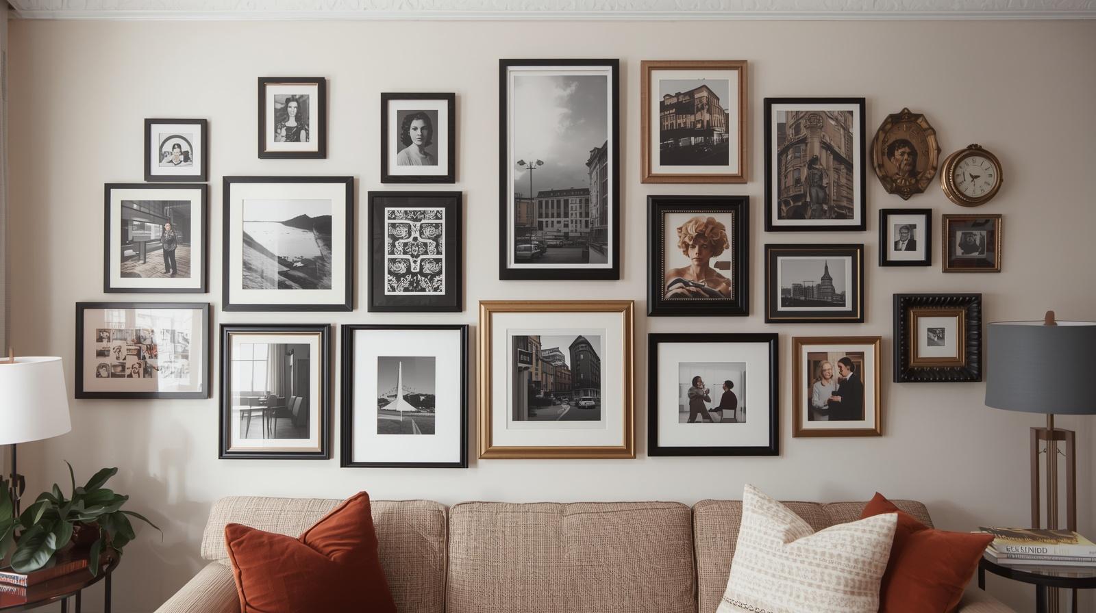
Frames act like punctuation in a gallery wall. Thin black frames feel crisp, wood frames feel warm, brass frames add a gentle shine, and white frames create a softer look. Mixing frame finishes can work, but the mix should feel repeated. One random gold frame in a field of black frames often looks accidental.
Art choices should connect to the room’s existing language. A living room with a patterned rug may need quieter wall art. A plain room can handle bolder pieces. If the sofa, curtains, and rug already carry warm tones, the gallery wall can repeat those tones through paper, wood, or muted artwork.
Color does not need to match perfectly. It needs to converse. A rust-toned print can relate to a fall rug, a green landscape can echo a plant, and a black frame can repeat a lamp base. These small connections give the wall a settled feeling without turning the room into a strict color formula.
Wrap Up:
A living room gallery wall succeeds when it feels connected to the furniture, colors, textures, and daily life around it. The strongest ideas use scale, spacing, repetition, and meaningful pieces rather than filling a wall for the sake of filling it.
Start with the layout that fits your room today, whether that is a sofa-centered arrangement, a clean grid, a family photo story, or a collected mixed-size wall. When each piece earns its place, the gallery wall becomes part of the living room’s character instead of just another decor project.
FAQs Section:
What is the easiest living room gallery wall to hang today?
The easiest option is a sofa-centered gallery wall with one larger anchor frame and several smaller pieces around it. The sofa gives you a natural boundary, so the layout feels balanced faster.
How many frames should a living room gallery wall have?
Most living rooms can handle five to nine pieces, depending on wall size and frame scale. A small wall may need only three strong pieces, while a wide sofa wall can support a fuller arrangement.
Should gallery wall frames match?
Frames do not have to match, but they should relate through color, material, or thickness. A repeated frame finish keeps the wall calm, while a careful mix can make it feel collected and personal.
Disclaimer:
This content shared by Fall Rugs is solely for research and informational purposes. Fall Rugs is not a professional interior design or home renovation consultancy, and the information provided should not be considered professional advice for home improvement or decor. All ideas and suggestions are based on current trends and general knowledge in the home decor industry.