TL;DR
Cool gray bathrooms dominated renovation projects for nearly a decade. That look is fading fast as homeowners and designers shift toward warm, earthy palettes rooted in clay, sand, and stone tones. The change reflects a deeper need for rooms that feel alive rather than austere.
Introduction
Walk into any model home or designer showroom right now and the message is unmistakable. The grey bathroom that felt sleek in 2017 reads cold and impersonal today. What looked clean a decade ago now just looks clinical. The shift toward terracotta, warm beige, sandy limestone, and muted olive says something specific about how people want their homes to feel after years of sensory disruption. This is not a seasonal flip or a paint-swatch whim.
It tracks with broader changes in material science, wellness culture, and the way lighting technology has altered our perception of color inside small, enclosed rooms. If you are in the middle of planning a renovation or just trying to understand why every design feed looks warmer than it did three years ago, the reasons are more layered than anyone gives them credit for.
Gray Ran Its Course Because the Rest of the House Changed First
The gray bathroom did not fail on its own. It got exiled by what happened in kitchens and living rooms across the same floor plan. Open-concept homes spent the mid-2010s getting warm hardwood floors, walnut cabinetry, and brass lighting. Those choices made sense together. But the attached bathroom stayed gray because renovators treated bathrooms as separate capsules rather than rooms that need visual continuity with the rest of the house.
Walking from a cognac leather sofa and oak flooring into a gray-veined white marble bathroom with chrome fixtures creates a thermal mismatch the eye registers instantly even if the brain does not name it. Designers noticed the problem around 2019 but took another two years to fully correct it because tile manufacturers and vanity suppliers had deep inventories tied to the gray trend. Once those supply lines cleared, the palette shifted fast.
The second factor no one discussed enough was LED color temperature. Early LED bulbs leaned aggressively blue, around 5000 Kelvin or higher, which made gray tiles look crisp in the showroom. But residential LED technology improved, and warmer 2700K to 3000K bulbs became the norm in renovation projects.
Under that warmer light, gray walls look muddy and slightly purple. That technical detail killed more gray bathroom renovations than any trend report ever could. Homeowners who swapped bulbs noticed the room suddenly felt off, and repainting or retiling became inevitable.
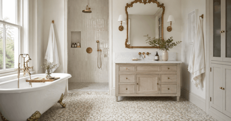
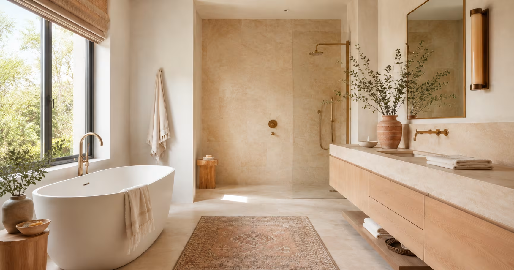
What “Warm Earthy Tones” Actually Means as a Material Palette
The phrase gets thrown around loosely, but in practice it refers to a narrow, disciplined range of hues drawn from unfired clay, limestone, sand, and oxidized iron. Think less about paint-chip names and more about raw material references. A proper earthy bathroom palette pulls from three anchor points: a warm neutral base like tan, putty, or sand, a mineral accent like terracotta, rust, or burnt sienna, and an organic dark note from walnut, bronze, or deep olive. That triad prevents the room from reading flat or monochromatic.
The Base Neutrals That Actually Work in Bathrooms
Beige had a reputation problem for decades because people associated it with 1990s builder-grade everything. The new wave of warm neutrals owes its sophistication to undertone control. Accessible Beige by Sherwin-Williams and Shaker Beige by Benjamin Moore have gray-green undertones that keep them from reading yellow or peach. That matters in bathrooms where humid air and steam can amplify unwanted color casts.
A beige that looks perfect on a drywall sample can turn sickly under shower steam if its undertone is too warm. Designers learned this the hard way with early greige experiments that went wrong in small, windowless powder rooms. The fix is testing paint and tile under both natural daylight and warm artificial light with the shower running. It sounds obsessive, but a bathroom is the one room where humidity literally changes how color reflects, and ignoring that leads to expensive tile regrets.
Terracotta and Clay Tones Are Not Just Accent Colors Anymore
Terracotta moved from accent tile to full-room application faster than most materials ever do. The reason ties back to the handmade tile revival that started gaining momentum around 2020. Zellige tiles from Morocco, with their uneven surfaces and deep color saturation, introduced a texture-first approach that gray subway tile never offered.
A full terracotta shower surround feels grounded rather than overwhelming because the natural variation in fired clay breaks up the surface optically. The key mistake people make is pairing terracotta with cool whites. It kills the warmth instantly. Terracotta needs cream, bone, or unbleached linen tones alongside it to maintain the thermal coherence that makes the look work.
The Wellness Angle Is Real but Needs Honest Framing
Every design article frames the shift to warm tones as a wellness-driven choice, and there is truth to that, but the mechanism is specific enough to explain clearly. Cool colors stimulate the sympathetic nervous system slightly. They raise alertness. That is useful in a home office, counterproductive in a bathroom where the physiological goal is parasympathetic activation, the lowering of cortisol, the shift toward rest.
A room wrapped in sand, clay, and wood tones signals safety to a part of the brain that evolved long before modern architecture. That is not woo-woo marketing. It is color psychology with decades of peer-reviewed research behind it, originally developed for healthcare environments and now filtering into residential design because homeowners got more intentional about how their spaces affect their nervous systems during the pandemic years.
The material side of this matters just as much as the color side. Matte finishes in warm tones absorb light unevenly, creating softer shadows than glossy gray surfaces ever could. A honed travertine vanity top in beige reads as softer and quieter than polished Carrara marble, and that tactile softness reinforces the visual warmth. This is why the shift from gray to earthy tones is not just a color replacement. It is a wholesale material strategy involving sheen, texture, and reflectance.
Real Materials Beat Faux Finishes Every Time in Earthy Palettes
One of the traps that caught early adopters of the warm bathroom trend was trying to achieve the look with faux materials. Vinyl plank flooring in a fake wood tone, printed porcelain that mimics terracotta poorly, manufactured stone that looks too uniform to convince anyone. The earthy palette lives and dies on imperfection. Real clay tiles vary from piece to piece.
Natural stone has veining and pitting that no factory can replicate convincingly. When someone sees a faux terracotta floor with identical repeat patterns, the room instantly loses its credibility because the brain flags the repetition as artificial, and that undermines the warmth the palette is supposed to deliver.
Why Matte Porcelain Took Over from Polished Surfaces
The matte porcelain tile market grew substantially as earthy tones rose, and the relationship is causal rather than coincidental. Glossy surfaces reflect light directionally, which creates hot spots that interfere with how warm colors register in a small room. Matte porcelain diffuses light evenly, allowing beige, sand, and clay tones to read the same from every angle.
Companies like Fireclay Tile and Cle Tile built entire product lines around this principle, producing hand-molded matte tiles in desert-inspired color ranges that simply did not exist in the gray era. The glaze technology improved enough that matte no longer means rough or hard to clean, which eliminated the practical objection that kept matte tiles out of bathrooms for years.
Wood Vanities Returned with Smarter Species Choices
The gray bathroom era paired almost exclusively with white painted vanities or dark espresso stains that read near-black. Warm earthy bathrooms brought wood vanities back, but the species selection got smarter. White oak, with its subtle golden undertone and tight grain, became the default because it sits naturally alongside beige and terracotta without competing. Walnut works in larger bathrooms where the dark anchor point I mentioned earlier adds depth, but it can shrink a small powder room visually.
Alder and birch, both lighter and more neutral in tone, offer budget-friendly paths that do not sacrifice the organic quality. The finish matters more than the species. A matte conversion varnish or natural oil finish preserves the tactile warmth of wood. High-gloss lacquer on a wood vanity kills the entire effect by making a natural material read as plastic, which defeats the purpose of using wood in an earthy context.
Lighting Layouts Had to Change Alongside the Color Palette
A gray bathroom forgives flat, single-source overhead lighting because cool tones look acceptable even under harsh shadows. Warm earthy tones do not. They need layered light from multiple angles to prevent beige walls from looking muddy in the corners. The standard renovation now includes at least three light sources in a primary bathroom: a central flush mount or semi-flush fixture on a dimmer, sconces flanking the mirror at face height, and an indirect source like a cove light or under-vanity strip. The sconces matter most because they eliminate the under-eye shadows that make people look tired in the mirror, a complaint that plagued gray bathrooms but got blamed on the color rather than the lighting setup.
Color temperature across all fixtures needs to stay locked at 2700K or 3000K with a high CRI rating above 90. CRI, or Color Rendering Index, measures how accurately a light source reveals true colors compared to natural daylight. Bathrooms with warm earthy tiles and vanities under low-CRI LED bulbs shift green or yellow in ways that make the entire renovation look cheap. Spending on good bulbs costs far less than replacing tile and delivers more visible improvement than any single material upgrade. This is the kind of detail that separates a bathroom that photographs well from one that actually feels good to use.
Real Project Walkthrough: The 1920s Bungalow That Changed a Designer’s Mind
A designer I know took on a 1920s bungalow primary bathroom in Portland, Oregon, back in 2022. The clients initially asked for white subway tile and gray floor hex tile because that was the look they had pinned for years. She convinced them to consider a 4×4 zellige tile in a sand color called “Natural Clay” for the shower walls, paired with unglazed terracotta hex tile on the floor. The vanity was a custom white oak piece with a honed soapstone top.
At the final walkthrough, the clients admitted they almost backed out mid-project because the terracotta looked too strong before the grout cured and the lighting went in. Once the warm LED sconces were mounted and the matte brass fixtures were installed, the room snapped into coherence. The designer told me later that the lesson was about trust. Earthy palettes look wrong during the messy middle of a renovation because the materials need the right light and context to resolve. If you judge the tiles while they sit in the box or even after setting but before grouting, you will probably panic. Wait until the room is lit and finished.
A Powder Room Under 40 Square Feet Shows the Opposite Lesson
A small builder-grade powder room in a 1990s subdivision got a refresh using only paint, a mirror swap, and a vanity change. The walls went from cool gray to Benjamin Moore’s Bleeker Beige, a warm neutral with just enough gray undertone to avoid reading peach. The mirror changed from frameless polished edge to a round matte brass frame.
The vanity switched from white laminate to a small oak console with an unlacquered brass vessel sink. The entire project cost under $1,800 and took a weekend. The room went from forgettable to memorable not because any single element was expensive but because every choice reinforced the same thermal language. The lesson here is that earthy tones do not demand a gut renovation. They reward consistency more than scale.
What This Means for Home Value and Resale Thinking
The resale question comes up constantly when people hesitate to abandon gray. Gray bathrooms do not hurt resale value today, but they no longer help it either. They read as dated in the same way that honey oak and beige tile read dated in 2015. Buyers walking through a home in 2026 see a gray bathroom and mentally assign a renovation cost to it, even if the room is in perfect condition.
A warm, earthy bathroom with matte brass or aged bronze fixtures and natural materials reads as current and intentional. The price difference between a gray renovation and a warm one is negligible at the material level. The real cost difference lies in lighting and fixture selection, and those costs apply regardless of palette. Choosing terracotta over gray subway tile changes nothing about the labour budget. It just changes the emotional impact of the finished room.
Builders in markets like Austin, Denver, and Nashville started phasing out gray spec bathrooms around 2022 and now default to warm neutrals in all new construction. National production builders lag behind custom builders by about eighteen months, which means gray is still showing up in some tract developments, but even those are shifting fast. The domino effect from tile manufacturers reducing gray inventory and increasing warm-toned SKUs accelerated the whole timeline.
Wrap Up
The disappearance of gray bathrooms is not a trend story. It is a convergence of better lighting technology, a deeper public understanding of how materials affect mood, and a supply chain that finally caught up with where design was already heading.
Warm earthy tones succeed because they match how the rest of the house has looked for years, and they forgive the imperfect light conditions that real bathrooms actually have. If you are mid-renovation or planning one, the single most useful move is committing to warm, high-CRI lighting first. Paint and tile decisions will land differently under that light, and you will make fewer expensive corrections later.
FAQs
Are warm earthy tones too trendy for a bathroom renovation that needs to last ten years?
The palette has deep roots in Mediterranean, Southwestern, and Japanese design traditions that have persisted for centuries, not seasons. Unlike high-saturation accent trends that cycle fast, beige, terracotta, and sand tones function as neutrals that adapt easily to hardware and fixture changes over time.
What grout color works best with warm-toned bathroom tile?
A grout that matches the tile’s mid-tone rather than the lightest or darkest point creates the most cohesive look. Contrasting dark grout on beige or terracotta tile draws a grid that fights the organic quality of the materials, while exact-match grout can wash out texture. Aim for one shade deeper than the tile’s dominant color.
Can I mix warm earthy tones with my existing gray bathroom fixtures without a full remodel?
Swapping chrome or polished nickel fixtures for brushed brass, aged bronze, or matte black creates an immediate shift toward warmth without touching the tile. Adding wood accessories, warm linen textiles, and 2700K bulbs pushes the room further in the earthy direction even if the gray tile stays in place.
Disclaimer
This content shared by Fall Rugs is solely for research and informational purposes. Fall Rugs is not a professional interior design or home renovation consultancy, and the information provided should not be considered professional advice for home improvement or decor. All ideas and suggestions are based on current trends and general knowledge in the home decor industry.