
TL;DR
You can create a stunning kitchen by using orange as a strategic accent through high-quality materials like terracotta, copper, or muted burnt orange cabinetry. Success lies in balancing these energetic tones with grounding neutrals and layered lighting to ensure the space remains inviting rather than visually exhausting.
Introduction
Does the thought of an orange kitchen bring back memories of loud 1970s patterns that felt more like a distraction than a design choice? Many homeowners avoid this vibrant hue because they fear it will dominate the room and clash with modern sensibilities.
However, when you approach this color with a focus on texture and tone, it transforms into one of the most appetizing and welcoming palettes available. We will look at how to integrate these warm shades to create a culinary environment that feels both high-end and deeply personal.
The Psychology of Warmth in Culinary Spaces
Orange naturally stimulates the appetite and encourages social interaction, making it a logical choice for the heart of the home. Designers often refer to it as a social color because it lacks the aggressive energy of pure red but offers more personality than a standard yellow. In a kitchen, this translates to an environment where guests feel comfortable lingering over a meal or a conversation.
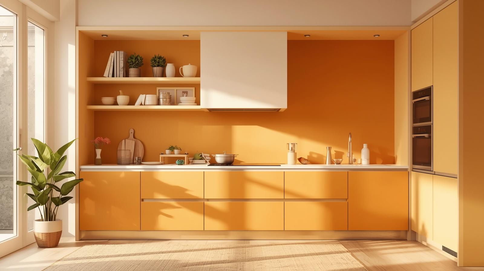
The secret to making this work involves understanding the intensity of the pigment you choose. A high-chroma neon orange might work in a fast-food setting to encourage quick turnover, but in a residence, we look for something more sophisticated. You want to aim for shades that pull from nature, such as the skin of a blood orange, the dust of a desert canyon, or the glow of an ember. These variations feel grounded and timeless rather than trendy or loud.
When you select a deeper version of orange, you are essentially bringing the feeling of a permanent sunset into your home. This creates a psychological sense of safety and warmth, particularly in regions that experience long, grey winters. By choosing materials that reflect light in a soft way, you ensure that the color glows rather than glares, providing a steady backdrop for your daily routines.
Idea 1: Selecting the Perfect Burnt Orange Cabinetry
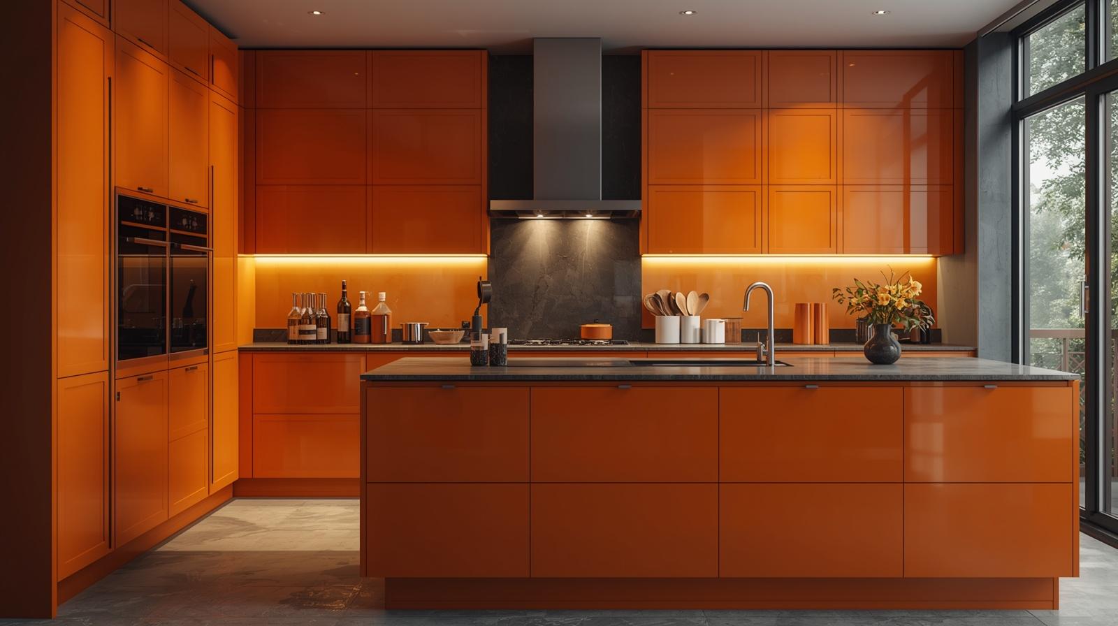
Choosing orange for your primary cabinetry requires a commitment to the specific undertone of the paint or laminate. Instead of a bright, primary orange, many successful modern designs utilize a burnt orange that leans heavily into brown or red territory. This shift allows the cabinets to act as a warm neutral when paired with the right hardware and surrounding surfaces.
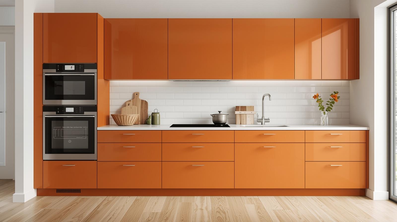
A matte finish is almost always superior to high-gloss when working with large surfaces of orange. Matte textures absorb light and soften the visual impact, preventing the cabinets from feeling like plastic. If you choose a flat-panel door style, the color becomes the architectural focus, allowing the clean lines of the kitchen to shine without the need for excessive ornamentation.
I recently observed a project in a mid-century modern renovation where the designer used a deep rust orange for the lower cabinets while keeping the upper units a crisp, warm white. This approach prevents the color from closing in on the ceiling and keeps the workspace feeling airy. The second-order effect of this choice is that the orange hides small scuffs and fingerprints much better than white or navy, making it a practical choice for busy families.
Balancing Cabinets with Countertop Selections
To keep the orange from overwhelming the senses, you must pair it with a cooling countertop material. Light grey quartz or honed basalt provides a necessary visual break that grounds the fiery energy of the cabinetry. The grey acts as a bridge between the vibrant wood or paint and the mechanical elements of the kitchen like the oven and sink.
Natural stone with subtle veining also works beautifully because the organic patterns mimic the complexity found in nature. Avoid countertops with heavy gold or yellow flecks, as these can compete with the orange and make the entire room feel muddy. A clean white marble or a high-quality solid surface keeps the focus on the craftsmanship of the cabinetry.
Idea 2: Integrating Terracotta for an Earthy Foundation
Terracotta tiling offers one of the most authentic ways to bring orange into a kitchen without it feeling like an artificial addition. These clay tiles carry a natural variation in color that ranges from pale apricot to deep reddish-brown. This inherent inconsistency is exactly what makes the material feel high-end and lived-in rather than mass-produced.
Using terracotta on the floor provides a thermal mass that can help regulate the temperature of the room, but its primary benefit is the visual weight it provides. Because the color comes from the earth itself, our eyes perceive it as a neutral base. You can cover an entire kitchen floor in these tiles and find that it feels less overwhelming than a single bright orange wall.
If a full floor feels like too much, consider using terracotta for a backsplash. Zellige tiles, which are handmade and often feature slightly irregular edges, create a beautiful play of light and shadow. The way light hits the glazed surface of a terracotta tile changes throughout the day, moving from a soft glow in the morning to a deep, rich hue under evening task lighting.
Maintaining the Integrity of Natural Clay
When you use porous materials like terracotta, you must ensure they are sealed properly to prevent staining from kitchen oils and acidic spills. A matte sealer is usually the best choice because it protects the stone without adding an artificial shine that would detract from the rustic appeal. Over time, these tiles develop a patina that only adds to the character of the kitchen.
Consider the grout color carefully when installing orange-toned tiles. A dark grey or charcoal grout can modernize the look and highlight the geometric shape of the tiles. Conversely, a sand-colored grout creates a more seamless, traditional Mediterranean feel that softens the overall aesthetic of the cooking area.
Idea 3: The Use of Copper and Warm Metallic Accents
Metal finishes offer a subtle way to introduce orange tones through reflection and material depth rather than flat paint. Copper is the most obvious choice here, providing a luxurious glow that changes as the metal ages. A hammered copper sink or a set of pendant lights can anchor a kitchen design, giving it a sense of history and permanence.
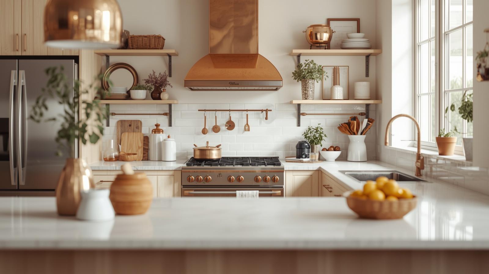
The beauty of copper lies in its living finish. As it oxidizes, it may develop deeper brown or even slight green tones, which helps the orange palette feel more integrated with the natural world. If you prefer a more consistent look, many manufacturers offer lacquered copper that maintains its bright, warm shine indefinitely.
Beyond the sink, consider copper for your cabinet hardware. Placing copper pulls on dark blue or forest green cabinets creates a stunning contrast where the orange tones of the metal pop against the cool background. This is a low-risk way to experiment with the color before committing to larger installations like flooring or cabinetry.
Coordinating Metals for a Cohesive Look
You do not need to stick exclusively to copper to achieve a warm orange vibe. Mixing metals is a hallmark of professional design, and you can easily pair copper with matte black or oil-rubbed bronze. The dark accents provide the necessary contrast to make the orange tones feel intentional and curated.
Avoid mixing too many shiny finishes at once. If you have a polished copper backsplash, consider using a brushed or matte finish for your faucets and handles. This prevents the kitchen from feeling like a jewelry box and keeps the focus on the warmth and functionality of the space.
Idea 4: Designing an Orange Focal Point with a Kitchen Island
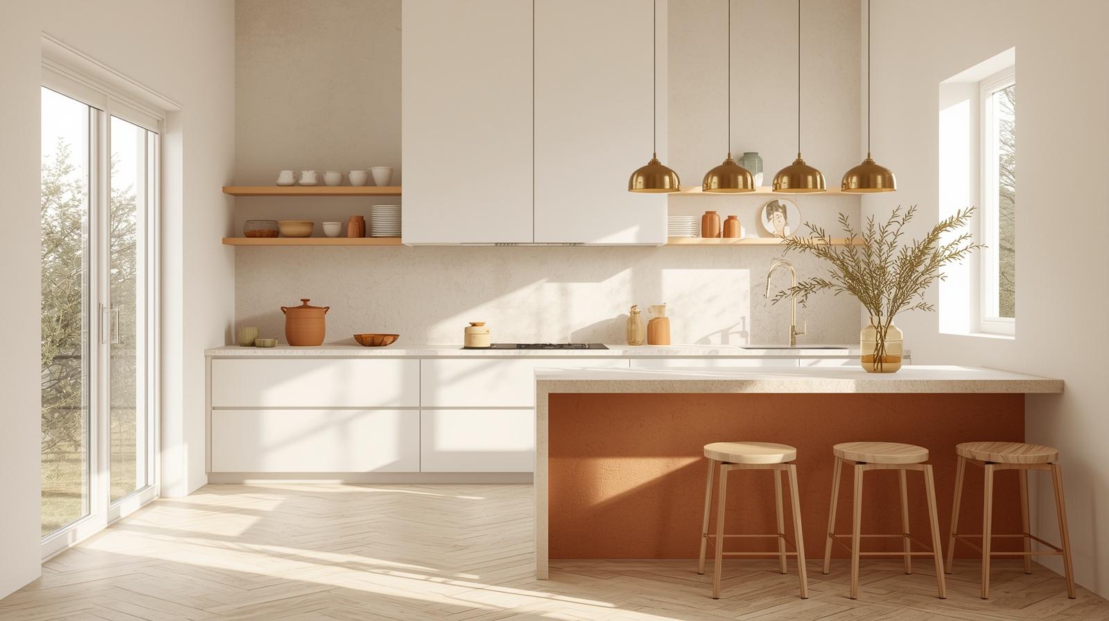
If you love the energy of orange but want to keep the rest of your kitchen neutral, the island is the perfect place to make a statement. Painting only the island base in a bold orange creates a central hearth that draws people into the room. This works particularly well in open-concept homes where the kitchen needs a clear visual boundary from the living area.
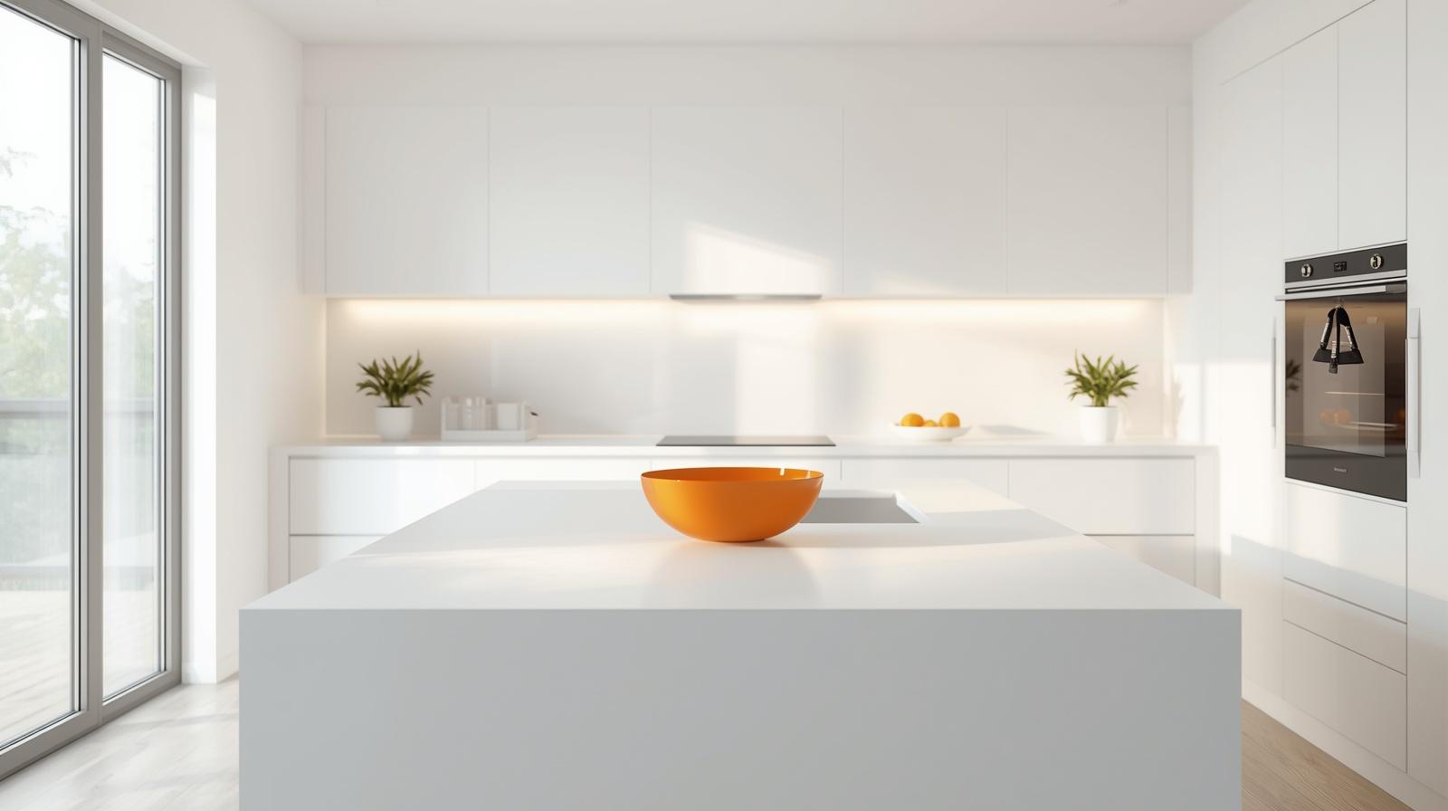
A wooden island top in a dark stain like walnut provides a stunning cap for an orange base. The natural oils and grain of the wood complement the orange tones, creating a look that feels expensive and architectural. This combination avoids the clinical feel of an all-white kitchen while maintaining a clean and organized appearance.
I once worked with a homeowner who was hesitant about using any color at all. We decided to paint the interior of the island shelving a bright tangerine while keeping the exterior a soft dove grey. Every time they pulled out a stool or reached for a cookbook, they got a burst of cheerful color that was hidden from the main line of sight, providing a playful touch that never felt like it was too much.
Scaling the Island for Maximum Impact
The size of your kitchen dictates how bold you can be with the island color. In a smaller galley kitchen, a vibrant orange island might feel cramped. In a large, airy kitchen with high ceilings, however, you can afford to go with a more saturated hue because the volume of the room can handle the visual weight.
Remember that the island is often the most used surface in the house. Choosing a high-quality, durable paint finish is essential. A cabinet-grade lacquer or a baked-on finish will ensure that the orange stays vibrant even after years of being kicked by barstools or wiped down after meal preparation.
Idea 5: Managing Light to Soften Orange Tones
Lighting is perhaps the most underrated factor in how we perceive color. Orange can look drastically different depending on the color temperature of your bulbs. If you use cool-toned LED bulbs, an orange wall might look muddy or even slightly sickly. To make orange truly sing, you need warm lighting that sits between 2700K and 3000K on the Kelvin scale.
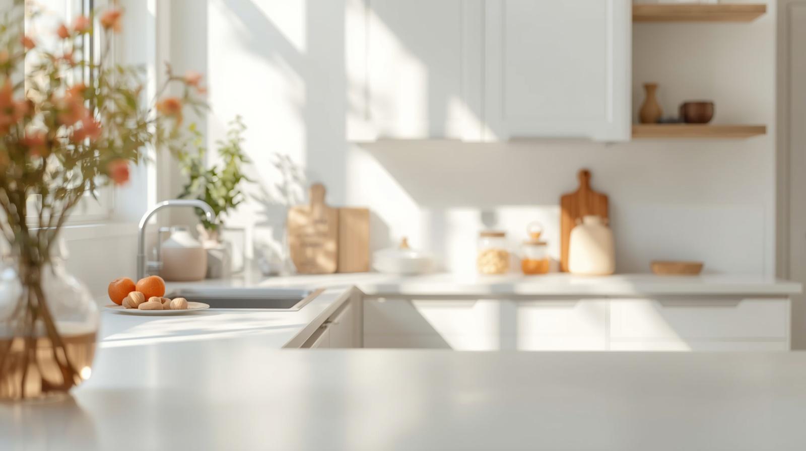
Layered lighting is crucial for preventing a flat, overwhelming look. Use under-cabinet lighting to wash the backsplash in a soft glow, which highlights the texture of the materials. When light grazes a textured orange surface, it creates highlights and shadows that add depth to the room.
During the day, natural sunlight will bring out the most honest version of the color. If your kitchen faces north and receives cool, blue-ish light, you should lean toward oranges with more red in them to compensate. For south-facing kitchens that get blasted with warm afternoon sun, a more muted, clay-like orange will prevent the room from feeling like a furnace.
The Role of Task and Ambient Lighting
Pendant lights over the island or dining area should serve as the decorative crown of the kitchen. Choosing fixtures with an orange or amber glass shade can cast a beautiful, warm light across the entire room. This type of ambient glow is much more flattering for skin tones and makes the food on the plate look more appetizing.
Recessed ceiling lights should be used sparingly and placed on dimmer switches. Being able to drop the light levels in the evening allows the orange elements of the kitchen to recede into a cozy, candlelit atmosphere. This transition is what makes a kitchen feel like a sanctuary rather than just a workspace.
Idea 6: Using Textiles and Moveable Accents
For those who are not ready for permanent changes, textiles offer a way to test the orange waters. A high-quality runner rug in a Persian or Turkish pattern often incorporates burnt orange as a primary thread. These patterns use small amounts of the color repeated across a large area, which provides the warmth you want without the intensity of a solid block of paint.
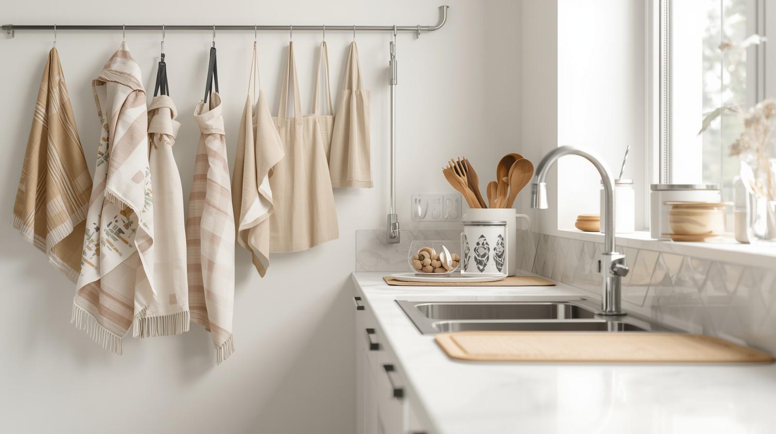
Linen napkins, seat cushions, and even window treatments can carry orange tones into the space. The beauty of these items is that they can be swapped out as the seasons change. In the autumn, you might lean into deeper rust and copper tones, while in the spring, you could bring in lighter peach or apricot fabrics.
Using orange in your dishware is another expert move. Stacking orange ceramic plates on open shelving adds a pop of color that feels functional and intentional. When these items are used daily, they become part of the kitchen’s rhythm, making the color feel like a natural part of your lifestyle rather than a forced design trend.
Choosing Textures for Fabric Accents
The feel of the fabric matters just as much as the color. A heavy cotton or linen weave provides a matte, organic look that suits the earthy nature of orange. Avoid shiny synthetic fabrics like polyester or satin, which can make the color look cheap or dated.
Woven baskets and wood accents also play into the orange palette. Many natural woods, like cherry or certain oaks, have underlying orange tones that are highlighted when you bring in orange accents. This creates a layered, monochromatic effect that feels sophisticated and carefully planned.
Idea 7: Creating Contrast with Bold Secondary Colors
Orange does not have to stand alone. In fact, it often looks its best when it has a strong partner. Navy blue is the classic complementary color for orange, and using them together creates a high-contrast look that feels very modern. The cool depth of the navy pulls the heat out of the orange, resulting in a balanced and visually interesting space.
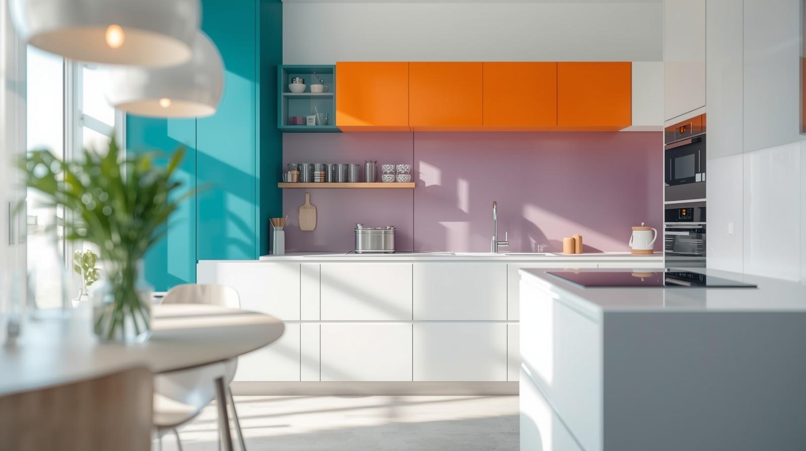
Another sophisticated pairing is orange and sage green. This combination feels very organic and reminiscent of a Mediterranean garden. The muted green acts as a neutral, allowing the orange to provide the focal points without overwhelming the room. This palette works particularly well in kitchens that have a lot of natural wood and plants.
If you prefer a more minimalist approach, pair your orange accents with various shades of charcoal and black. This creates a moody, industrial vibe where the orange acts as the “light” in the room. It is a bold choice that requires confidence, but the results are often the most stylish and memorable.
Designing for Longevity
When you combine orange with other colors, think about the long-term appeal. Trends come and go, but color combinations found in nature tend to stay relevant. Look at the way a tiger lily is colored or the shades of a canyon wall at dusk. Mimicking these natural ratios will ensure that your kitchen remains stylish for years to come.
Avoid adding too many secondary colors. Stick to a primary palette of three: your orange shade, a grounding neutral, and one accent color. This limitation prevents the kitchen from feeling cluttered and ensures that every design choice has a clear purpose.
Wrap Up
A stylish orange kitchen is entirely achievable when you focus on the quality of materials and the subtlety of the shades. By choosing muted tones like terracotta or burnt orange and balancing them with natural textures and smart lighting, you create a space that is both energetic and comfortable. The goal is to let the color enhance the room’s architecture rather than compete with it, resulting in a timeless heart of the home.
FAQs Section:
Will an orange kitchen make my house harder to sell in the future?
Not necessarily, provided you use the color in high-quality materials like terracotta tiles or as an accent on a kitchen island that can be easily repainted. Sophisticated, muted tones often appeal to buyers looking for a home with a unique, warm personality rather than a cookie-cutter design.
What is the best neutral color to pair with bright orange?
Light grey or a warm charcoal is the best choice because it provides a cool contrast that grounds the energy of the orange without clashing. Avoid using stark white if you want a softer look, as the high contrast can sometimes feel too jarring or clinical.
How do I prevent an orange kitchen from looking like it belongs in the 1970s?
Avoid pairing orange with heavy brown wood paneling or busy floral patterns, and instead use clean lines and modern materials. Incorporating matte finishes, sleek hardware, and contemporary lighting will ensure the space feels fresh and updated rather than retro.
Disclaimer:
The content shared by Fall Rugs is solely for research and informational purposes. Fall Rugs is not a professional interior design or home renovation consultancy, and the information provided should not be considered professional advice for home improvement or decor. All ideas and suggestions are based on current trends and general knowledge in the home decor industry.