TL;DR
A lounge room that looks modern but still feels genuinely lived-in requires layering textures, choosing furniture with real proportions, and letting personality show through objects with actual history. The goal is not perfection; it is warmth with intention. Getting that balance right changes how every hour spent in that room actually feels.
Introduction
There is a particular kind of lounge room that photographs beautifully and feels completely hollow in person. Every cushion is geometrically placed. Nothing is out of order. And yet the moment you sit down, something feels off, like you wandered into a hotel lobby by mistake. The rooms that people genuinely love spending time in follow a different logic entirely. They mix the clean lines of modern furniture with the soft unpredictability of real life a well-worn throw draped at an angle, a lamp that was clearly chosen because someone loved it, a rug that has a story beneath it. That is the look this piece breaks down, idea by idea, so your lounge room stops performing and starts living.
1. Start With a Furniture Plan That Has Real Proportions
Most lounge rooms that feel sterile have the same root problem: furniture scaled to a catalog photograph rather than an actual room. A sofa that is too small makes a space feel sparse and uncertain. One that is too large turns a room into a corridor. Getting proportions right is the first act of making a modern lounge feel grounded.
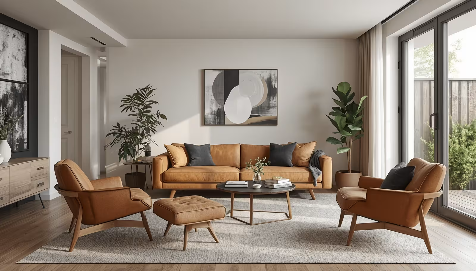
The practical rule that experienced interior stylists use is the two-thirds ratio: your primary seating piece should occupy roughly two-thirds of the wall it sits against, leaving breathing room on each side without disappearing into the space. For a typical living area in a mid-size apartment, that usually means a sofa in the 220 to 260 centimetre range paired with a coffee table sitting roughly 45 centimetres away close enough to reach comfortably, far enough to walk around without thinking.
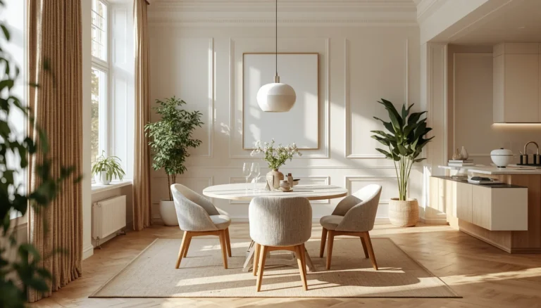
What modern design often misses is that proportional furniture alone does not create comfort. A sleek modular sofa in a clean-lined room can look remarkable in a photograph and feel completely cold in practice. The fix is pairing structured forms with softness: linen or bouclé upholstery on a low-profile frame, a coffee table with a natural timber top rather than tempered glass, a single armchair in a tactile fabric positioned at a slight angle to the main sofa. That diagonal break is subtle, but it signals to the eye that a human made this arrangement, not an algorithm.
Choosing Sofas That Age With Dignity
Not all modern sofas hold their look past the first year of use. Tight, high-gloss upholstery tends to show wear in ways that read as neglect rather than character. Fabrics with some natural variation a slubby linen, a textured weave, a mid-pile velvet in a muted tone actually improve as they soften. That aging quality is what separates a truly lived-in look from a room that simply looks tired.
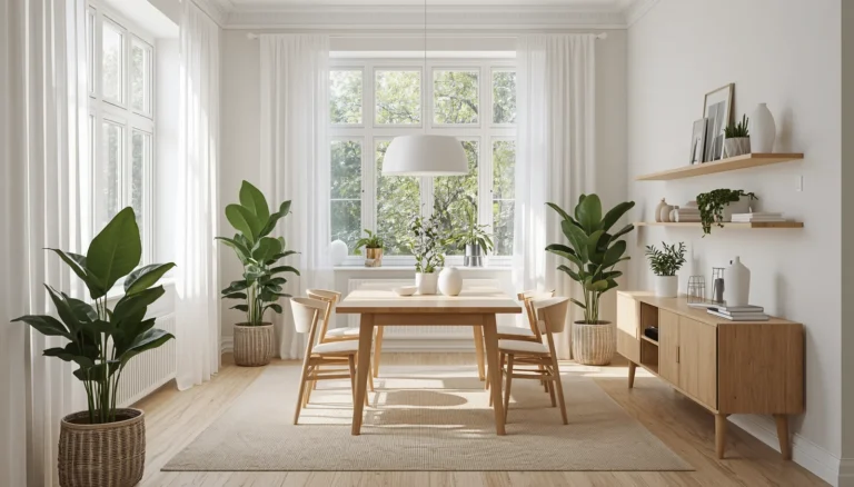
2. Layering Rugs to Anchor the Whole Room
A rug is the single most transformative element in a lounge room, and it is also the most frequently mishandled. The standard mistake is buying a rug that is too small, placing it in the centre of the room, and wondering why the space still feels disconnected. A rug that sits only under the coffee table while the sofa legs float on bare floor does not anchor the seating area it just marks the middle of the room.
The standard that works consistently: at least the front two legs of every piece of major seating should rest on the rug. In practical terms, this means sizing up from what feels instinctively right. If you think you need a 160 by 230 centimetre rug, you probably need 200 by 300. Wool flatweaves and hand-knotted pieces with natural dye variations are the categories that perform best in a modern lounge that wants warmth without visual noise.
Layering two rugs is a technique that genuinely elevates a room when done with some restraint. A larger natural jute or sisal base underneath a smaller, more detailed piece creates depth that a single rug cannot replicate. The key is keeping the top rug tightly coordinated in tone with the rest of the room. A patterned Moroccan-style piece on a neutral sisal base works in a room with otherwise clean, minimal furniture precisely because the contrast is controlled one moment of visual complexity against a restrained backdrop.
The Fall Rug Principle in Year-Round Design
Seasonal rugs are not just for autumn. The earthy, warm-toned palettes associated with fall decor terracotta, deep ochre, warm sand, slate actually function as excellent year-round foundations in a modern lounge because they read as sophisticated rather than trend-specific. A room built around these tones does not look seasonal; it looks considered. The warmth those colours bring prevents a modern, low-furniture lounge from tipping into the coldness that minimalism sometimes produces.
3. Lighting Layers That Do the Heavy Lifting
A lounge room lit only by a central ceiling fixture is a lounge room that will never feel right after dark. This is one of the most reliable observations in residential design: overhead lighting at full brightness flattens a space, eliminates shadow, and makes even beautiful furniture look institutional. The rooms that feel genuinely welcoming after sunset are the ones with multiple light sources operating at different heights and intensities.
The practical framework involves three layers. The first is ambient light, the overall fill that keeps the room navigable this can come from a statement pendant or a flush mount, but it should be on a dimmer. The second is task or accent lighting: a floor lamp positioned beside a reading chair, a table lamp on a side table, a pair of small lamps flanking a console. The third layer is what designers sometimes call decorative or atmosphere light a candle cluster on the coffee table, a small LED lamp tucked on a bookshelf, a warm-toned plug-in sconce on a wall that has no hardwiring.
What makes this approach feel modern rather than fussy is consistency in warmth. All bulbs in a lounge room should sit in the 2700 to 3000 Kelvin range. Mixing warm and cool light sources is the most common lighting error in residential spaces, and it is the reason a room with beautiful furniture can still feel uncomfortable. When all the light in a room shares the same warmth, the space coheres in a way that reads as deliberate even when it is relatively simple.
Using Lamps as Furniture, Not Afterthoughts
A lamp that was clearly chosen with care an interesting base material, an unusual height, a shade in an unexpected colour contributes to a room’s personality in the same way a piece of art does. Designers who work with smaller budgets often prioritise a single striking floor lamp over multiple forgettable table lamps, because one well-chosen piece changes the character of a corner in a way that a trio of generic ones never will.
4. Bringing in Texture Without Chaos
Modern design has a texture problem. Rooms styled to look contemporary tend to overindex on smooth surfaces polished concrete, glass, lacquered wood, machine-woven textiles because those finishes photograph cleanly. In practice, a room built entirely from smooth surfaces feels cold and aurally flat; there is nothing for light to catch, nothing for the eye to rest on, nothing that makes you want to run your hand along it.
The correction is not to abandon clean lines but to introduce deliberate textural contrast at specific points. A stone or ceramic table lamp base next to a smooth plaster wall. A woven throw across a sleek sofa cushion. A low-pile rug at the centre of the room bordered by smooth timber flooring. A terracotta vase on a marble or concrete side table. Each of these pairings works because the contrast is localised one surface against another, not a whole room of competing textures.
Natural materials do something that synthetics do not: they carry evidence of having been made. A hand-thrown ceramic bowl has slight irregularities in its form. A linen cushion cover has a subtle weave pattern that changes in different light. A timber coffee table shows grain variation across its surface. These qualities are what give a modern lounge room the sense that people live there and have made choices with intention, not that a room was assembled from a single afternoon of online shopping.
The Organic Detail That Changes Everything
Samar, a graphic designer in Melbourne, had a lounge room that looked exactly like her Pinterest board and felt nothing like it. Everything was in the right style category a walnut media unit, a cream bouclé sofa, a patterned rug. The room felt flat because every element was purchased at the same moment, from the same aesthetic era. Adding three pieces that had no stylistic connection to the rest a vintage ceramic lamp from a charity shop, an inherited timber side table with visible repairs, a hand-embroidered cushion from a local market changed the room’s entire character. The inconsistencies were not flaws; they were the proof that the room belonged to a real person.
5. Walls, Art, and the Objects That Make a Room Personal
A modern lounge room with bare walls is a lounge room that has not finished becoming itself yet. Art does not need to be expensive to do its job well. What matters is that it is hung at the right height the centre of a piece or a gallery arrangement should sit at approximately 150 to 155 centimetres from the floor, which is roughly eye level for a standing adult and that it has some relationship to the scale of the wall it occupies.
The rooms that feel most genuinely inhabited tend to have a mix of two-dimensional and three-dimensional objects on their walls and surfaces. A framed print alongside a small shelf with objects on it. A large-scale painting next to a mirror that bounces light. A grouping of smaller framed pieces that includes something hand-made alongside something more considered. The variety signals that the room accumulated its personality over time rather than arriving fully formed.
Ceramics on shelves and sideboards deserve particular mention because they carry texture, colour, and form simultaneously. A grouping of three ceramic vessels in complementary earth tones does more visual work than a single large decorative object, because the eye moves between them and reads the arrangement as a considered moment in the room. This is the principle behind the designer trick of grouping objects in odd numbers the slight asymmetry keeps the eye engaged rather than satisfied too quickly.
Books as Interior Objects
Books are one of the most underrated design elements in a modern lounge, not because stacking them signals intelligence but because they carry colour, texture, and scale that is hard to replicate with anything else. A curated section of a bookshelf with spines in a coordinated colour palette or deliberately broken with one contrasting spine as an accent functions as art without needing a frame. A stack of two or three books on a coffee table with a small object resting on top creates the kind of composed casualness that every styled lounge room reaches for.
6. Greenery and the Natural Element That Grounds a Room
Plants in a modern lounge room are not a decorative trend; they are a structural decision. A large-leafed plant in a substantial planter placed in a corner where the eye would otherwise hit a blank wall anchors the room in a way that no other object quite matches. It adds height, softens angles, and introduces the kind of asymmetry that makes a room feel genuinely designed rather than arranged.
The species choices that work best in interior conditions with indirect light a fiddle leaf fig, a monstera, a rubber plant, or a mature pothos allowed to trail over a high shelf are also the ones that bring the most visual presence. The planter matters as much as the plant. A terracotta pot with visible patina next to a concrete-toned wall, or a matte black glazed pot against warm timber flooring, gives the pairing a grounded, intentional quality.
Dried botanical arrangements and pampas grass have had their cultural moment, but their appeal holds in a modern lounge because they introduce organic form without the maintenance requirement. A tall arrangement in a large vessel brings sculptural presence to a corner that might otherwise feel unused. The key is scale a small dried arrangement on a side table reads as filler, but a substantial one in a 50-centimetre vessel on the floor becomes an architectural element.
Wrap Up
A lounge room that feels modern and genuinely lived-in is the result of specific decisions made with confidence rather than a formula followed to the letter. Proportional furniture, layered lighting, textural contrast, and personal objects collected over time are the ingredients that produce a space with real character. The rooms that people never want to leave are not the ones that look perfect in photographs they are the ones that reveal a little more of themselves each time you spend an hour in them. Get the foundations right, trust your own instincts about what belongs, and let the room accumulate its own story.
FAQs
What makes a lounge room look modern without feeling cold?
Pairing clean-lined furniture with natural textures like linen, wool, and timber prevents the sterility that modern design sometimes produces. Warm-toned lighting and a well-proportioned rug do the most work in keeping a contemporary space feeling genuinely inviting.
How do I make my lounge room feel more lived-in?
Introduce objects that were not all bought at the same time or from the same source. Vintage finds, inherited pieces, hand-made textiles, and plants that have grown over time carry the kind of visual irregularity that signals a room belonging to a real person rather than a catalog shoot.
What size rug works best in a modern lounge room?
Most lounge rooms need a larger rug than the one first considered. The front two legs of all major seating should rest on the rug, which typically means choosing a size of at least 200 by 300 centimetres in a standard living area. Going too small is the most common rug mistake, and it makes even well-chosen furniture look disconnected from the room.
Disclaimer:
This content shared by Fall Rugs is solely for research and informational purposes. Fall Rugs is not a professional interior design or home renovation consultancy, and the information provided should not be considered professional advice for home improvement or decor. All ideas and suggestions are based on current trends and general knowledge in the home decor industry.
![Human/ Act as a senior SEO content strategist, a semantic SEO authority, and a veteran editorial journalist with years of real publishing experience. Your writing must pass as the work of a domain expert who writes for other experts while remaining fully accessible to a curious new reader. The final article must meet Google AdSense content policies (no adult, no hate, no dangerous claims, no copyrighted material reproduced verbatim, no deceptive content). PRIMARY OBJECTIVE: Create a highly user-intended article that earns topical authority through semantic depth, lived‑experience insights, and a confident, natural prose rhythm. Search intent must be fully satisfied without any filler. Every sentence earns its place. Make sure you follow all the following structures. MANDATORY HEADING HIERARCHY Use exactly one H1. It must be the most compelling, idea‑rich headline. It must differ from the meta title. H2 headings must be clearly subordinate to H1 in visual weight. Under any H2, include 2 to 3 paragraphs depending on the subtopic’s complexity. Every paragraph's word count is natural (average 50–70 words). Avoid identical paragraph lengths in sequence. Use H3 sections where it helps break a subtle point into readable sub‑layers. H3 must be clearly smaller than H2. Never skip heading levels (no jumping from H2 to H4). Headings must use semantic variants of the core topic naturally. Do not stuff keywords. FORMAT RULES (GOOGLE ADSENSE COMPLIANT & HUMAN-EDITED LOOK) Use active voice sentences (80–90%) in the blog article. Write only in flowing paragraphs. Do not use bullet points, numbered lists, or any kind of table. Blog must include entities to rank in LLM. Make sure strictly do NOT use em dashes (—). Do not insert divider lines. Keep punctuation clean and natural like an editor. Readability should generally sit between 60 and 70 on the Flesch Reading Ease scale, but small deviations are acceptable when a complex point needs precise language. WORD COUNT & DEPTH Minimum 1700 words long. Expand using conceptual depth, relevant examples, and context. No words may be added just to inflate length. If the topic truly requires extended analysis, go up to 2400 words. Every paragraph must feel intentional. ADVANCED SEMANTIC SEO & ENTITY REQUIREMENTS Build the article around core entities, related entities, and their attributes. Search engines must perceive a knowledge graph‑level understanding. Naturally weave in LSI terms, co‑occurring phrases, and intent‑specific variations (informational, practical, comparative) without disturbing the narrative flow. Cover informational, implementation‑oriented, and contextual angles in a seamless order. Do not place any external links or reference citations in the article. The piece must stand on its own authority. Never keyword‑stuff. The main keyword’s frequency must feel invisible. NLP & GOOGLE HELPFUL CONTENT OPTIMIZATION Write for a curious, time‑pressed human. Show that you have made the mistakes, fixed them, and learned something worth sharing. Use sentence‑length variation: some lines short and punchy, others layered with careful reasoning. Favour contractions and everyday speech patterns where it feels natural, like a real copywriter. Stiff, over‑formal prose is a failure. Foreshadow questions a reader would ask, then answer them in a later paragraph. This creates an organic, non‑robotic flow. Must Include E-E-A-T SIGNALS (MUST BE EMBEDDED, NOT DECLARED) Write with the quiet confidence of someone who has spent years in the subject. State observations that cannot be found on generic summary pages. Explain why a method works, what the second‑order effects are, and when it fails. No mention of gambling, adult themes, weapons, unsubstantiated health claims, or anything outside standard informational/safe commercial topics. Must include one or two realistic, concrete examples (not hypothetical “imagine you” starters; use real‑world scenario descriptions like a case reporter). Names can be fictionalised, but the scenario must feel true. Reference broad industry patterns without naming specific sources or linking out; the knowledge must appear to live inside the author’s head through experience. LAST INSTRUCTIONS / DO NOTS DO NOT produce content that is defamatory, illegal, or that violates Google and Google AdSense platform policies. DO NOT present the prompt itself to readers; keep this instruction set internal. Do not include meta phrases or AI-style conclusions (e.g., "Certainly", "Here’s the article"). DO NOT put the reference source links and mentions in the Article, The links and posts which you use as source to generate the article (Strict). Deliver only the article content without self-references (Strict). EXTENDED BANNED PHRASES & AI FINGERPRINT LIST (Strictly DO NOT USE ANY OF THESE) Intro/Starting: Discover, Explore, In today’s digital world, Understanding, Hands on, In this article we will discuss; let's dive in; let's explore; this article will cover, In this guide, In recent years, Nowadays, Over the years. Robotic transitions/connectors (when used as crutches at the start of multiple sentences in a row): learn, Moreover, Furthermore, Additionally, However, Therefore, As a result, In conclusion, To sum up, Overall. (Fine to use sparingly and organically, but never stack them.) Overused AI style words: Ultimate, Essential, Comprehensive, Complete guide, Step‑by‑step, Proven, Effective, Powerful, Best practices, Key benefits, Key features. Overused SEO/blog scaffolds: You need to know, Everything you need to know, Must know, Top reasons, Top benefits, Top tips, Best ways, Simple ways, Easy methods, Quick tips. Generic explanation padding: It is important to note, Keep in mind, Make sure to, You should, One of the best ways, The main reason is, The key factor, The most important thing. Ending/Conclusion clichés: In summary, To wrap up, Final thoughts, At the end of the day, We hope this article helps, Hopefully this guide. AI‑typical sentence patterns: Whether you are a beginner or expert, No matter your experience level, From beginners to professionals, This makes it easier, This helps you to, This allows you to. Fluffy filler: Basically, Simply put, Generally speaking, In simple terms, Needless to say, Clearly, Obviously. AI marketing hype: Game‑changer, Next‑level, Cutting‑edge, Revolutionary, Boost your, Skyrocket, Maximize, Unlock. Extra AI fingerprints: Let’s take a look, Here’s what you need to know, Here are some tips, Let’s break it down, Let’s get started, Without further ado, That being said, It goes without saying, In a nutshell, All things considered. Meta‑phrases in the output: “Certainly,” “Here’s the article,” any self‑reference to the fact that you are an AI. The reader must never suspect a machine is behind the words. elve, navigate (the world of / the landscape of), leverage (as a verb for “use”), underscores (e.g., “This underscores the importance of”), pivotal, realm (e.g., “within the realm of marketing”), robust (when talking about features, solutions, strategies), seamless / seamlessly, foster (e.g., “foster a sense of community”), streamline, synergy / synergistic, actionable (e.g., “actionable insights”), granular (e.g., “granular control”), holistic, testament (e.g., “a testament to the quality of”), adhere to (instead of “follow”), facilitate, elevate (your skills / your work), harness (e.g., “harness the power of”), resonate (with your audience). ARTICLE STRUCTURE (EXACT SEQUENCE) METADATA SECTION (WRITE FIRST, INTERNAL ONLY) Main Keyword: Secondary Keywords: Meta Title (55–61 characters, high click‑intent): Meta Description (150–160 characters, promise a unique insight): SEO URL Slug (short, keyword‑rich): Image Alt Text (descriptive, entity‑aware): H1: (Different from Meta Title, crafted to spark curiosity) ##TL;DR A clear TL;DR (Too Long; Didn’t Read) summary in 2–3 concise sentences. Focus only on the main idea and key points. Avoid extra details, examples, or repetition. Keep it simple and easy to understand. ##Introduction An engaging introduction (3–5 sentences) for a blog post. Start with a hook or question, clearly introduce the topic, and explain what the reader will learn or gain. Keep the tone simple, clear, and reader-friendly. Main Body (H2 and H3 Structure) Write a comprehensive main body for a blog post on the following topic using proper H2 and H3 headings. Organize the content into logical sections. Under each heading, provide clear explanations, actionable tips, and must-be-relevant examples. Use simple language and short paragraphs, and make the content SEO-friendly and easy to scan. ##Wrap Up: A short, clear, and concise closing (3–4 sentences) for the following topic. Summarise the key points, restate the main idea, and give a final takeaway or advice. Keep it simple, engaging, and reader-friendly. ##FAQs Section: Create exactly 3 SEO-friendly FAQs for the following topic. The questions should reflect real user search intent and be highly relevant and highly searched. Write clear, helpful, and authentic answers (1–2 sentences each). Keep the language simple and informative. In this article write disclaimer same as is it, make sure, dont changing, Disclaimer: This content shared by Fall Rugs is solely for research and informational purposes. Fall Rugs is not a professional interior design or home renovation consultancy, and the information provided should not be considered professional advice for home improvement or decor. All ideas and suggestions are based on current trends and general knowledge in the home decor industry. ============ OUTPUT FORMATTING (STRICT) Return the entire article in proper Markdown format. - Use # for H1 - Use ## for H2 - Use ### for H3 - Make important phrases bold using **bold** - Separate paragraphs with proper spacing - Do not return plain text - Do not describe formatting – apply it directly The final output must look like a fully formatted published blog post. Here is my topic [Small Studio Layouts That Live Much Bigger Than They Are] These ideas must be with proper numbering Deliver only the finished article with no self-referential phrases like “Now I will write…” or “Here is the article.” The final output must look exactly like a published page. And everything must be well formatted.](https://fallrugs.com/wp-content/uploads/Dining-Room-Ideas-That-Set-a-Modern-Mood-Without-Feeling-Cold-768x438.avif)