
TL;DR
Perfect rug and floor pairings rely on balancing visual contrast and matching undertones. Light wood floors benefit from deep, grounding textiles, while dark floors need bright or highly textured rugs to prevent a room from feeling heavy. Identifying whether your floor has warm, cool, or neutral underlying tones ensures your decor looks cohesive rather than cluttered.
Introduction
Does your living room feel slightly off balance even though you spent weeks picking out the furniture? The culprit is frequently an unresolved visual conflict between your flooring and your area rug. People often choose textiles based entirely on a pattern they love in a showroom, completely forgetting that the floor serves as the background canvas. Mastering how to match rugs with floor colors requires looking at your room as a complete ecosystem where wood grains, tile glazes, and woven fibers interact. This guide provides the exact structural formulas interior designers use to build cohesive spaces from the floor up.
Decoding Floor Undertones Before You Shop
Before browsing online catalogs or visiting a showroom, you must determine the precise temperature of your flooring. Wood, luxury vinyl plank (LVP), tile, and polished concrete all carry subtle underlying pigments that dictate how a rug will look once unfolded. Failing to recognize these undertones is the primary reason neutral rugs often look flat or strangely yellow in a home setting.
Warm Wood and Tile Foundations
Warm floors feature distinct golden, red, orange, or rich brown base notes. Common examples include traditional red oak, Brazilian cherry, natural hickory, and classic terracotta tiles.
When dealing with a strong amber or orange floor, a common error is dropping a highly saturated yellow or red rug directly on top. This creates a hot, visually exhausting space. Instead, professional decorators balance these intense tones by using complementary or grounding earthy hues.
- Use terracotta, deep olive, or warm beige textiles to create a soft, continuous flow in traditional spaces.
- Introduce subtle navy or muted indigo pieces from brands like Pottery Barn to create a sophisticated, high-contrast look that cools down aggressive orange wood grains.
- Maintain a buffer zone by ensuring your rug contains cream or ivory borders to visually separate the main pattern from the intense floor coloration.
Cool and Contemporary Surfaces
Cool floors have grown massively popular in modern architecture, characterized by gray, ash, weathered oak, or white washed finishes. Polished concrete and slate tiles also fall square into this category.
Cool foundations require specific textile structures to avoid looking cold, clinical, or uninviting. The objective here is to inject comfort without fighting the underlying crispness of the floor.
- Opt for stone grays, soft blues, and charcoal shades to build a serene, monochromatic aesthetic.
- Look for plush wool rugs with deep textures, such as shags or thick loop piles, to add physical warmth to hard, flat slate or concrete surfaces.
- Introduce a subtle pop of contrast with soft pastels like mint or dusty rose, which keep the environment bright without looking stark.
Neutral and Flexible Backdrops
If your home features natural white oak, plain un-stained birch, or soft greige flooring, you possess a highly flexible foundation. These surfaces sit right in the middle of the temperature spectrum, making them exceptionally forgiving.
With neutral floors, the biggest trap is creating a look where everything blends together into a flat, boring wash of beige. Designers call this the beige blur issue.
- Break up the monotony by selecting rugs with bold geometric patterns or rich, dark borders from lines like the West Elm compilation.
- Bring in organic textures like a large 9 by 12 foot natural jute or sisal rug to add organic depth without shifting the color palette.
- Experiment with rich jewel tones, including emerald green or deep burgundy, which stand out brilliantly against a clean blonde wood backdrop.
Mastering Contrast Across Different Material Shades
Once you identify your floor undertones, you must decide on the level of contrast your room requires. Contrast dictates whether a space feels dramatic and grand or intimate and peaceful.
Brightening Rich Dark Hardwoods
Deeper floor tones like American walnut, dark stained espresso oak, or midnight charcoal tiles bring undeniable luxury to a property. However, they rapidly swallow light, making rooms look smaller or cave-like if paired with the wrong textiles.
+-------------------------------------------------------------+
|              DARK FLOORS (Walnut, Charcoal Tile)            |
+-------------------------------------------------------------+
|                                                             |
|   [ Cream / Off-White Rug ]  --> High Contrast (Airy Mood)   |
|                                                             |
|   [ Muted Mint / Sky Blue ]  --> Fresh Energy (Soft Glow)    |
|                                                             |
|   [ Dark Base + Gold Weave]  --> Moody Luxury (Rich Depth)   |
|                                                             |
+-------------------------------------------------------------+
To balance these heavy surfaces, use light reflecting textiles that anchor your furniture groupings while opening up the floor plan.
- Place a large, creamy off-white wool rug across dark plank flooring to instantly establish a crisp focal point.
- Look for rugs featuring a dark base color but woven with intricate, light silver or gold patterns to achieve cohesive depth without making the floor look pitch black.
- Avoid thin synthetic viscose pieces in high-traffic hallways, as dark floors show rug backing slippage and fiber shedding much faster than lighter surfaces.
Grounding Light and Airy Floors
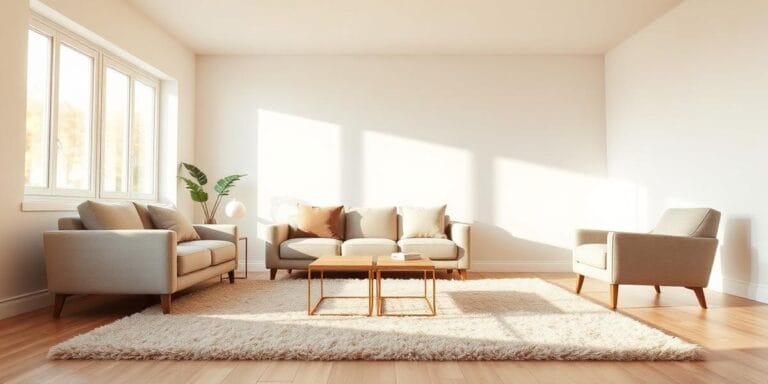
Blonde oak, soft beige luxury vinyl, and pure white ceramic tiles excel at bouncing natural sunlight around a room. While this makes small apartments look expansive, it can also leave furniture looking like it is floating aimlessly in space.
Grounding a bright room requires a rug that acts as an anchor, pulling the seating arrangement together into a defined zone.
- Deploy deeper charcoal, rich chocolate, or moody navy area rugs to frame light colored sofas and coffee tables beautifully.
- Select traditional low-pile distressed rugs from suppliers like Ruggable, which mix charcoal tones with soft cream accents to bridge the gap between dark furniture and pale wood.
- Ensure that at least the front two legs of every major seating piece sit firmly on the rug surface, cementing the structural layout of the room.
Practical Room Scenarios and Tactical Solutions
To see these rules in action, let us look at two real-world design dilemmas that frequently puzzle homeowners during renovations.
Scenario A: The Overly Orange Living Room
In a 2025 suburban renovation in Chicago, a homeowner faced a massive living room covered in high-gloss, amber-stained pine floors. The initial mistake was placing a bright red oriental reproduction rug in the center, which made the room look remarkably hot and dated.
The fix involved pulling up the red textile and replacing it with a 100 percent washed wool rug featuring a muted sage green field and ivory detailing. The green directly neutralized the aggressive orange wood tones on the color wheel. The low-sheen matte texture of the wool also softened the high-gloss reflection of the polyurethaned floor planks, resulting in a balanced, grounded family room.
Scenario B: The Cold Concrete Loft
A graphic designer moving into a downtown loft featured beautifully polished, dark gray concrete floors. While modern, the space felt cold, acoustic echoes were loud, and the overall look resembled a commercial garage.
The solution required layering textures rather than chasing loud colors. The designer laid down a large, flat-weave neutral jute rug as a base layer to provide an organic, raw look. On top of that base, a smaller 5 by 7 foot plush, ivory Moroccan style rug with simple charcoal lines was layered directly under the coffee table. The combination instantly dampened the room acoustics, cut through the industrial chill of the concrete, and stayed perfectly aligned with the cool gray undertones of the building.
Wrap Up
Selecting the ideal rug color is never an isolated choice; it is a direct negotiation with the surface beneath it. By identifying whether your floor carries warm, cool, or neutral undertones, you can confidently choose textiles that either blend harmoniously or offer striking contrast. Avoid the common trap of buying small rugs that float like islands, and always favor rich, physical textures when working with flat, monochromatic flooring. With the correct tonal foundation in place, your furniture, walls, and decor will naturally fall into a balanced, beautifully curated layout.
FAQs Section
Should a rug be darker or lighter than the floor?
Generally, a rug should contrast with your floor to create visual balance. Place lighter rugs on dark floors to brighten the room, and use darker, saturated rugs on light floors to anchor your furniture layout effectively.
How do you choose a rug color if you have multiple wood tones in a room?
Look for a multi-colored or patterned rug that contains hints of your dominant floor color while incorporating the secondary wood tones of your furniture. This common thread ties the conflicting wood elements together seamlessly.
What color rug looks best on traditional red oak flooring?
Muted sage greens, soft earthy terracottas, and deep blues look exceptional on red oak. These shades work to either complement the natural warmth of the wood or gently cool down strong orange and red undertones.