

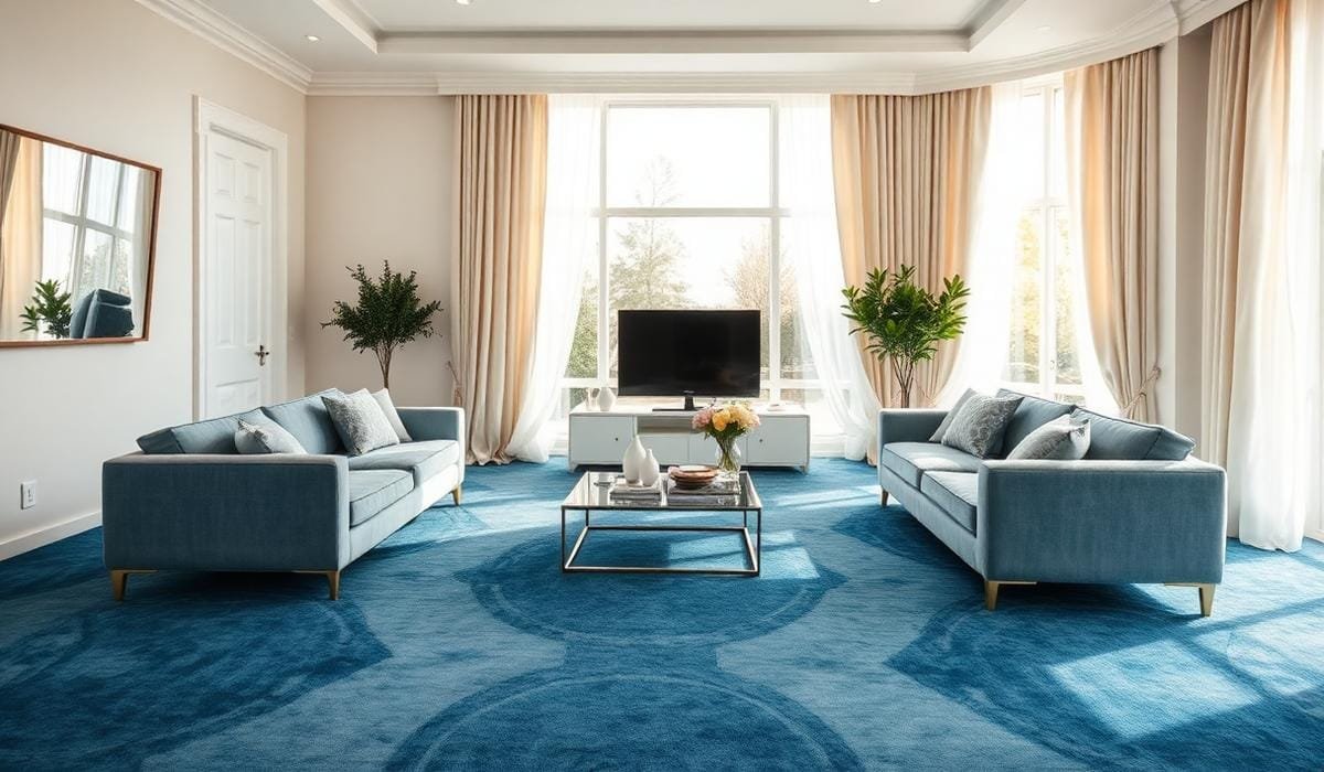
TL;DR
White, cream, soft gray, beige, navy, mustard, blush, and patterned curtains can all suit blue carpet. Choose by checking the carpet’s undertone, the room’s light, the wall color, and the amount of contrast the space needs.
Introduction
Why do some curtains make blue carpet look polished while others leave the room cold or mismatched? Blue can carry green, gray, or violet undertones, so one curtain color won’t suit every shade. Strong pairings either soften the floor, repeat a related tone, or add measured contrast. The advice below covers living rooms, bedrooms, offices, rentals, and family spaces.
Start With the Exact Shade of Blue Underfoot
Powder blue behaves very differently from royal blue, teal, denim, or navy. Light blue often feels airy, while dark blue gives the floor more visual weight. Place curtain samples beside the carpet in daylight and after sunset. A neutral that looks balanced at noon may turn yellow, green, or purple under warm LED lighting.
Undertones matter more than many homeowners expect. Teal contains green, so cream, oatmeal, rust, and warm beige tend to sit well beside it. Violet-blue often works with cool gray, crisp white, lavender-gray, or dusty rose. Kelly Wearstler’s interiors show how strong contrast can still feel controlled when colors share a clear temperature or visual link.
- Pair powder blue with white, ivory, pale gray, or taupe.
- Pair royal blue with cream, beige, mustard, or white-and-blue print.
- Pair navy with flax, camel, blush, or pale blue.
- Pair teal with sand, rust, terracotta, or warm stone.
- Avoid two near-matching blues that look accidental.
A common rental mistake is combining medium-blue carpet, cool gray walls, and cool gray curtains. The room can look flat because every large surface has the same temperature. Warm ivory linen usually restores contrast without fighting the floor. IKEA DYTÅG and West Elm European Flax Linen curtains show how textured neutrals can soften a strong blue base.
White and Cream Curtains Give the Cleanest Balance
White curtains create a clear boundary above blue carpet and reflect daylight into the room. Crisp white works with cool blues, chrome, black metal, and modern furniture. Cream and ivory suit oak, walnut, brass, rattan, and tan leather. The difference looks minor on a sample, but it becomes obvious across full-length panels.
Room direction changes the result. North-facing spaces receive cooler light, so bright white can feel stark beside navy or royal blue. Cream, ecru, or natural linen often feels calmer there. South-facing rooms carry warmer daylight and can support cleaner white. Light-filtering fabric also creates gentler contrast than dense blackout cloth.
- Choose crisp white for modern rooms with cool blue carpet.
- Choose ivory for traditional rooms with warm wood.
- Choose natural linen for coastal or Scandinavian styling.
- Use lined panels where privacy and light control matter.
- Repeat the curtain tone in cushions, trim, or lampshades.
Pottery Barn’s Belgian Flax Linen range includes white, ivory, flax, and muted neutral shades. In a navy-carpeted bedroom with white walls and walnut bedside tables, ivory panels often feel richer than stark white. The carpet keeps its depth, while the curtains stop the room from becoming dark or overly formal.
Gray, Beige, and Taupe Keep the Scheme Calm
Gray curtains can work with blue carpet, but their undertones need to agree. Blue-gray carpet pairs well with dove, silver, or soft charcoal. Green-blue carpet usually needs a warmer gray with beige or brown beneath it. Pure cool gray beside teal can develop a dull cast, especially under low-quality bulbs with uneven color rendering.
Beige and taupe add warmth without creating a loud color statement. They suit family rooms, offices, and rental homes where furniture may change. A beige curtain can also connect blue flooring to jute, cane, oak, and leather. This stops the room from looking overly coordinated and gives it a more collected feel.
- Use dove gray with powder blue or slate-blue carpet.
- Use greige with denim, teal, or medium blue.
- Use camel or sand with navy and warm timber.
- Use charcoal only when walls and ceilings stay light.
- Avoid dark gray in a small room with little daylight.
A practical office example uses medium-blue commercial carpet, white walls, black desks, and acoustic panels. Pale greige curtains soften glare and reduce the corporate feel without drawing attention away from the workspace. Ruggable’s blue-and-neutral rug collections also show how blue sits comfortably beside sand, stone, and warm gray, even though the brand sells rugs rather than curtains.
Warm Accents and Blue-on-Blue Add More Personality
Mustard, ochre, rust, terracotta, and soft coral create contrast because they sit opposite or near opposite blue on the color wheel. Muted fabric usually feels more settled than a bright primary shade across a large window. Mustard suits royal blue and navy, rust works with teal, and blush softens deep blue in bedrooms or nurseries.
Blue curtains can also work with blue carpet when the shades have a clear relationship. Exact matching often fails because carpet and fabric reflect light differently. Choose curtains several tones lighter or darker, then separate the surfaces through texture. Linen, cotton, plush fabric, and wool each handle light in a different way.
- Use mustard with navy carpet and walnut or brass.
- Use rust with teal carpet and cream walls.
- Use blush with deep blue carpet and light oak.
- Use pale blue curtains with navy carpet.
- Add white or beige through a blue patterned fabric.
One living room had navy carpet, cream walls, a gray sofa, and black shelving. Bright yellow curtains made the floor appear nearly black. Muted ochre panels restored balance, and two matching cushions were enough to repeat the accent. For blue-on-blue styling, IKEA SANELA dark blue curtains work better with pale blue carpet than with navy in a small room.
Use Pattern, Lighting, and Fabric to Finish the Choice
Patterned curtains can connect carpet, walls, and furniture in one surface. A print may contain the carpet blue, the wall neutral, and one accent from the sofa or artwork. Stripes, botanical prints, checks, and geometric motifs all work. Broad patterns suit larger rooms, while smaller repeats often sit better in compact bedrooms and traditional spaces.
Lighting and fabric weight can change the final color. Warm bulbs around 2700K enrich cream, beige, rust, and mustard, while neutral white bulbs around 3000K to 3500K give living rooms a balanced appearance. Sheer voile adds brightness but limited privacy. Linen filters light, while blackout polyester suits bedrooms and media rooms.
- Hang curtains near the ceiling to add visual height.
- Extend the rod beyond the frame to expose more glass.
- Use lighter panels in small or north-facing rooms.
- Test samples beside the carpet, walls, sofa, and night lighting.
- Limit patterned rooms to one dominant large-scale print.
A compact London flat with dark blue carpet and one narrow window benefits more from warm off-white curtains than charcoal blackout panels. A large Dubai villa with high ceilings and strong sunlight can carry heavier taupe, navy, or patterned drapery. Scale, climate, privacy, and daily use matter as much as the carpet shade.
Wrap Up
Blue carpet can work with many curtain colors when the undertones and light agree. White and cream create clean balance, beige and taupe add warmth, gray keeps the room quiet, and mustard or rust brings measured contrast. Blue-on-blue succeeds when the shades differ enough to look deliberate. Test fabric in the actual room before buying because paint, bulbs, furniture, and daylight can shift the result.
FAQs Section
What color curtains look best with navy blue carpet?
Ivory, flax, warm beige, camel, blush, pale blue, and muted mustard work well with navy carpet. Lighter curtains open the room, while warm accents stop navy from feeling too formal.
Can gray curtains go with blue carpet?
Yes, gray curtains suit blue carpet when their undertones agree. Use cool dove gray with blue-gray carpet and warmer greige with teal, denim, or green-based blue.
Should curtains match the carpet or the walls?
Curtains don’t need to match either surface exactly. They often look better when they connect the carpet and walls through a lighter neutral, a darker related shade, or a pattern containing both.