Most people buy the furniture first and treat the wall as leftover territory. The wall becomes a repository for whatever feels missing, a mirror hung too high, a shelf placed because there was a stud, and a print that sort of matches the sofa. A truly resolved modern layout never starts with the objects.
It starts with reading the wall as an active plane, a breathing surface that carries weight, shadow and silence in equal measure. Getting that balance right changes whether a room feels assembled or designed. The difference between something that looks like a furniture showroom and something that feels like a home comes down to a few structural decisions most design advice skips right over.
TL;DR
Modern wall furnishing succeeds when you treat the wall as a complete visual plane rather than leftover space around furniture. Focus on proportion first, use negative space deliberately and layer materials for depth. Integrated storage and lighting are functional elements that also serve as primary visual anchors.
Introduction
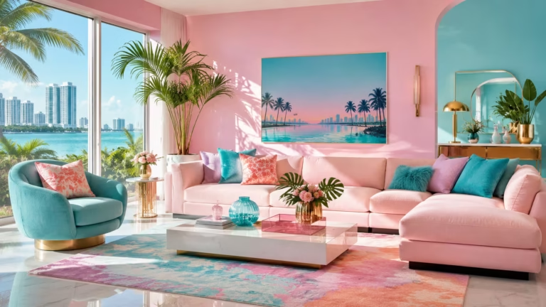
Walk into a room that feels instantly right and ask yourself where your eye lands first. It rarely goes straight to the sofa or the coffee table. Something on the vertical plane holds the gaze long enough for the rest of the space to settle around it. That is what proper wall furnishing does. It creates a visual anchor that gives every other piece in the room permission to exist.
Homeowners spend weeks choosing paint colours and months agonising over flooring, then treat the walls as an afterthought. This piece walks through the principles, material choices and layout logic that turn a bare vertical surface into the element that ties the whole room together.
The Proportion Principle Most Furniture Layouts Ignore
People measure floor space obsessively and never measure the wall before hanging anything on it. The wall is not a neutral backdrop. It has weight, boundaries and a centre of gravity that shifts depending on ceiling height, window placement and the mass of furniture sitting against it. When a wall furnishing looks wrong even though the individual pieces are beautiful, the problem is almost always a broken proportion between the wall plane and what sits on it.
Reading the Wall as a Vertical Canvas
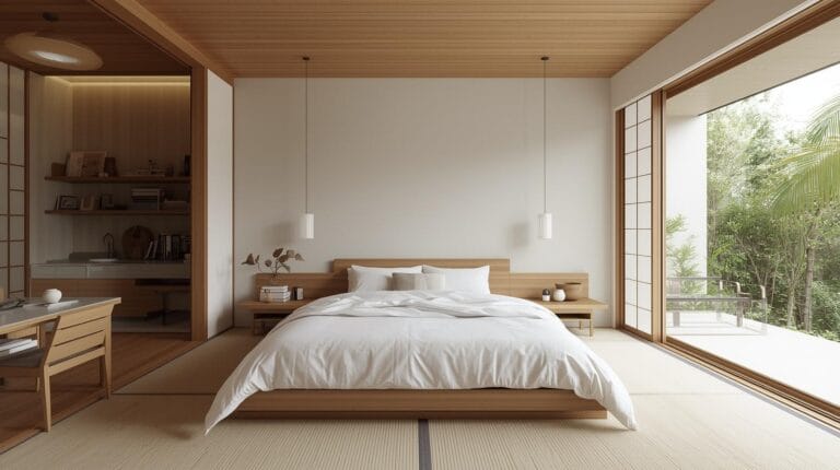
A wall that stretches twelve feet across and rises nine feet high needs a completely different furnishing logic than a narrow alcove beside a fireplace. Wide walls demand horizontal anchoring. A long low media console in walnut veneer, a series of three framed prints spaced equally or a single large textile hanging will settle the eye. Tall narrow walls call for vertical stacking. Think a slim floor mirror leaning against the paint, a pendant light dropping through the void and a narrow bench beneath to catch the shadow.
The height of the ceiling dictates the breathing room above any piece. On a standard eight foot ceiling, hanging anything higher than fifty eight inches to the centre loses the relationship with the furniture below it. The piece floats orphaned on the plaster. On ten foot ceilings, that same rule breaks.
You can hang higher but must introduce a secondary element below, a console table, a low bench, a row of books laid flat, to bridge the gap between the human scale and the architectural height. I once walked into a loft where the owner had hung a gorgeous abstract canvas dead centre on an eighteen foot wall. It looked like a postage stamp. Adding a low credenza underneath and suspending a linear pendant above reshaped the entire zone without touching the painting.
Negative Space as a Deliberate Material
The empty portions of a wall are not empty. They are the visual rest that lets the furnished sections register. A wall crammed with shelves, prints and sconces exhausts the eye the same way a paragraph with no punctuation exhausts the mind. Modern furnishing understands that what you leave unfurnished matters as much as what you hang.
I learned this the hard way in my own narrow dining room. I had installed floating shelves end to end, then filled them with ceramics, small framed photographs and a few trailing plants. The room felt smaller, noisier, even though nothing was ugly. Pulling out every other shelf and leaving a generous blank swath of the original warm grey plaster in the centre changed the entire feel.
Suddenly the remaining shelves read as intentional compositions rather than clutter. The room breathed. If a wall layout feels tense, remove one element before you add another. The fix is usually subtraction.
Material Choices That Build Depth Without Chaos
Modern does not mean cold or sparse. It means intentional. A wall furnished with a single material reads flat no matter how expensive the piece. The eye craves texture contrast to perceive depth. This is where material layering earns its place in the conversation, not as a decorating trick but as a perceptual requirement for making a wall feel finished.
Wood, Textile and Mineral in the Same Plane
Three materials in a single wall composition almost always outperform two. A fluted oak panel behind a low bench creates warmth and vertical rhythm. A smooth plaster finish or a single slab of marble atop a console introduces a cool mineral note that stops the wood from feeling sauna like. Then a textile, a woven wall hanging, a thick wool tapestry, a raw canvas piece, pulls the two extremes together and softens the sound in the room.
The sequence matters more than the individual pieces. Placing a textile next to wood exaggerates the softness of the fibre and the grain of the timber. Placing stone next to plaster highlights the honed surface against the matte wall. These pairings work because the contrast is quiet, not theatrical.
A friend who designs high end hospitality interiors once told me that the best hotel lobbies never use more than three core materials in any single sightline. The rule holds in residential spaces. Pick wood for warmth, mineral for coolness and textile for absorption. Let those three do the heavy lifting.
The Case for Integrated Wall Furnishings
Freestanding furniture pushed against a wall always leaves a sliver of shadow that subtly ungrounds the piece. Built in or wall mounted furnishings eliminate that gap and the visual noise that comes with it. A floating credenza fixed to the wall creates a crisp horizontal line and lets the floor run uninterrupted underneath, making the room feel larger. This is not a minimalism dogma. It is a straightforward spatial trick that works in rooms from one hundred square feet to one thousand.
Real world scenario. A couple in a mid century apartment had a sixty inch television dominating one wall with a tangle of cables, a soundbar and mismatched consoles purchased three years apart. The wall looked busy and bottom heavy. Removing every freestanding piece and installing a full width low wall mounted unit in matte white with a warm oak top shelf solved the cable chaos and gave the wall a unified horizon line.
The television became part of the composition rather than an alien object bolted onto the plaster. Total material cost came under nine hundred dollars. The visual upgrade felt like a renovation that cost five times that.
Lighting as a Wall Furnishing Element
Light fixtures are furnishings. They occupy vertical space, cast texture onto surfaces and draw the eye along deliberate sightlines. Treating lighting as a separate electrical afterthought misses half the wall furnishing opportunity. A well placed sconce does more for a wall composition than another framed print ever could.
Wall Washers and Grazing for Texture Amplification
A wall washer throws a broad soft beam down a vertical surface, revealing the subtle undulation of plaster, the grain of a wood panel or the weave of a textile. This is the lighting choice for smooth refined walls where you want to amplify material quality without drawing attention to the fixture itself.
Grazing light, a beam set very close to the wall surface and angled sharply, scrapes across brick, stone or heavily textured plaster and dramatises every peak and trough. Use washing for elegance and grazing for drama. Combining the two on opposite walls in an open plan space creates a push pull of visual softness and tension that makes the room feel larger and more considered.
The mistake most people make is mounting sconces too high. Eye level or slightly below, typically fifty five to sixty five inches from the floor, keeps the light in relationship with the furniture and the seated human body. A pair of sconces flanking a large mirror or a console table creates a symmetrical anchor that holds the composition.
Asymmetrical lighting, a single pendant dropping over a reading chair, works only when the chair itself is heavy enough to balance the visual weight. Light fixtures in a modern wall layout function as sculptural punctuation marks. Choose them after the main material decisions, not before.
Six Modern Wall Furnishing Ideas for a Stylish Layout
The following ideas are not fleeting trends lifted from a lookbook. Each one addresses a specific spatial problem and solves it with a combination of proportion, material logic and layered depth. They are numbered to clarify distinct approaches, but the principles behind them can and should be mixed once the underlying logic makes sense to your eye.
1. The Full Width Low Horizon
This layout anchors a broad wall with a single unbroken horizontal line running at roughly one third the room height. A wall mounted console that spans at least seventy percent of the wall width, finished in oak veneer or matte lacquer, sits beneath a deliberate expanse of blank wall. Above that blank zone, one large scale artwork or textile piece centres the upper field.
The console itself carries a few low objects, a stack of large format art books, a single ceramic vessel, a tray that hides daily clutter. Nothing sits above the artwork. The ceiling void remains empty.
This works because the eye reads the console as the ground, the artwork as the figure and the empty plaster as the sky. The proportions mimic the way we read a landscape. The layout solves the problem of a wide wall that feels too vast for a single picture but too empty with nothing. The horizontal anchor does the heavy lifting. The artwork supplies the personality.
2. The Vertical Stack for Narrow Walls
A narrow wall between two doorways or beside a chimney breast often stumps people. The temptation is to hang a small print and call it finished. The print inevitably looks lost. A vertical stack fixes this by building the composition upward through three distinct zones: floor level anchor, mid level focal object and upper level light.
Place a slim bench, a narrow console or even a stack of three large books at floor level. Directly above it, hang or lean a tall vertical mirror or a long textile panel that stretches upward for at least forty inches.
At the top third of the wall, mount a single pendant light or a picture light aimed at the textile surface. The three zones read as one tall uninterrupted composition. The wall feels intentional rather than leftover. This layout works in hallways, entry vestibules and the skinny walls between windows.
3. The Material Panel Backdrop
Instead of furnishing the wall with objects, this approach makes the wall itself the furnishing. A section of wall, roughly six to eight feet wide, receives a full height treatment of a single distinct material. Vertical fluted wood panels, large format stone veneer sheets or a textured plaster finish in a tone slightly deeper than the surrounding walls transforms that zone into a backdrop. A single piece of furniture, a dining table, a bed headboard, a reading chair, sits directly in front of the panel.
The material shift defines the zone more effectively than a rug or a room divider. The surrounding walls stay simple and unadorned. The panel does all the atmospheric work. I have seen this done with reclaimed teak panels behind a dining table in an otherwise white room. The contrast stopped everyone who entered. The cost was around the price of a good quality sideboard, and the impact far exceeded any piece of furniture you could place in the same spot.
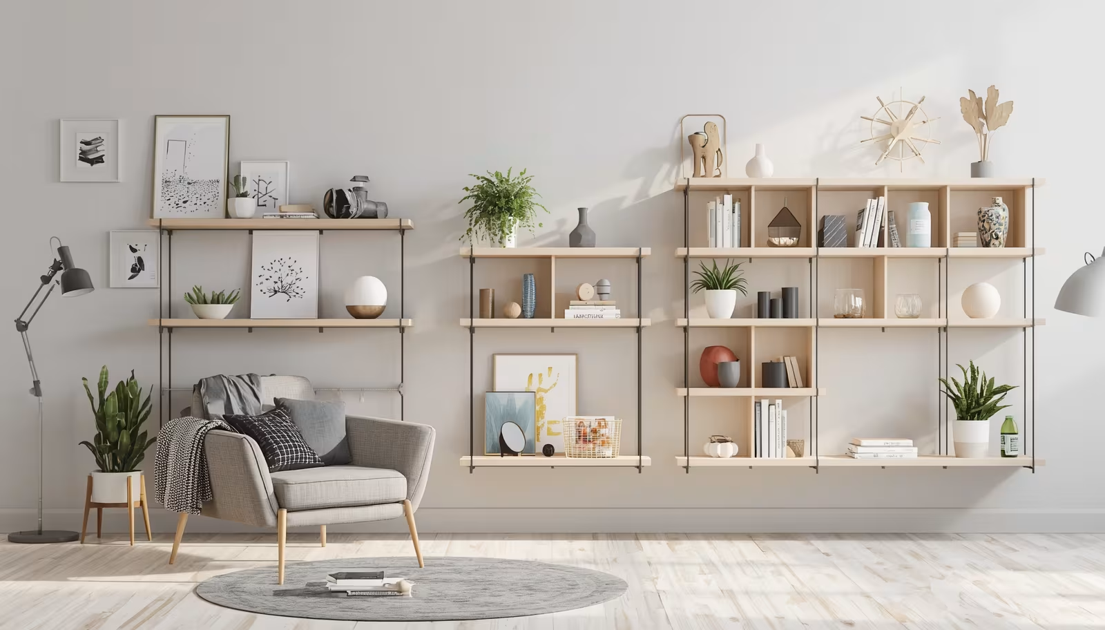
4. The Functional Gallery Wall
A traditional gallery wall often turns into a chaotic aggregation of mismatched frames and impulse purchases. The modern version treats the wall as a unified composition where every piece relates to a central axis and functional objects are invited into the arrangement.
A large central clock, a wall mounted shelving unit or a mirror anchors the layout. Smaller framed works, shallow shelves with trailing plants and a single wall mounted lamp radiate outward along invisible grid lines.
The grid is the secret. Draw an imaginary line horizontally and vertically through the centre of the anchor piece. Every other object aligns to those lines or to the spaces between them. The result feels curated rather than cluttered. The inclusion of functional items, the clock, the lamp, a small wall planter, prevents the composition from feeling like a museum display. The wall lives rather than just hangs.
5. The Concealed Utility Wall
Entire walls of a room can disappear into cabinetry that looks like wall surface. Full height doors in matte lacquer or wood veneer, flush with the plaster and free of visible handles, hide storage, a television, a home office or a bar. When closed, the wall reads as architecture. When open, the room transforms.
This idea suits living rooms that double as work spaces or media rooms that must also host dinner parties. The client I mentioned earlier with the television wall took this approach to its logical conclusion. Every cable, streaming box and game console vanished behind panels that matched the wall colour. The room felt bigger, quieter and far more adult. The cost of custom millwork needs weighing against the value of gaining back a room that serves multiple functions without visual compromise.
6. The Layered Lean Approach
Not every wall furnishing must be mounted. Leaning pieces against the wall creates a casual depth that fixed installations sometimes lack. A large floor mirror leaned against the paint, framed by two tall potted plants and a low stack of books at its base, builds a layered composition where objects sit at different depths from the wall plane. The mirror reflects light and gives the illusion of more space. The plants add organic texture. The books anchor the arrangement visually at floor level.
This approach works well in rental spaces where wall mounting is restricted and in awkward corners where no single large piece of furniture fits. The key is ensuring that leaned objects are stable and that the arrangement is not so deep it intrudes into walking paths. A depth of roughly eighteen inches from the wall plane to the outermost object keeps the composition feeling generous without eating the room.
The Sound Dimension Nobody Discusses
Walls do more than hold visual weight. They shape how sound moves through a room. Hard bare walls bounce sound and make conversation feel sharp and echoey. Furnished walls with textile, wood and irregular surfaces absorb and diffuse sound. This is not acoustician territory. It is everyday comfort that most people notice only in its absence.
A large textile wall hanging behind a sofa tames the slap echo that makes open plan living rooms feel cold. Fluted wood panels break up sound waves the way a diffuser panel does in a recording studio, without looking technical.
Bookshelves filled with books of varying sizes create a wonderfully irregular surface that scatters sound naturally. If a room feels harsh and you cannot figure out why, the wall surfaces are almost certainly too reflective. Add one soft furnished element to the largest blank wall and listen for the difference.
Wrap Up
A wall treated as an active plane changes how a room feels at the gut level. Start with proportion, work through material contrast and let negative space do its job. Integrated furnishings, intentional lighting and a willingness to leave sections empty matter more than spending more on art or shelving. The most stylish modern layouts feel calm, anchored and inevitable. That quality is not a matter of budget. It comes from making the wall as considered as any piece of furniture sitting in front of it.
FAQs
What is the best height to hang wall furnishings in a modern layout?
For most pieces above furniture, aim for the centre of the object to sit between fifty five and sixty five inches from the floor. This keeps the piece visually connected to the furniture below and matches the natural sightline of someone seated or standing.
How do I furnish a wall without making it feel cluttered?
Remove one item for every two you place and leave at least one substantial blank area on the wall. Mixing materials like wood, textile and plaster creates depth without requiring more objects.
Can a modern wall layout work without built in cabinetry?
Freestanding and leaned pieces work well when arranged with attention to proportion and depth. A low console, a large leaning mirror and a textile element can create a resolved wall composition without any permanent installation.
Disclaimer
This content shared by Fall Rugs is solely for research and informational purposes. Fall Rugs is not a professional interior design or home renovation consultancy, and the information provided should not be considered professional advice for home improvement or decor. All ideas and suggestions are based on current trends and general knowledge in the home decor industry.