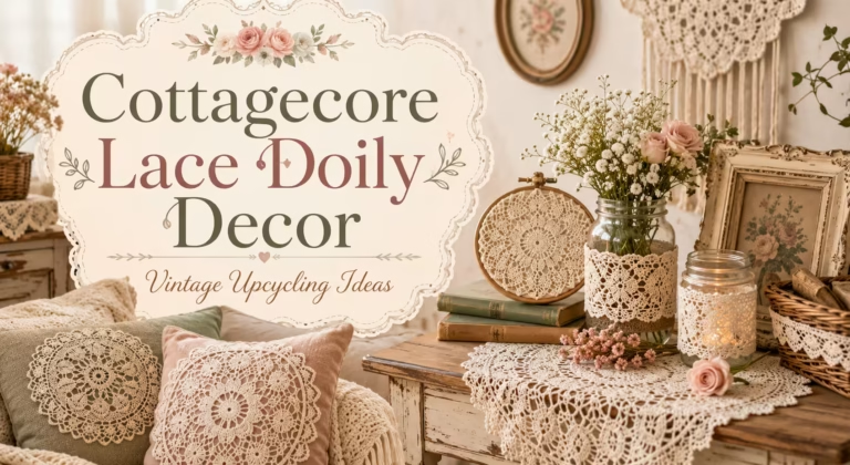
TL;DR
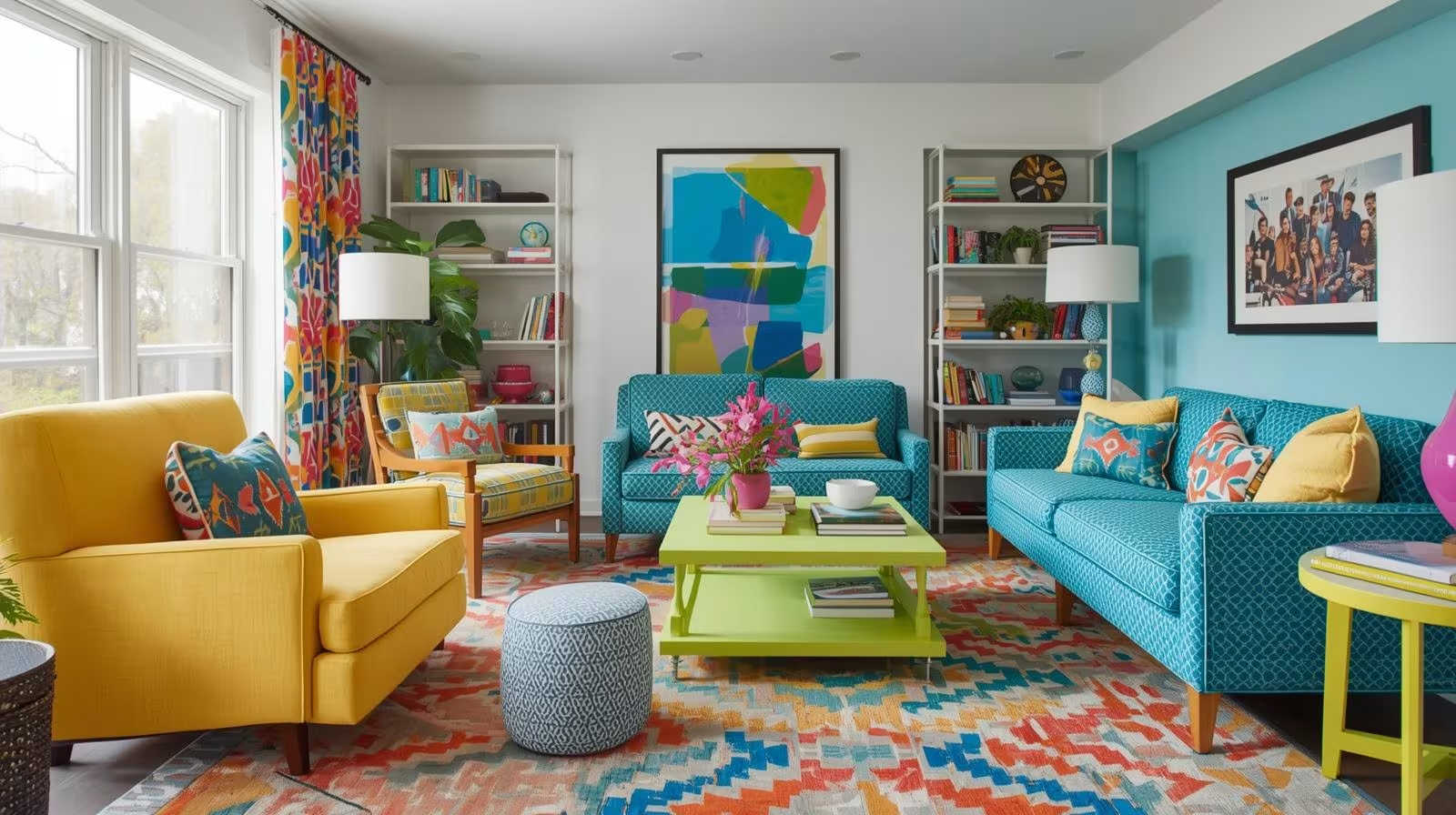
Multi colored furniture introduces warmth, visual contrast, and light reflection that plain white walls simply can’t achieve alone. The right color combinations trick the eye into perceiving more space and energy. Placement and material choice determine whether the effect reads as curated or chaotic.
Introduction
What if the fastest way to brighten a dark, flat room wasn’t a lighting upgrade or a renovation, but a sofa? Color psychology and interior design research consistently show that saturated, warm-toned furnishings affect perceived brightness almost as much as natural light does. This piece walks through how multi colored furniture interacts with room architecture, which palettes perform best in low-light spaces, and what real rooms with real constraints look like when they get the color treatment right.
How Color in Furniture Actually Affects Light in a Room
Most people associate bright rooms with white walls and large windows. That’s accurate, but incomplete. Furniture occupies between 30% and 60% of a room’s visual field, depending on the space. A charcoal sectional in a north-facing London flat will absorb ambient light rather than bounce it. Swap that same sectional for one upholstered in saffron or terracotta, and the room reads as warmer and more luminous, even without changing a single bulb.
This isn’t purely subjective. Warm hues like amber, coral, and goldenrod have higher reflectance values than cool neutrals or deep charcoals. Designers working in Scandinavian markets, where winter light is limited from October through March, have used this principle for decades. Brands like IKEA’s STOCKHOLM and SÖDERHAMN collections lean on cognac leather and rust-toned fabrics precisely because they perform in low-light interiors.
The secondary effect is contrast. A room with varied furniture tones creates visual rhythm. That rhythm pulls the eye across the space rather than letting it rest on one heavy, dark focal point. Movement equals perceived energy, and energy reads as brightness in the brain before the eyes have fully processed what they’re seeing.
The Role of Saturation Versus Brightness in Furniture Colors
There’s a common mistake worth naming early: confusing bright colors with light-enhancing colors. Neon yellow is technically bright, but a neon yellow armchair in a beige living room creates visual noise rather than warmth. The better approach is to think in terms of saturation paired with mid-range values.
Pottery Barn’s 2023 furniture catalog made an editorial shift toward what they called “grounded jewel tones,” colors like deep sage, dusty rose, and muted cobalt. These aren’t dark, but they’re not high-saturation either. They sit in the mid-value range, which means they catch light without overwhelming it. Interior designer Leanne Ford has built much of her residential portfolio around this principle, pairing aged wood tones with chalky off-whites and washed linens for rooms that feel bright without feeling clinical.
Saturation also behaves differently depending on the material. Velvet at high saturation reads as luxurious and deep. Linen at the same hex color reads as airy and casual. This means the same mustard yellow performs differently on a velvet ottomon versus a loose-weave throw blanket. Material awareness is what separates a room that works from one that doesn’t.
Mixing Furniture Colors Without Losing Cohesion
Anchoring With a Neutral
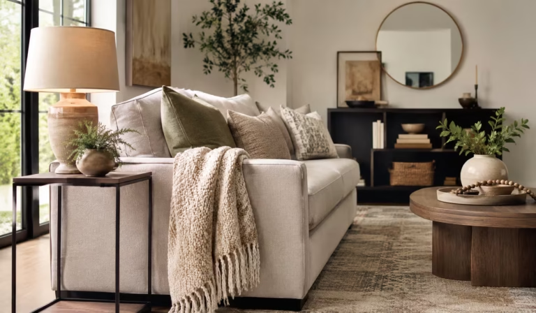
The most reliable approach to multi colored furniture is the anchor method: start with one large neutral piece, then build color outward. A cream or oatmeal sofa from a brand like Article or West Elm can hold the room steady while accent chairs, side tables, and ottomans introduce color. The neutral acts as visual whitespace.
Maria, a homeowner in Austin, Texas, spent two years with a gray sectional that made her 1970s ranch-style living room feel dim despite three west-facing windows. She replaced it with a creamy bouclé sofa, added a terracotta reading chair from West Elm, and introduced a hand-painted blue side table she sourced from a local ceramics studio. The room felt larger and brighter before she’d even rehung the curtains.
The 60-30-10 Rule Applied to Furniture
The 60-30-10 color rule was originally a designer shorthand for walls, textiles, and accents. It adapts cleanly to furniture. Sixty percent of the furniture footprint stays in your dominant tone, 30% in a complementary color, and 10% in an accent or contrast shade. In a living room, this might mean a pale blue sofa (60%), olive green side chairs (30%), and brass or deep burgundy accent pieces (10%).
Ruggable, which sells washable rugs in hundreds of colorways, built their marketing strategy around this rule. Their room visualizer explicitly prompts users to identify their dominant furniture tone before selecting rug colors. The result is rooms that feel coordinated rather than cluttered even when three or four distinct furniture colors are present.
When to Break the Rule
Rules in interior design are starting points, not ceilings. Some of the most compelling rooms photographed for Architectural Digest and Elle Decor in recent years ignore 60-30-10 entirely. A maximalist approach, where five or six distinct furniture colors share equal visual weight, can work in large, high-ceilinged rooms with strong natural light and a unifying material palette.
The key when going maximalist is material consistency. If every piece of furniture is matte-finished wood or every upholstered item uses a linen-cotton blend, the color variety becomes the feature rather than the flaw. The room reads as collected and intentional rather than accidental.
Low-Light Rooms and the Colors That Consistently Work
North-facing rooms, basement living areas, and rooms shaded by neighboring buildings all share the same challenge: they get cooler, bluer ambient light throughout the day. Warm furniture tones are the most direct counterbalance.
Interior colorist Annie Sloan, known for her chalk paint formulas used across furniture restoration projects in the UK and US, has noted that rooms with significant north-facing light benefit from ochre, warm white, and reddish-brown furniture accents. These hues absorb the blue cast and return warmth to the eye. It’s similar to the way photographers use warming gels on flash units in studio settings, compensating for color temperature with the physical materials rather than with artificial light.
Concrete numbers matter here. A cream or ivory sofa reflects approximately 70-80% of incoming light. A charcoal gray sofa reflects around 10-15%. In a low-light room receiving 200 lux on an overcast afternoon, that difference is perceptible without any additional fixtures. Mid-century teak furniture with its amber grain lands somewhere in the 40-50% reflectance range, which is why it continues to perform well in European apartments with limited glazing.
What Doesn’t Work in Dark Rooms
Jewel-toned furniture in very dark rooms can backfire if the pieces are large. A deep emerald green sofa in an already low-light space absorbs more than it reflects, compounding the dimness rather than solving it. The workaround is scale: use jewel tones on smaller pieces like accent chairs, side stools, or ottomans. Keep the large anchor pieces in lighter, warmer tones.
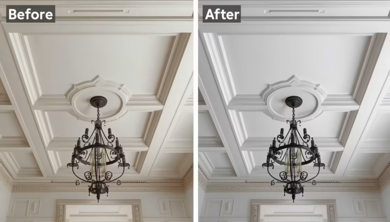
Mirrored or lacquered furniture surfaces function differently from upholstered ones. A lacquered white or ivory cabinet near a window bounces light horizontally across the room, a technique used frequently in Paris and Tokyo micro-apartments where floor area is too limited for additional fixtures.
Practical Furniture Choices Organized by Room Type
Living Rooms
Living rooms carry the highest furniture density of any room in a home. This makes them both the riskiest and most rewarding place for multi colored furniture. A 2022 Houzz survey found that 61% of homeowners who renovated their living rooms chose two or more distinct furniture colors, up from 47% in 2018. The trend toward color confidence is measurable.
Sofas in warm neutrals paired with accent chairs in jewel or earth tones remain the best-performing combination for brightening average-sized living rooms between 150 and 300 square feet. Adding a statement coffee table in painted wood or powder-coated metal introduces a third color without requiring a major upholstered investment.
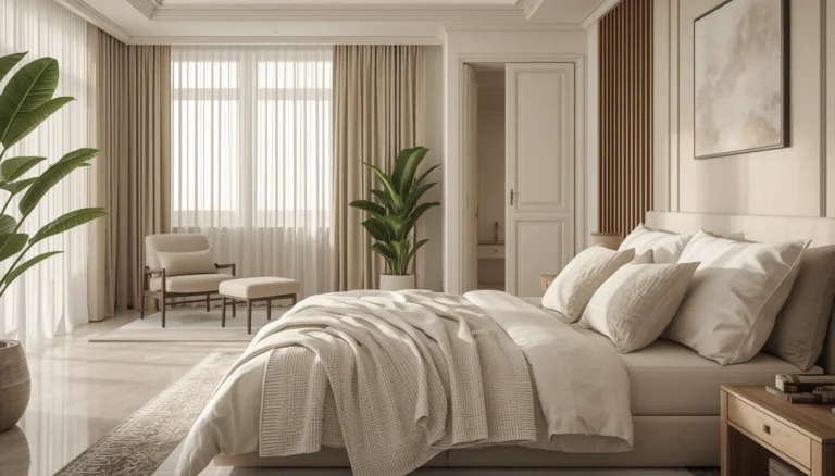
Bedrooms
Bedrooms benefit from softer iterations of the same principle. A bed frame in warm walnut or honey oak paired with a linen upholstered headboard in dusty blue performs differently than a matching bedroom set in identical dark espresso throughout. The variety prevents the eye from flattening the space.
The brand Floyd Home has built its product line around this logic, offering bed frames in three distinct wood tones and a range of upholstery options designed to combine rather than match. The deliberate mismatch approach reflects a broader shift away from matchy-matchy suites that dominated American bedroom design from the 1980s through the early 2000s.
Dining Rooms
Mixing dining chair colors is one of the fastest-growing furniture trends tracked by Pinterest’s annual trend reports. In 2023, mismatched dining chairs increased in searches by over 140% year over year. The functional appeal is practical: it allows households to replace individual chairs rather than full sets. The aesthetic appeal is that varied chair colors, especially around a natural wood or white table, create the kind of informal, collected warmth that makes dining rooms feel lived in rather than showroom-staged.
Wrap Up
Multi colored furniture isn’t a decorating shortcut. It’s a structural approach to how color, light, and material interact across a room’s visual field. Warm, mid-value tones brighten low-light spaces more effectively than most lighting upgrades. The anchor method, the 60-30-10 principle, and material consistency all give structure to what might otherwise feel like guesswork. Start with one piece, observe how the room responds, and build from there.
FAQs
Can multi colored furniture make a small room look bigger?
Yes, when the palette uses warm, lighter tones on large pieces and reserves deeper colors for smaller accents, the contrast creates visual depth that reads as spaciousness rather than clutter.
What is the easiest way to start mixing furniture colours?
Replace a single accent chair in a color that complements your existing sofa without matching it, then assess how the room feels before adding more variation.
Do multicoloured furniture pieces need to match the wall colour?
No. Furniture and walls work best as separate layers. Warm-toned furniture can brighten a cool gray or white room precisely because the contrast between the two creates the light-enhancing effect.
Disclaimer
This content shared by Fall Rugs is solely for research and informational purposes. Fall Rugs is not a professional interior design or home renovation consultancy, and the information provided should not be considered professional advice for home improvement or decor. All ideas and suggestions are based on current trends and general knowledge in the home decor industry.