TL;DR
Transforming a cramped living space requires shifting from traditional furniture placement to strategic architectural zoning. By using low-profile pieces, multi-functional dividers, and clear sightlines, a single room can successfully host distinct areas for sleeping, working, and lounging. The secret lies in treating floor area as a canvas for scale and movement rather than as a storage locker.
Introduction
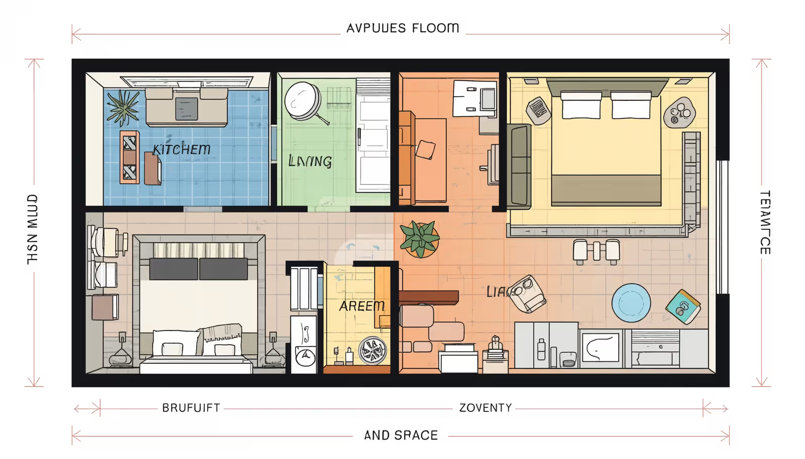
Can a mere three hundred square feet truly feel like an expansive sanctuary? Most residents in dense urban centers face the daunting challenge of squeezing an entire life into a single rectangular room. The typical response involves pushing all furniture against the walls, which accidentally highlights the cramped perimeter and shrinks the perceived room size. This analysis breaks down the spatial mechanics that alter human perception, transforming tightly boxed quarters into highly functional, visually open environments.
The First Layout Strategy: The Linear Perimeter Concept
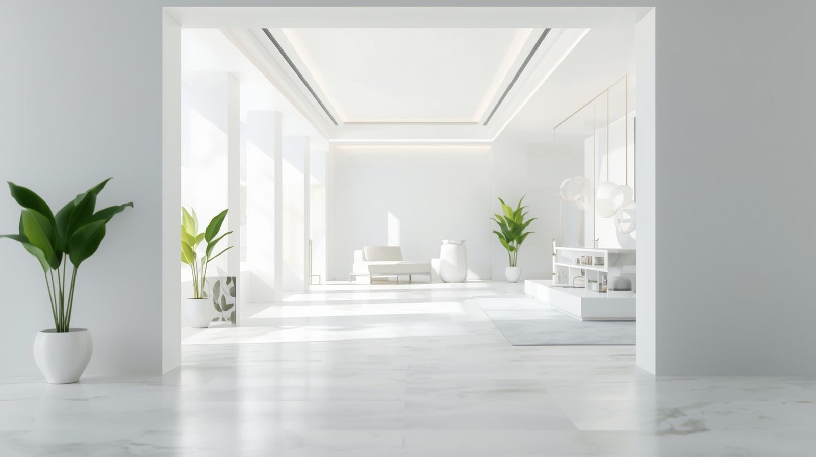
Concentrating all major utilities along a single architectural boundary dramatically alters how someone experiences a small room. This method leaves the remaining floor area entirely open, creating an unbroken expanse that mimics a larger suite. A designer in Seattle applied this methodology to a tight two-hundred-square-foot micro-apartment, building a continuous wall unit that integrated a kitchen, wardrobe, and desk. The room retained its natural light perfectly.
The success of a linear layout hinges on visual uniformity. Mismatched cabinet colors or varying depths stop the eye at every transition, making the wall feel intrusive. Opting for flat-panel, handleless cabinetry that matches the wall color tricks the brain into viewing storage as an architectural element. This visual trick guides the eye toward the open floor space and windows.
When arranging the rest of the room opposite a linear utility wall, floating furniture pieces become your finest option. A sofa with slender legs that sits off the ground allows light to pass underneath, contributing to an airy atmosphere. Heavy, skirted furniture pieces block the view of the flooring, shrinking the perceived square footage. Keeping the floor visible right up to the baseboards establishes a sense of openness that traditional layouts lack entirely.
The Second Layout Strategy: The Central Pod Partition
Positioning a substantial, multi-sided structural element right in the center of a studio might seem counterintuitive, yet it provides remarkable zoning benefits. Instead of dividing a room with permanent drywalls that block natural illumination, a central freestanding furniture pod can define individual zones naturally. A classic example involves a custom open-backed bookshelf placed squarely between the sleeping area and the living space. This piece acts as a divider while allowing daylight from a single window to penetrate both sides of the apartment.
This layout establishes a circular traffic pattern that mimics the experience of walking through a larger multi-room home. As a resident moves around the central pod, they transition from the entryway to the kitchen, then to the lounge, and finally to the sleeping quarters. This physical movement creates a psychological separation between daily activities, which prevents the feeling of being trapped in a single box. The second-order effect of this layout is an increase in usable wall space, as the central pod itself provides storage and display surfaces on multiple sides.
Selecting the right scale for a central partition requires careful calibration. A solid, ceiling-high wardrobe placed in the middle of a room will completely darken the far half of the space and feel incredibly oppressive. Choosing a mid-height console or an open shelving unit preserves the upper sightlines of the room. When the ceiling remains completely visible from wall to wall, the human brain perceives the entire square footage as a single expansive volume, even if the floor is divided into functional segments.
Balancing Light and Division in Central Layouts
Maintaining a bright environment while splitting a room requires materials that interact beautifully with light. Industrial glass panels with thin steel frames offer an exceptional alternative to solid wood bookshelves in a central layout. They block sound and create a distinct barrier for a bed or home office without sacrificing a single ray of sunlight. In a historical renovation in Chicago, designers used fluted glass panels to shield a sleeping nook, ensuring privacy while transforming harsh direct sunlight into a soft, glowing ambiance.
Translucent textile panels or woven acoustic screens also perform beautifully in these central configurations. They offer the flexibility to shift the boundaries of the room based on immediate needs, pulling closed for a cozy evening or sliding back during the day. This adaptability ensures the studio remains dynamic, altering its identity to match the rhythm of the occupant’s schedule.
The Third Layout Strategy: The Elevated Vertical Loft System
When floor area is at a premium, looking upward reveals a massive amount of underutilized volume. Studios with ceilings measuring nine feet or higher are perfect candidates for vertical layering, which effectively doubles the usable footprint of the sleeping zone. By hoisting the mattress onto a structural platform, the ground level becomes available for activities that require more active movement, such as working or entertaining.
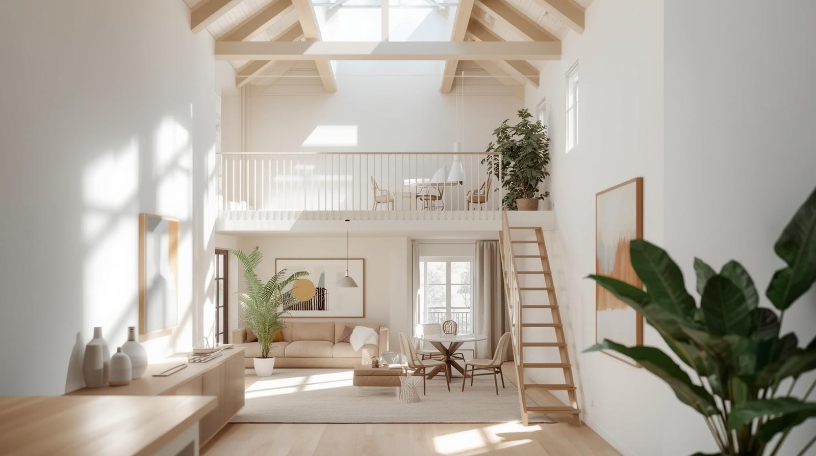
A notable project in London transformed an old industrial warehouse unit by installing a custom timber loft platform above the main living area. The space beneath the platform became a compact, high-efficiency kitchen and a walk-in storage closet, while the top deck served exclusively as a serene sleeping loft. This structural intervention completely isolated the bed from the rest of the apartment, eliminating the common studio dilemma of looking at unmade sheets while sitting at a desk or welcoming guests.
Implementing a loft system introduces distinct environmental factors that require proactive management. Heat naturally rises, meaning an elevated sleeping platform can become uncomfortably warm during summer months without proper air circulation. Installing a low-profile ceiling fan or dedicating a specific split-system climate vent to the upper zone resolves this issue completely. Additionally, ensuring comfortable head clearance on both levels prevents the spaces from feeling like claustrophobic crawlspaces.
Optimizing the Under-Bed Workspace
For apartments where a full structural loft is impractical, an elevated bunk system tailored for a home office offers a similar spatial reward. Placing a deep wooden desk directly underneath a high mattress frame preserves valuable perimeter wall space elsewhere. This layout works exceptionally well when integrated with task lighting that counteracts the shadows cast by the overhead platform.
Choosing light-reflecting materials for the underside of the bed frame prevents the desk area from feeling dim or cave-like. Applying a high-gloss white paint or mounting a series of thin LED strip lights creates a bright, focused workspace. This distinct micro-environment helps separate professional life from relaxation, a crucial boundary when living and working in identical quarters.
The Fourth Layout Strategy: The Dual-Zone Diagonal Blueprint
Most people naturally arrange their furniture parallel to the main walls, a habit that emphasizes the boxy nature of a studio apartment. Placing furniture at a strategic angle or creating an intentional diagonal path of sight completely disrupts this predictable geometry. The longest line across any rectangular room is always the diagonal path from one corner to the opposite side. Aligning the primary seating or sightlines along this axis coaxes the eye to travel further, creating a powerful illusion of spaciousness.
A practical application of this design involves angling a low-backed sofa across a corner, rather than flushing it against the long wall. The empty triangular space behind the sofa can then accommodate a tall architectural plant or a sculptural floor lamp, adding depth and visual texture to the layout. In an apartment layout in San Francisco, an interior decorator used this diagonal orientation to point the main seating area toward a large bay window, pulling the outdoor view into the immediate living experience.
This diagonal arrangement naturally guides foot traffic through the space along a wider path, preventing collision points near the entryway or kitchen counters. When a person walks along a diagonal trajectory, they experience a more varied perspective of the room, which makes the square footage feel far more complex and generous than it actually is. It breaks the monotony of the standard box layout, providing a custom architectural feel without structural renovation.
Enhancing Depth with Accent Placement
To reinforce a diagonal floor plan, strategic placement of visual anchors in the far corners of the apartment is vital. A vibrant piece of artwork or a distinctive chair positioned at the end of the diagonal line draws the eye across the maximum length of the room. This technique ensures that the entire volume of the studio is appreciated, rather than just the immediate center.
Using mirrors on adjacent walls can amplify this diagonal effect by bouncing reflections across the room at unique angles. A tall, leaning mirror placed near a corner reflects the opposite side of the space, creating a deceptive sense of an additional room hidden just out of view. This interaction of light and reflection expands the horizons of a small floor plan with zero impact on actual floor availability.
The Fifth Layout Strategy: The Kinetic Moving Wall Arrangement
Static furniture creates static limitations, whereas kinetic architecture allows a small studio to change shape based on the hour of the day. Using sliding partitions, track-mounted bookshelves, or heavy rolling wall panels transforms a single space into a multi-phase environment. This approach acknowledges that you rarely need a living room, a bedroom, and a dining room simultaneously.
In a Manhattan apartment measuring just over three hundred square feet, designers engineered a heavy wooden library wall that glides along an overhead steel track. During daytime hours, the wall rests against the back boundary, exposing a spacious lounge area with a sofa and an integrated workspace. When night falls, a smooth pull shifts the entire wall forward, revealing a hidden fold-down bed while creating a private dressing corridor behind the moving structure. This dynamic versatility ensures that every square inch performs double duty throughout the weekly routine.
While kinetic layouts offer unparalleled space optimization, they demand precise engineering and high-quality hardware to remain functional over time. Cheap tracks or poorly balanced rollers will quickly become frustrating to operate, leading to a static setup that defeats the purpose of the design. Investing in heavy-duty commercial sliding hardware ensures smooth, effortless movement that can withstand daily transitions without wearing down the floor or straining the walls.
Maintaining Fluidity in Dynamic Spaces
Operating a moving wall system successfully requires keeping the path of travel entirely clear of secondary furniture. Light, easily moveable accent pieces like nesting tables or upholstered ottomans on wheels are ideal companions for this layout style. They can be rolled out of the way in seconds, allowing the main structural walls to shift positions without requiring a major reorganization of the room.
This fluidity encourages a minimalist approach to everyday decor, forcing the resident to curate possessions thoughtfully. When every piece of furniture must have a clear purpose and a designated spot during transitions, clutter naturally disappears. The resulting clean lines and open spaces are fundamental to making a micro-apartment feel sophisticated, orderly, and significantly larger than its physical dimensions suggest.
The Sixth Layout Strategy: The Asymmetric Focal Point Layout
Shifting away from symmetrical furniture groupings can create unexpected breathing room in a studio apartment. When people attempt to center everything perfectly, they often create awkward, narrow paths that restrict natural movement. An asymmetric layout intentionally pairs a single large focal feature, like an oversized window or an architectural fireplace, with offset furniture arrangements. This imbalance draws the eye across different focal distances, making the boundaries of the room feel more distant than they are.
In a historic brick studio in Boston, a resident successfully placed an oversized velvet armchair completely off-center, balanced by a low, long media console on the opposite side. The deliberate empty space between these items allowed traffic to flow naturally while making the room feel relaxed rather than stiffly packed. This strategy relies on the principle that negative space holds its own visual weight, giving the eye a place to rest.
Choosing an asymmetric layout requires a commitment to bold proportions rather than tiny, fragmented furniture. Many studio dwellers make the mistake of buying multiple small items, which results in a cluttered, restless aesthetic. Selecting one or two large, comfortable pieces and placing them with deliberate asymmetry creates an atmosphere of confident luxury, shifting the narrative from a lack of space to a choice of style.
Managing Visual Clutter and Balance
Successfully executing an asymmetric plan depends on controlling the heights of your furniture across the room. If all the tall elements gather in one corner, the room will feel lopsided and uncomfortable to inhabit. Distributing height unevenly but gracefully, such as balancing a tall bookcase on one wall with a hanging light fixture on the opposite side, restores equilibrium without returning to rigid symmetry.
Incorporating varied textures rather than diverse colors helps maintain this balance without overloading the senses. Smooth leather, coarse linen, and polished wood provide visual interest that keeps the eye moving throughout the space. This continuous movement prevents the viewer from focusing on the physical limitations of the walls, reinforcing the illusion of a spacious home.
Wrap Up:
Achieving a spacious feel within a limited studio footprint requires moving past traditional layout assumptions and embracing tactical zoning. By utilizing strategies like linear perimeters, central anchors, vertical elevations, diagonal sightlines, or kinetic partitions, a single room can offer the utility and comfort of a multi-room home. The true value of a thoughtful floor plan lies in its capacity to change perspective, making daily living feel unconfined and thoroughly organized. Focusing on open sightlines and continuous flooring will ensure that any micro-apartment becomes a welcoming, functional sanctuary.
FAQs Section:
How can I separate my bed from the living area in a studio without using dark walls?
Using open-backed bookshelves or fluted glass panels divides the space effectively while allowing natural light to filter through the entire room. Lightweight textile screens that slide on ceiling tracks also offer an adjustable barrier that can open or close based on your needs.
What furniture style works best for making a small studio look larger?
Low-profile furniture with exposed legs creates an airy feeling by allowing light and sightlines to pass underneath the pieces. Avoid heavy, solid items that block the view of the baseboards, as keeping the perimeter floor visible expands the perceived square footage.
Where should a home office desk be placed in a single-room apartment?
Positioning a desk underneath an elevated loft bed or aligning it within a linear wall unit keeps the central floor space open and clear. Angling a small workspace in an underutilized corner along a diagonal path can also provide a quiet zone without disrupting daily foot traffic.
Disclaimer:
This content shared by Fall Rugs is solely for research and informational purposes. Fall Rugs is not a professional interior design or home renovation consultancy, and the information provided should not be considered professional advice for home improvement or decor. All ideas and suggestions are based on current trends and general knowledge in the home decor industry.