TL;DR
A contrast-edge sofa uses a distinct welt or piping color to outline its silhouette, turning a structural seam into an optical boundary. The choice of edge contrast alters perceived furniture volume, hides early wear on high-friction zones, and anchors a room’s color logic more deliberately than a solid sofa can. Done wrong, it dates a piece in two years instead of twelve.
Introduction
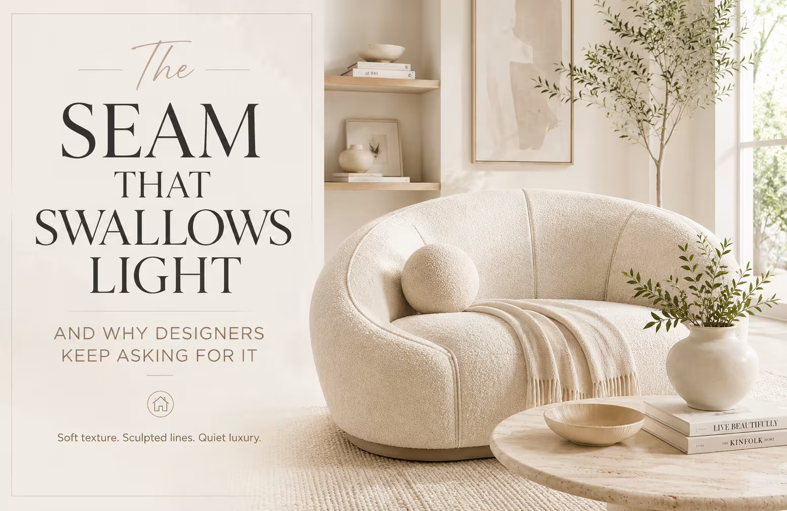
Marlene Vega ordered a charcoal sofa for her west-facing Denver living room. Six months later she called the upholstery workroom asking if they could retroactively add pale sand piping to every cushion edge. The couch felt like a black hole, she said. All the afternoon light died when it hit the unbroken dark mass. That single project taught me more about contrast welting than a decade of furniture showroom visits ever could.
A piping decision seems like a trim-level checkbox until you live with the consequences of getting it wrong. This piece unpacks why the contrast-edge sofa has moved from trend-report novelty to foundational seating logic and when you should leave the edges alone entirely.
The Optical Mechanics of a Contrast Welt
Why the Eye Reads an Edge Before It Reads a Color
Human vision processes boundaries before it processes surfaces. A contrast welt hijacks that wiring. When a cream sofa carries a thin ink-blue piping along the arm curve and front rail, the brain sees the silhouette first, the body color second. Solid upholstery does the reverse and that reversal explains why two sofas with identical dimensions can read as visually heavier or lighter depending entirely on edge treatment. A dark edge on a light sofa compresses perceived volume. A light edge on a dark sofa expands it, though the effect weakens in rooms with low ambient light because the contrast ratio collapses.
The optical principle operates like an artist’s contour drawing. Henri Matisse understood it when he painted the edges of a figure with a line that didn’t exist in life but made the form read clearly from across the room. A contrast-edge sofa does the same thing for seating. The piping defines the furniture’s territory, separating it from the floor, the rug, the wall behind it. Without that definition, upholstered forms tend to bleed into their surroundings, especially in open-plan spaces where multiple zones compete for visual attention. The welt becomes a kind of punctuation mark, telling the eye where the sentence ends.
Contrast Ratios Matter More Than Color Choices
Designers talk about contrast piping as though color selection drives the result. It doesn’t. The contrast ratio between the body fabric and the welt fabric does the heavy lifting. A warm white linen with a slightly creamier white welt offers almost no ratio at all and that’s intentional when someone wants the architectural clarity of a welt without the graphic punch.
A midnight navy sofa with a silver-gray piping carries a ratio that reads from thirty feet away. Most successful contrast-edge sofas land somewhere in the middle range where the welt is distinct in daylight but recedes under warm evening bulbs, giving the room two different moods across the day.
Fabric value does part of the work independently of hue. A medium-toned olive velvet with a pale ecru welt reads differently than the same olive with a deep burgundy welt, even though both combos use saturated colors. The ecru option lightens the sofa’s footprint. The burgundy option intensifies it. Neither is wrong, but swapping one for the other changes how the piece anchors a seating group.
I’ve seen a pair of matching sofas in a London townhouse, one with bone piping on charcoal, one with charcoal piping on bone, sit opposite each other and create the illusion that one side of the room was physically larger. The host noticed it before I said anything. The welt ratio was doing spatial work that paint colors normally handle.
How Contrast Edges Change Perceived Scale in a Room
The Visual Shrinking Effect of Dark Boundary Lines
A sofa is the biggest single object in most living rooms. Anything that changes how the eye measures its bulk becomes a spatial tool, not just an aesthetic choice. A dark welt on a light sofa acts like a drawn perimeter that pulls the form inward. The mind registers the line as the object’s true boundary even though the upholstered volume extends slightly beyond it. The sofa appears more compact, more contained, more like a deliberate object and less like a bloated cushion field. Small rooms gain usable negative space from this trick without moving a wall.
The effect amplifies when the piping color matches another anchoring element in the room. A walnut-stained floor pairs with a chocolate-brown welt on an ivory sofa and suddenly the vertical plane and horizontal plane share a visual frequency. The sofa looks planted rather than floating. Without the welt, the same ivory mass hovers above the floor with no tether. This isn’t metaphor. The dark line acts as a visual stake, and interior photographers exploit this constantly by positioning contrast-edge pieces where floor and wall meet in the frame’s background. The sofa outlines itself against both surfaces simultaneously.
When the Welt Expands Instead of Contracts
Light piping on a dark sofa body behaves differently. The bright boundary line pushes outward optically, making the sofa read slightly larger than its physical dimensions. That sounds undesirable for small rooms, but it works brilliantly in cavernous spaces where furniture tends to look under-scaled and apologetic. A deep aubergine velvet sofa with a cream welt in a converted warehouse living area stops the piece from disappearing into the exposed brick shadows. The welt announces the sofa’s presence and gives the eye a reason to pause at the seating zone rather than sliding past it toward the kitchen island twenty feet away.
The expansion effect has limits tied to welt thickness. A standard quarter-inch piping cord creates a crisp line that registers as boundary without stealing surface area from the body fabric. Chunky half-inch or jumbo welts cross into decorative territory where the piping becomes a color block rather than a contour line. Those wider welts genuinely increase the sofa’s visual footprint and the effect is additive, not just perceptual.
The piece physically reads larger because the welt claims territory the eye treats as sofa volume. Furniture makers in the 1970s leaned hard into this with oversized contrast welts on modular seating, and the surviving pieces look like they’re wearing bumper guards. The pendulum swung back toward slim, almost shy piping in the last decade and that thinner welt is what most people picture now when they hear the phrase contrast-edge sofa.
The Upholstery Geometry Behind the Look
Welt Construction and the Failure Points Nobody Discusses
Piping lives at the exact intersection of every high-friction zone on a sofa. The arm fronts catch elbows, the seat edges catch thighs sliding on and off, the back rail catches shoulders when people lean to grab a book from the end table. A contrast welt concentrates wear in a single strip of fabric that, by definition, contrasts with its surroundings. When that strip abrades, frays, or fades, it announces the damage more loudly than body fabric ever would. This is the structural argument against contrast edges that furniture salespeople rarely volunteer.
Welt cord itself comes in several materials and the choice determines whether the edge holds its line or collapses into a sad wrinkle after eighteen months. Cotton cable cord stays firm but rots if moisture reaches it. Polyester cord resists rot but flattens under sustained pressure from seat cushions that bear body weight directly on the front rail. Paper-wrapped cord, the traditional upholstery standard, splits if it gets wet and then the welt loses tension and sags.
The best compromise I’ve seen in production furniture is a poly-wrapped synthetic core with a cotton outer braid, which gives the upholsterer enough tooth to stitch cleanly while maintaining shape retention. Custom workrooms sometimes still use all-cotton for the tightest radius curves but those sofas need to live in climate-controlled rooms.
Seam Placement Determines Whether the Edge Survives a Decade
The location of contrast piping dictates its wear pattern. A welt running vertically up the arm face endures less abrasion than one spanning the front seat rail because people don’t slide across arms the way they slide across seat edges. The front rail welt takes the worst beating on any sofa and when that welt contrasts strongly with the seat cushion fabric, every worn spot becomes a high-contrast distress signal. Some manufacturers combat this by using a double-stitched welt on seat rails only, burying two lines of thread instead of one to distribute the friction load across more fiber.
Seat cushion edges present their own geometry problem. Box-edge cushions with contrast piping on all four sides look crisp on delivery day and then the front welt starts to roll under as foam softens and the cushion settles. The piping migrates from a visible edge detail to a hidden crease within the first year if the cushion core lacks enough firmness to resist compression set.
Reversible cushions help because flipping halves the duty cycle on each welt, but the issue persists on non-reversible designs where the cushion sits permanently in one orientation. The fix is a higher-density foam with a Dacron wrap thick enough to keep the welt proud of the cushion face, but that adds cost and changes the sit, so it’s a trade-off many mid-market brands decline to make.
Contrast Edge as a Style Period Indicator
Mid-Century Precision Versus 1990s Overstuffed Everything
Contrast piping has cycled through furniture history as a marker of design intent. Mid-century Danish pieces used it sparingly, almost surgically, with thin leather welts that echoed the teak leg taper. Those edges read as engineering, not decoration. The piping was doing the work of defining a form that was already lean.
American mass-market furniture in the 1990s used contrast welts the opposite way, wrapping thick braided cord in shiny polyester and running it around overstuffed rolled arms with no structural logic whatsoever. The welt became a decorative afterthought, a way to add visual interest to a generic silhouette without improving the silhouette itself.
Current contrast-edge designs borrow from both eras but the execution leans toward the Danish precedent. Slim welts, matte fabrics, colors drawn from the body fabric rather than clashing against it. The restraint reads contemporary because it doesn’t beg for attention. A visitor notices the edge eventually, usually after twenty minutes of sitting in the room, and that delayed recognition marks the difference between furniture that performs and furniture that performs loudly. The quiet contrast edge doesn’t compete with artwork or window treatments. It registers subliminally and does its spatial work without interrupting conversation.
When the Edge Becomes the Whole Statement
Some designers reverse the hierarchy entirely and make the welt the star. A neutral sofa body in oatmeal linen with an acid-green piping or a cobalt welt on a chalk-white frame takes the contrast principle past subtlety and into deliberate visual collision. The result functions almost like jewelry on an outfit, with the sofa body acting as a neutral backdrop for a thin, saturated line.
This approach succeeds when the welt color repeats elsewhere, on a lampshade trim, on a rug fringe, on the leading edge of a curtain panel. Without those echoes, the pop-color welt reads as a gimmick that belonged in a catalog spread, not a room where people actually live.
The high-contrast welt also dates faster than the quiet version because color trends move faster than furniture replacement cycles. A neon coral piping from 2018’s palette looks aggressively timestamped five years later in a way that a muted brass or warm taupe welt does not. The pop-color edge is a fashion play on a long-cycle purchase.
People who swap sofas every three seasons can ignore this. Everyone else should consider whether the welt color they love today will still feel like an ally when the next wall color refresh rolls around. The safest pop-contrast welt uses a color that already exists in the room’s permanent hard finishes, tile, stone, wood stain, rather than a color imported from a trend forecast.
The Material Pairings That Make or Break a Contrast Edge
Leather Piping on Fabric Bodies
A leather welt on a woven fabric sofa brings a material contrast that exceeds mere color difference. The leather’s surface sheen catches light at a different angle than the matte body fabric, so the welt glints as someone walks past the sofa. This effect animates the piece and makes the edge detail visible from multiple viewing positions. The downside is abrasion asymmetry. Leather welts on heavy-use fabric sofas wear at different rates than their surroundings, and when the leather eventually burnishes to a darker patina while the fabric fades, the contrast ratio shifts in ways the original design didn’t anticipate.
The leather-to-fabric interface also creates a seam stress point because the two materials stretch at different rates under tension. Upholsterers who know the difference will pre-stretch the leather welt more aggressively than the fabric body panel to compensate, but production-line furniture rarely gets that level of material-specific adjustment.
The result is subtle puckering along the seam after the first seasonal humidity cycle. The puckering is rarely visible from more than three feet away but it telegraphs quality to anyone who runs a hand along the arm curve. High-end workrooms sometimes solve this by bonding the leather welt to a thin fabric backing before stitching, normalizing the stretch rates enough to hold a clean line through seasonal changes.
Suede Welts and the Nap Direction Problem
Suede piping introduces a nap direction variable that woven cotton or linen welts avoid. Because suede has a directional pile, the welt reflects light differently depending on whether you view it from the front edge, the side, or above. A sofa with suede piping running around the arm face looks slightly darker when seen from the front and lighter from the side profile.
This isn’t a defect. It’s inherent to the material, but it surprises people who chose the welt color from a flat swatch in a showroom with even overhead lighting. In a real room with windows on one wall and lamps on the other, the welt shifts tone as the viewing angle changes throughout the day.
Nap direction also affects wear visibility. A suede welt brushed upward from the factory will gradually lay flat in high-contact zones, creating shiny patches that read as discoloration against the still-brushed sections. Brushing the nap downward at installation slows this process because natural contact pushes the fibers in the same direction they already lay.
Custom upholsterers who work with suede welts often cut the piping strips against the nap direction specifically so that the finished welt faces downward on installation. Production furniture rarely specifies this, so the welt direction becomes a lottery. The fix for existing pieces is a suede brush and a careful ten-minute nap reset every six months, but most owners never discover this until the shine has already set.
Real-World Lessons from Two Sofas
The Soho Loft That Needed Boundaries
A New York conversion on Greene Street had sixteen-foot ceilings, white walls, pale oak floors, and a massive sectional that visually evaporated into the expanse. The owners, a couple who ran a graphic design studio, kept adding throw pillows trying to define where the sofa ended and the room began. Nothing worked because the pillows scattered and the beige upholstery stayed beige. Their upholstery workroom eventually rebuilt the entire front rail and arm faces with a slim black leather piping that cost roughly the same as the cumulative throw pillow experiment.
The sofa snapped into focus instantly. The black line tethered the seating mass to the dark window frames and the steel stair railing, creating a vertical-horizontal grid that gave the room structure it never had. Nobody who visited afterward could articulate what had changed, but everyone commented that the space felt more finished. The piping did what architecture normally does.
The Family Room Sofa That Ate Its Welts
A suburban Chicago household with three young kids bought a performance velvet sofa with bright white contrast piping because the showroom model looked crisp and tailored. Within eight months the front seat rail welt was gray, the arm welts were frayed from backpacks catching on the way through the room, and the once-graphic white line looked like a dirty scribble. The performance velvet body fabric held up perfectly.
The welt, made from a less durable cotton blend that couldn’t match the velvet’s stain resistance, failed first and dragged down the entire piece. The lesson isn’t to avoid contrast edges with children. It’s to match the welt material durability to the body fabric durability and accept that a white welt in a family room will need replacing long before the sofa frame gives out. The family eventually swapped the welt color to a mid-toned charcoal that still contrasted with the cream body but hid the daily evidence of three kids and a dog. That one change extended the sofa’s visual life by several years.
The Relationship Between Contrast-Edge sofa and Pattern Mixing
Striped Welts on Solid Bodies
A striped welt introduces a third design element beyond the body color and the piping color. The stripe rhythm interacts with the sofa’s contours in unpredictable ways. Vertical arm faces with horizontal-stripe piping create a perpendicular grid that can read as busy if the stripe width exceeds a quarter inch.
Narrow pinstripe welts, by contrast, read as a single blended color from a distance and reveal their stripe pattern only up close. This delayed reveal rewards attentive guests and bores nobody because the stripe stays subordinate to the silhouette.
The stripe direction on a welt is a cutting-floor decision most consumers never witness. A welt strip cut on the bias yields diagonal stripes that flow continuously around curves without the jarring directional shift that happens when horizontal-stripe fabric bends ninety degrees at an arm corner.
Bias-cut striped welts cost more in fabric waste but produce the cleanest curve transitions. Straight-grain striped welts, the default in mass production, create a visible seam where the stripe direction breaks at every corner. The break looks like a mistake even when it’s technically correct, and that corner dissonance is one of the fastest ways to spot a budget contrast-edge sofa from across a showroom.
When the Welt Competes With a Patterned Body
A patterned body fabric with a contrast welt walks a fine line between intentional layering and visual noise. A floral chintz with a solid green welt works because the welt borrows a color already present in the pattern and acts as a quiet frame. A geometric body fabric with a contrasting geometric welt creates a pattern collision that few rooms can absorb without feeling agitated.
The safest rule, repeatedly violated by designers who know when to break it, is that either the body or the welt can carry pattern, rarely both. When both carry pattern, the scale difference must be dramatic, a large-scale floral body with a micro-stripe welt, for instance, so the eye never processes the two patterns simultaneously as competing grids.
This tension explains why solid contrast-edge sofas dominate the market while patterned contrast-edge sofas remain a custom-order rarity. The solid-on-solid combination produces a legible spatial effect. The patterned versions produce a textile conversation that demands everything else in the room step back and shut up. Most rooms can’t afford that level of furniture dominance, so the solid contrast edge remains the default because it plays well with others.
Light Behavior and the Contrast Edge Across a Day
Morning Glare and the Vanishing Welt
East-facing rooms with strong morning light present a specific challenge for contrast-edge sofas positioned perpendicular to the window wall. The low-angle sun lands directly on the welt that faces the light source, overexposing it visually and washing out the color contrast. A navy welt on a cream sofa can read as pale gray during the morning glare window and then snap back to navy by eleven o’clock.
This temporal shift is part of living with contrast edges and nobody warns buyers about it. The effect reverses in west-facing rooms during late afternoon, with the welt that faces the window darkening dramatically while the opposite welt stays true to its indoor color.
The fix isn’t to avoid contrast-edge sofa in sunny rooms. It’s to position the sofa so the longest welt runs parallel to the primary light source rather than perpendicular, which keeps the contrast ratio more stable across the day’s brightest hours. If the room layout forces a perpendicular orientation, a slightly wider welt helps because the additional surface area retains some color visibility even under direct glare. The quarter-inch welt disappears fastest under bright light. The half-inch welt holds its color longer because the eye has more material area to sample.
Evening Warmth and the Contrast Collapse
Warm LED bulbs at 2700K pull color perception toward amber, which compresses the contrast ratio between certain welt and body combinations. An olive body with a taupe welt loses definition under warm bulbs because both colors shift toward the same brown family in low-color-temperature light. A blue body with a gray welt loses less definition because the cool tones hold their separation even as the light warms.
This isn’t a design flaw, it’s color physics, and it explains why some contrast-edge sofa look dramatically different between a daytime open house and an evening dinner party. The sofa didn’t change. The light did, and the contrast-edge sofa is the part of the sofa most sensitive to that change because it relies entirely on differential color perception to do its visual work.
Designers who work under tunable white lighting systems can test their contrast-edge sofa choices across multiple color temperatures before committing. Everyone else can approximate the test by viewing fabric swatches together under a daylight bulb and then under a warm bulb before ordering. The welt that pops under both conditions is the one that will hold its line across the full arc of a real day.
The Care Routine That Keeps a Contrast Edge Crisp
Cleaning the Groove That Collects Everything
A contrast welt creates a tiny shadow line where the piping cord meets the body fabric. That groove collects dust, pet hair, and skin oils at a rate that surprises new owners. The collection isn’t just a cleanliness issue. It gradually darkens the visual contrast along the welt line because the accumulated debris fills the shadow and blurs the edge definition.
A monthly pass with a soft bristle brush along the welt groove clears the buildup and restores the sharp boundary that defines the contrast-edge sofaeffect. The brush should have natural bristles firm enough to dislodge debris but soft enough not to abrade the welt fabric. Horsehair upholstery brushes, used in museums for textile conservation, do the job without wearing down the fibers.
Vacuum attachments with sharp plastic edges are the enemy of contrast welts. The plastic corner catches the piping cord and, over repeated passes, frays the welt fabric at the exact point where it’s most visible. A vacuum with a smooth-edged upholstery nozzle used parallel to the welt, not across it, reduces this risk. The parallel pass cleans without snagging because the suction pulls debris from the groove without the nozzle edge catching the piping ridge.
Replacing a Welt Without Reupholstering the Whole Sofa
A contrast welt can be replaced independently of the body fabric if the body fabric is still sound. This extends the sofa’s life significantly because the welt usually fails first. The process involves opening the seam along the welt line, removing the old piping cord and its fabric wrap, inserting new cord wrapped in fresh welt fabric, and resewing the seam closed.
The body fabric panels stay in place. The work is surgical and requires a skilled upholsterer who can match the original stitch line exactly because any deviation creates a visible scar where the old needle holes show alongside the new stitching.
Color-matching a replacement welt to an original that has faded is the hardest part. The body fabric has almost certainly lightened from UV exposure, so a welt matched to the original factory color will read as darker than intended. A welt matched to the current body color will blend rather than contrast, defeating the purpose.
The solution is to split the difference, choosing a welt color slightly darker than the faded body but lighter than the original factory welt, which preserves the intended contrast ratio while acknowledging that the sofa has a history. This kind of nuanced replacement keeps a beloved contrast-edge sofa looking intentional rather than patched, and it costs a fraction of a full reupholstery.
Wrap Up
A contrast-edge sofa is a spatial decision disguised as a trim detail. The welt defines volume, anchors furniture to its surroundings, and shifts its visual weight across the arc of a day. Getting it right means thinking past the fabric swatch and into the light, the wear patterns, and the lifespan of the materials. The seam that separates two colors also separates a sofa that holds a room together from one that gradually comes undone. Pay attention to the edges and the center takes care of itself.
FAQs
Does a contrast-edge sofa look more formal than a solid sofa?
Not inherently. A slim, tone-matched welt reads almost invisible and keeps the sofa casual. A thick, high-contrast welt in a shiny fabric pushes the piece toward formality, but the body shape and upholstery material influence formality more than the edge detail alone ever will.
Can I add contrast piping to an existing sofa?
Yes, a skilled upholsterer can open the outer seams and insert contrast welting without replacing the body fabric. The work requires the existing seam allowances to be intact and the body fabric strong enough to withstand restitching. The cost varies widely based on the sofa’s seam complexity and the number of edges receiving new piping.
What welt color works best on a beige sofa?
A welt two to three shades darker than the beige body creates definition without high drama. Charcoal, warm taupe, or muted olive all read as architectural rather than decorative. Pure white or black piping on beige produces a starker graphic effect that leans modern and works best when the room already carries strong contrast elsewhere.
Disclaimer
This content shared by Fall Rugs is solely for research and informational purposes. Fall Rugs is not a professional interior design or home renovation consultancy, and the information provided should not be considered professional advice for home improvement or decor. All ideas and suggestions are based on current trends and general knowledge in the home decor industry.