TL;DR
Butter yellow is a soft, creamy warm tone that sits between ivory and golden yellow, making it one of the most livable colors a dining room can wear. It pairs well with white trim, natural wood, navy blue, and sage green. These ten decor ideas cover everything from paint choices to table styling so you can work the shade into any dining space.
Introduction
What makes some dining rooms feel instantly welcoming the moment you step in, while others feel cold no matter how expensive the furniture is? A lot of it comes down to color temperature. Butter yellow, the kind that reads more cream than banana, carries a gentle warmth that catches candlelight beautifully and makes food look genuinely appetizing.
It is not the bold sunshine yellow of a 1970s kitchen or the harsh lemon of a fast-food chain. It sits closer to the palette of a French country farmhouse or a Scandinavian summer cottage. This piece walks through ten concrete ideas for using butter yellow in a dining room, covering paint, textiles, lighting, and furniture with real product examples so you can act on them directly.
1. Start With the Right Shade of Butter Yellow Paint
Not all yellows labeled “butter” actually behave the same way on a wall. The difference between a beautiful warm glow and a slightly greenish or orange cast often comes down to the undertone. Farrow and Ball’s Dorset Cream (No. 359) leans toward a hazy, dusty warmth that reads almost neutral in low light. Benjamin Moore’s Pale Yellow (2020-50) carries a crisper, more sun-drenched character that brightens a north-facing dining room noticeably. Behr’s Butter Up (P280-2) sits somewhere between the two and tends to read truest to the classic “butter” descriptor.
The finish matters as much as the color itself. Flat paint on dining room walls absorbs light beautifully and hides minor imperfections, but eggshell holds up better when someone brushes a greasy sleeve against it during a dinner party. Most professional residential painters recommend eggshell for dining rooms for exactly that reason. A 12-by-12-foot dining room typically takes around two gallons for two solid coats.
One common mistake is choosing the paint chip at the store and skipping the sample step. Butter yellow shifts dramatically depending on whether your dining room faces south or east, what time you usually eat dinner, and whether your overhead lighting is warm LED or cool fluorescent. Always paint a 12-by-12-inch swatch directly on the wall and live with it through morning and evening light before committing.
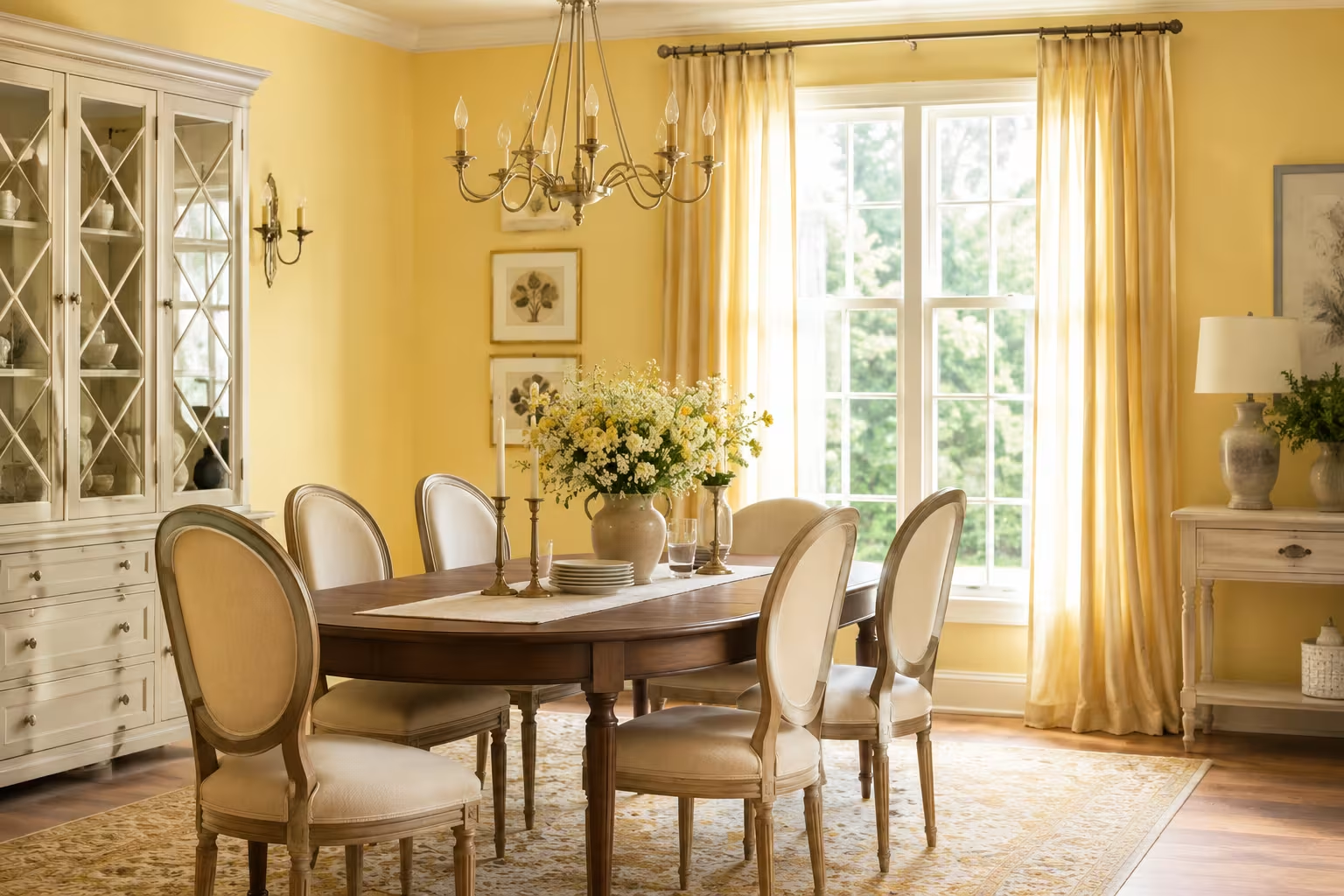
2. Pair Butter Yellow Walls With White Trim for a Classic Look
The combination of butter yellow walls and bright white trim is one of the oldest pairings in Anglo-American interior design, and it holds up because the contrast is sharp without being harsh. The white trim acts as a visual frame that makes the yellow feel intentional rather than accidental. In a 2019 renovation feature in Architectural Digest, a Georgian-style townhouse dining room in Savannah, Georgia used exactly this pairing with 10-inch baseboards and was described by readers as the most-shared interior image that issue ran.
Choosing the right white is not trivial. Pure blue-whites like Benjamin Moore Chantilly Lace look slightly cold against a warm butter yellow. Warmer whites like Sherwin-Williams Alabaster or Dulux Natural White create a softer, more cohesive transition. The goal is not maximum contrast but a relationship where neither color overpowers the other.
If your dining room has crown molding or wainscoting, painting those elements in the same warm white as the trim creates a layered, architectural richness. This approach works particularly well in older homes built before 1970, where the rooms tend to have higher ceilings and more pronounced molding profiles.
3. Bring in Natural Wood Furniture to Ground the Color
Butter yellow can feel slightly untethered without a grounding element, and natural wood is the most reliable anchor. Oak, walnut, and acacia dining tables all sit naturally within butter yellow’s warm range. A solid white oak dining table from West Elm, specifically their Emmerson Reclaimed Wood table, brings enough texture and tonal variation that it prevents the room from looking flat or staged.
The grain of the wood does real visual work here. A heavy, straight-grained oak in a medium-warm finish repeats the yellow’s warmth without matching it exactly, which is what you want. Chairs do not need to match the table material exactly. A walnut-framed chair with a linen seat cushion in oat or sand creates exactly the kind of easy mix that looks curated rather than catalogue-purchased.
Avoid very dark wood stains like espresso or ebony in a butter yellow dining room unless the room has exceptional natural light. These very dark tones tend to absorb the yellow’s warmth and make the space feel heavier than intended. Mid-tone or light wood finishes almost always work better.
4. Layer Soft Textiles in Complementary Warm Neutrals
Textiles are where butter yellow dining rooms often get made or broken. The wrong tablecloth or curtain fabric can make the yellow look sickly. Linen in natural undyed ecru or warm oat tones works beautifully because linen’s inherent texture adds visual interest without competing with the wall color. Pottery Barn’s Belgian Flax Linen tablecloth in Natural is a reliable choice that consistently photographs well in butter yellow settings.
Window treatments deserve more thought than they usually get in dining room planning. Roman shades in a soft ivory or warm taupe linen filter afternoon light in a way that intensifies butter yellow’s golden quality without washing the room out. Full-length curtains in a heavier fabric like a cotton-linen blend add a sense of height and formality that suits a dining room used for entertaining.
Rug choice is particularly important because the floor plane anchors everything above it. A jute or sisal rug in its natural straw-gold tone is almost universally compatible with butter yellow walls. Ruggable makes a washable version of a natural-tone woven rug that holds up well under dining tables, where spills are a regular occurrence rather than an occasional accident.
5. Use Navy Blue or Forest Green Accents for a Striking Contrast
Butter yellow and navy blue is one of the most historically grounded color pairings in European interior design. It appears in 18th-century Dutch still-life paintings, in traditional Delft pottery, and in English country house dining rooms designed throughout the Georgian period. The contrast works because the two colors sit opposite each other on the color wheel while sharing an underlying seriousness that prevents the combination from reading as playful or childish.
A set of navy linen napkins, a deep indigo table runner, or a dark blue ceramic centerpiece bowl all introduce the accent without overwhelming the butter yellow backdrop. IKEA’s FÄRGRIK ceramic dinnerware in dark blue is an affordable way to test this pairing before committing to larger accent pieces. For a more invested approach, Wedgwood’s Blue Italian series brings genuine heritage and craftsmanship into the combination.
Forest green, specifically the deeper, more shadowed end of the green spectrum, works on similar principles. Sage green is too soft and risks merging with the butter yellow. Dark hunter green or bottle green brings the kind of weight and contrast that makes both colors read more clearly. A set of dark green upholstered dining chairs around a natural wood table against butter yellow walls is a combination that photographs extremely well and has been a consistent feature in Elle Decor dining room roundups since around 2021.
6. Choose Warm Metallic Hardware and Lighting
The metal tones in a dining room do more atmospheric work than most people realize. Brass and unlacquered bronze both carry yellow-adjacent warmth that reinforces butter yellow without matching it. Polished chrome and cool nickel, by contrast, introduce a blue-gray undertone that competes with the yellow’s warmth and can make the room feel slightly disjointed.
A brass chandelier above the dining table is one of the highest-impact single purchases in a butter yellow dining room. Visual Comfort’s Carrier Small Chandelier in Antique Brass is a widely recommended option in interior design communities for rooms between 100 and 200 square feet. It provides genuine warm light spread and its finish stays relevant as brass has maintained consistent design currency since its resurgence around 2014.
Candleholders and sconces extend the metallic warmth to lower levels of the room. A set of brass taper holders on the dining table, even inexpensive ones from H&M Home or CB2, adds a layer of visual richness that overhead lighting alone cannot achieve. Using warm-spectrum LED bulbs rated at 2700K or below in any dining room fixture is non-negotiable if you want the butter yellow to glow correctly rather than look washed or greenish.
7. Hang Art That Draws From the Butter Yellow Palette
Artwork in a butter yellow dining room does not need to repeat the yellow directly. In fact, art that picks up the complementary tones, warm terracotta, burnt sienna, cream, soft gold, faded blue, works much more naturally on a butter yellow wall than prints that attempt to match it. Think of the warm, earthy still-life paintings common in Dutch Golden Age work, or the kind of sun-faded botanical prints that landscape artist and textile designer William Morris popularized in the late 19th century.
Gallery walls work well in butter yellow dining rooms specifically because the warm wall color unifies disparate frames and print styles. A mix of small prints in simple brass or natural wood frames, featuring botanical subjects, loose landscape studies, or abstract warm-toned compositions, can fill a large wall without looking cluttered. Anthropologie and Society6 both carry print collections that translate well into this kind of arrangement.
Avoid very cool-toned or high-contrast black-and-white photography in a butter yellow dining room. The visual temperature clash is jarring in person even when it looks acceptable in edited lifestyle photography.
8. Style the Table With Organic and Handmade Objects
Butter yellow’s appeal is partly rooted in its association with natural, handcrafted things: fresh butter, aged linen, hand-thrown ceramics, beeswax candles. Leaning into that association through table styling reinforces what the color is already communicating. A ceramic fruit bowl with visible throwing marks, a hand-dipped beeswax taper, a woven seagrass placemat, these objects belong in a butter yellow dining room in a way that mass-produced plastic or high-gloss acrylic objects simply do not.
Michaela, a home stylist based in Portland, Oregon, renovated her 1940s bungalow dining room in 2023, painting the walls in Sherwin-Williams Cream in My Coffee and then furnishing almost entirely with handmade or vintage objects sourced from local estate sales and Etsy ceramics sellers. The result was a room that read immediately cohesive despite no single piece having been purchased as part of a set. The lesson is that butter yellow is forgiving of imperfect mix-and-match styling in a way that colder, more clinical colors are not.
Real linen napkins, even unironed ones with natural wrinkles, look better on a butter yellow table than crisp white cotton. The slight rumple of linen reads as deliberately relaxed rather than careless, which suits the tone butter yellow sets.
9. Work With Butter Yellow in a Small Dining Room Without Fear
The most persistent myth about color in small rooms is that light, neutral colors make them feel larger. This is only partially true. A small dining room painted in a warm butter yellow will not look significantly smaller than the same room painted white, and it will feel considerably more welcoming. The warmth contracts the perceived volume slightly but adds a sense of envelope and intimacy that works in a dining room’s favor.
A dining room measuring 8 by 10 feet, which is on the smaller end of what most residential architects include in a house plan, benefits from butter yellow on all four walls rather than a single accent wall. The single accent wall approach tends to make small rooms feel slightly unresolved, as though the decoration was not quite finished. Full-room butter yellow in a small space creates a cocooning effect that guests consistently describe as intimate and comfortable.
The 2022 renovation of a garden apartment dining alcove in Brooklyn, New York, covered in a home design blog by interior designer Sarah Wittenbraker, used Benjamin Moore’s Pale Moon on all four walls of a room that measured just 7 by 9 feet. Visitors reported that the room felt larger than it measured because the warm color created a sense of visual ease rather than visual contraction.
10. Mix Butter Yellow With Rattan, Cane, and Wicker for a Relaxed Aesthetic
Rattan and cane furniture has moved firmly into mainstream dining room design since roughly 2018, and butter yellow is one of the colors it works best with. The natural straw color of rattan sits within the same warm spectrum as butter yellow, creating a tonal harmony that feels collected and intentional. A rattan pendant light above a dining table in a butter yellow room is one of the most-pinned combinations on design platforms for good reason: it photographs naturally and lives even better.
IKEA’s SINNERLIG pendant lamp in bamboo, discontinued but widely available secondhand, and Serena and Lily’s Cleo Rattan Pendant are both frequently cited in design discussions as entry-level and mid-range options respectively. The key with rattan lighting is scale: a shade that is too small looks tentative above a dining table, while one that fills roughly 40 to 50 percent of the table width below it feels grounded and intentional.
Rattan or cane-backed dining chairs alongside a solid wood or painted dining table introduce texture without competing with butter yellow’s visual dominance. The combination is particularly well suited to dining rooms that open onto outdoor space, where the material continuity between interior and exterior softens the boundary between inside and outside.
Wrap Up
Butter yellow is one of those rare colors that performs well across a wide range of dining room styles, from formal Georgian to relaxed coastal to mid-century modern. The ten ideas here cover the full range of budget and commitment levels, from a single tin of paint to a full furniture refresh. The thread running through all of them is warmth: the goal is a room where people want to sit down, slow down, and stay longer than they planned. That quality is harder to manufacture than it looks, and butter yellow is one of the most reliable tools for achieving it.
FAQs
What colours go well with butter yellow in a dining room?
Navy blue, forest green, warm white, and natural wood tones are the strongest partners for butter yellow. Brass metals and terracotta accents also work well without competing with the yellow’s warmth.
Is butter yellow a good color for a small dining room?
Yes. Butter yellow adds warmth and intimacy to small dining rooms without making them feel significantly smaller. Painting all four walls rather than a single accent wall works best in compact spaces.
What is the difference between butter yellow and pale yellow paint?
Butter yellow reads warmer and slightly more golden than pale yellow, which can lean cool or greenish. Butter yellow typically has a cream or golden undertone, while pale yellow often carries a slightly sharper, brighter character that feels less warm in artificial light.
Disclaimer
This content shared by Fall Rugs is solely for research and informational purposes. Fall Rugs is not a professional interior design or home renovation consultancy, and the information provided should not be considered professional advice for home improvement or decor. All ideas and suggestions are based on current trends and general knowledge in the home decor industry.