TL;DR
Wasabi green sits between olive and chartreuse, and it reads warmer and more grounded than sage on most walls. It works best as an accent wall or kitchen feature in rooms with good natural light, paired with warm wood, brass, and linen textures. Pick the wrong sheen or skip primer, and the same shade can look muddy instead of rich.
Introduction
Why does one green paint chip look fresh in the store and dull on the actual wall? That gap between the swatch and the finished room is exactly where wasabi green trips up a lot of homeowners. This piece breaks down what the color really does in a room, which spaces handle it well, how to pair it with furniture and metal finishes, and which paint brands and application habits keep it from turning flat. By the end, picking and applying wasabi green should feel a lot less like guesswork.
1. What Wasabi Green Actually Looks Like on a Wall
Wasabi green leans more yellow than sage and more green than olive, which puts it in the same family as chartreuse but several shades darker and earthier. Under daylight it can look almost herbal; under warm bulb light it pulls toward a deeper, mossier tone. That shift matters more than most paint charts let on.
Light Reflectance Value, or LRV, explains why. Wasabi green typically sits in the 15 to 25 LRV range, meaning it absorbs more light than it bounces back. A room painted in it will feel cozier and more enclosed than one painted in a pale sage like Benjamin Moore’s October Mist 1495, which was the brand’s 2022 Color of the Year and sits much higher on the LRV scale. Hunter green and forest green, by comparison, carry a blue undertone that makes them read cooler and more formal.
- Wasabi green vs sage: sage carries more gray and cooler undertones, wasabi reads warmer and more saturated
- Wasabi green vs olive: olive leans brown, wasabi stays closer to true green-yellow
- Wasabi green vs avocado: avocado is yellower and lighter, often tied to 1970s kitchens
- North-facing rooms pull the blue out of any green and can make wasabi look almost gray by midday
- South and west-facing rooms intensify the yellow, making the same paint look brighter and more lime-toned by late afternoon
2. Picking the Right Room for a Wasabi Green Wall
Living rooms and home offices tend to handle wasabi green the best because they already lean toward calm, low-glare lighting. Kitchens work too, especially on a single wall behind open shelving or as a lower-cabinet color paired with white upper cabinets, a combination that’s shown up repeatedly in remodels featured by Behr and Sherwin-Williams in their seasonal color guides.
Bedrooms need more caution. A small, north-facing bedroom painted on all four walls in a saturated green can feel closed in fast, especially with low ceilings or minimal window coverage. Bathrooms are usually fine as long as the paint is rated for high-moisture areas, since standard wall paint can peel near showers within a year or two.
A homeowner named Maria in Austin learned this the hard way. She painted her north-facing guest bedroom on all four walls using a deep wasabi shade straight from a sample she liked in a sunny showroom. By winter, the room looked almost black after sunset and felt smaller than its actual square footage. She repainted three walls in a warm off-white, kept one wall in wasabi green as an accent behind the headboard, and added a brighter LED fixture rated closer to daylight white. The room read twice as large within a weekend, and the green wall finally looked intentional instead of overwhelming.
- Best fits: living rooms, kitchen accent walls, home offices, dining nooks
- Use with caution: small bedrooms with limited natural light, hallways under six feet wide
- Needs moisture-rated paint: bathrooms, laundry rooms
- Accent wall first, full room later: test commitment before painting every wall
- Lighting check: warm bulbs (2700K) intensify yellow, daylight bulbs (4000K+) keep the green more neutral
3. Pairing Wasabi Green With Furniture, Textiles, and Metal Finishes
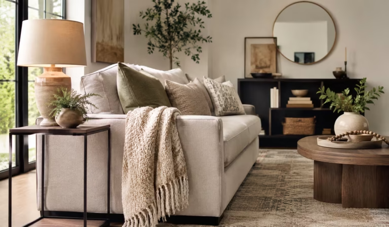
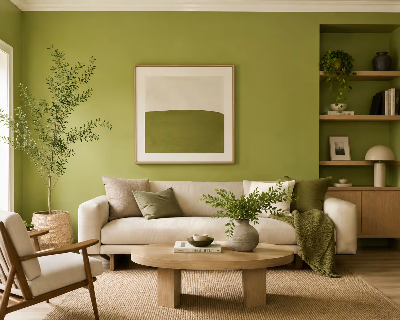
Wasabi green plays well with warm wood tones like white oak and walnut, the same pairing IKEA leans on heavily in its newer living room collections. Pottery Barn and West Elm both lean into this combination too, often styling olive and moss-toned upholstery against natural wood frames rather than painted white ones, which keeps the room from feeling too cold or too matched.
Textiles do a lot of the heavy lifting. Jute and wool rugs from brands like Ruggable soften the saturation of a wasabi wall, while linen curtains in oatmeal or rust tones keep the palette from skewing too monochrome. Brass and aged brass hardware tend to warm the room further, while matte black fixtures create more contrast and a slightly more industrial feel.
- Wood tones: white oak, walnut, and natural rattan all read warm against wasabi green
- Metals: brass and aged brass for a softer look, matte black for higher contrast
- Rugs: jute, wool, or low-pile neutral rugs from brands like Ruggable keep the floor from competing with the wall
- Textiles: linen, boucle, and cotton in oatmeal, rust, or cream tones balance the green without matching it exactly
- Avoid: pairing wasabi green with cool gray furniture, which tends to wash out both colors
4. Choosing the Right Paint Brand, Finish, and Application Method
Most major paint brands carry a wasabi-adjacent shade, though the exact name varies. Behr, Sherwin-Williams, Benjamin Moore, and Farrow & Ball all stock deep yellow-greens in their core collections, and most paint counters can custom-tint a sample if the closest stock color isn’t quite right. A quart sample, usually priced between eight and twelve dollars at most national chains, is worth buying before committing to a full gallon, which typically runs forty to seventy dollars for premium lines.
Finish matters as much as the color itself. Eggshell and satin finishes are the most common choices for living rooms and bedrooms because they hide minor wall imperfections while staying easy enough to wipe down. Kitchens and high-traffic hallways do better with satin or even semi-gloss, since flatter finishes scuff and stain more easily near cabinets and doorframes. Saturated colors like wasabi green almost always need a tinted gray primer underneath, since a standard white primer often requires three full coats to get even coverage, while a tinted base usually gets the job done in two.
- Test swatches on at least two different walls and check them morning, midday, and evening before deciding
- Use a tinted primer for full saturation in two coats instead of three
- Choose eggshell or satin for living spaces, satin or semi-gloss for kitchens and hallways
- Budget roughly forty to seventy dollars per gallon for premium brands, less for mid-range lines
- Ask for a sample pot first; a wall-sized swatch reveals undertones a paint chip can’t
5. Common Mistakes With Green Walls and the Fixes That Actually Work
The most common mistake is skipping primer entirely on a freshly painted white wall, which leads to a blotchy, uneven green that needs a third or fourth coat to fix. The second most common mistake is choosing the paint color under store lighting alone, since fluorescent showroom lights almost always shift a green’s true undertone once it’s home under regular bulbs.
A renter in Chicago named Diego ran into a different version of this problem. His lease didn’t allow permanent paint changes, so he tried a peel-and-stick wasabi green wallpaper instead of paint. The first panel he applied bubbled within a week because he hadn’t smoothed out air pockets during installation. He restarted with a squeegee tool and worked in smaller sections, and the second attempt held cleanly for the rest of his lease. The lesson translated directly to paint too: rushing the application, whether it’s wallpaper or a roller, almost always shows up later as a visible flaw.
- Mistake: skipping primer on saturated colors, leading to blotchy coverage
- Fix: always prime with a tinted gray base before the first coat
- Mistake: choosing color under artificial showroom lighting only
- Fix: test the actual sample pot at home across a full day
- Mistake: rushing application on large wall sections
- Fix: work in smaller, manageable sections with consistent roller pressure
Wrap Up
Wasabi green earns its growing popularity because it sits in a sweet spot between calming sage and bold olive, but it only looks intentional when the room, lighting, and finish all support it. Test the actual paint at home before committing to a full wall, lean on warm wood and brass to soften the saturation, and never skip a tinted primer on a color this rich. Get those three details right, and wasabi green stops being a risky choice and starts looking like the room was designed around it from day one.
FAQs
Is wasabi green paint still trending in 2026?
Yes, deep yellow-greens like wasabi remain popular for accent walls and kitchen cabinetry, continuing a broader shift toward earthy, nature-inspired palettes that started gaining traction in the early 2020s.
What rooms work best with wasabi green walls?
Living rooms, kitchens, and home offices with strong natural light handle it best, while small north-facing bedrooms often look better with just one accent wall instead of full coverage.
Does wasabi green paint make a room look smaller?
It can, since its low LRV absorbs more light than it reflects, but pairing it with bright trim, warm lighting, and lighter furniture usually offsets that effect.
Disclaimer
This content shared by Fall Rugs is solely for research and informational purposes. Fall Rugs is not a professional interior design or home renovation consultancy, and the information provided should not be considered professional advice for home improvement or decor. All ideas and suggestions are based on current trends and general knowledge in the home decor industry.