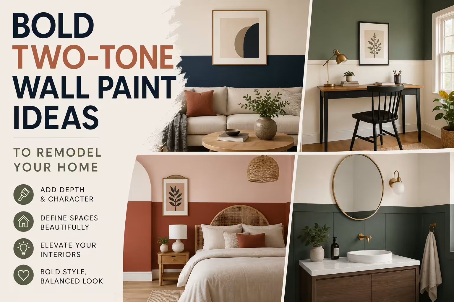
TL;DR
Two-tone wall painting uses contrasting paint shades to alter how room proportions look. Successful applications rely on clean geometric lines, precise spatial measurements, and high-quality painter tape to divide bold hues from neutral balances. Choosing contrasting tones creates architectural focus without structural changes.
Introduction
Why settle for single-shade surfaces when dual tones can rewrite the layout of an entire room? Homeowners often struggle with small rooms or high ceilings that feel cold and empty. Applying two distinct bold colors to a single surface establishes immediate focus, balances scale, and gives plain drywall a sense of architectural intent. This breakdown provides detailed, field-tested layouts that combine striking color theory with practical layout methods.
1. Velvet Moss and Terracotta Split for Warm Living Rooms
Deep organic tones introduce a grounded, secure atmosphere in large living spaces with tall ceilings. Interior designers frequently recommend balancing heavy tones by placing the darker value on the lower third of the wall surface. This specific approach mimics traditional wainscoting while avoiding the material cost of timber trim, providing a rich backdrop for wooden furniture from brands like West Elm or Pottery Barn.
A common application mistake involves splitting the wall exactly in half, which creates an uncomfortable optical illusion that cuts the room visually. Instead, measuring exactly 36 inches from the floor upward establishes a perfect golden ratio for the transition line. Homeowners in older Pacific Northwest properties use this specific measurement to preserve historic character while introducing modern color.
Implementing the Lower Third Horizon Line
Applying a deep shade like Benjamin Moore Smartly Moss on the bottom portion stabilizes the seating area. The upper portion requires a lighter, complementary shade like Sherwin-Williams Audacious Amber to maintain a bright ceiling zone.
- Use a self-leveling laser tool mounted on a central tripod to project an unbroken line across the entire room perimeter.
- Apply premium low-tack tape along the laser line, pressing the edges down firmly with a plastic putty knife to prevent bleeding.
- Paint the upper light section first, letting it dry completely for 24 hours before taping the line to apply the lower dark shade.
- Pull the tape away slowly at a 45-degree angle while the second coat of paint is still slightly damp to achieve a razor-sharp edge.
A real-world project in an 1890s Seattle craftsman home showed how this layout fixed a cold, drafty living room. The designer used a rich earthy green on the bottom and a soft clay pink on top, instantly making the 11-foot ceilings feel cozy and proportional.
2. Midnight Navy and Crisp Alabaster Structural Contrasts
High-contrast combinations offer a striking aesthetic that defines modern coastal and urban minimalist spaces. Utilizing a saturated midnight blue next to a clean white highlights structural features like window frames, built-in bookshelves, and fireplace mantels. This strategy relies on stark light absorption and reflection differences to guide the eye toward specific architectural elements.
Many decorators struggle with crisp lines when working on textured plaster surfaces. Saturated blue pigments tend to creep into minor wall imperfections beneath standard painter tape, ruining the transition. Preparing the boundary line with a tiny bead of clear paintable caulk or a thin layer of the base wall color seals the tape edge perfectly.
Creating the 70-30 Vertical Room Division
Instead of a horizontal split, a vertical division running from floor to ceiling creates an asymmetric focal point behind major furniture pieces. This layout works excellently behind a dining room buffet or a modern low-profile media console from IKEA.
- Measure two-thirds of the distance across the primary accent wall to establish the vertical dividing marker.
- Choose a rich, light-absorbing tone such as Farrow & Ball Hague Blue for the larger 70 percent wall block.
- Coat the remaining 30 percent section in a brilliant, light-reflecting white like Behr Ultra Pure White.
- Ensure the dark paint extends into the corner joints to prevent slivers of white from showing through gaps.
A residential renovation in Chicago utilized this vertical 70-30 division inside a narrow high-rise dining area. By placing the dark navy on the window wall and extending it across a portion of the long side wall, the room gained unexpected visual depth, making the small dining area look like a high-end art gallery.
3. Forest Green and Soft Sand Geometric Zoning
Zoning provides an exceptional way to separate functional areas within multi-use rooms, such as home offices built into guest bedrooms. Using distinct geometric shapes like painted arches or sharp diagonals organizes a room without needing physical room dividers. This technique utilizes color psychology and spatial layout to create a room within a room.
The primary risk with geometric zoning is overcomplicating the design with too many intersecting shapes. Stick to one bold shape per room to keep the space looking intentional rather than chaotic. A single large circle or a clean diagonal block provides enough visual impact without overwhelming standard residential furniture arrangements.
Designing a Painted Arched Home Office Zone
A painted arch acts as a visual frame for a desk, a floating shelf unit, or a reading armchair. It mimics classical architecture using nothing more than a can of matte paint and a piece of string.
- Find the exact center point of your desk or workspace and mark it on the wall at eye level.
- Tie a piece of chalk to a string measured to half the desired width of your final arch.
- Hold the bare end of the string at your center mark and rotate the chalk upward to draw a perfect semi-circle arc.
- Use a high-quality 2-inch angled sash brush to carefully paint the curved edge freehand before rolling the interior space.
A freelance graphic designer in Austin used this approach in a tiny studio apartment. By painting a wide arch in a rich forest green against a background of warm desert sand, she separated her workspace from her sleeping quarters, improving her daily work-life balance.
4. Charcoal Grey and Dusty Rose Ceiling Extensions
Extending wall paint onto the ceiling breaks traditional design rules in a way that makes long, narrow rooms feel much wider. This technique involves painting the upper 12 to 18 inches of the wall the same color as the ceiling, dropping the visual boundary line downward. It creates an intimate, cocoon-like atmosphere perfect for bedrooms and private dens.
When choosing dark shades for this layout, matte or flat finishes are necessary to avoid unwanted light reflections. Shiny finishes like satin or eggshell will catch light from lamps, highlighting ceiling imperfections and creating distracting glares. Matte charcoal or deep slate absorbs light evenly, making the upper boundaries of the room blend together softly.
Implementing the High-Dado Rail Extension
The high-dado extension requires painting the ceiling and the top portion of the wall in one continuous shade, while the lower wall gets a contrasting color. This layout works beautifully in bedrooms featuring low bed frames and minimal wall decor.
- Measure down exactly 18 inches from the ceiling joint along several points of each wall in the room.
- Connect these marks using a long spirit level and a pencil to create a level guide line around the perimeter.
- Paint the ceiling and the upper 18-inch wall band in a saturated shade like Benjamin Moore Kendall Charcoal.
- Apply a soft, contrasting tone like Sherwin-Williams Malted Milk to the remaining lower portions of the walls.
An interior design project in London applied this exact layout to a long, narrow bedroom with a low ceiling. The dark charcoal ceiling wrap made the room boundaries appear to drift outward, turning a cramped, tunnel-like bedroom into a sophisticated sleeping space.
5. Mustard Yellow and Teal Blue Dramatic Entryways
Foyers and entryways are perfect for experimental, bold paint choices because people only spend a few moments in them. Combining two saturated jewel tones creates an energetic transition from the outside world into the home. This high-energy approach works best in spaces with plenty of natural light or high-quality architectural lighting fixtures.
The key challenge with jewel tones is managing the high pigment load during application. Saturated yellows and deep teal blues often require three full coats of paint to achieve total opacity over standard white drywall primers. Skipping coats results in a patchy, uneven finish that ruins the crisp look of the two-tone design.
Executing the Dual-Tone Door Frame Wrap
This method involves painting the entryway door and its immediate surrounding wall space in one vivid color, then transitioning to a second hue on adjacent surfaces. It turns a standard entryway into an intentional architectural transition.
- Select a vibrant, welcoming shade such as Farrow & Ball India Yellow for the main entry door and its immediate trim.
- Extend this yellow paint out 12 inches onto the surrounding wall surface, creating a bold color frame.
- Transition the rest of the foyer walls into a deep jewel tone like Benjamin Moore Teal Ocean.
- Use a high-quality acrylic latex primer designed for deep colors to ensure maximum color depth with fewer topcoats.
A historic townhouse remodel in Boston used this dual-tone frame wrap in a small vestibule. The bright yellow entry zone contrasted beautifully against deep teal walls, creating a memorable first impression for guests during the winter season.
Wrap Up
Two-tone bold paint applications allow you to alter room proportions without expensive structural remodeling projects. Success relies on precise measurements, proper tape sealing, and high-quality flat or matte finishes. By choosing unexpected color combinations and clever layouts, you can turn plain drywall into a dynamic architectural feature that highlights your furniture and defines your living spaces.
FAQs Section
What is the best height for a horizontal two-tone wall split?
The most visually pleasing height is either one-third of the way up from the floor, around 32 to 36 inches, or two-thirds of the way up, around 72 inches. Splitting a wall exactly in half can make the ceiling look lower and feel visually awkward.
How do I stop paint from bleeding under the tape line?
Apply your painter tape along the line, then seal the edge by painting over it with your base wall color or a thin bead of clear paintable caulk. Once that layer dries, apply your second bold color to get a perfectly crisp line when the tape is removed.
Should the darker color be on the top or the bottom of the wall?
Placing the darker color on the bottom third grounds the room and creates a stable look similar to traditional wainscoting. Putting the darker color on top or extending it onto the ceiling works well for making tall, cold rooms feel cozier.
Disclaimer
This content shared by Fall Rugs is solely for research and informational purposes. Fall Rugs is not a professional interior design or home renovation consultancy, and the information provided should not be considered professional advice for home improvement or decor. All ideas and suggestions are based on current trends and general knowledge in the home decor industry.