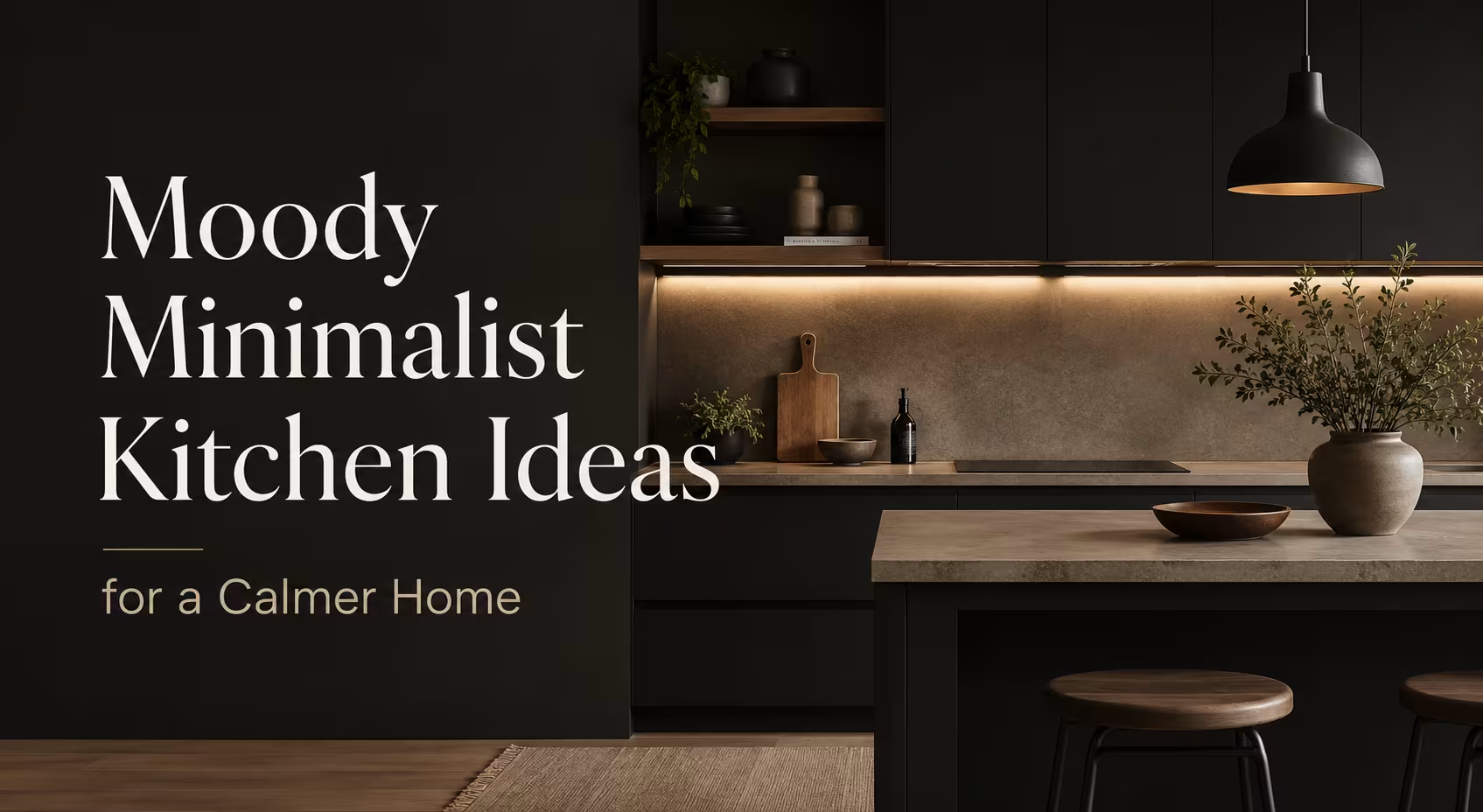
TL;DR
A moody minimalist kitchen blends dark color, clean lines, natural materials, and calm storage choices without making the room feel cold. The strongest redesigns balance black, charcoal, espresso, walnut, stone, brass, and soft lighting so the kitchen feels grounded, practical, and lived in.
Introduction
Why do some dark kitchens feel expensive and calm, while others feel heavy by breakfast? The answer sits in proportion, texture, light, and restraint. Moody minimalist kitchen redesign inspiration works when the room has enough shadow to feel intimate and enough clarity to stay useful.
This style suits city apartments in London, narrow Victorian terraces in Manchester, Brooklyn brownstones, California bungalows, and new-build homes that need more character. It borrows from Scandinavian restraint, Japanese wabi-sabi, Italian stonework, and modern American cabinetry. Done well, it gives a kitchen the quiet confidence of a private restaurant rather than a showroom.
The goal isn’t to make everything black or strip the room bare. The goal is to edit the kitchen until every surface, handle, shelf, rug, light, and appliance has a reason to be there. That is where the redesign starts to feel mature.
Start With a Dark Palette That Still Lets the Room Breathe
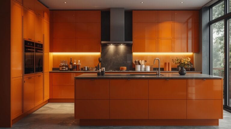
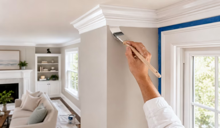
A moody minimalist kitchen usually begins with black, graphite, deep green, tobacco brown, oxblood, or dark navy. Farrow & Ball’s Railings, Studio Green, and Off-Black have become reference points because they change through the day rather than sitting flat on the wall. Benjamin Moore’s Black Forest Green and Sherwin-Williams Iron Ore offer the same controlled depth.
The mistake I see most often is painting every surface dark before studying the daylight. A north-facing kitchen in Glasgow needs more lift than a sunlit kitchen in Los Angeles. In a small flat, one charcoal cabinet wall may be enough. In a larger open-plan room, dark base units can carry the mood while pale plaster, limewash, or warm white upper walls keep the eye moving.
A strong palette also needs an undertone check. Blue-black can feel crisp with stainless steel and marble, while brown-black feels warmer with walnut and limestone. IKEA’s VOXTORP dark grey fronts, Reform’s BASIS cabinets, and deVOL’s dark Classic English cabinetry all show how a controlled color choice can hold a whole kitchen together.
Let Contrast Do Some of the Work
Contrast doesn’t mean bright white everywhere. A softer mix of charcoal cabinets, cream zellige tiles, smoked oak flooring, and honed stone reads more expensive than a sharp black-and-white split. Interior designer Athena Calderone often uses contrast through material weight, not loud color, which is why her dark rooms still feel calm.
A London kitchen with black lower cabinets, Roman Clay-style walls, and brushed brass taps will feel different from a Melbourne kitchen with graphite laminate, terrazzo, and stainless steel. Both can work. The difference lies in how the materials speak to the local light, the age of the building, and the daily cooking habits inside the room.
Useful palette anchors include:
- Charcoal cabinets with warm white walls and oak flooring for narrow homes.
- Espresso-stained wood with travertine counters for a softer European mood.
- Deep green cabinetry with unlacquered brass for Georgian or Victorian properties.
- Matte black doors with concrete-look quartz for lofts and studio apartments.
- Dark navy lowers with pale stone for coastal homes that need depth without gloom.
A real-world example sits in many Ruggable and West Elm campaign kitchens: the dark cabinetry feels welcoming because rugs, ceramics, and wood stools add middle tones. Without those pieces, the same kitchen can feel like a product display. The eye needs resting places between black surfaces.
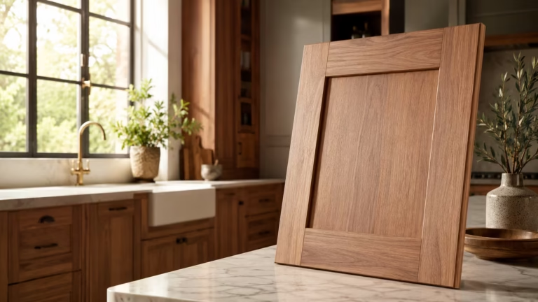
Choose Materials That Feel Honest, Not Overdesigned
Moody minimalism depends on touch. Matte lacquer, honed marble, soapstone, walnut, oak, clay tile, microcement, brushed steel, and linen shades all absorb light in different ways. Glossy black acrylic can look sharp in a nightclub, but it often shows fingerprints, dust, and scratches by lunchtime in a family kitchen.
Soapstone is a classic choice because it darkens with age and tolerates heat well, though it can scratch. Honed Nero Marquina marble brings drama, but acidic foods like lemon and vinegar can etch it. Quartz from brands such as Caesarstone, Silestone, and Cambria gives more stain resistance, while Dekton offers high heat resistance in sleek slabs.
The right material depends on who cooks there. A baker needs a forgiving worktop and room for trays. A coffee obsessive may care more about a durable drink station with storage for a grinder, scale, and beans. A rented apartment might only allow peel-and-stick backsplash panels, removable cabinet film, and a washable rug.
Build Warmth Into the Fixed Surfaces
Wood keeps moody kitchens from becoming severe. Walnut, smoked oak, ash, and dark-stained birch soften black cabinets without stealing attention. In Japanese-inspired kitchens, designers often use slatted oak or walnut to bring rhythm to a plain wall, a detail seen in many Tokyo and Copenhagen apartment renovations.
Stone adds another kind of warmth when the finish stays quiet. Travertine, limestone, and tumbled marble have pores, veining, and small flaws that make minimal rooms feel human. Pottery Barn’s marble-top kitchen islands and West Elm’s Anton storage pieces work because they mix clean shapes with tactile surfaces.
Good material pairings include:
- Honed black granite with walnut shelves and antique brass.
- Soapstone counters with cream plaster walls and terracotta floor tile.
- Dark oak cabinets with Taj Mahal quartzite and bronze hardware.
- Microcement floors with matte black cabinets and linen pendant shades.
- Stainless steel counters with smoked glass and dark green fronts.
A practical warning matters here. Dark matte surfaces show flour, hard-water marks, and cooking oil more than mid-tone woods. I once reviewed a compact kitchen where black laminate cabinets looked flawless in photos but showed every handprint after a dinner party. The fix wasn’t replacing them. The owner swapped to satin hardware, added a runner, and kept a microfiber cloth in the prep drawer.
Lighting Decides Whether Moody Feels Luxurious or Dull
A dark kitchen needs layered lighting more than a pale kitchen does. Ceiling downlights alone flatten the room and make dark cabinets look lifeless. The better approach combines task lighting under cabinets, warm pendants over an island, wall sconces near open shelves, and discreet toe-kick lighting only where it serves a purpose.
Color temperature matters. Many residential kitchens feel better around 2700K to 3000K because the light reads warm but still clear enough for cooking. A cool 4000K bulb can make black cabinets look blue and stone look clinical. Brands such as Philips Hue, Tala, Schoolhouse, and Visual Comfort offer fixtures and bulbs that suit this layered approach.
Placement also changes the feel. A pendant hung too high above an island can feel lost. One hung too low interrupts sightlines and catches steam. In most kitchens, the bottom of a pendant sits roughly 30 to 36 inches above the worktop, though ceiling height, shade size, and island depth can shift that range.
Treat Shadows as Part of the Design
Moody rooms need shadows, but they need controlled shadows. A sconce washing across handmade zellige tile will reveal texture. A strip light hidden under a shelf will make a stone backsplash glow. A single bare bulb in the wrong spot will throw hard shadows across a chopping board and make cooking annoying.
Dimmer switches deserve more attention than they get. A kitchen used for weekday breakfasts, recipe testing, homework, and late-night tea needs different light levels. Lutron dimmers, IKEA smart bulbs, and Hue scenes can create these shifts without changing the design language.
Lighting choices worth testing before purchase:
- Under-cabinet LEDs with diffusers, not exposed dots.
- Opal glass pendants for soft island light.
- Small picture lights above open shelving.
- Warm recessed lights placed away from cabinet faces.
- Wall sconces near a breakfast nook or coffee station.
A New York apartment renovation I studied used dark oak cabinets, black stone counters, and only ceiling spots at first. It photographed well but felt flat in person. After the owner added two brass sconces and warm under-shelf LEDs, the same materials looked richer because the light caught the grain, edges, and stone movement.
Use Storage to Protect the Minimalist Part of the Mood
Minimalism fails fast when the toaster, blender, cereal boxes, phone chargers, spice jars, and mail pile compete on the counter. A moody kitchen magnifies clutter because dark backdrops frame every object. Storage planning has to happen before paint colors and cabinet samples become exciting.
The strongest minimalist kitchens hide routine mess without hiding daily life. Appliance garages, deep drawers, pull-out bins, tray dividers, vertical spice storage, and internal charging drawers keep the surfaces calm. Blum hinges, Hettich drawer systems, and IKEA MAXIMERA drawers all prove that hardware matters as much as the cabinet finish.
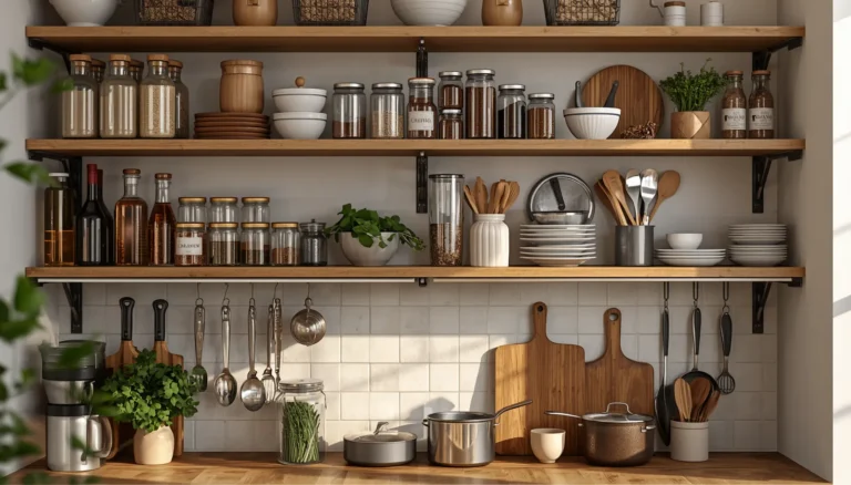
Open shelving needs discipline. Two walnut shelves with ceramics from Hasami Porcelain, Heath Ceramics, or Denby can add texture and use. Five shelves filled with mugs, packets, and novelty jars can make the room noisy. A moody minimalist kitchen needs fewer objects with better shape, material, and spacing.
Edit What Stays Visible
Visible items should earn their spot. A black Fellow Stagg kettle, a Smeg espresso machine, a Le Creuset Dutch oven, a dark wood chopping board, or a stone mortar can act like part of the room. Cheap plastic packaging rarely does. Decanting helps only when the jars are used often and not staged for a photo.
I’ve seen the same issue in small rental kitchens from Birmingham to Toronto: people buy more organizers before removing anything. The better order is remove, group, measure, then buy. A 12-inch gap beside a fridge may fit a pull-out pantry. A blind corner may need a LeMans unit. A deep drawer may solve what three wall cabinets couldn’t.
Storage moves that support the look:
- Hide small appliances in a tall cabinet with internal sockets.
- Use drawer inserts sized for actual cutlery and utensils.
- Store pans near the hob, not across the room.
- Keep oils and spices away from direct heat where possible.
- Limit open shelves to items used weekly or objects with real beauty.
The cost range varies widely. A full custom cabinet system from a studio like Plain English or deVOL can run into tens of thousands of pounds. A smaller upgrade using IKEA METOD cabinets, Semihandmade fronts, a Ruggable runner, and new lighting can give a similar mood at a lower spend. The planning discipline matters at every budget.
Bring in Texture, Rugs, and Objects Without Breaking the Restraint
A moody minimalist kitchen can still have softness. In fact, it needs it. Rugs, stools, ceramics, linen blinds, wood bowls, woven baskets, and art prevent dark kitchens from feeling like a showroom. The trick is to choose texture over clutter and tone over loud pattern.
Ruggable’s washable runners, especially low-pile vintage-inspired designs, work well in galley kitchens because they add warmth and protect high-traffic paths. A 2.5-by-7-foot runner often suits a narrow kitchen, while a 3-by-5-foot rug can work near a sink in a wider layout. Washable materials help in homes with children, pets, and frequent cooking.
Stools and chairs shape the mood too. A black kitchen with Wishbone chairs, West Elm leather stools, or IKEA’s FRANKLIN bar stools will read differently. Cane, leather, oak, and powder-coated steel each carry a different tone. For a calmer room, repeat one material at least twice, such as walnut shelves and walnut stool seats.
Use Seasonal Changes With Restraint
Seasonal styling can work without turning the kitchen into a display. In autumn, a dark ceramic bowl with pears, a smoked glass vase, or a rust-colored runner can warm the space. In winter, linen shades and brass candleholders can add glow. Spring might call for pale stoneware and herbs near the window.
The risk sits in over-theming. Too many pumpkins, signs, jars, or faux plants can fight the architectural calm. A moody kitchen already has presence. It only needs small shifts to reflect the season, especially around Eid gatherings, Christmas cooking, Thanksgiving prep, or summer hosting.
Texture choices that carry the style:
- Wool or washable runners in charcoal, clay, olive, or taupe.
- Linen Roman blinds instead of shiny roller shades.
- Handmade tile with slight color variation.
- Fluted glass on a pantry or drinks cabinet.
- Aged brass, blackened bronze, or brushed nickel hardware.
A Manchester couple redesigned a 1930s semi-detached kitchen with dark green cabinets, oak counters, and a muted runner near the sink. The rug solved two problems at once: it softened the room and hid minor floor wear until they could afford new limestone tiles. That kind of phased design feels more realistic than a one-week makeover.
Match the Layout to Real Cooking, Not Just the Photo
A kitchen that looks calm but cooks badly will annoy its owner every day. The classic work triangle, first discussed in the 20th century for sink, hob, and fridge placement, still helps. Yet modern kitchens also need zones for coffee, waste sorting, baking, school lunches, and laptop work.
In a moody minimalist redesign, layout decisions become more visible because there are fewer decorative distractions. A black island that blocks the fridge path will feel wrong. A beautiful stone backsplash won’t fix a sink with no landing space. The room needs flow before it needs styling.
For small kitchens, the best move may be subtraction. Removing upper cabinets from one wall can make a galley feel wider. Replacing swing doors with drawers can improve access. Moving a microwave into a tall unit can free the counter. These changes don’t sound dramatic, but they change daily use.
Measure Before Buying Anything Large
Measurements save money. A 36-inch range may look appealing, but many urban kitchens function better with a 30-inch cooker and more prep space. A deep farmhouse sink can eat into base-cabinet storage. A large island needs clearance around it, often about 36 to 42 inches for comfortable movement, with more space where doors and drawers open.
Appliance finish matters too. Stainless steel can add a professional tone, seen in restaurant kitchens from Paris to Chicago. Panel-ready appliances keep the wall quiet but cost more. Black appliances can blend into dark cabinetry, although mismatched blacks may look off when placed side by side.
Layout checks worth doing early:
- Stand where the cook stands and test the route to sink, hob, and fridge.
- Measure drawer swings, dishwasher clearance, and bin access.
- Keep prep space near water and heat.
- Place sockets where appliances will actually live.
- Check daylight before committing to dark upper cabinets.
A compact Edinburgh flat used IKEA cabinets, matte black fronts, a quartz counter, and a 24-inch dishwasher because the owner cooked often but lived alone. That smaller appliance created a wider drawer stack for pans and dry goods. The kitchen felt more minimalist not because it had less function, but because function had a proper home.
Wrap Up
A moody minimalist kitchen works when darkness, warmth, storage, lighting, and layout support each other. Dark cabinets or black stone alone won’t create the mood. The room needs texture, measured contrast, warm light, and fewer visible objects with better purpose.
Start with the light in the room, then choose the palette, materials, and storage around real cooking habits. Use brands and products as references, not as shortcuts. The most memorable kitchens feel edited, grounded, and personal, with just enough drama to make daily routines feel calmer.
FAQs Section
What colors work best for a moody minimalist kitchen?
Charcoal, matte black, espresso brown, deep green, dark navy, and warm greige work well when balanced with wood, stone, and warm lighting. Test paint samples at morning, afternoon, and evening before choosing.
How do I make a dark minimalist kitchen feel bigger?
Use dark lower cabinets with lighter upper walls, add warm under-cabinet lighting, reduce visual clutter, and keep flooring consistent. Reflective details like brushed metal, glass, and honed stone can also add depth without looking busy.
Are moody minimalist kitchens expensive to redesign?
They can be costly with custom cabinetry, natural stone, and panel-ready appliances, but the look also works with IKEA cabinets, new hardware, washable runners, better lighting, and carefully chosen paint. Planning and editing often matter more than the price tag.
Disclaimer
This content shared by Fall Rugs is solely for research and informational purposes. Fall Rugs is not a professional interior design or home renovation consultancy, and the information provided should not be considered professional advice for home improvement or decor. All ideas and suggestions are based on current trends and general knowledge in the home decor industry.