TL;DR
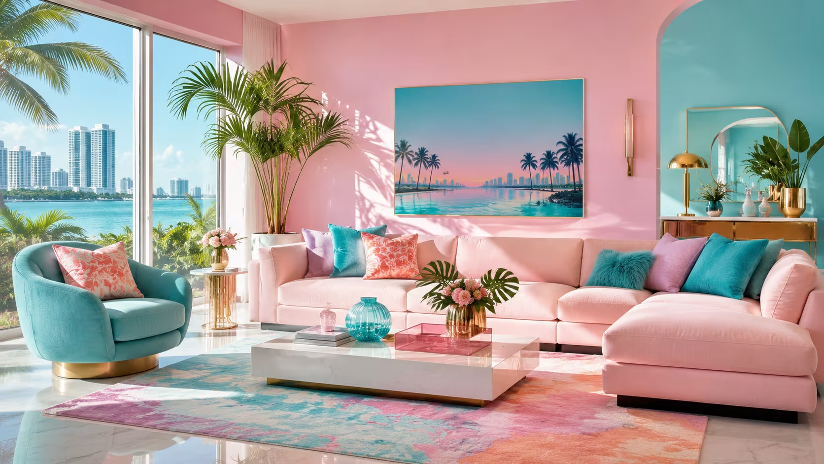
Miami Vice colours, anchored by hot pink, aqua turquoise, and sun-washed coral, translate surprisingly well into contemporary home decor. The key is pairing saturated accents with neutral foundations rather than coating every surface in neon. Done right, this palette reads fresh and confident instead of costume-y.
Introduction
What does a 1980s television series have to do with the rug you are about to buy? More than you would expect. The colour palette that defined Miami Vice, the NBC crime drama that ran from 1984 to 1990, was not accidental. Production designer Jeffery Howard and costume designer Joanna Merlin made deliberate choices to strip out dark colours and let tropical pastels carry the visual weight of the show.
Decades later, those same choices are showing up in IKEA seasonal drops, Ruggable limited collections, and Pottery Barn’s coastal-refresh lines. This piece breaks down what those colours actually are, why they work architecturally, and how real rooms are pulling them off without looking like a film set.
What Makes the Miami Vice Colour Palette Distinct
The show’s visual signature came from a deliberate restriction: no earth tones, no black clothing on the main characters, and no muddy or desaturated colours anywhere in the frame. That rule produced a palette that most colour theorists would now classify as a warm-cool split with high chroma accents.
The core hues are hot pink or fuchsia (close to Pantone 812 C), aqua or turquoise (similar to Pantone 326 C), coral orange, seafoam green, and lavender as a quieter supporting note. These are not pure primaries, and they are not neon in the fluorescent sense. They sit in a specific mid-brightness range, bright enough to read as bold but soft enough to avoid eye fatigue over time.
That tonal quality is precisely what makes them liveable indoors. A true neon green at 100% saturation becomes exhausting in a bedroom within a week. The Miami Vice tones stay closer to 70 to 80% saturation, which is why a turquoise accent wall in a West Elm-influenced living room still feels calming rather than aggressive.
The Architecture of the Palette: Proportions That Actually Work
Interior designers working with high-chroma palettes almost universally follow the 60-30-10 rule, and the Miami Vice palette is one of the cleaner demonstrations of why that rule exists. Sixty percent of the room stays neutral, typically white, warm linen, or light concrete grey. Thirty percent takes one anchor colour, most often aqua or coral. Ten percent handles the accent punch, usually fuchsia or deep lavender.
Miami-based interior designer Adriana Hoyos, whose studio has worked extensively with tropical residential projects in South Florida and Colombia, has noted publicly that the instinct to saturate every surface is what kills these palettes in residential settings. The eye needs somewhere to rest. A terracotta-tiled floor, crisp white walls, and a single turquoise sectional sofa from West Elm or CB2 does more visual work than three competing accent walls.
The math holds across room sizes. In a 10 by 12 foot bedroom, that 60% neutral means white bedding, a natural jute rug, and pale grey walls. The 30% anchor could be aqua linen curtains or a coral velvet headboard. The 10% accent arrives in a single fuchsia ceramic lamp or a throw pillow set from Ruggable’s coastal collection. That proportion keeps the room feeling intentional rather than themed.
How Rugs Become the Pivot Point in a Miami Vice Room
Flooring is where this palette gets either rescued or destroyed. A busy patterned rug in three competing Miami Vice tones flattens everything around it. A single-colour high-pile rug in seafoam or coral lifts the room without creating conflict with furniture and wall colour.
The smarter approach, one that shows up repeatedly in before-and-after projects on design forums and in Apartment Therapy features, is to use the rug as the neutral and let the palette live above the floor line. A natural sisal or warm ivory flatweave rug from IKEA’s TÅNUM collection, for example, grounds a living room where the sofa is turquoise and the throw pillows pull in coral and pink. The floor reads quiet, so everything above it has room to breathe.
When the rug does carry colour, geometry matters. Moroccan-inspired tile patterns in aqua and white, or a dhurrie-style flatweave with horizontal stripes in coral and cream, reference the Art Deco geometry that Miami’s South Beach architecture is built on. That visual connection is not accidental. The Miami Vice palette draws from the same design movement that shaped the Cardozo Hotel, the Breakwater, and the Colony Hotel on Ocean Drive, all built in the 1930s and all using pastel facades against white stucco.
Rug Materials That Hold Colour Best
Wool holds dye more consistently than polypropylene at these mid-saturation levels, which is why a hand-tufted wool rug in aqua from a brand like Loloi or Surya will stay truer to its original tone after years of sunlight than a machine-woven synthetic version. UV exposure is a real risk with pinks and corals in particular. Fuchsia is one of the most photosensitive dyes in textile production, fading toward salmon pink within two to three years in direct sun.
If a room gets significant southern or western light, solution-dyed acrylic and outdoor-rated polypropylene from brands like Dash and Albert or Pottery Barn’s Outdoor collection are more stable choices for coral and pink tones. These yarns are pigmented before fibre formation rather than dyed after, which means the colour runs all the way through and resists UV breakdown significantly better.
Real Room Scenarios: What the Palette Looks Like in Practice
Maria, a graphic designer in Coral Gables, Florida, renovated her 1970s split-level in 2022 with a budget of around $8,000 for soft furnishings and paint. She painted the main living area in Benjamin Moore’s Pale Sea Mist, a muted aqua that reads almost white in lower light. Her sofa is a neutral sand linen from Article. The area rug is a 8 by 10 foot hand-knotted piece in coral and ivory from RugsUSA. Her single hot pink accent comes from a vintage Italian ceramic table lamp she found at a Miami estate sale for $140.
The result reads as a confident coastal room, not a costume. Visitors describe it as fresh and warm. Nobody says it looks like a TV set.
Compare that to a common mistake: a designer in Wynwood painted an entire studio apartment in fuchsia, laid a turquoise area rug, and added coral curtains in 2021. The space photographed beautifully on Instagram but became genuinely difficult to live in. The client requested a repaint within four months. The lesson is not that Miami Vice colours fail in small spaces. It is that the proportions failed. Three competing high-chroma colours at full coverage left no visual exit.
The Art Deco Connection That Grounds the Palette Historically
Calling this a purely 1980s palette undersells its roots. Miami’s Art Deco Historic District, designated in 1979, preserves over 800 buildings along Ocean Drive and Collins Avenue, most painted in exactly these tones. The Preservation Board has approved coral, seafoam, pale yellow, and lavender as historically appropriate colours for district facades since the 1980s restoration effort led by Barbara Capitman.
This means the Miami Vice palette is not nostalgia for a TV show. It is a visual language that has existed in South Florida architecture since the 1930s, was captured on screen in the 1980s, and continues to define the built environment of Miami Beach today. Bringing it indoors is not a trend chase. It is a reference to a century of design thinking about colour in hot, bright climates.
Styling Furniture and Textiles Around the Palette
The furniture profiles that pair best with this palette are clean-lined and relatively low-profile. Bulky, dark wood traditional furniture sits in tension with these colours. Mid-century modern silhouettes, the kind associated with Knoll, Herman Miller, and their contemporary interpreters at Blu Dot or Article, give the palette a visual partner that does not compete.
Chrome and brushed brass hardware both work, though they read differently. Chrome reads cooler and sharper, which pairs well with aqua-dominant rooms. Brass reads warmer, which softens coral and pink rooms slightly and keeps them from feeling clinical. Matte black hardware is probably the worst choice here because it anchors the palette too heavily and introduces a contrast the pastels cannot support gracefully.
Textiles should vary in texture rather than colour. A linen throw, a velvet pillow, and a cotton canvas cushion can all sit in the same coral-pink range without the room feeling flat, because the texture variation creates enough interest that you do not need hue variation to hold attention. This is a technique that high-end decorators use consistently in monochromatic or near-monochromatic rooms.
Cost Benchmarks for Building This Palette
A credible Miami Vice-influenced living room does not require a luxury budget. At the accessible end, IKEA’s GURLI throw in dusty pink retails for around $10, and their STOCKHOLM rug in striped cream and aqua runs around $299 for a 5 by 8 foot size. West Elm’s Linen Weave pillow covers in turquoise run about $25 to $35 each. A 5 by 8 foot coral-toned area rug from Ruggable’s washable collection sits around $179 to $259.
At the premium end, a hand-knotted 8 by 10 wool rug in aqua or coral from Loloi’s Joanna Gaines x Loloi Sinclair collection runs $800 to $1,200. A bespoke upholstered sofa in turquoise from a custom studio in Miami like Artefacto can reach $4,000 to $9,000. The palette itself does not dictate a price tier. The quality of materials within each tier does.
Wrap Up
Miami Vice colours work in real rooms because they are rooted in actual climate-responsive design thinking, not just television aesthetics. The palette earns its staying power because South Florida architecture has been using these tones successfully for nearly a century. Apply the 60-30-10 rule, choose your anchor colour deliberately, protect pink and coral tones from direct UV, and let the rug act as a neutral foundation where possible. That approach produces rooms that feel alive and considered rather than dated or theatrical.
FAQs
What are the exact Miami Vice colours?
The core palette includes hot pink or fuchsia, aqua turquoise, coral orange, seafoam green, and soft lavender. These sit at roughly 70 to 80% saturation, which keeps them vivid but liveable for everyday interiors.
Do Miami Vice colours work in small rooms?
They do, but proportion becomes even more critical in small spaces. Limit the palette to one or two accent hues and keep the dominant surfaces neutral. A single turquoise wall or a coral rug carries the palette effectively without overwhelming a compact room.
What rug colours pair best with a Miami Vice-inspired room?
Neutral rugs in ivory, natural jute, or warm cream tend to anchor the palette best by giving the eye a resting point. If you want colour in the rug, single-hue options in coral or aqua work better than multicolour patterns that compete with furniture and wall colours.
Disclaimer
This content shared by Fall Rugs is solely for research and informational purposes. Fall Rugs is not a professional interior design or home renovation consultancy, and the information provided should not be considered professional advice for home improvement or decor. All ideas and suggestions are based on current trends and general knowledge in the home decor industry.