TL;DR
Interior design is built on a small set of principles, including balance, proportion, light, and color, that work together to make spaces feel intentional. You don’t need a design degree to apply them. Getting these fundamentals right matters far more than choosing expensive furniture.
Introduction
Have you ever walked into a room that felt immediately calm, or one that felt somehow off even though everything in it looked fine on paper? That feeling has a name, and it’s the result of design principles either working together or quietly failing each other. Interior design is not about filling a space with beautiful objects.
It’s about understanding how people move through, perceive, and emotionally respond to a room. Getting those fundamentals right is what separates a space that photographs well from one that actually feels good to live in.
What Interior Design Actually Means
Most people think interior design is about picking paint colors and furniture. Professionals think of it differently. At its core, interior design is the discipline of shaping interior spaces to meet both functional and emotional needs. It involves space planning, material selection, lighting strategy, and an understanding of how visual elements interact at scale.
The confusion between interior design and interior decorating is worth clearing up early. Decorating is a subset of design, focused primarily on aesthetics: fabrics, art, accessories, and finishes. Design, by contrast, includes structural thinking, traffic flow analysis, and sometimes coordination with architects or contractors. A well-decorated room with poor spatial planning will still frustrate its occupants daily.
Residential design, commercial design, and hospitality design each follow the same foundational principles, even though the goals differ. A hotel lobby and a home office both require a clear understanding of who uses the space, for how long, and what they need to feel while they’re in it.
The Seven Elements Every Designer Works With
Line and How It Guides the Eye
Lines are one of the most underestimated tools in a designer’s vocabulary. Horizontal lines, like a low-profile sofa or a wide console table, create a sense of calm and stability. Vertical lines, like tall bookshelves or floor-length curtains, draw the eye upward and make ceilings feel higher. Diagonal lines introduce energy and movement, which is why they’re used carefully and usually sparingly.
In practice, a room full of horizontal furniture and no vertical interruptions can feel flat and uninspired. Adding a pair of tall lamps or hanging artwork at a height that pulls the eye up changes the entire spatial experience without moving a single piece of furniture.
Form, Shape, and Visual Mass
Form refers to the three-dimensional shape of objects in a room. Rounded forms, like a curved sectional or an oval dining table, tend to feel softer and more welcoming. Angular, geometric forms read as modern and structured. Mixing forms is almost always more interesting than committing to one type, though the ratio matters.
Visual mass is the perceived weight of an object, which is not always related to its actual weight. A dark, tufted armchair reads as heavy. A transparent acrylic chair reads as almost weightless. Designers use this perception to balance a room, placing heavier-feeling pieces against lighter ones to avoid making one wall feel like it’s collapsing under the visual load.
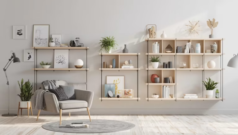
Texture and Material Language
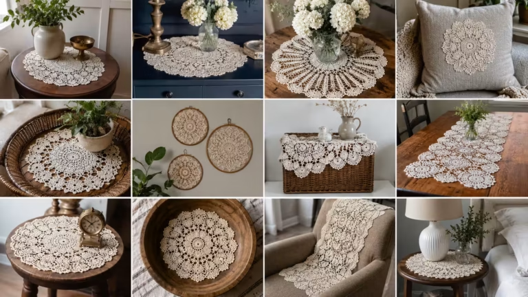
Texture operates on two levels: tactile (how something actually feels) and visual (how something appears to feel from across the room). A room built entirely of smooth, reflective surfaces will feel sterile and cold regardless of its color palette. Introducing a jute rug, a linen throw, or a rough-hewn wooden side table adds what designers call “material warmth.”
Sara Okafor, a Lagos-based interior designer, spent two years designing hotel rooms before moving into residential work. Her standing advice to clients: if your room feels flat in photos and cold in person, the problem is almost always texture, not color. Layering three to five distinct textures in a single space is her baseline recommendation, and it almost always resolves the complaint.
Color Theory in Real Rooms
The 60-30-10 Rule
The 60-30-10 rule is one of the oldest and most reliable frameworks in color composition. The dominant color covers roughly 60% of the room (walls, large area rug, or main upholstery). The secondary color covers 30% (accent chairs, window treatments, or a secondary furniture grouping). The accent color takes the final 10% in cushions, artwork, decorative objects, and hardware.
This ratio prevents a room from feeling either flat (too much of one color) or chaotic (too many competing colors fighting for attention). It works across styles, from maximalist Victorian drawing rooms to spare Scandinavian interiors, because it’s rooted in proportion rather than aesthetic preference.
Warm vs. Cool Tones and Light Behavior
One of the biggest mistakes in residential design is choosing paint colors from a chip under fluorescent store lighting. Colors behave entirely differently depending on the light source, the time of day, and the orientation of the room. A north-facing room receives cool, indirect light throughout the day. Painting it in a cool gray or blue can make it feel genuinely cold and uninviting. Warm tones like terracotta, warm white, or honey yellow compensate for that light condition.
South-facing rooms receive warm, direct sunlight for most of the day. Cool tones balance that warmth and prevent the room from feeling washed out. Designers always test paint samples in the actual room at different times of day before committing. A small painted sample board, moved around the room over 48 hours, tells you more than any color theory chart.
The Psychology of Neutrals
Neutrals are not the absence of color. White, beige, gray, and greige each carry distinct undertones that only reveal themselves in context. Benjamin Moore’s “Chantilly Lace” reads almost blue-white in some light conditions. Sherwin-Williams’ “Accessible Beige” can look distinctly green on certain walls. Understanding undertones is a skill that separates confident designers from those who repaint rooms three times and still can’t figure out what went wrong.
Space Planning and Proportion
How Traffic Flow Shapes Furniture Placement
Space planning begins with movement, not furniture. Before placing a single chair, a designer maps how people enter the room, where they naturally walk, and what they need to access. Standard clearances include at least 36 inches for main traffic paths, 18 inches between a sofa and a coffee table, and 48 inches of clear walkway in dining areas.
Jaylen Morris, a Chicago-based residential designer, often describes his first site visit as “walking the room like a stranger.” He pays attention to where he instinctively wants to stand, where the light draws him, and where the space creates awkward hesitations. That instinctive mapping, done before any furniture plan, prevents the common mistake of designing for how a room looks in photos rather than how it functions at 7 p.m. on a Tuesday.
Scale and Proportion Across Furniture
Proportion is the relationship between objects and their surroundings. A small rug under a large sectional makes both pieces look wrong. A tiny piece of artwork hung alone on a vast wall looks like an afterthought. Getting scale right requires thinking in relationships, not in absolute size.
The rug is one of the most frequently misjudged elements in residential design. In a living room, the front legs of all major seating pieces should sit on the rug. In a dining room, the rug should extend at least 24 inches beyond all sides of the table so that chairs remain on the rug when pulled out. These aren’t arbitrary rules. They exist because a correctly-sized rug anchors the furniture grouping and defines the space visually.
Lighting as Architecture
The Three-Layer Lighting Approach
Lighting design uses three distinct layers: ambient (general illumination), task (focused light for specific activities), and accent (directional light that highlights architectural features or objects). Relying only on overhead ambient lighting is the most common lighting mistake in residential spaces. It creates a flat, institutional feel regardless of how good the furniture is.
A well-lit living room might combine recessed downlights on a dimmer (ambient), a floor lamp beside a reading chair (task), and directional picture lights above artwork or a wash of light on a textured wall (accent). The ability to control each layer independently transforms a single room into multiple moods without changing anything else.
Natural Light and Window Treatment Strategy
Natural light is the most valuable design resource in any space, and it costs nothing. Treatments that block natural light to create privacy often sacrifice the room’s best asset. Designers typically favor sheers or light-filtering linen panels that diffuse rather than block daylight, reserving blackout functionality for bedrooms.
The height at which curtain rods are mounted changes everything. Hanging curtains at ceiling height rather than just above the window frame makes ceilings feel taller and windows feel grander, even in rooms with standard 8-foot ceilings. This single adjustment is one of the highest-impact, lowest-cost changes in residential design.
Balance, Rhythm, and Visual Harmony
Symmetrical vs. Asymmetrical Balance
Symmetrical balance, two matching nightstands flanking a bed, or a pair of identical sconces on either side of a fireplace, is the easiest form of balance to achieve and the most formal in character. It reads as calm and classical, which is why it dominates traditional and transitional interiors.
Asymmetrical balance is harder to execute but more dynamic. It involves balancing different objects of roughly equal visual weight on either side of an axis. A tall plant on one side of a console balanced by two shorter objects and a framed print on the other side can feel perfectly balanced while using nothing that matches. Visual weight is the operating concept: dark, heavy, or complex objects have more of it than light, simple, or transparent ones.
Rhythm and Repetition in Decoration
Rhythm in design is created through repetition of colors, shapes, or materials at intervals throughout a space. A single blue accent cushion sits alone. Three blue accents in different forms (a cushion, a ceramic vase, and a woven throw) create rhythm. The eye moves through the room rather than landing and stopping.
Repetition also applies to materials. If you introduce brass hardware in one area, echoing it in a lamp base, a picture frame, or a side table leg creates cohesion without making the room feel themed. This technique, called “carrying a material through a space,” is a core skill in creating rooms that feel thoughtfully assembled rather than randomly furnished.
Wrap Up
The basics of interior design come down to understanding how visual elements interact with human perception. Line, form, color, texture, light, scale, and balance are not decorating preferences. They’re perceptual tools, and when applied with intention, they make the difference between a room that looks assembled and one that feels inevitable. Start with space planning, get the light right, and let the layering of materials and color follow from there. The most expensive piece of furniture in a poorly planned room will always look out of place.
FAQs
What are the most important principles of interior design for beginners?
The foundational principles are balance, proportion, light, and color harmony. Mastering space planning and understanding how furniture scale relates to room size will produce the biggest improvement in any space.
How do I choose the right color palette for a room?
Start by identifying the room’s light source and orientation, then use the 60-30-10 rule to build a palette with a dominant, secondary, and accent color. Always test paint samples in the actual room at different times of day before committing.
What is the difference between interior design and interior decorating?
Interior decorating focuses on the aesthetic layer: furniture, fabrics, art, and accessories. Interior design includes all of that plus spatial planning, traffic flow analysis, and sometimes structural or lighting coordination, making it a broader discipline.
Disclaimer
This content shared by Fall Rugs is solely for research and informational purposes. Fall Rugs is not a professional interior design or home renovation consultancy, and the information provided should not be considered professional advice for home improvement or decor. All ideas and suggestions are based on current trends and general knowledge in the home decor industry.