TL;DR
Using dark paint against bright moulding creates an architectural framework that anchors large spaces and defines small rooms. Success requires balancing matte textures with proper light reflectance values to avoid an oppressive atmosphere. Selecting the right temperature coordinates between the two paint shades ensures a cohesive finish.
Introduction
Does a room with deeply saturated paint and bright boundaries feel sophisticated or merely claustrophobic? Many homeowners hesitate to abandon safe neutrals because they fear shrinking their living spaces or creating a harsh visual environment. Mastering this high contrast design technique reveals that deep charcoal or ink tones actually push walls back visually when paired with the right perimeter framing. You will discover how to select compatible undertones, manage natural illumination, and apply professional styling principles to balance this striking architectural look.
The Mechanics of Visual Contrast in Interior Architecture
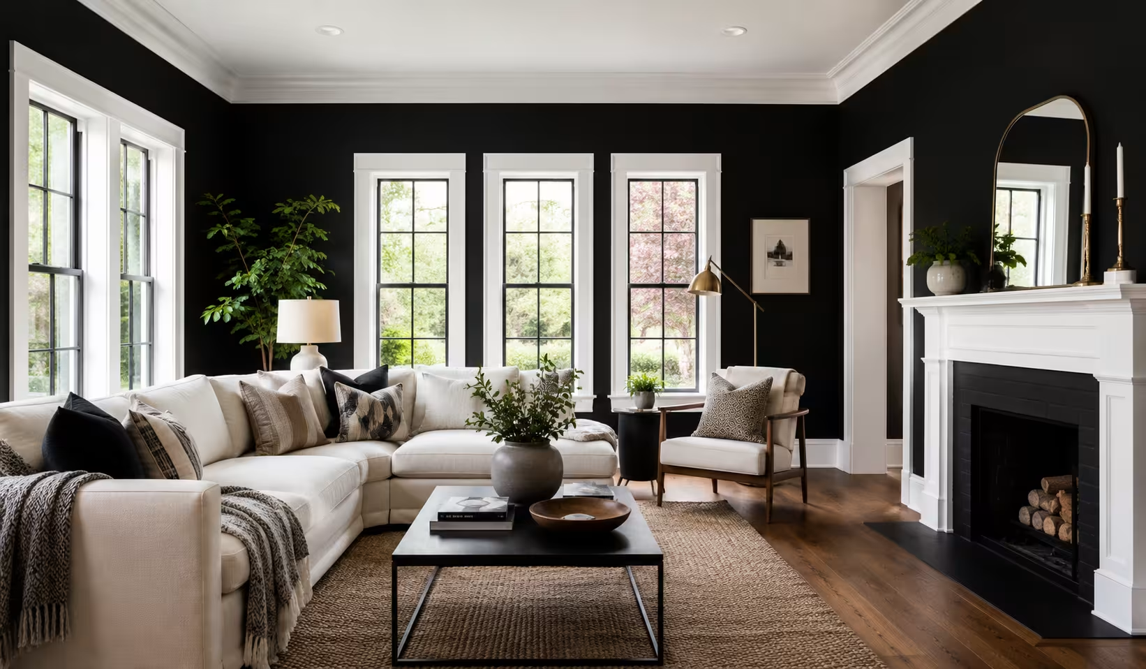
Deep pigments absorb light while bright surfaces reflect it, creating a push and pull dynamic that alters perceived room dimensions. When applying an obsidian shade to drywall, the surfaces appear to recede into the background, which can make a small study or powder room feel infinitely deep. The crisp perimeter acts as a graphic frame, drawing the eye to the structural lines of the space rather than the physical boundaries of the room. Designers call this the artwork effect, where the wall becomes a dark canvas and the woodwork serves as the matting.
A common misstep involves ignoring the light reflectance value of the dark paint, which dictates how much illumination the surface bounces back into the room. Selecting a flat or matte finish prevents harsh glare and masks minor imperfections in the drywall that often show up under dark coatings.
Glossy dark surfaces tend to mirror windows and lamps, breaking the illusion of depth and creating a restless visual environment. Maintaining a matte finish on the main surfaces while using a semi-gloss or satin sheen on the surrounding woodwork establishes a sophisticated texture story.
During a recent renovation of a historic colonial home in Boston, an editorial team observed a parlor painted in Behr Beluga alongside stark white casing. The initial application felt jarring because the starkness of the woodwork lacked visual weight against the heavy black backdrop.
The installation of substantial five inch baseboards and thick crown molding resolved the issue by providing enough structural mass to balance the deep wall color. Thin, modern trim often disappears or looks like a mistake when placed next to intense, midnight tones.
Balancing undertones across opposing palettes
Every dark paint carries a hidden bias toward blue, green, purple, or brown that dictates how it behaves under different light sources. Pairing a cool charcoal that has distinct blue undertones with a warm, cream-colored baseboard creates a muddy visual conflict. The underlying temperatures must align so the transition feels intentional rather than accidental.
Managing the weight of architectural moldings
Thicker window casings and substantial door frames anchor a room when the walls are saturated with dark pigment. Small or flat moldings fail to provide the necessary visual break, causing the dark paint to overwhelm the architectural lines. Increasing the profile thickness ensures the crisp framing holds its own against the dominant wall color.
Selecting Paint Formulations and Color Combinations
Navigating the catalogs of major paint manufacturers reveals that not all dark tones are created equal. Farrow & Ball offers a shade called Railings, which contains heavy blue undertones that soften the starkness of a pure black and pair beautifully with their All White trim color. For a warmer, more organic atmosphere, Benjamin Moore Iron Mountain provides a rich charcoal hue that leans slightly brown, making it an excellent match for a soft perimeter color like Swiss Coffee. Exploring these variations allows you to tailor the mood of the room to its specific orientation and purpose.
The choice of the lighter shade requires just as much scrutiny as the main wall color. Pure, untinted whites often look clinical or blue when placed next to a true black, resulting in a look that feels more like a commercial gallery than a home. Selecting a softened variant that contains a hint of gray or beige mellows the transition and prevents eye fatigue. Testing large swatches on different walls throughout the day remains the most reliable method for observing how changing daylight affects the relationship between the two colors.
A design studio in Chicago recently shared a project where a client insisted on using an ultra-glossy midnight black in a north-facing bedroom. The resulting glare from the gray winter light made the space feel cold and industrial rather than cozy. The design team corrected the issue by switching to Sherwin-Williams Tricorn Black in a matte emerald finish, paired with Pure White on the window frames. The change in sheen immediately absorbed the cold light, transforming the bedroom into a calm, enveloping sanctuary.
Assessing the impact of natural illumination
Rooms facing north receive a cool, bluish light that can make deep tones feel icy and stark white trim appear slightly blue. Southern exposure brings warm, golden light that softens dark walls but can cause bright moldings to look yellow if the paint contains warm undertones. Adjusting your paint selections based on window orientation prevents unexpected color shifts.
Establishing sheen hierarchy for longevity
Applying a flat finish to the main wall surfaces provides an elegant, velvet-like texture that minimizes light bouncing across the room. Using a satin or semi-gloss finish on the surrounding woodwork ensures durability against scuffs while offering a subtle sheen contrast. This variation in finishes adds a layer of professional craftsmanship to the final look.
Furnishing and Styling High Contrast Spaces
Introducing furniture into a room with dark surfaces and bright trim requires a deliberate strategy regarding color value and material texture. Placing a dark charcoal sofa directly against an ink-colored wall causes the furniture to vanish, creating a heavy and monolithic silhouette.
Choosing mid-tone fabrics, such as a camel leather armchair or a soft gray tweed sofa from West Elm, bridges the gap between the dark surfaces and the bright woodwork. This approach ensures that individual decor pieces remain distinct while contributing to a cohesive room design.
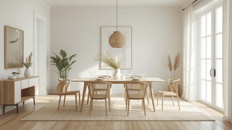
Natural wood elements play a critical role in warming up a high contrast environment and preventing it from feeling sterile. A light oak dining table or a walnut sideboard adds organic grain patterns that soften the crisp lines of the room framing. Incorporating textiles with rich tactile qualities, like a thick wool rug from Ruggable or linen drapery panels, introduces varied layers that absorb sound and enhance comfort. Metallic accents, particularly muted brass or brushed bronze hardware, offer subtle points of brightness without creating distracting reflections.
An interior stylist based in Seattle documented a challenge involving a long, narrow living room painted in a deep obsidian hue with crisp perimeter lines. The space initially felt like a tunnel because the furniture was lined up against the dark walls, drawing too much attention to the room shapes.
The stylist resolved this by pulling a cream-colored Pottery Barn sofa away from the wall and placing a large, light-toned jute rug in the center of the space. This arrangement broke up the dark floor plane and connected beautifully with the bright baseboards and window frames.
Integrating mid-tone transitional elements
Layering furniture in shades of olive, terracotta, or warm amber prevents the room from feeling like a harsh binary environment. These intermediate values soften the visual leap between the deep wall surfaces and the light framing. The result is a space that feels balanced and layered rather than starkly divided.
Strategizing artwork placement and matting
Hanging art with oversized light matting and thin dark frames establishes a direct visual connection with the room architecture. The white matting echoes the trim color, pulling the perimeter accents into the body of the wall. This technique breaks up large expanses of dark paint and creates focal points that anchor the gaze.
Structural Considerations and Common Practical Fixes
Executing this design requires meticulous attention to detail during the preparation and painting phases. Dark pigments reveal every skipped sand, uneven joint compound application, or wavy line along the ceiling grid. Using high-quality painter’s tape and sealing the edge with a thin line of the base color before applying the dark paint prevents bleeding. If the boundary line between the dark drywall and the bright molding is uneven, the high contrast will immediately draw attention to the flaw.
Another structural challenge occurs at the inside corners of the room where two dark walls meet. If the paint application is uneven or too thick, the pigment can pool and create a shiny line that catches the light unnaturally. Applying multiple thin coats with a microfiber roller rather than one heavy coat ensures an even distribution of the dark base. When coating the baseboards, extending the light color slightly onto the floor shoe molding creates a grounded foundation that prevents the dark walls from looking bottom-heavy.
A residential painting contractor in Denver recalled a project where a homeowner attempted a DIY application of a midnight shade over an existing beige wall. The project failed because they used a cheap primer, resulting in a patchy, translucent finish that required four coats of expensive topcoat to fix. The contractor stepped in, sanded the surfaces down, applied a gray-tinted primer, and finished with two coats of premium matte product. The tinted primer provided the necessary depth of color from the start, saving time and ensuring a flawless finish.
Sealing edges to prevent color bleeding
Crisp lines require advanced taping techniques to ensure the dark pigment never creeps onto the light woodwork. Applying a clear matte medium or a tiny bead of the trim paint over the tape edge seals the barrier completely. Once the dark coat goes over the top, removing the tape reveals a razor-sharp boundary.
Modifying electrical outlets and switch plates
Standard white plastic switches and outlet covers stand out like beacons when placed on an obsidian surface. Replacing these utility plates with matte black alternatives or painting them to match the wall ensures they disappear into the background. Keeping the outlet covers cohesive with the wall color preserves the unbroken flow of the dark palette.
Wrap Up
Embracing a dark paint palette paired with light perimeter framing offers a powerful method for defining interior architecture and creating mood. Success depends on selecting compatible undertones, choosing the correct low-sheen finishes, and scaling your moldings to match the visual weight of the paint. By incorporating mid-tone furnishings and organic wood textures, you can transform any room into a balanced, sophisticated space that feels intentional and grounded.
FAQs Section
Does painting walls black with white trim make a room look smaller?
Deep colors absorb light and cause walls to recede visually, which can actually make a space feel more expansive when framed by light moldings. The high contrast creates clear boundaries that give a room structure and depth rather than shrinking it.
What is the best sheen combination for this specific design style?
The most effective approach uses a flat or matte finish on the walls to minimize reflection and mask imperfections, paired with a satin or semi-gloss finish on the trim. This contrast in sheen adds sophistication and ensures the woodwork is durable and easy to clean.
Should the ceiling be painted white or black in this scenario?
Painting the ceiling a crisp white that matches the molding keeps the room feeling open and tall by drawing the eye upward along the light framework. A dark ceiling creates a dramatic, tent-like effect that works best in rooms with exceptionamouldingt or abundant natural light.
Disclaimer
This content shared by Fall Rugs is solely for research and informational purposes. Fall Rugs is not a professional interior design or home renovation consultancy, and the information provided should not be considered professional advice for home improvement or decor. All ideas and suggestions are based on current trends and general knowledge in the home decor industry.