TL;DR
Transforming a bedroom with deep blue shades requires balancing rich paint colors with strategic warm lighting and layered textiles. Incorporating contrasting wood tones and reflective metallic details prevents the dark palette from overwhelming the space. Selecting the right finish and accent fabrics ensures a cozy, sophisticated retreat.
Introduction
Why do standard white bedrooms dominate modern design when deeper tones offer far better sleep quality? Cultivating a dark blue moody bedroom is less about shrinking a room and more about wrapping it in visual comfort. Many homeowners hesitate to use deep tones because they fear creating a cold, gloomy cave. This guide demonstrates how to use saturated midnight shades, specific lighting placements, and tactile surfaces to build a secure, restorative sanctuary.
1 Selecting the Right Midnight Foundation Paint Tones
The base of any moody room rests entirely on the walls. Choosing a flat or matte finish prevents standard drywall imperfections from catching the light and creating distracting glares. Deep navy blues with subtle gray or green undertones change character beautifully throughout the day, shifting from crisp definition in afternoon sun to quiet shadows at night.
A common misstep is painting only a single accent wall, which breaks the visual flow and actually makes a small room feel restricted. Carrying the rich color across all four walls, and even onto the baseboards, creates an unbroken horizon line that pushes the boundaries of the room outward.
- Benjamin Moore Hale Navy offers a classic, dependable base that adapts well to both natural and artificial light.
- Farrow & Ball Hague Blue introduces a slight green undertone that pairs beautifully with vintage wooden furniture.
- Sherwin-Williams Naval delivers a crisp, regal midnight shade that stabilizes rooms with exceptionally high ceilings.
During a 2024 renovation of a historic brownstone in Boston, designers painted a small 120-square-foot guest room entirely in Farrow & Ball Hague Blue, including the radiator and window trim. Rather than shrinking the perimeter, the room appeared to expand because the sharp corners of the room visually dissolved in the dark hue.
2 Balancing Deep Wall Tones with Rich Wood Textures
Placing dark furniture against dark walls can cause pieces to disappear entirely into the background. To avoid this visual erasure, introduce warm wooden surfaces that provide natural contrast and organic texture. Mid-century modern walnut, reclaimed oak, and honey-toned birch cut through the cool properties of blue paint without disrupting the quiet environment.
The goal is to select timber tones that feature distinct grain patterns to catch ambient light. A bed frame, a pair of nightstands, or even a simple wooden bench at the foot of the bed adds structural grounding to the space.
- Walnut platform beds introduce a mid-tone brown that offers a clean contrast against midnight walls.
- Reclaimed oak dresser tops add rough-hewn character that balances smooth matte wall finishes.
- Teak accent chairs bring out the subtle warm undertones hidden inside dark paint formulas.
An interior decorator working on a coastal Maine property in 2025 fixed a sterile-looking navy bedroom by removing white laminate nightstands. The decorator replaced them with vintage walnut dressers from West Elm, instantly turning a flat, cold space into an inviting room with tangible history.
3 Layering Velvet and Linen Textiles for Depth
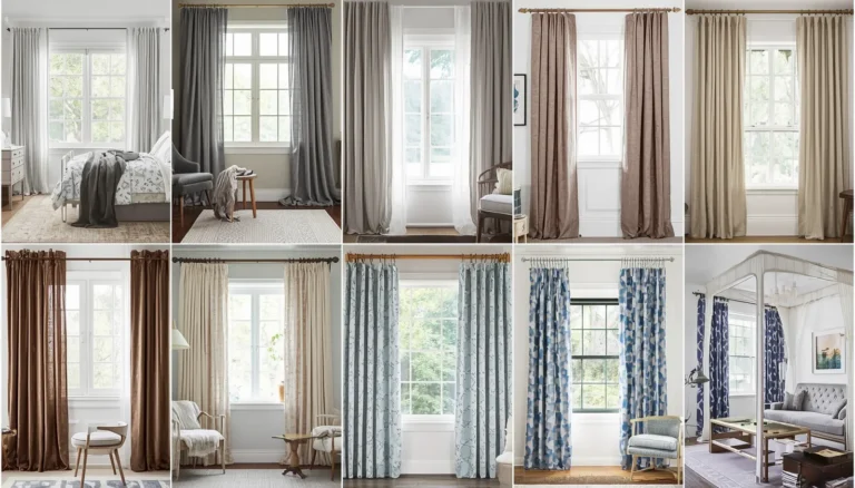
A dark room devoid of diverse fabric textures quickly feels flat, cold, and uninviting. Layering different materials across the bed, windows, and floors is the secret to generating physical and visual warmth. Combine the heavy weight of matte velvet curtains with the casual, crumpled texture of pure flax linen sheets to establish immediate contrast.
Floor coverings play an equally important role in anchoring the entire design layout. A plush, pattern-heavy area rug introduces a soft surface underfoot while breaking up dark wood flooring or standard gray carpeting.
- Pottery Barn velvet drapes in muted mustard or olive green break up expansive blue wall sections.
- Ruggable washable area rugs featuring vintage Turkish patterns add intricate detail under the bed.
- Brooklinen washed linen duvet covers in soft charcoal or cream prevent the bedding from looking heavy.
A modern apartment in Chicago felt overly stark after the owners applied a deep midnight paint. By adding a thick, cream-accented vintage rug from Ruggable and heavy velvet drapes from Pottery Barn, the room transformed from feeling like an empty concrete box into a plush, acoustically dampened retreat.
4 Arranging Low-Level Warm Lighting Elements
High-output overhead lighting completely destroys the intimate ambiance of a dark blue bedroom. To keep the space feeling mysterious yet functional, shift the focus toward low-level, scattered accent lighting. Wall-mounted sconces, low-wattage bedside lamps, and discreet LED light strips behind the headboard create pockets of soft illumination.
Opt for light bulbs that sit between 2700K and 3000K on the color temperature scale to cast a golden glow across the blue paint. This specific color intersection prevents the dark blue walls from shifting into a sickly, cold gray tone after sunset.
- Angled brass wall sconces cast gentle downward pools of light exactly where reading illumination is required.
- Frosted glass globes soften harsh bulb filaments and spread light evenly across dark corners.
- Dimmable amber LED strips hidden behind architectural moulding provide a soft, indirect framing glow.
When retrofitting a low-ceilinged attic bedroom in Seattle, an editorial stylist avoided central ceiling fixtures entirely. They installed two dimmable brass sconces next to the pillows and a single low-slung floor lamp in the opposite corner, creating a soothing hotel-like environment.
5 Incorporating Warm Metallics and Reflective Accents
Dark walls absorb a significant amount of light, which can leave a room feeling somewhat heavy during gray winter months. Introducing small, deliberate metallic elements provides a reflective surface for ambient light to dance across. Brushed brass, antique bronze, and polished copper work best against dark blue because their inherent orange and yellow undertones sit directly opposite blue on the color wheel.
Be careful to use these materials sparingly on small touchpoints like drawer pulls, light switches, and picture frames. Overdoing shiny surfaces can make the room look gaudy rather than sophisticated.
- Brushed brass drawer pulls break up the solid front faces of dark-painted nightstands.
- Gilded antique mirror frames bounce natural light from windows deep into the dark corners of the room.
- Oil-rubbed bronze window hardware adds a subtle weight that complements deep navy window casings.
In a 2023 design project in London, a bedroom styled with deep navy walls felt slightly gloomy during rainy days. The design team introduced a large, ornate golden mirror sourced from Anthropologie opposite the main window, which instantly doubled the available daylight without altering the wall color.
6 Incorporating Striking Artwork with High Contrast
Leaving dark blue walls completely bare can make a bedroom feel unfinished or institutional. Displaying artwork with high visual contrast creates a focal point that draws the eye through the space. Look for prints, photography, or paintings that feature cream backgrounds, bright abstract strokes, or metallic leafing.
The framing choices are just as critical as the artwork itself. Utilizing wide, bright white or cream mats inside clean wooden frames provides a visual buffer that allows the art to stand out cleanly against the deep background.
- Monochrome black and white photography framed with wide white mat boards adds a classic look.
- Abstract paintings featuring ochre, terracotta, and rust tones harmonize beautifully with deep blue backdrops.
- Botanical sketches printed on aged cream parchment bring a delicate, organic touch to dark spaces.
An art collector living in San Francisco utilized their dark indigo bedroom walls as a private gallery background. By hanging three oversized monochrome architectural photographs in bright white mats, they turned an otherwise plain wall into a sophisticated display that rivaled local gallery spaces.
7 Extending the Moody Palette to the Ceiling
A bright white ceiling in a dark blue room can create a jarring visual stop that makes the ceiling feel lower than it actually is. To avoid this boxing-in effect, brave decorators paint the ceiling to match the walls or choose a color just one shade lighter. This technique creates an infinity-pool effect where the boundaries of the room become difficult for the eye to define.
If a full dark ceiling feels too daring for a small space, choosing a muted, complementary mid-toned gray can soften the transition. This approach works exceptionally well in bedrooms featuring architectural details like crown moulding or exposed ceiling joists.
- Matching matte ceiling paint eliminates the harsh white line where the wall meets the top of the room.
- Muted charcoal ceiling tones offer a gentle transition that keeps the room feeling grounded.
- Soft tint washes allow wood grain to show through while toning down bright pine ceiling planks.
A design client in Denver struggled with an irregular, sloped ceiling in their master bedroom. By painting the entire ceiling surface in the same deep navy shade as the walls, the awkward angles vanished, resulting in a cohesive, cozy interior architecture.
8 Grounding the Layout with Natural Greenery
Every dark interior space benefits from a touch of living color to break up solid blocks of paint and fabric. The vibrant green foliage of indoor plants contrasts sharply against dark blue walls, making the leaves appear exceptionally bright and healthy. Select varieties that thrive in lower light conditions if your moody color palette choice matches a room with limited window exposure.
Placing a tall plant in an empty corner or a trailing vine on top of a dresser introduces movement and life into a design scheme that might otherwise feel static.
- Fiddle-leaf figs provide broad, structural green leaves that stand out against dark corners.
- Snake plants offer upright, architectural lines that fill narrow spaces between windows and wardrobes.
- Pothos vines cascade softly over the edges of tall shelves, breaking up sharp vertical wall lines.
A bedroom makeover in Portland utilized a large potted monstera plant placed next to a navy-painted IKEA wardrobe. The natural green leaves softened the heavy storage unit, showing how simple organic elements can balance deep paint selections.
Wrap Up
Designing a dark blue moody bedroom requires balancing deep wall finishes with thoughtful interior layers. By pairing rich tones like Benjamin Moore Hale Navy with warm walnut furniture, textured Ruggable floor coverings, and golden brass hardware, the space becomes a comforting sanctuary. Avoid high-contrast white ceilings or harsh overhead lighting to preserve the cozy atmosphere. Focus on rich textures and low-level lighting to ensure your dark bedroom remains inviting throughout every season.
FAQs Section
Will dark blue walls make my small bedroom look like a cave?
When applied correctly across all walls and trim pieces, dark blue dissolves the sharp corners of a room, which can actually make a small space feel larger. The addition of warm lighting elements and reflective brass mirrors prevents the room from feeling closed in.
What bedding colors look best inside a dark blue bedroom?
Crisp white, soft cream, charcoal gray, and warm earthy tones like terracotta or mustard yellow offer the best balance against navy walls. Layering linen and velvet textures adds depth without overwhelming the eye with chaotic patterns.
Should I use a matte or eggshell paint finish for a moody look?
A flat or matte paint finish works best for dark, moody rooms because it absorbs light and hides minor drywall imperfections. Shiny finishes like satin or semi-gloss create harsh glares from lamps, which disrupts the soothing atmosphere.
Disclaimer
This content shared by Fall Rugs is solely for research and informational purposes. Fall Rugs is not a professional interior design or home renovation consultancy, and the information provided should not be considered professional advice for home improvement or decor. All ideas and suggestions are based on current trends and general knowledge in the home decor industry.